Hello everybody! Today’s post is going to be split into two different sections as I watched two different movies for my assignments. If you don’t like spoilers I would suggest not reading on further.
“La Jetée”
For the first part of this post, I am going to talk about the movie “La Jetée” by Chris Marker.
Chris Marker used different styles of framing to convey the way the apocalypse feels throughout “La Jetée”. When showing us what the apocalypse looks like in Paris, he starts with a simple cityscape view. Then almost like zooming in, he shows us specific buildings that have been destroyed. Framing these zoomed in pictures on the ruins, draws the viewer’s attention to the destruction that has racked Paris.
Moreover, the photographer uses heavy shadows to frame the image and focus the attention on the subject. In the photo below, the background is mainly black. This simplifies the image so one cannot help but analyze the man in the funny glasses. Chris Marker’s use of shadows to frame throughout the movie gives the underground galleries a dark and mysterious feel. This gloomy atmosphere in the movie defines the way that Chris Marker imagines the apocalypse.
Furthermore, throughout this movie I noted the tips and techniques we discussed that Chris Marker also employs.
Chris Marker likes to change the viewer’s perspective by shooting up from below. He especially likes to employ this technique when the warden character and the prisoner are interacting. This leads to the feeling of a power imbalance and the insecurity that stems from that.
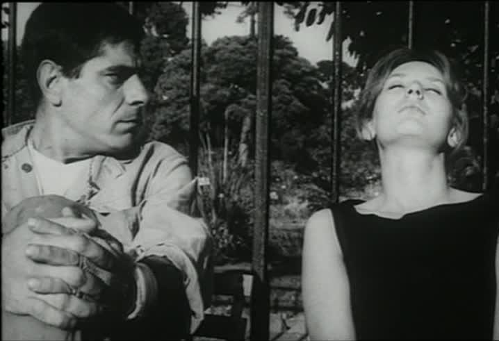
Additionally, Chris Marker uses the depth of field tip. This can be seen in the screenshot below with the man in background blurry while the crazy man in focus. With the focus on the crazy man, the viewer can almost feel his pain.
In general, Chris Marker also deploys heavy subject contrast between the dream like memories and the harsh cold tunnels. Through this technique, the viewer can feel the sharp contrast that the main character goes through every time he time travels.
Chris Marker also uses foreground and background techniques. In the photo below, the foreground of the image (the birds) is in focus whereas the man and the woman are not. Strangely, through the focus on the birds we choose to concentrate on the blurry man and woman.
In addition to foreground techniques, Chris Marker uses lighting and shadows to add mysterious vibes to his photos. When the main character travels to the future, Chris Marker highlights the future people’s strangeness with intense lighting and shadows.
As previously mentioned, Chris Marker frames each shot to really convey emotion to the viewer. Whether Chris Marker is shooting up from below or using light to add drama to his subject, the viewer feels what the subject is feeling. As a viewer, I found each of Chris Marker’s images really moving. Through his images, I felt immersed into the world of “La Jetée”. I felt what the characters felt. However, because of Chris Marker’s highly framed and focused images everything did feel a little surreal. The shadows sometimes obscured the background and the little details I wanted to pick up on. Of course, this was done purposefully. But, the intense concentration on the subject led me to also feel distanced from the movie as the images were almost overly dramatic. In general, I missed the feeling of reality in some of the underground gallery shots.
What resonated with me about “La Jetée” was that love can be unconventional and still work. In the movie, the main character discusses how the woman accepts his strange appearances and disappearances. Despite that oddity, she still falls in love with him. The two of them shared such a deep connection that even though he sometimes wordlessly leaves and returns, she still loved him.
Some other aspects of the movie that worked well was the heart beat noise Chris Marker would insert. This sound got me very stressed and really captured my attention. Also, the costumes, especially the weird glasses they wore in the underground galleries, worked well. These glasses and the weird headgear of the future people made it easy to separate the trips to the past, present and future. Also, I loved Chris Marker’s break from images to film. When he included the video of the woman in bed, I actually got really scared. The change from photos to video was quite jarring. This aspect was done well, but I feel like as a viewer I could have been eased into it more.
In general, the author really drew me in through his use of framing and characters. At the end of the movie, you are almost rooting for the man and woman to somehow have a happy life. All of these features come together to form a really enjoyable film. Even though at times “La Jetée” reminded me of Flipagram, I did enjoy it as it used photos to create a narrative and an immersive experience.
“Mad Max”
The second film I decided to watch was “Mad Max” by George Miller.
*Before reading more, Mel Gibson is a dueche here is why*
Throughout “Mad Max” I paid close attention to how the scenes were shot and added certain elements to the film. In terms of forwarding the narrative, George Miller would shoot scenes that included Mad Max’s family very up close. With this extra focus on Max and his family, the viewer could see how he interacts with them. This helped forward the narrative and plot line for later (no spoilers).
Additionally, George Miller used an up from below perspective multiple times in the film to show when the power has shifted or is imbalanced. This can be seen when Max is trying to quit his job, but his boss won’t let him. Through the camera angles we can see how his boss still has power over Max and won’t let him go.
Concerning how the scenes draw me in as a viewer, there were multiple times that George Miller used interesting angles to capture my attention. One example is when Goose is riding his motorcycle and we get a view from his motorcycle dash. This is an interesting angle as we feel like we are driving the motorcycle.
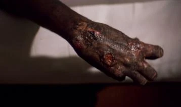
Also, George Miller masterfully used camera work to create empathy or disgust for the characters. He mainly used the Rule of Thirds to help the viewer focus on specific people or subjects to evoke these feelings. An example of this includes the disgust one feels when the nomads beat up the couple and sexually assault them. Moreover, empathy can be felt when when George Miller uses the Rule of Thirds to focus on Goose’s burned hand.
George Miller is also amazing at conveying emotion through his choice of framing. A wonderful example of how George Miller uses framing to convey emotion is through Jessie and Sprog’s death. After they are hit with a motorcycle, George Miller decided to focus on the shoe and ball. The shoe focus is on the left and then George Miller uses depth of field on the right to show the nomads leaving. This framing leads to serious emotions, specifically heartache, as you watch the ball bounce down the road.
This use of framing to convey emotion continues as depth of field is used to draw attention to Max collapsing near his dead son and very injured wife.
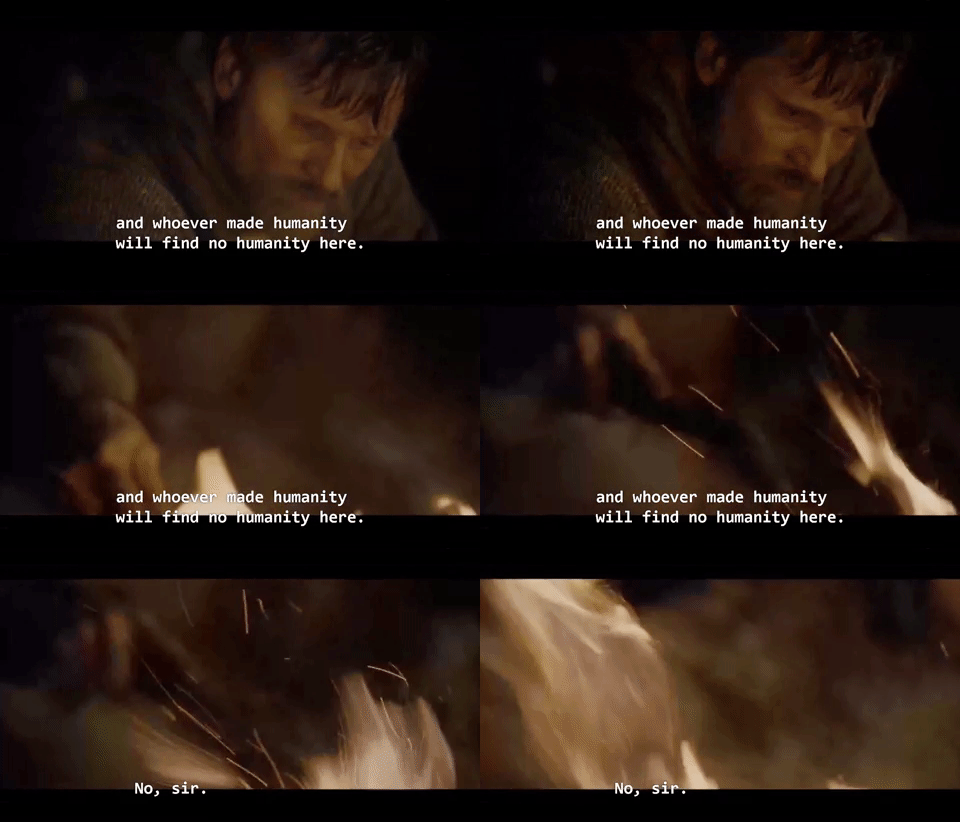
As part of the watching, I was tasked to choose one very short clip from “Mad Max” that I think worked particularly well and to make a GIF out of it.
The scene I chose from “Mad Max” was when Toecutter drags Johnny into the water at the beach. Toecutter then thrusts a shotgun into Johnny’s mouth and reminds him to keep his mouth shut. This whole action is really violent and leads to a lot of tension. Weirdly, right after this Toecutter drops the shotgun and throws an arm around Johnny in almost a fatherly way. I decided to focus on the moment that Toecutter has his arm around Johnny is guiding them into the sun. This shot evokes a range of emotion including anxiety and also tenderness. The lighting in this moment is also amazing as the setting sun adds to the mood of it. I think this scene is just like a mood swing, which is why I find it kind of thrilling and decided to make it into a gif.
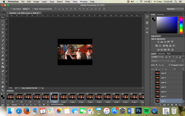
To make this gif I used QuickTime screen recording and then went to ezgif to make my gif. In ezgif I selected my time and cropped the gif to not include the black of the screen. I found this particularly easy as I have made hundreds of gifs. I did decide not to use Photoshop, however, as I felt that the dithering through it would have been worse. One thing I could improve is to try and make the gif loop. However, I think that may be a little extra.
Overall, I really liked “Mad Max”. I think what resonated with me about this movie is the fall of a man. Throughout this movie we see Max’s devolution. He starts as a cop, who just enforces the law, and ends as a man who basically lives above it. In the end, Max becomes the thing he used to fight. Likewise, George Miller did an excellent job of drawing me in through the characters and the emotions that they expressed. On the other hand, I feel like what didn’t work well in the story is the lack of explanation for why the world was the way it was. I feel like adding this into the story would give more meaning behind the characters’ actions (especially the nomads). Besides that, I really enjoyed “Mad Max” because it created stimulating character arcs and a detailed sense of place.
Thanks everyone for reading, I’ll catch you on the flipside.







 .
.