Not quite what it seems

Screen Shot 2015-01-26 at 7.37.16 PMScreen Shot 2015-01-26 at 7.37.16 PM

painting


I thought about this visual assignment for a little while. I knew I wanted to capture something with a good amount of color to manipulate and play with. When I saw this painting, I immediately knew that it was what I wanted to use for this project. As I said before about the kinds of things that attract my lens, I really enjoy vibrant colors and unique images. The texture of the painting is also something that really stood out to me.

This was a great photo to play with in terms of saturation, brightness, contrast, highlights, shadow effects, temperature, and other editing features. I took this photo on my phone and used the app Afterlight to size, shape, and edit the photo. Although it’s just an iPhone app, it actually offers a large variety of editing features that help enhance photos. I use it a lot to bring out color, sharpen, and crop or align my photos.

I had a lot of fun messing with the effects on this photo, and found that playing with the different levels exposed colors I didn’t even notice before. I felt like the end result had a bit of a “pop art”-esque effect, which I thought looked really interesting. It was cool how messing with the effects on this picture really changed the main components of the picture itself, showing both how easy it is to manipulate visuals from their original product as well as how many layers there can be to a visual that the human eye can’t even detect.

Stepping Stone Mood Swing

Foursquare anyone?


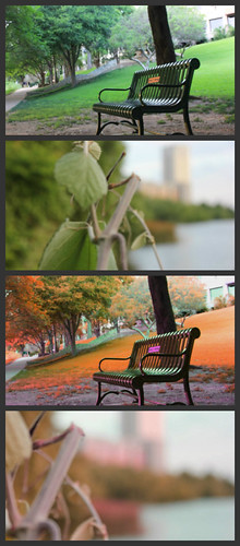
They are all just so moody!  Now before you judge, the bottom left is to original. I felt it need to be included. I’m not telling my secrets on how I did what. I’m sure you can guess. I’m partial to the one on the bottom right. I really like how it brings out the reflection in the water. Which one is your favorite? Feel free to comment.

George’s New Look**

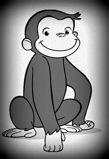
This quick and easy visual assignment, Switch Up the Mood, allowed me to spruce up Curious George’s profile picture for his dating site. I used Picasa to edit the photo and take from this:

Curious-George

To this:

Profile Pic

Since it’s a cartoon picture, there wasn’t as much I could have done with it, had it been a “real” photo.  I think it adds some class to George’s image ;)

2 stars

Switch Up The Mood

Switch Up The Mood (2 stars)

“Color, lighting, saturation, contrast, and many other factors all play in to taking a decent photo and making it fabulous. This assignment is to change the mood or tone of a photograph by altering the contrast, brightness, hue, saturation, exposure, etc. You do not have to change all of those things about the photo, but you can if you would like to. Experiment. Don’t be afraid to take it to the extremes, and don’t be afraid to be subtle.”

mood

Switching the Mood

This was a tough assignment.  We were supposed to edit a picture to change the mood of the photo.  Here’s my attempt.

before and after

The one on the right was the before picture.  To change the photo, I messed around with the contrast, hue, etc.  I’m not really sure how I did it honestly, I just played around.  I think the final photo ended up looking old and worn, which definitely changes the feel of the photo.

Austin during spring!

Contrast assignment

I edited a couple of pictures that I took in spring. I changed the mood of these pictures by altering the hue and brightness. This visual assignment represents two different seasons, spring and autumn.

An Attempt to Darken the Mood

Switch up the Mood

Although we read left-to-right, suspend reality for a second. The picture on the right is the original, and I used GIMP to darken things up a bit, using mostly the Brightness-Contrast and Hue-Saturation tools. Here is the finished product! It looks overcast, although, its hard to make flowers look foreboding :(

2/5 stars

Laundry

An edited image of laundry hanging in Ethiopia

One for One

Today I was inspired to go the day without shoes to raise awareness and money for Toms. Toms is a company that would match every pair of shoes purchased with a pair of new shoes given to a child in need. One for One. Today April 10, 2012 Jacksonville State University held a campus wide awareness down for One for One. This event consisted of walking around everywhere barefoot to obtain a better understanding of what children without a way to protect their feet have to endure on a daily basis. As the day of fun and festivities ended it was time for the long walk around University/Trusties Circle, barefoot of course. This is when the reality kicked in. With the asphalt almost unbearable and the rough rocks rubbing blisters on the balls of feet, it was a real challenge to make it to the finish line.
This picture was inspired by today’s events. I used Photoshop.com (online version) to increase the contrast, brush the toenail polish glair, and made the blues really pop. I found this assignment exciting and what a great way to involve my experiences of today in my blog.
 
 Yes those are blisters.