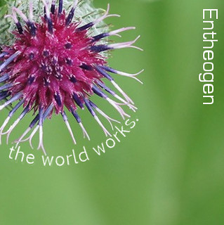
Their hit single is “Oh Dude, I Dropped My Peyote Buttons.”

Oh man. I love the Random Album Art activity. I’ve done it at least three times and it never gets old.

Random album cover!

I actually started this assignment over because the first Wikipedia article I got was about a real album, so I figured I should try another random article. I’m delighted that I did–the next article I got was about a psychoactive substance used in religious rituals with a name that literally translates to “generating the divine within.” Too. Perfect. The quote and image that popped up were also excellent, but the image was listed under an “All Rights Reserved” license, so I reloaded the page. Same deal. Did it again. Still copyrighted. I was delighted to see so many gorgeous photos and completely understood why the photographers wouldn’t want their stuff messed with, but c’mooooon, cut a creator a little slack, huh?

After reloading the Explore/Interestingness/Last 7 Days section of Flickr about twelve times, I decided to see if there wasn’t a better way to find a photo I could use. I checked out the Most Recent Uploads and decided to look at the last picture on the page for my album cover artwork. Same. Freaking. Thing. Well and truly frustrated, I figured I’d try and find a way to filter out all the photos that ARE licensed as remix-friendly under the Creative Commons. Turns out that Flickr, as far as I could tell, doesn’t make that distinction, but the Yahoo Image Search does have a Creative Commons filter. Score! To make sure the image I got was totally random, I found a random letter generator and typed that one letter (I got “U”) into Yahoo image search. Ineffective–all I got was variations of the letter U (duh).

Screw it, I thought. Back to Flickr. And then finally, finally I found a photo I could use!! Tatters:), you are my favorite person on Flickr right now.

Album cover

album cover

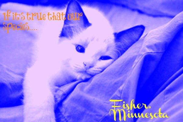
The process to create this photo was interesting. I followed the directions as to which photo to pick and what text to write in to make my album cover. I loved that this photo is random and mine actually makes some sense because the background photo is of a cat and the album name is “If it’s true that our species” by Fisher, Montana. When making the album cover, I used picmonkey.com to help me edit my cover and make it more interesting. To  pick the fonts of the text I just tried some and picked one that looked good with the picture. I re sized the picture and made bigger. Then I used the Andy Worhol technique for my album cover mixing a dark blue and white. I thought the technique made the cover more interesting and make it stand out.


Albulm Cover

Coveralbulm

This was pretty simple, but exciting because you had no idea what title, band, or cover picture you were going to get. For this assignment I gathered all three items to make my album. After which I used PicMoney to create and edit my picture. I messed around with fonts and effects for the picture. The original picture was black and white. However, once I messed with the effects, I got to change the picture to orange.

Daikatana Band

Don’t know what Daikatana is? Me either. BUT, I did land on it randomly by doing my fourth visual assignment, “An Album Cover“. I think this is the coolest visual assignment I’ve done yet. Click the link and learn more if you want to make your own album cover! Here’s how I made mine.

Step 1. Click for the random Wikipedia page. This will be your band name. I got Daikatana:

Step 2. Get a random quote. The last few words of the last quote is your new band’s album title. I got the quote, “After all is said and done, a lot more will be said than done.”:

Step 3. You go to a Flickr link, and the third photo is now your album cover:


Now what you do is create an album cover with what you found and customize it to your hearts content! Once again, I’m not the biggest fan of GIMP, but it will do what you need it to and save you $600 instead of buying Adobe Photoshop…although I do love it =( Anyways, I created this album cover:I think this all goes together awesomely! Daikatana, not only is a first person shooter(according to wiki) but it makes me think “Die, Katana!” The picture goes well because the black and white, as well as the style of the building give  me an impression of an older/eerie feeling. Plus it’s deserted, like everyone died…(zombie apocalypse?) So then I have the witty quote left. Which I think is cool because if there was a zombie apocalypse, I feel more should be done than said…BUT THIS IS A MUSIC ALBUM SO IT ALL MAKES SENSE! More will be said BECAUSE they will sing! I put it in “Chiller” font to give it a creepier look.

I’m sorry if you don’t get it, but it makes PERFECT sense to me! And I had a blast doing it! Go create your own!

8/10

Album Cover

full of doubts

For this assignment we were to design an album cover using some random information:

  • from wikpedia my band name was : OutlookSoft
  • from a random quotation page, my album title: “Full of Doubts”
  • from a random flickr page, my album cover is of a church.

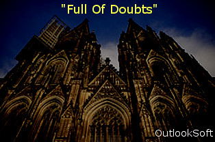
I darken or desaturated the church by using a free photo-editing software called GIMP2.6. I added the text and that’s about it. I like the idea of a dark, ominous grand church being coupled with the title “Full Of Doubts”. I’m really happy how the two came together giving a sad, hard, possibly confused message which is often associated with church or God.  I find the group name ‘OutlookSoft’ as funny, maybe even fitting. I can see how the terms ‘outlook’, ‘doubts’, and ‘god’ can be associated together in terms of faith or destiny. This was an easy task, but I think I just lucked out with my random items. I could see how if others might not fit together and would require more editing.


Some Sort of Musical Fusion

An Album Cover

I don’t know if I’d necessarily buy this album… Mehndi TV is a Canadian Hindi television station and Michele Shea’s quote “Creativity is…seeing something that doesn’t exist already. You need to find out how you can bring it into being and that way be a playmate with God,” became “Be a playmate with God,” which to me, sounds a little off. I had to bend the rules a little bit on the photo, I only looked at “3rd photos” but had to re-roll for a while until I found a photo with the necessary copyright allowances.

2/5 stars


Wrecking the Unsalvageable

Check out the new album by Balaram BoseWrecking the Unsalvageable! It’s a brilliant concept album that combines American folk, ranchera, and mariachi styles and follows a young man’s journey across Latin America retracing Che Guevara and Alberto Granado‘s famous journey, with a few extra stops of his own. The accordion solo during “Maté, My Friend” is particularly poignant.

Okay, that was a tiny bit facetious. I created this for the “An Album Cover” visual assignment. I’ve actually done this exercise before – it went through waves of popularity when I was in college as a midterms/finals period exercise in procrastination. We had a community-wide discussion forum where people would post their album covers. And many of them were brilliant combinations of titles and imagery. Sometimes funny, sometimes poignant, always interesting.

In creating this particular album cover, I was struck by the resemblance of the original image to both the Inca ruins at Machu Picchu (which Guevara and Granado visited during their trip), and to the aftermath of the 2001 earthquakes in El Salvador. So I decided that this must be a concept album related to Latin American social issues.

From there it was just a matter of assembling the cover. For that I turned to my usual stand-by, Photoshop CS5. But none of the default fonts seemed appropriate, and I realized that really what I wanted was the classic look of a dymo label maker. This is, after all, a folk album. It needs some indie cred.

To achieve the look, I used the fantastic “Label Brushes” brush set created by Invisibles Now which can be downloaded for free here. It required some tweaking with layers and cropping (it’s very difficult to match up the brush sizes, and you have to add a white background for the letters to stand out).  But the end result looks great imho.


An Album Fit for a King

The Golden Path

Oh boy, getting a jump start on this weeks assignments!  Ok, so I decided to try my hand at the “An Album Cover” assignment from the visual assignment archive.  It was only worth two stars and wasn’t too hard.

I started off by randomizing a wikipedia article.  Unfortunately I kept getting song and band names; I must’ve gotten 3 in a row.  Finally, I came up to “The Golden Path,” a chinese television show.  Weird choice for a band name, but I’ve seen weirder.  Then, for the quote that would be the album name: I ended up getting Oprah Winfrey’s quote.  Finally, for an album cover I picked “All in a Row” from flickr’s last 7 days feature.  From there, it was a really simple process of importing the image into Gimp, cropping it, and then adding in text using the text feature.  Mini-rant time! I don’t really like the text feature in Gimp.  It feels as if there should be more features.  Really all I could do was play around with where I placed the text and what color and font I wanted; there were no options for text placement, like vertical text, or any really cool features to make this stand out.

Because of these lack of features, we’ll say that The Golden Path is a relatively new band struggling to get on its feet.  They’re a kind of midwestern emo, twinkly kind of band, although they do have some poppier songs.  Hopefully they find their feet in a genre that is dying out.

Visual Assignment: An Album Cover

An Album Cover.

So here’s something fun for everyone to do, should be quick and easy, but try to make it pretty.

First, go here: http://en.wikipedia.org/wiki/Special:Random The title of the article is now the name of your band.

Next, go here: http://www.quotationspage.com/random.php3 Go to the bottom of the page.

The last four to five words of the last quote are the title of your first album Lastly, go here: http://www.flickr.com/explore/interesting/7days Select the 3rd image. It is the picture for your album cover. Manipulate the picture, resize it, add some other color, whatever. Do the same with the band name and album title, put them over top. However you wanna do it. Make it look cool.

This is a 2 star assignment.

The random Wikipedia page I got was Hunan Cuisine, so that’s what my band is called.  My album cover is called Alone in the World.  It is from a quote from Henry David Thoreau. The photo I got was called Angry Bunny in the Dark?!  This was posted by Thomas (music note next to name).

What I first did was download the photo.  It then opened in Windows Live Photo Gallery (my default place for pictures on my computer).  I then played with the coloring of the image. The next thing I did was open the drawing in paint to add text to it.  I like the few color thing in this because having few colors can represent loneliness.  Which seems to be the theme in this abum.  I really enjoyed this assignment because it I like how with these 2 random words and 1 random picture can create a story itself.

Visual Assignment: An Album Cover

Visual Assignment: A Debut Album

An Album Cover: Create an album cover to a fictional band.

Following the assignment’s directions, I generated the following:
Band Name: Philipine Legislative Election, 1946
Album Title: “Save what you choose to impose” (Which comes from Alan Moore’s Watchmen. The full quote is, “Existence is random. Has no pattern save what we imagine after staring at it for too long. No meaning save what we choose to impose.”)
Album Image: “nightways” by Flickr user brian hefele

Here’s what I came up with after several hours of trial and error:

Album by Phillipino Legislative...

Preparing to go platinum

CC Attribution_NonCommercial_ShareAlikeClick here to see this image on Flickr.

It’s got a real grunge or rap feel to it, which wasn’t intentional. It just kind of went that way. I wanted to stretch myself in both Photoshop and graphic design, so I tried mixing texture and colors, messed around with filters and just about everything I could think of. Oh, and also the colors. I’m terrible at picking out matching/appropriate colors. Thank goodness for my trusty color wheel. I didn’t go into the project with a plan in mind, and it resulted in a hefty amount of work. Next time, I’d like to have a picture or end result in my head before I get to it.

I visited dafont.com, where I picked out some Horror fonts.

The most difficult part of this was finding a place for the band name, and the right font. It needed to match the grunge of the album title, but it couldn’t be too similar or it would all look the same. Photoshop doesn’t do much in the way of grunge and dirty fonts, but I finally settled on the one you see now.

Maybe I’ll make a little video showing you all the layers and the settings I worked with to create this thing.

I’m not completely happy with it the way it looks, but I’m not repelled by it, either.