Hey. Have you heard about my band?

A lot of folks are doing some really fun album covers, so what the hell.  Let me get in on the create too.

Here’s what you need to know:

Band name:  Galeophobia

Wikipedia does not have an entry for Galeophobia, so if you have some time to kill perhaps you could fill that Wikipedia void.  Wiktionary says that Galeophobia is (1) a fear of cats and (2) a fear of sharks.  I have no idea how sharks and cats are related.  There is also another term for the fear of cats.  It’s called ailurophobia.  But all of this is boring.  Back to the fun stuff.

Album title:  Part of Your Essential Being

I didn’t have a specific photo editor in mind.  I knew I wanted to use something I’ve never used before.  I did a search for web photo editor and selected Befunky, because it was kind of near the top and I am not discerning.  It’s an easy tool to use though the font choices are limited.  There are lots of photo effects though.  I also like the fact that the tools can be used without registering as a user.

I’m pretty sure that Galeophobia is a metal band, so I selected some gothic fonts and made them as hard to read as possible, which is what metal bands are wont to do.  I did the “Galeophobia” first and applied my changes.  I wanted to change the positioning of the band name after applying said changes, but was unable to figure out how to do that without redoing the image.  I then added the album title, played around the with coloring, and called it a day.  Here it is:

album cover art

First go

I was having fun though and I had some time to kill before graduation, so I decided to do another cover.  Fun times!

another album cover, because a band has to have choices.

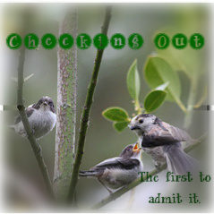
The First to Admit It (Checking Out)

Checking Out Album Art
Visual Assignment 44—Album Cover (2 stars). This was a fun and fairly simple project that I could do on my lunch hour at work. It also gave me a good opportunity to try a few free web-based photo editors. For this project, I used FotoFlexer (www.fotoflexer.com)

In keeping with the instructions of the assignment, here’s how I ended up with a voyeuristic bird on the album cover of a curiously named band:

Followed the link http://en.wikipedia.org/wiki/Special:Random The title of the article that that this link generates now becomes the name of my band. Thus, my band became “Checking Out”. 

The title of the album is generated by using the last 4-5 words of the last quote of this page: http://www.quotationspage.com/random.php3

Checking Out’s debut album is now called “The First to Admit It”.

The cover art is based off a randomly generated Flickr photo. The 3rd image that shows up here: http://www.flickr.com/explore/interesting/7days is the foundation for “The First to Admit It” album cover.


Here’s a closer look at the original:

Credit to lucia bianchi for the photography: http://www.flickr.com/photos/lubi66/7344834132/

I used FotoFlexer to assemble the random elements to create the complete album cover. Specifically, I applied a filter and adjusted it to soften the image and blur the edges to frame the birds. Then I added and manipulated the text until I found a compilation that I like and viola! Checking Out’s very first album art is ready for release…complete with a dirty bird watching the birdie couple like a green-eyed stalker!

A Truly Sedge Experience

For my first Visual Assignment I chose the “Make An Album Cover“. I’ve done this before on some other blog of mine but, I enjoy the random elements to this assingment.

A True Sedge Folk Rock Band

Gathering the pieces

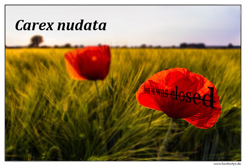
The first step is picking the band name via the random page function in wikipedia. I landed on a page about the Carex nudata, which is apparently a species of true sedge.

Next is the album name through another random function of Quotations Page. The random quote ended up being, “Last week, I went to Philadelphia, but it was closed.”

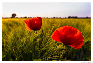
Lastly, the hardest part, finding an image on the Explore Page of Flickr that had a creative commons license on it. By the third roll I lucked out with this one:

Klatschmohn im Abendlicht

Credit to Michael Lamberty for the original photo

Also does anyone know what good practice in when remixing someones photo when they put their name at the bottom of the photo? Is it ok to delete that? Or should I maintain that as a way to connect back to the original source? Deleting is probably ok as long as I give credit somewhere, right?

The Creation

So the first thing I notice is the nice open space at the top of the image. A good spot to put some sort of text, right? I chose to place the band name there and stick with the kind of italics I associate with scientific naming of things.

I also noticed the brightness of the flowers might be a good place to drop some text. So after typing it in and playing with a bit of transformation in Gimp I got it to look mostly the way I wanted it to. I liked the combination of the word “closed” and the strike-through at first. I’m still not sure if I love it but, I think it works.

Once the text was placed I wondered what would happen if not only the far background was blurred but all the image surrounding the flower. As I began playing I noticed it made the flower pop and seem almost surreal. It lost a bit of its flower look when it became disconnected from the rest of the image but, I think I like the fact that it became this lone, weirdly shaped object. If I was a bit more daring I think I would have blurred the background even further to really isolate the flower.

Overall, I like the way this one came out. I imagine this band would be some kind of folksy, alt-rock kind of band. You know, a hipster kind of group that would think a scientific name was clever for a band.

A True Sedge Folk Rock Band

ds106 – Make a monochrome photo

Today I mashed up the Daily Create with the “An Album Cover” Mission: DS106 visual assignment. Last time I attempted the cover, I ditched some of the random elements (the name of the album, the album art), so – after catching fellow campers’ work – I wanted to design a more random cover in the spirit of the assignment.

So here is the cover for List of Women’s Football Clubs in Spain’s new album, I am not mad.

I am not mad by List of Women's Football Clubs in Spain

I am not mad by List of Women's Football Clubs in Spain

I captured a square screen shot from the original image and dragged it into Acorn. I cut out the dog. Then I applied a green monochrome filter to the rest of the image and adjusted its saturation and brightness. I picked green because of the lush vibrancy of the original photo.Then I pasted the dog back in, blurred it, and bulged its head. I wanted to isolate and transform the dog from the rest of the image to create some ambiguity about the album’s title and its speaker or subject.

I inserted the text thinking about this week’s photo tips encouraging the use of a 9-square grid for arrangement elements in an image. If the boy and the dog make up the skewed squares on either side of the image, I hope the lettering fits into the squished middle squares in a complementary way.

Rocking Out to the Orchestral Funk of Sid Hammerback


cc licensed ( BY ) flickr photo shared by cogdogblog

I cannot believe by good fortune to come across the mint copy of the Sid Hammerback group’s groundbreaking introduction album “Let the Rest Go By”; from everything I have read, the last public version of this disc was seen in East Berlin. Not long after the album was released in 1978, lead glockenspiel player Ken Hubbard contracted a crippling bought of whooping cough, and the loss of his sound for ever crippled the band, despite the later infusion of congo virtuoso Bertolt “M.C.” Winkler…

Okay, this is my effort at the ds106 Album Cover assignment; after having seen a number of students do this last semester (it has been done 47 times as of this post), and just this week, Jeff McClurken undercovered the cover for the death grunge sound of Swiss Emmigration to Russia and Bryan Jackson reminded us of the goth soul classic Dactyloceras lucina, it was high time for me to spin a cover.

Step 1 is the band name, generated by a random Wikipedia article, in my case yielding Sid Hammerback, a character from the show CSI NY. This is one where the band name sounds like it is an individual, by in reality (the one I make up), it is a group.

The album title comes from the last 4 words of the bottom quote of from a quotations generator- the last quote on mine was Ken Kesey’s “Take what you can use and let the rest go by.” so my album is Let the Rest Go By.

Last was the flickr suggestion for the album cover, the 3rd photo from the last 7 days interesting collection on flickr – I ended up with a nice one to use, this red brick and window:

But the problem I have now with this assignment is that most of these images, including mine, are not creative commons, so I do not have the right to do a derivative version. So I changed my approach, and took the third photo from the Creative Commons flickr group pool

or


cc licensed ( BY NC ) flickr photo shared by pareeerica

So now I have all my pieces… except I am still feeling lost without my copy of Photoshop, so I had to monkey around in GIMP. I got the hump effect on the text, which was one of the distort filter effects (curve bend), and the layer mode is set to “dodge” to give the layered effect. I deleted the white space around the blue planet and put a layer in back with a random generated color pattern. The layer effect on the text for the album title is “difference” which complements the crazy background.

In writing the fake intro; I used the Snarkmarket Musical Genre Name Generator to come up with ones like “Orchestral Funk” and “Goth-Soul”.

This is a very playful kind of assignment because it does have a formula to follow, but I consider all of the rules open to be done differently, as long as you can make something interesting.

I’d write more, but I really want to lay in the hammock behind my bunkhouse and let the Sid Hammerback sounds blast out of my cabin….

An Album Cover

Screen shot 2012-06-05 at 9.57.36 PM

First, go here: http://en.wikipedia.org/wiki/Special:Random The title of the article is now the name of your band. Next, go here: http://www.quotationspage.com/random.php3 Go to the bottom of the page. The last four to five words of the last quote are the title of your first album Lastly, go here: http://www.flickr.com/explore/interesting/7days Select the 3rd image. It is the picture for your album cover. Manipulate the picture, resize it, add some other color, whatever. Do the same with the band name and album title, put them over top. However you wanna do it. Make it look cool.

Not usually one for the visual assignments, I saw Jeff McClucken’s effort to capture the essence of his new band, Swiss Emigration to Russia, and succinct breakdown of how to create the album cover and went through the brief process of creating a band and finding an image.

After being introduced to the Dactyloceras lucina – a species of moth of the Brahmaeidae family found in central and west Africa – I went a little further with the image search, consulting Flickr’s the Commons under the search tag for Interesting and found my base layer, which I then uploaded into pixlr.com, an online photo editor that let me add text and diffuse the picture to give it the grainy/painting effect.

Other than not creating a square image – as I believe is one of the requirements – I also think I could have done a better job capturing the essence of my randomly generated quotation, which I’ll share in full here as a fond greeting to my camp and bunkmates, but also an acknowledgment of Camp Macguffin’s initial honeymoon period (I mean, not in Bunk X, but for the other campers):

The only thing that lasts longer than a friend’s love is the stupidity that keeps us from knowing any better.

Randy K. Milholland

Mission: ds106 – visual assignment sprint

I found some time over the past two days to sprint through a handful of Mission: DS106 visual assignments. My notes are spread over a few devices (including my favorite red-covered Moleskine), but I’ll try to get my thoughts in order and give a full accounting of each assignment. I’ll present them in asynchronous order by complexity, from what felt like the least complex task to the most complex one.

For these activities, I used a MacBook running OSX 10.6.8 on a 2.26 GHz Intel Core Duo 2 with 2 GB of memory. Chrome is my current browser of choice. When I talk about drawing or coloring something, I mean “drawing or coloring something with a Wacom Bamboo tablet.” (These are like my global variables, thus called.)

Stories Written in a Window – 3 stars

I wrote Still Alive and Climbing the Walls in iTunes. I tried to pick songs that reflected what I have on this computer (which carries only a bit of my poor, neglected-on-an-external-hard-drive music collection). I also tried to include a few songs by friends and friends of friends that I hope folks will go out and find and/or hear on DS106 Radio.

Most of what I listen to is pop of one kind or another, so I wrote a love story. Here it is:

"Still Alive and Climbing Up the Walls"

Replay Value – 3 stars

I call this one The Love Triangle. Though the assignment is worth 3 stars, I’ll only claim one here. I’m not entirely satisfied with the result, but something about it’s glaring artificiality defies any further editorial meddling from me.

"Love Triangle"

For this piece, I imagined Steve, Pip Boy, and Journey’s Protagonist meeting in a desert (alas, alack, and rue the day, I couldn’t find any cc-licensed pictures of Lucky Wander Boy).

On Flickr, I found cc-licensed pictures of each of these characters being cos-played. Here are Steve, Pip-Boy, and the
“>Protagonist
.

I used Acorn (my trial is almost up, so I am sad) to ditch the backgrounds by using the magic wand to outline and then cut the characters out of the pictures. I then saved just the characters as .pngs with transparent backgrounds.

Then I brought everybody into ComicLife against a desert-climate Minecraft screenshot I took from the DS106 server as viewed from my own computer. I used ComicLife to compose the piece because I wanted to add a witty caption or bit of dialogue. However, after seeing the look in Steve’s eyes, I decided to keep quiet.

Since Steve is armed, I put the characters into a triangle and imagined them embroiled in some kind of emotional struggle with one another – how does one adapt to finding other people where there should be none? What emotional habits kick in once we enter community?

Comic Book Effect – 1 star

I used Photo Booth to grab a silly picture of myself and then headed over to Acorn to throw a half-tone dot effect over it. Once I achieved half-tonality, I opened up ComicLife and set up a half-Dark-Knight-Returns, half-Scott-McCloud, half splash-page layout to show myself sitting the Marvel Way. I look just like my dad looks when he plays video games, but he sometimes sticks out his tongue. Like Jordan. My dad is the man.

"Sitting Down the Marvel Way!*"

Draw it. – 2 stars

I remain drawn to the portrait I used for my Daily Create trace drawing. The amount of detail in the photograph captivates me – it speaks to the part of my brain that has been filling up bookscovers and meeting agendas with cartoon eyes, cross-hatching, flames, flowers, spirals, and stick-figure legs since 1990. I went back to the same portrait for this exercise and the next.

I wanted to find a combination of filters that made the portrait look like a pencil drawing while preserving the volume of the subject’s beard. I clicked through a number of combinations in Photoshop Elements 9, and eventually settled on the pencil cross-hatch effect combined with fully desaturated colors and dust and scratched noise to soften the cross hatching and add volume back to the beard.

"Beard with Volume"

Warhol Something – 3 stars

This was the first visual activity I tackled. I found myself using several different programs to get it done. Each program had bits that seemed intuitive to me, and each had bits that seemed obtuse, so I bounced back and forth between them at my whim.

I went back to my portrait and pasted it into SketchBook Pro. I added a layer and colored in different areas with colors that appealed to me in vaguely Warholian ways.

Then I went to Acorn and used the magic wand to prune a copy of the original image so that I would up with a layer of details I could paste over the colored image in SketchBook Pro in hope of creating a silk-screen effect.

I dig it.

"Beard with Warhol"

An Album Cover – 2 stars

My random Wikipedia search turned up Konrad I, Duke of Glogow. I rolled through his dad’s page and found the Piast Dynasty and its arms.

From there I did a cc-license search for Piast on Flickr and found a sculpture of the arms.

At that point I decided to try something inspired by the work of Rose Chase, a high school drama club pal, who designs for the Lower Dens, a Baltimore-based band.

I am no Rose Chase, but I went into Photoshop Elements 9 and equalized the images of the Piast arms. Next I put a blue photo filter on the image, blurred it five times, and desaturated the colors. To create the band of arms, I threw a 4-panel kaleidoscope effect on the arms, separated out the lower elements, and stitched them back on to the side of the upper elements. I drew, shadowed, and copied a few gold chevrons to represent one of the Piast colors and Konrad’s military victories. Finally, I dropped in the band and album names, adjusting the kerning on “Konrad1″ and the line spacing on “The Duke of Glogow.” I picked Trebuchet MS – a favorite sans-serif font of mine – and pink so that the lettering would conserve some interior weight and pop a bit.

Get ready for the drop:

"Konrad1 - Duke of Glogow"

Picturing Prufrock – 3 stars

I love comic books covers by Brian Bolland and Jim Steranko, and I staggered after them here.

First, I printed and read the poem, marking up lines that spoke to me. Then I started sketching street signs in my Moleskine. Pretty quickly, I decided on iterating a picture of a faceless man whittling a mask while seated on a pile of discarded faces. I gave him some shirt-sleeves because why not?

I went into SketchBook Pro and did a blue-line drawing, which is something I picked up from traditional comic book pencilling – artists sometimes layout a page in blue pencil (which doesn’t photocopy) before drawing “finished” pencils on the page for photographing and inking.

"Blue-line Prufrock"

On top of the blue-line sketch I drew a black-line picture of the man and his faces.

"Black-line Prufrock"

After that, I opened Acorn to get rid of the background and keep the figure and faces.

I added a nerve filtered to translucency in a layer behind the figure, and behind that I added a circular patten, coloring every other ring yellow as the fog curling around the house (sorry – couldn’t help it). I also inserted a text layer in a modern font with the lines that inspired the work.

I saved the image and exported it as a .jpg. I brought the .jpg into comic life and added the marquee lettering, which I wanted to be a bit jarring – this would be a Vertigo title, no? I used our bunkhouse logo for the publisher’s imprint and priced the comic according to my ever-loving whim. Finally, I added a lovely portrait called “The Love Song of J. Alfred Prufrock” and pushed it to the back of the image to take care of some of the negative space underneath the circles. I liked using a huge face that someone shot to represent the poem because it fit with what interested me about the poem this time around – the creative donning and murderous abandonment of different faces and identities.

Here is the cover as it stands around, maudlin and modern:

"Prufrock - the Comic"

I’m still processing all the work, but I felt delighted and surprised throughout by how some pieces defied my expectations of myself and came out much better – or even much worse – than I imagined. I would like to practice enough visual arts this summer to get a better feel for the kinds of tools and design approaches that can consistently get me into a flow state in pursuit of work that delights me. And I want to connect it all to what I’m learning about coding while noodling about in the shallowest kiddie pools of HTML, CSS, Javascript, and game design.

Visual Assignment 1 — An Album Cover

An Album Cover — DS106 Assignment here

So here’s something fun for everyone to do, should be quick and easy, but try to make it pretty. First, go here: http://en.wikipedia.org/wiki/Special:RandomThe title of the article is now the name of your band.

Swiss Emigration to Russia is my band name


Next, go here: http://www.quotationspage.com/random.php3 Go to the bottom of the page. The last four to five words of the last quote are the title of your first album

“Contemplate What Is Happening” is my album title.  [Appropriately enough for a digital media course, it's from a line by Marshall McLuhan.]

Lastly, go here: http://www.flickr.com/explore/interesting/7days Select the 3rd image. It is the picture for your album cover.

I had several great images, but none of them were creative commons licensed.  Given that I was going to be changing it around, I decided I wanted to have something with some clearer copyright.  So I thought of the Flickr Commons, the partnership Flickr started with the Library of Congress (though its promise is mostly unrealized still).  There I found this image (3rd in the random Commons Sampler). Given my band’s name and album title, it seemed perfect.

Views in Sydney and New South Wales, 1930-40 / by Charles F. Walton

Views in Sydney and New South Wales, 1930-40 / by Charles F. Walton

Manipulate the picture, resize it, add some other color, whatever. Do the same with the band name and album title, put them over top. However you wanna do it. Make it look cool.


Then I dumped it into Photoshop, cropped it to a square, and used the Sun Faded Photo style to make it a little more yellow so that I could more easily put text on it.  I did some new layers with the text of the band name, which I changed to red.  I had initially thought I would try to place the title of the album on the hanging clothes, but “contemplate” and “happening” are awfully long words.  So, instead I went with this, which I like better in terms of spacing.  I also like the way “happening” ends up highlighting the two people just visible at the edge of the album cover.  Contemplating what is happening is exactly what I hope this design causes people to do.


Fake album cover for DS106 class

Swiss Emigration to Russia (2012)

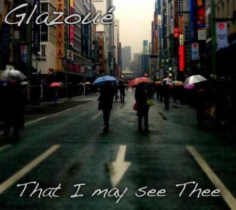
Glazoué: That I may see Thee

Image

The Assignment:

Create an album cover for a band.

The Process:

I went to the wikipedia randomizer page, and got the term ‘Glazoué’ as my band’s name. Next, using the Randomizer in the quotations page, I got the words ‘That I may see Thee’. I was going to use the random photo as the guidelines said, but the photos weren’t Creative Commons. So, to stay safe, I decided to use a picture I took in ?? today.

I then combined these three elements in Photoshop. The font used is ‘Handwriting-Dakota’ (maybe something off of dafont?). To make the font stand out a bit more, I used the backdrop feature. Finally, I cropped my original photo down (it was too long).

The Story:

Glazoué is an American pop-rock band with two male leads, a rapper and singer. The rapper has a style mix of Jay-Z and B.o.B, while the singer has a voice similar to that of Jay Kim from the Trax. There is a female pianist, guitarist and  bass guitarist, and a male drummer.

The name Glazoué comes from where they all first met on a volunteer trip. All the members strongly support volunteer work and charity. Their latest cd, titled ‘That I may see Thee’, is a charity cd, and 100% of the cds’ profits go toward aiding victims of 3/11.  The cd is a 5 track cd featuring remakes of 4 of their biggest hits, and 1 brand new song only for the cd.

~NOMNOMreeses~

Coprecipitation-DS106 album cover

The Assignment-

This assignment is a mashup of three random things together to make an album cover. First, take a random wikipedia entry, this is the name of the band. Then, take a random quote (the last 4-5 words of the last quote), this is the title of the album. Finally, take a random flikr image (the 3rd picture) and use it for the album background. I think its important to either add a background story for the band or a song list as well.

The Process-

Wikipedia entry (band name)- http://en.wikipedia.org/wiki/Coprecipitation

Quote (album title)- “The moment of victory is much too short to live for that and nothing else. “- Martina Navratilova

Flikr image (album cover)- Snowy Owl by Touchlight Photography

I used photoshop to manupilate this stunning image of a snow owl. First I used the grain filter to get the texturized feel. Then I added the texts of the band name and album cover. This assignment did not take too long, so the rest of the time was spent creating the story of the band.

The Story-

Croprecipitation is back with their latest album For that and nothing else featuring their hit single: “Like an Owl in the Dawn”! Inspired by their walkabout through the forests of Washington state, this album will immerse you in the beauty of nature. Soothing pan flutes, relaxing harps, and gentle navajoe drums will take you through a journey of mind, body, and spirit. You won’t want to stop listening once you start! This album can be enjoyed anywhere; in the bedroom to guide you through fantastical dreams, during daily activities, or even on the daily commute to prepare yourself for a busy day.

This album brings the 20 years of relaxation music experience of Coprecipitation that you know and love and adds the lyrical harmonics of gregorian chanters from the Vatican City. The combination of saintly harmonics and earthly instrumentals soothes your soul to levels never before imagined.

Pick up your copy of For than and nothing else today and receive a free set of incense handmade by coprecipitation! This incense made from herbs and oils from the deep forests of Washington State and when combined with Coprecipitation’s music will make your relaxation complete. Relax, enjoy life, and listen to the sound of the Earth with Coprecipitation.