Pinocchio Paradox


What you see above is my latest creation for the DS106 Album Cover assignment. The Band’s name, Pinocchio Paradox, is seemingly a hardcore heavy metal music band that is rectifying the music scene with its new crazy style. Here are a list of the songs on their first CD “Life’s Not the Movies.”

1. The Reveler of Lies
2. Get sawed
3. Geppetto’s Wail
4. Angel’s Requiem
5. In the belly of the whale
6. Endless fire
7. Wooden Cage
8. Finally Real

To make this picture, I simply assembled the necessary information.

The quote was originally: “Some relationships start with fights… But, usually only in romantic comedies. Life’s not the movies.” Takayuki Ikkaku, Arisa Hosaka and Toshihiro Kawabata, Animal Crossing: Wild World, 2005

The picture and article name were both very easy to get from Flickr and Wikipedia after simply copying the hyperlink from the assignment into my address bar. and then neatly compiled it together in photoshop. The link for the original source of my photo can be found here and the Wikipedia page entry can be found here as well. Possibly the hardest part of this assignment was choosing the band name and whether or not to alter the image for greater effect. I felt that since I was going for a more hardcore look, my random picture’s landscape was quite well suited for it. I hope you agree. Also, I capitalized the letters in the album cover to kind of say “I no I rox”, or in other words, “I know I rock”. I thought maybe that this would enhance the bands integrity.

Let me know what you think below!

An Album Cover: Like a Moon on the Tides / Sydney Weekender

Visual Assignments: An Album Cover
 So here’s something fun for everyone to do, should be quick and easy, but try to make it pretty. First, go here: http://en.wikipedia.org/wiki/Special:Random The title of the article is now the name of your band. Next, go here: http://www.quotationspage.com/random.php3 Go to the bottom of the page. The last four to five words of the last quote are the title of your first album Lastly, go here: http://www.flickr.com/explore/interesting/7days Select the 3rd image. It is the picture for your album cover. Manipulate the picture, resize it, add some other color, whatever. Do the same with the band name and album title, put them over top. However you wanna do it. Make it look cool.
 There are more than forty people who have completed this album cover assignment. That’s a lot of participants and I thought I should be one of the bunch. One trivial memory from the creative process is that I had to reload quite a few times to find an image under the right license. All these impressive photos appeared, but sadly they said “All rights reserved”. The photo I finally found then was the base image for the album cover. Assuming from the photo title, the scenery happens to be somewhere in Paris, France. Despite the artist’s name “Sydney” weekender, the background image is of another continent.
 I tried using GIMP this time and failed to create a proper cover art I initially intended to make. During my first try, I messed up the original picture so I had to restart from downloading the image again from Flickr. Then, I resorted to Pixlr which probably didn’t eat up my computer’s memory. I was slightly mad at myself after realizing while working on this article that I spelled the word “Sydney” wrong (Syndey? What?). Of course, I went back to Pixlr and it was fixed. There’s not many photo manipulations done to the base image. Instead I played around with the fonts. I noticed for the first time that Pixlr lets you use the fonts you already have in your computer. The fonts used in the cover art are free, by the way.

Daniel Gunkel: What Makes Great Art?

ds106 Album Art - Daniel Gunkel

Assignment: The ds106 Album Cover assignment is one I never gave much thought to until I noticed such great stuff coming from so many students this semester. I think Bryan N. started the ball rolling with Smicropus several weeks ago, and just today I noticed Keiko’s brilliant Left to the Politicians featured on the assignment page. When I saw Alison’s By Any Other Name, I realized I could delay no longer and must make one of my own.

What is most appealing to me about this assignment is how through the use of pulling together a few random items, it is possible to create something that can be attractive and meaningful. The assignment directs you to draw the artist name from one random wiki page, the album title is derived from a page of random quotes,  and the image from a random Flickr page of recent interesting images. Here are links to those random generators for those interested in exploring the possibilities.

Process: I followed the steps as directed to get Daniel Gunkel who happens to be a German soccer player and the quote (last four words from the final quote). It turns out the quote is from Ward Jenkins. For the image, I cheated a little. We were supposed to choose the third one but I didn’t think a Red Ferrari would work (now that I rethink, it could have been pretty good). Instead, I used Praline3001′s CC licensed image from Flickr of this New Orleans street musician which was adjacent to the Ferrari on the page.

Once downloaded (the trick for downloading images from Flickr seems to be to view them in all sizes and select the one of your choice to download), I opened it in Pixlr and applied an inverted pastel effect with the setting of 4. I don’t know what that means, but I like the softened feel it gave to the image. I then added the text. I used a 30 point Adobe Caslen Pro in semibold italic font for the album title and a 60 point Academy Engraved Plain LET for the artist’s name.

All together it took less than 30 minutes.

Story: Well as many of you know, I used to work in radio. One of the high points of the job was interviewing musicians and bands when they would come to perform in my town. To do a good interview, it’s important that the interviewer is familiar with the music and knows something about the artist.

Such was not the case when I was sent to the Roadway Inn in Waldport, Oregon to conduct a recored interview with Daniel Gunkel on his 1992 Oregon Coast Tour. I listened to his album “What Makes Great Art?” on my Walkman cassette player as I took the bus from Lincoln City to Waldport. The music was a fairly standard a standard blend folk guitar and harmonica with lyrics about struggle and solidarity. I was expecting to meet some older hippie guy from the sixties with a flowing white beard like the guy on the album cover.

I was totally shocked when I got out of the bus and was met by Daniel himself standing near his limo with the whitest smile I’d ever seen. He allowed me to record the interview as we rode in the limo back to Lincoln City for his concert. He was a thoughtful and humorous guy not afflicted with a superstar-type ego. He actually owned a company in the midwest that manufactured chocolate cookies. Music for him was more of a hobby than a career. The only question he wouldn’t answer was when I asked him who was the guy on the album cover. I never could figure out why.

More Visual Assignments

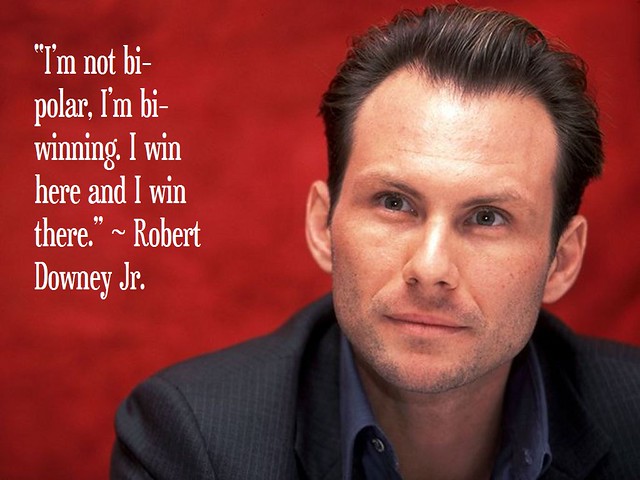
Spent some more time doing some of the ds106 visual assignments.  I was drawn to the Troll Quote assignment.  My old desktop background was a picture of Patrick Stewart that said “Use the Force, Harry”, with the quote attributed to Gandalf.  That was the first example I had ever seen and it kept me in stitches for far longer than it had any right to.  I resisted the urge to go the geek route and did this instead:

Troll Quote - Sheen - Slater - Downey

I really hope people get this, because having to explain it would jut ruin everything forever.


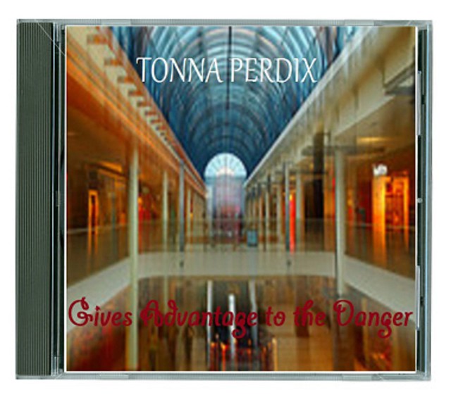
I also did the assignment for “an album cover” (which, thanks to an SNL Celebrity Jeopardy sketch, I keep calling “anal bum cover”, in my best Sean Connery).  The band name came from a random wikipedia entry, which turned out to be tonna perdix.  The album title came from the quote ”Let the fear of danger be a spur to prevent it; he that fears not, gives advantage to the danger.” ~Francis Quarles.  This too, having been randomly generated.  Then the picture (you guessed it, random)Mall With Intentional Camera Movement

Mix until blended and…

anAl bum Cover

I added the jewel case for authenticity.  What kind of music would Tonna Perdix be?  Was their older stuff better?  I hear they really sold-out with “Gives Advantage to the Danger”.

Now I want to go watch some Christian Slater movies.  Pump Up the Volume, perhaps.

Album Cover

The assignment was to create an album cover.

I used photoshop for editing this, the actual picture was taken by a friend. I liked the particular photo to create an album cover out of cause of the parallel lines running through the bottom half of the photo. First, I did some color and hue correction. Then I added a slight motion blur to the trees in the background and added a tint on top. Finally I added the text and the logo to finish everything off.

An Album Cover

Album Cover

I love the challenge to work with what you are given in this assignment. I felt very nervous when I was pasting the url into the browser and pressing enter. I was afraid it would randomly generate me with something horrible. At first I did not like what it was given, but I think the end result turned out well. Here are screen shots of what I received:

Wind Wave Model

What life is all about.

Flickr Generated Image

I had just downloaded GIMP so spent a good hour experimenting with all of the different tools to see what they did. The image I was given had obviously already been edited. I tried to work with what the pervious owner had done, instead of against it. I tweaked the levels of red, green, and blue in the image to get its color. I also got rid of some of the “hairs” coming off of the animal, mainly the ones around his eyes. I liked the image better with solid black eyes. I experimented with different colors and cropping different sections of the image. I tried putting the text in different areas  on the image and looked at almost every font in the program.

When I was finally content with the result of the image it was time to save. I had a very hard time saving the photo through GIMP. Eventually I just resorted to taking a print screen of my monitor and cropping the image. This worked pretty well, but I am afraid it lowered my image quality. In all I am sure that my issues with saving were an operator error. I’ll have to experiment with it more to get the hang of how the program operates.

This is a very fun project that really challenges you to be creative and I thoroughly enjoyed doing it!

I’m Starting a Band

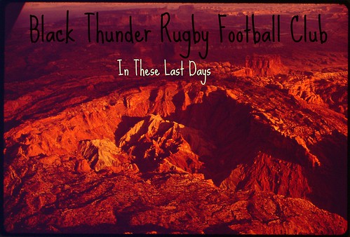
I have to after completing the “Album Cover” visual assignment.  Who wants to be a part of the Black Thunder Rugby Football Club with me?  Basically I’m looking for insanely talented musicians and singers to make up for the talent I severely lack when it comes to musicality.  You bring the tunes, I’ll bring the pizazz.  How can we not succeed with a band name like this?!?

The Best Band Ever! by maura_monahan
The Best Band Ever!, a photo by maura_monahan on Flickr.

This assignment was as quick and easy as the description claims it is.  I simply copied the links into my browers and away we went!  I promise that the Black Thunder Rugby Football Club Wikipedia page honestly was the first search result returned.  For the album title I once again copied the link provided in the assignment description and used the last four words of the final quote on the page.  I actually love the album title.  It would work really well for a band’s final album together or a compilation of their greatest hits.

I had a little more trouble with finding the picture to use as the cover art.  I used the link provided but I wanted to make sure I didn’t use a picture that had “All Rights Reserved” on Flickr.  I kept refreshing the page while still only choosing the third image returned but I wasn’t having much luck.  Instead, I searched “interesting” in Flickr Commons and used the third image from that search.  I played around with the color of the picture a little bit in Picnik before adding the text (also in Picnik).

This assignment was simple but I am really happy with the final product.  Part of me wishes I had played around with the color of the text a bit more but I just couldn’t find a shade of color I preferred over simple black and white.  Number one album on iTunes?

the survival rate for everyone drops to zero

Interesting how this assignment works. You put together three random elements to make a unified thing – an album cover. The Wikipedia link to me to a page titled Laws of infernal dynamics, which is not the best band name, but I’ve heard more cumbersome ones. While the entry has nothing really to do with heat, infernal suggests inferno. The random quote came from Fight Club: “On a long enough timeline, the survival rate for everyone drops to zero.” “Drops to zero” can be interpreted as related to heat, in an inverse way. Then the random picture was Sadness and Snow by Alexandre Bordereau, a blizzard scene of someone’s head exploding. Even though they’re all random elements, they had some connections, however tenuous.

The image would work as a cover design by itself, by I feel honor-bound to manipulate it. I copied the layer and inverted the colors, then played with the hue and saturation to get some warm color in it. I started playing with the layer blending mode until I got this freakish neon thing. I found a Jazz LET typeface, which I had never noticed before, so I used it for the title, and I forget what I used for the name. I thought the whole thing looked infernal enough. It’s time to sleep.

First Visual Assignment!!

I am so excited to get started on these assignments! I started looking through a few and just could hardly wait to start. Unfortunately I have a big paper due on Thursday, so the fun ones will have to wait until this weekend. For now, I kicked off the assignment by choosing the Album Cover project.

I liked this project because of all the randomness involved; it guarantees you’ll find something interesting!

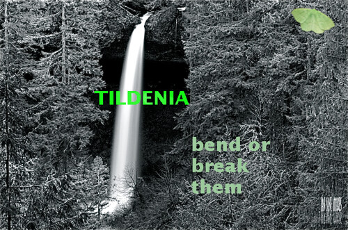
My band name is Tildenia, which according to Wikipedia is a genus of moth in the family Gelechiidae. Intriguing. Because my band’s namesake is a moth, I had to have one in there somewhere! Although the moth I have in there is not scientifically accurate; all of the Gelechiidae moths are really gross looking and are usually an agricultural pest. Not exactly what I wanted on my album cover. If you’re REALLY that curious, here’s a Wikipedia article. At any rate, I found the moth photo I used on the Flickr creative commons.

The album title, “Bend or Break Them,” came from a random quote; the full quote was by Robert Graves: “Every English poet should master the rules of grammar before he attempts to bend or break them.” Cool quote, by the way.

Then had to pick a picture at random, this was a little harder because I had to make sure that I had a photo that was under creative commons.

I feel like I really lucked out, I got some really cool pieces to put together into an album cover! So here it is -

Visual Assignment: Album Cover

I simply put the original photo into black and white. I really struggled with the text because I couldn’t do black or white because of the background; I had to choose colors that weren’t blinding to the eyes but still stood out on the busy background. I did all of this (except the conversion to B&W, that I did in iPhoto) using GIMP for the first time. I was more than a little frustrated with the application, it took me a lot longer to figure it out than I expected. However, it did allow me to cut out that little moth and stick it into the top right corner of the album cover, so I enjoyed that!

My New Band

I just started a new band (don’t worry, I’m totally not the lead singer….I get to play the drums*) and we needed a new album cover.

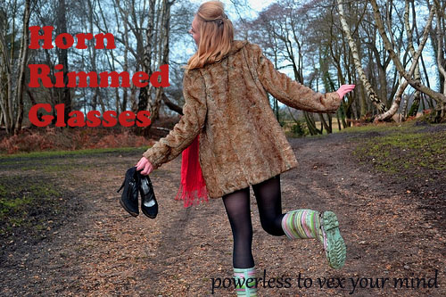
Of course, we also needed a band name, but that’s another story. No, you really don’t want to hear about this.  Ok, if you insist. What we did was a random search on wikipedia and came up with the brilliant, if a little dated, name of “Horn Rimmed Glasses.” The guy who plays the cowbell liked it because it was a little bit 50s with a little bit of hipster.  Perfect.

Next, we needed a good title.  After much deliberation and a few oreo milkshakes, we decided to go for something a little bit more cerebral.  We picked a quote from Da Vinci, and the last few words were “powerless to vex your mind.” It felt a little ska, but a swing band named Horn Rimmed Glasses could rock that too, right?

Then, our PR guy suggested that we actually put this whole thing together with some cover art.  Well, the keyboardist’s daughter drew some really nice rainbows and puppies with her Crayolas, but that just didn’t jive with our new sound, so we went to flickr where we chose a photo at random that was listed as creative commons (because, you know, that’s not cool to steal other people’s art). After a few hours (ok, minutes) of manipulating those three items in the ol’ Photoshop, we got our album cover.

Pretty nifty, huh?

So that’s the story of our band.  Please don’t ask for any samples of our music, because we shouldn’t let anyone hear that.  It ain’t pretty.

*I don’t have any formal training with actually playing the drums, but knitting uses two sticks, so how hard can it be?