Pods Embed Error: Pod not found.

Martin Garrix Vs. Techno Viking

For this assignment, I decided to mash techno viking and Animals by Martin Garrix together. I tried to link the part where the techno viking really gets into it and when the beat drops so that it almost looked like he was dancing in sync. Hope you guys enjoy it :)

GIFAChrome Camera GIFs Cory Doctorow

Professional photographer Jonathan Worth has put out an invitation for anyone to take his photos of Cory Doctorow, activist for liberalizing copyright laws and proponent for Creative Commons, and remix them in anyway you like. They will then choose from the best remixes and share any profits with their co-creators.

A series of photographs taken by Jonathan Worth of author Cory Doctorow are now available for you to remix, regenerate, and to make new art, especially in light of the themes and topics of his books. Your challenge is to make something new out of the photos.

This is a new experiment in public art, and a new way of thinking about digital media. Who could be a better figure than an author who releases all of his published works under creative commons license with an open invitation to remix?

This opportunity was presented to the DS106 participants for Remix/Mashup weeks, as well as turned into an assignment MashupAssignments1020. The process of creating these new images evolved through three versions and resulted in the creation by Rockylou Productions of the first GIFAChrome Camera with accompanying GIFAChrome DS106 Film.


Cory_GIFStrip-3DWig_100px

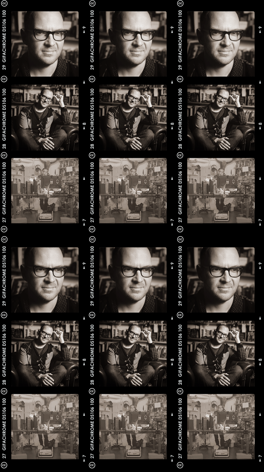
Cory Doctorow GIFAChrome DS106 GIFStrip – A new experiment in public art sponsored by Jonathan Worth. Created by Rockylou Productions

And as part of the “rules” of the remix challenge, everything we create must be licensed under a creative commons license too. (Notice the CC license logo on the strip?) So no worry about patent infringement or licensing fees. Everyone is welcome to use this work and remix it for themselves. I’ve even included templates at the end of the post that you can download to make your own GIFAChrome image.

The Manufacturing Process of a GIFAChrome GIFStrip

After perusing the photos of Doctorow, and the remixes already submitted, my creativity kicked into high gear. I happily discovered  two versions of the Doctorow head shot that could be turned into a GIF. [Head shot 1  and Head shot 2] How about making one of my GIF strips? [DJ BIrthday Dance GIFStrip] Yep… I found two more images from Jonathan of Cory working at his computer that could work. [Working 1 and Working 2]. The third would be the shot of him sitting in his chair in front of the bookcase.

DRAFT 1:

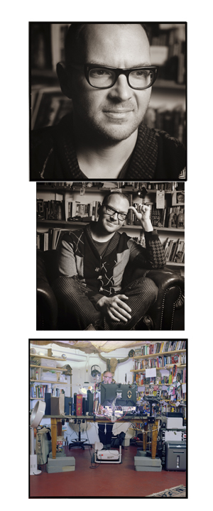
Using Photoshop CS5, each GIF was made in its own Photoshop file.  Then the three image composites were combined into one larger canvas strip with one above the other as shown below.

Cory_GIFStrip_PicsDraft

Each GIF and/or image is stacked one atop the other to create an image strip.

I then placed a film strip template on top of everything.  DJ BIrthday Dance GIFStrip will walk you through the process. With the first draft finished, I alerted the DS106 community on Twitter and our DS106 Google+ Community, asking for feedback to improve the image. This was after all to be a collaborative project.

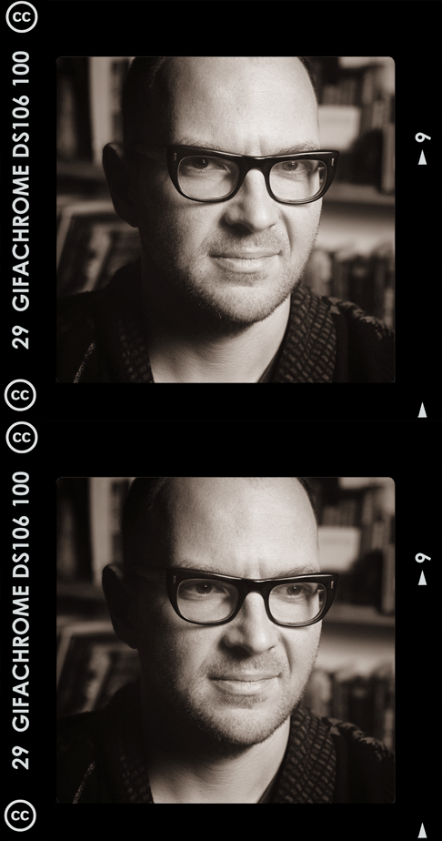
There were comments from several that the head shot image was a favorite. So I turned it into a single GIFAChrome image.


Cory_GIFAChrome_Head

Cory Doctorow GIFAChrome DS106 Image created from original images by Jonathan Worth

VERSION 2:

Adjusting the colored image:

I wasn’t happy with the final panel as colored, I learned how to use layer filters in Photoshop, thanks to a post by Alan Levine, and was able to apply hue/contrast and brightness adjustments to a single layer. I was pleased that it didn’t take me too long to approximate the color scheme of the first two panels.

Redesigning the film strip template:

Jonathan had joked about his disappointment with the rebate  He was evidently accustomed to 120 film. What the heck was he talking about?

I had to do a Wikipedia search to find out what a film “rebate” was (the stuff along the sides of the images that give the image number and film type) and that the film template I was using was for 35mm film. 120 film doesn’t have those little sprocket holes on the sides. [Learn more about the differences]  I certainly wasn’t expecting a lesson on photographic film types for this assignment. But you never know what rabbit hole the DS106 Matrix will take you down.

I went back to Worth’s photos and found a collage of contact sheets that I used as examples to build the new frame template. The font used on the Kodak strip turned out to be pretty close to Century Gothic. That was easy. Alan Levine joining in the Twitter banter, suggested a DS106 film would be appropriate.

I had toyed with many names for my new invention. RockylouChrome was definitely out. It was clunky. Finally the light bulb turned on and GIFAChrome DS106 film was born.The GIFAChrome DS106 100 film obviously had to have a camera to be used in. With version two of the GIFStrip a new-to-the-world GIFAChrome camera was invented.

I was also watching and listening to the viewers of these new images, and several were concerned with the middle frame not “GIFfing”, and wondered if there was something wrong with the strip.

Back to the photoshop for…

VERSION 3:

AlanLevine_GIFAChrome-3D-5

Alan Levine GIFAChrome DS106 3D Wigglegram

What to do…. What to do…. What I considered an artistic statement by keeping the middle frame still was confusing to others, So I put my artistic ego aside and turned the middle frame into a 3D Wigglegram GIF.  A technique I acquired this summer creating Rockin’ The Rocks in 3D. And with Alan Levine as my subject matter while completing this project.


I very carefully extracted Cory sitting in his comfy leather chair from the bookshelf background with the quick selection tool. I then had to use the clone tool and spot healing brush to rebuild some of the bookshelf and applied a blur filter to the entire background. This would help Cory’s image stand out even more.

I made three images of Doctorow and off-set each slightly.  The 3D wigglegram GIF looks better if it “wiggles” faster than the other GIFs I was using.  To create this effect I made 12 animation frames for the entire GIF sequence at 0.06 seconds in duration.  The top and bottom frames remained stationary for 6 frames each (a total of 0.24 sec) while the center frame rapidly oscillated at the 0.06 frame rate.

GIF Download: Cory Doctorow GIFAChrome DS106 GIF Strip- 100ppi

We were requested to save our files in the high resolution of the original images. At 3000ppi this resulted in a final Photoshop file of a whopping 1.4GB. Ouch! That’s huge. It’s amazing that my computer didn’t crash- just slowed down during processing.  If you’re interested you can download the whole thing here. All were created in Photoshop CS5.

TEMPLATES:

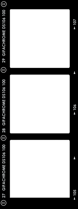
GIFAChrome Templates are in the .png format so you can easily insert your own GIF images with a transparent center frame.

GIFAChrome-StripTemplate_100px

GIFAChrome DS106 GIFStrip template DOWNLOAD

GIFAChrome-Single_100px

GIFAChrome DS106 Single Frame Template DOWNLOAD

Who Loves Ya, Cory?

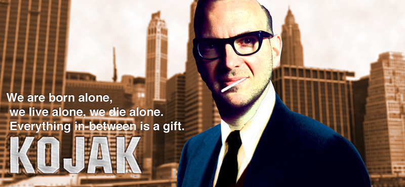
cory-kojak
So I am looking at Headless Weeks 13 & 14: ximeR and M@$#up, there is a lot of stuff to watch, read and think about. There is also Alan’s Triple Dog Dare for one is:

Remix a photo of Cory Doctorow

Which I’ve done before.

So I end up on my usual ds106 pattern, browsing through the assignment bank until I circle back to the first one (Cory). By this time I’ve forgotten some of the details, but I am busy dreaming and googling.
I start with Yul Brynner, and veer to Kojak. I’ve now forgotten all of the details and heading for a Troll Quotes. The idea in my head is a wonder, perfect photocopying, I’ve forgotten I don’t know photoshop and a searching flickr for a background.

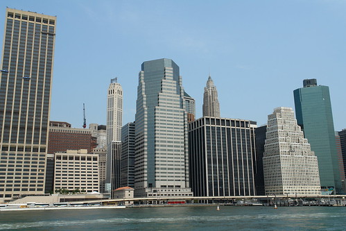
Lower Manhattan Skyline, New York, NY, USA
Lower Manhattan Skyline, New York, NY, USA | Flickr – Photo Sharing! by Flickr: MD111′s Photostream
used under a Creative Commons — Attribution-NonCommercial 2.0 Generic — CC BY-NC 2.0 license.

My imagined assignment is now better than perfect. Then it is all cloud filters, saturation for the brown ‘kojak feel’, a bit of a mask on Cory to try and get a drawn feel.
By bedtime I am delighted, in the morning I realise I am probably missing the target on a few levels, driving to work I decide to post anyway, maybe I could get a story out of the making?

The quote: Quote by Yul Brynner: We are born alone, we live alone, we die alone….

ds106ic: Collide With Destiny

It’s time to swan dive back into ds106, I seem to have lost by absence note for the last six weeks. But here, at the tail end of video week comes something more massive than a MOOC, a ship that sails like no other, and for which no iceberg will generate a plot:

This is for the Mash a Movie for ds106 assignment:

Download different scene clips from one movie to create a short commercial for DS106. Clip, trim and remix them to let people know what DS106 is all about and how they can find us at ds106.us. Challenge yourself to overdub the audio to have the characters saying DS106 where it would be appropriate. Also try and add the DS106 logo onto an object in a scene.

Now that I read it again, I did not exactly do the assignment. So what? It’s not following rules or stapling yourself to some rubric that counts. I saw this assignment from Rochelle a few clicks back, and was motivated after seeing the masterpiece John did for BrigaDS106.

So what could be a more bloated big movie about a bog thing than to parody Titanic? (“Collide with Destiny” was one of the taglines, others were just as juicy). My starting point was latching on to the “King of the World” yell with the ship proudly setting out, not the mushy scene with jack and Rose, but when he and Fabrizio first skip out to the bow:

What nailed it was when they were excitedly pointing to the dolphins, and I had the idea they would be pointing to Headless ds106 blogs.

I did feel like it needed a graphic poster for an opening, which sent me down another design/photoshop/fun rabbit hole:

ds106ic

based on the original poster that I liked for the simple image, words

titanic-original-600

ds106ic text As usual, in Photoshop, I start with a duplicate of the image so I can use the original as a reference. I clone brushed out the title with the texture of the ship’s hull.

The closest font I had in my pile was “Haettenschweiler” with a bit of tracking extended to 75 so make the letters a bit more spread out. I command click the layer to make a selection of the text, create a new layer, and use Edit -> Paste Special -> Paste Into to paste in a texture file I found of steel with rivets.

Boom. Good enough.

texted

But I did not want Jack and Rose in my poster, so I removed them out (a bit of magic wand selection to remove behind the ship rails.

no jackrose

For the space behind the image I would use, I created a new layer below this one. I made a foreground color selection of the blue in the original and a background color of the lighter white there. I then used Filter -> Render -> Clouds to make a background fill layer in case the new image did not completely cover. Yes, you can see a seam, but I can smudge out that boundary later if needed

clouds

And who to put in the sky? I immediately thought of the bizarre multiple mashup image of Nana-Tine-Little-Alan
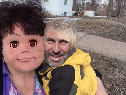

cc licensed ( BY NC ) flickr photo shared by Rochelle Lockridge

I added a Underpainting filter and some gaussian blur to make the couple more dreamy. With a bit of brush erasure, I made the image blend in the background.

And all of that work was just for the intro part of the video.

The video work is all iMovie, the clip downloaded from Youtube as an MP4 and put into the project (trimming out the ends of the original). Here is a glance at the final workspace

(click for full size)

(click for full size)

I keep the option (small blue button bottom right) to show the audio waveform- this makes it easy to “see” the audio, and quickly adjust levels if needed.
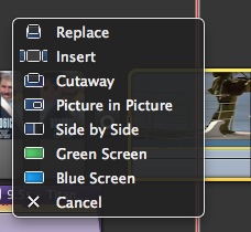
optionsTo do the cuts to the screens, I use the advanced tools, so when I drag and drop an image from the Finder into a clip segment I can use the Cutaway option so the video cuts to m image but the audio remains in tact. For the bit of ds106 text that overlays the video, I use a transparent background PNG and use the Picture in Picture tool.

For each cutaway, I resized the ends of it to match the cut points (essentially when the shot was not of the two characters). In each clip, I edited the cropping to remove the Ken Burns effect for most clips). While iMovie lacks all the features of a full editor, with use of these tools I can get away with most effects I want in ds106 movies.

The voice over recording tool is insanely useful for redubbing the dialog- I can just talk over as it records, and the automatic ducking knocks down most, but not all of the original so I can talk over

voice over

So the captain’s assistant says “680 blogs sir” instead of “21 knots” and when Fabrizio says “I can see the Statue of Liberty, already” in my movie he says “I can animate a GIF, already”…. and then the boom line “I AM KING OF THE WEBBBBBBBBBBBBBB”

The intro and outro are additions with the poster. To add audio my technique is to select small clip of the original with the music I want. I then select the clip and use “Detach Audio” to separate the video and audio tracks. I insert my image, slide the audio under my image, and delete the original clip. This allows me to extend the music.

And there you go. The biggest ship in the ocean. It looks like the icebergs hit the lesser ships.

The ds106ic: It may Collide with Destiny bit it ain’t going down. Jack and Rose can GIF it on.

got ds106?

Oh boy… did I have fun with the DS106 Daily Create tdc671. We were to make a poster for a new DS106 ad campaign, ‘got ds106?’, based on the ‘got milk?’ milk industry campaign started back in 1993. [Wikipedia article].  I created the DS106 DesignAssignment1234 to share the fun with future DS106ers. 

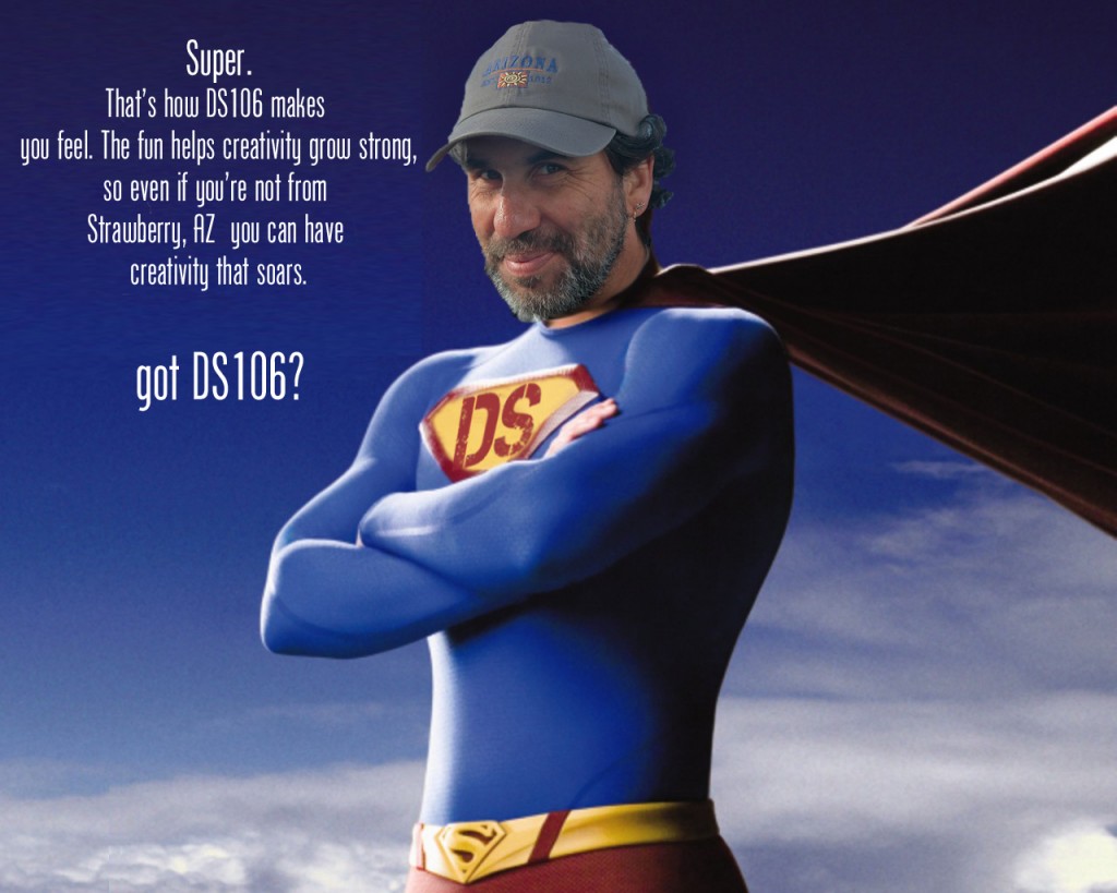
got-ds106-superman

Super Hero Alan Levine assuring us DS106 helps build creativity that soars.

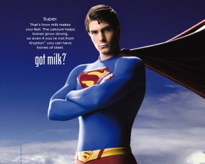
got-milk-supermanI did a quick search of Google Images for ‘got milk?’ posters and had a plethora of great images pop up.  I was immediately drawn to the Superman poster.  Employing the Google once again I located the Phoenix American font used for the original campaign.  The link will take you to a free downloadable non-licensed version.

I deleted the original text, then copied a section of the remaining blue sky to paste and stretch to fill the empty space.  Using the newly downloaded Phoenix American font I changed a few words to customize it for our ‘got ds106?’ campaign.

Super.
That’s how milk DS106 makes you feel.
The calcium fun helps bones creativity grow strong,
so even if you’re not from Krypton  Strawberry, AZ
you can have bones of steel creativity that soars.
got milk DS106?

 I could’ve just replaced the text , but what would be the fun and challenge in that?

alan-levine

Alan Levine

Photoshopping Alan (a ds106 instructor at Cogdog Blog) Levine’s head onto Superman’s body was a must, and turned out to be much simpler than I thought it would be. (These techniques are “simple” now, but it’s taken lots of practice and perseverance to learn them.) Choosing a good picture with the right composition was important.  I wanted him to be facing to the left and tilted similarly to Superman’s.  It didn’t take me but a few minutes to find a nice photo with another Google Image search, this time for Alan Levine.  Amazingly, the lighting was even a close match.  How lucky was that?

Using the quick selection tool in Adobe Photoshop Elements 12 for the Mac, I selected and deleted everything but Alan’s head, neck and hat. (I thought the hat added another layer of giggle-able absurdity to the mashed image.) Another bit of serendipity was that Alan’s brown jacket blended well with Superman’s cape. Yippeee!  But I needed to do a little rebuilding of the top of his hat since it was cropped in the photo.  This required copying a piece of it from the top, duplicating it a couple of times, reducing the size to align these little ridges on his hat, and then erasing the outside edges of each layer to produce a rounded head effect. I merged all of the layers and used the clone tool to blend them.  His neck was a little trickier. I started with the Spot Healing Brush, then found two new tools today, Smudge and Blur. I was quite pleased with the results. As a finishing touch I used the blur tool again around the edges of his hat and face to give a more blended effect against the sky.

The DS chest plate was pretty simple too.  I used the clone tool to erase the “S”, and produce a blank yellow background in the process. Then cut out a “DS” from the DS106 logo. By adjusting the hue and saturation of the DS layer I was able to approximate the red color of the original “S”.  Resizing and transforming the layer with the skew and distortion effects was employed. And the final adjustment was to reduce the opacity just a tad.

After I uploaded the new poster to flickr I noticed that Superman’s belt also has an “S” on it.  Ooops….. Oh well… it’s not about being perfect here in DS106.  It’s about the creating, trying, learning, and giving it your best…. wherever you’re at.

BrigaDS106

So at the start of this week I though I’d get back into the headless course and do some video assignments. I spent a while looking through them but this one looked like it would be fun:

Download different scene clips from one movie to create a short commercial for DS106. Clip, trim and remix them to let people know what DS106 is all about and how they can find us at ds106.us. Challenge yourself to overdub the audio to have the characters saying DS106 where it would be appropriate.  Also try and add the DS106 logo onto an object in a scene. You can find an example at The DS106 Matrix

from: ds106 Assignments: Mash A Movie For DS106

Looking back at the description I see I’d completely forgot about the logo bit, I also didn’t dub the characters. Rochelle’s example is great and I started looking for some sort of SF connection, but somehow ended up in Brigadoon. Perhaps because cogdog visited Scotland last weekend.

Also because I only read the assignment once I got it into my head to make a trailer. I found the Brigadoon trailer on youtube:

Mt first idea was to find the clips used in the trailer without the text and recreate it shot by shot with new text and voice over, of course I could not find the same scenes on youtube. I did find a few clips and decided to go with the timing and titles from the trailer with different scenes behind.

I expected to do the editing in iMovie but quickly realised that its titling was not up to the zooms and swings on the original. I switched to Screenflow as I knew it could do nice transitions of text. There I found that the text could be animated nicely but not curved. So I opened up Fireworks to make transparent titles which I could animate in Screenflow.

By now I’d spent a fair bit of time on this with nothing to show so I only spent a few minutes realising that recreating the text accurately would take more time than I had. I just found a vaguely similar font and used that. I also used a brighter yellow that the original.

brig-title-04

The workflow was, copy a frame from QuickTime of the original trailer, paste into Fireworks. Add text, messing a little with the spacing. Then aligned the text to a path if I needed a curve, dropped a shadow, grouped and gave a quick blur. Hid the scheenshot layer and exported as a transparent png. I hide all the layers, added the next screenshot a did the next bit of text. All the graphics from one document for laziness.

Back in screenflow I edited the clips, animated the overlay and added a voice over. Screenflow is a pretty nice tool for this sort of thing and would be good and doing the animated typography sort of movie too.

This took a fair amount of time, if I had ben willing to spend more time it would have been less rough, the text could have been better, the voice over I just used the first take with my macs inbuilt mic as I did that bit at lunchtime in work. I had to extract audio from different bits of video and move it around, again I did a fairly quick and dirty job of this, trying to balance time and fun. THis is the final effort:

You might notice that some of the characters are aligned weirdly or rotated a bit, this was first due to accident, I could have cleaned up the path they were aligned to in Fireworks but left them in and made some more for extra klunky charm;-)

Pacific Rim vs Man of Steel Trailer

Pacific Rim vs. Man of Steel Trailer from Mai Shalalaiwan on Vimeo.

I decided to mash up two of my favorite blockbusters on the summer. I took a trailer from both movies and took out multiple action sequences. The song used in the video is an OST from the film Inception. The song and action scenes blended well together. The trailer is slightly lengthy because I couldn’t bring myself to cut the song short. The song Mind Heist is such a beautiful composition by Hans Zimmer.

Big Bang’s Greatest Hits

Big Bang is from South Korea and made their debut in early 2006. I started listening to Big Bang in 2007 and immediately got hooked to their songs. Big Bang sings mostly in Korean and I didn’t really understand the language in the beginning. Music is amazing because it is able to break down a language barrier. I started to learn the Korean language and became fluent after studying for several months. All of Big Bang’s songs began to make more sense but the emotion in their vocals bring the lyrics to life. Even a person who doesn’t understand Korean would be able to get a feel of the music just by listening. I combined five of Big Bang’s greatest hits into one track. The mashup includes Fantastic Baby, Tonight, Crayon, High High and Day after Day.

The DS106 Matrix

 ”Do you want to know what IT is?….Unfortunately, no one can be told what DS106 is.  You have to see it for yourself.” – Morpheus from The Matrix

I’ve been working this week in Headless ’13 ds106 learning how to read movies.  The initial part of the week 10 assignment to analyze a scene from a movie will be posted soon.  I had decided on using the lobby shoot out scene from The Matrix.  A portion of the assignment asked us…

To get practice in basic video sequencing, locate at least two smaller portions within these clips that demonstrate the points you made in your analysis above.  We want you to put these scenes together in a short montage, sequencing them together so that you get some basic experience with video editing.

MatrixRemixThumbRemixing of video and other digital media is a skill I’m familiar with already.  [See Talky Tina - Sweet as Tupelo Honey].  So I modified the assignment to give me a bit more of a challenge.  I remixed the clips to create a montage/trailer for the DS106 course experience rather than demonstrating the points made in my video clip analysis.  I tried to find a DS106 video assignment or mashup assignment for something like this, but didn’t see one.  Did I miss it?  If not, I think I’ll create one for us.  I created one for us: VideoAssignments1232

Production Notes

I downloaded 3 clips from The Matrix with the Firefox add-on Video Downloader.

I was drawn to snippets of the dialogue that I felt I could string together to have them talking about the chaos we experience and the perplexing situation we have trying to tell someone else what DS106 is all about.

For my video editing software I used Adobe Premiere Elements 12.  Making the clip transitions cleanly from one to the other took a bit of fiddling around by shortening and lengthening the clips so that I didn’t have massive jumps between shots that looked out of place.  At about 20 sec in there’s one cut that didn’t quite work right.  The rest I’m pretty satisfied with. I really had a chance to see and understand how the cuts from one character to another or one scene to another are made as I put this together.

The audio went pretty smoothly.  There were two spots where I wanted to dub in “DS106″ – one with Neo and one for Morpheus.  It helped that my voice at the moment is pretty low due to a cold, but I’m not really satisfied with the quality of the dubbing job.  I opted to let it go since I didn’t want to work that hard to make it “perfect”.  I know I could’ve taken the audio into GarageBand and played around with effects and stuff,  but it was good enough this time around.  Personally I think it’s funnier that it stands out as being dubbed anyway.

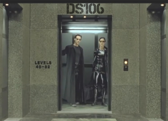
The DS106 logo overlay onto the elevator was created with the addition of a .png formatted still image onto a new layer above the video track. Reducing the opacity down to 70% made it look more realistic. Finding the location to place the logo was the hardest part. I had to look for a somewhat logical spot in the video that had a stationary image for at least 5 seconds.  Above the elevator worked fine.  The logo had to be resized initially, but no zooming or tracking was required.  Both a white and a black version of the logo are attached below for others to download and use in their projects.

Source Videos:

DS106 Logos in .png format for download

They’ll have a transparent background.

ds106_Black

ds106

Guess What I Did Today? I Animated Cow Poop!

Do you get to do that in your fancy MOOC? What more do you need to know to be part of ds106? And the beauty is, you can start this creative experience at any time. You are never behind, or missing out on some quiz to get some chips.

I digress.

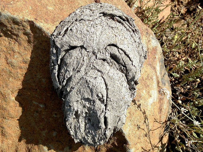
I thought this photo along was pretty funny- on my Tuesday bike ride, I was looking for some good cowpies (do I really need to explain what they are) adjacent to the forest road, and I noticed one was draped kind of funny over a rock. It was not until later when I was looking at my photo that I was amazed that there was a face in it, almost like The Scream!

cc licensed ( BY SA ) flickr photo by Alan Levine: http://flickr.com/photos/cogdog/9667370443/

cc licensed ( BY SA ) flickr photo by Alan Levine: http://flickr.com/photos/cogdog/9667370443/

But after sharing it via twitter, I got a request from Bill Fitzgerald

How could I not respond? I was asked to animate some cow poop!

This was just thrown together (ewwwww)– my idea was to make the face wink.

winking-cowpie

It’s just three frames. I made it in PhotoShip CS5.5, first importing the photo as a base image. I made a copy of the layer, made a lasso selection around the eye, then inverted the selection, and deleted. The plan is to isolate the part to animate as a separate layer.

Create a copy layer and delete everything but what will animate.

Create a copy layer and delete everything but what will animate.

This is going to move around so I need to go back to my base layer, and use the clone brush to paint in a surface behind the eye. It does not have to be perfect because it will be mostly covered., but since the eye will change shape we want a neutral backdrop.

Clone brush in the area behind the eye.

Clone brush in the area behind the eye.

Now I make a copy of the eye layer, and use the EditPuppet Warp tool.

Using the Photoshop Puppet Warp

Using the Photoshop Puppet Warp

I only started dabbling with this last year, but offers a way to distort a selection in a way that is more like pushing clay around, and suitable for changing the shape of this eye over a few frames.

Photoshop puts a mesh on the selection, and I click a few anchor points:

The mesh and selecred edit points in the Puppet Warp tool

The mesh and selecred edit points in the Puppet Warp tool

I cannot say for sure the best strategy. You will need more points near where you want to make movement. On my first one I should have put more at the bottom like this to keep it anchored. But if you click and drag on one of the yellow points, it starts mashing the object around. My idea was to squeeze the top of the eye down as if it was winking:

The puppet warp was used to squeeze the eye down form the original

The puppet warp was used to squeeze the eye down form the original

I then made a copy of this distorted frame, and repeat to make a third one, eve more squeezed down. I can check my effect by toggling layers on and off- I decided to use the brush eraser tool to remove a bit of fringe.

Now that I have a background layer as a base, and 3 versions of the eye as separate layers, I am ready to animate. In CS5.5 there is a menu in the upper right of the animation window, and I use the Convert Layers to Frames item.

What I get is each layer in its own frame- not quite what I need. I can delete the first frame with just the base layer, and in the others, I just toggle on the visibility of that layer so it stays as a background.

Layers and animation in PhotoShop

Layers and animation in PhotoShop

I select all the frames in the animation window, and change the frame rate to 0.5 seconds. Then save for Web & Devices as a GIF, and I am done.

As a final GIF it is only 278k. When you have just a few things in a layer, it is a lot less disk space to save then if each frame is a full image. By isolating movement, you get not only a more subtle animated GIF, it weighs a lot less.

If you want to look at the source file, download the PSD (2 MB).

How much more fun can you have?

I’m tagging this for a Say It Like Peanut Butter assignment (though technically it is not a movie scene) (what am I going to get into TROUBLE?)