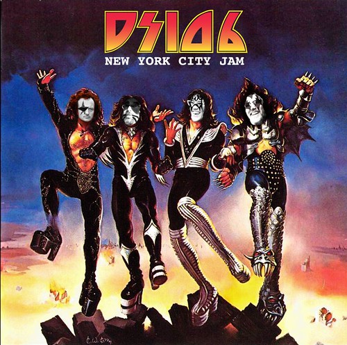
For my first assignment I choose to do one from the mashup group . The assignment I choose was the Remix an Album Cover. For this assingment i choose to use a kanye west alum cover because he is my favorite artist . I used his 808 & Heartbreak cover , in this album there is a song called heartless and on the cover there is a picture of a broken heart white gloves pretty much tearing it apart . I choose a sentence from the song heartless , “how could you be so heartless”, and wrote a somewhat funny answer. I changed the color of the text to go with the one that was already on there and i paint brushed the 808 & Heartbreak because i felt it didnt go with what i wrote . so here is the cover …


