My fifth grade teacher, Mrs. Piraino (you can imagine the nicknames we had for her), was a teacher that loved creativity. Every year she transformed her entire room into Santa’s workshop, letting her students build life size reindeer out of cardboard and decorate the walls with paper-crafted strings of garland. During the small group novel studies, she encouraged students to build dioramas, even entire set pieces for scenes from her favorite books. But while she would let our creativity run wild for large projects, I always sensed that her comfort with letting her students “play” with learning concepts was always a bit more straight-jacketed.
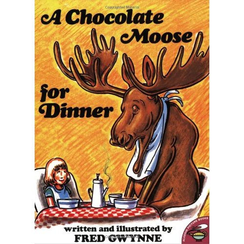
I remember while learning about homophones, she read aloud to us from “A Chocolate Moose for Dinner“, a popular children’s picture book filled with images depicting what idioms and homophones might actually look like if they were real. She gave us an assignment to try and come up with our own homophones and idiomatic phrases, then illustrate them for comedic effect (i.e. “my dad put a new wing on the house” would turn into a drawing of a house with a feathery wing stuck to the side of it.). I failed miserably at the assignment. It wasn’t from lack of effort though; I illustrated half a dozen homophones that I hadn’t seen or heard in any of the books my teacher had used, and I was proud of “playing” around with the concept. Sadly, I had the assignment returned with red marker all over it, so I gave it a second go; still no good. After a week of trying to play around with the concept, and receiving little to no feedback beyond the red marks of “try again”, I finally just turned in some copies of illustrated homophones and idioms lifted from one of Fred Gwynne’s books. I passed the assignment.
While Mrs. Piraino had an amazing streak of creativity that I will be forever thankful for, I remember that one assignment as an example of how she didn’t really allow us to “play” when learning new concepts, or rather, she didn’t take into consideration or make note of the progress we were making while we played, and sometimes struggled, to make sense of some new piece of information. To this day I’ll never know if I actually understood homophones back in 5th grade, but what I did take away from the experience is that as a learner, I feel that I’m learning best when someone is supporting my playful learning, failure, and struggles, rather than just saying “copy what’s in the book”. I’ve found that trying to build new understanding, whether it’s difficult topics like encouraging social activism or just learning how to edit in Adobe Premiere Pro, I usually learn best when working, failing, playing around with ideas, and building something new with the support of a community.
Which is why I’m so enamored with the ds106 community. They are a powerful community of educators that understand how to support one another through play, social media, and constructive criticism. To be fair, the ds106 community has its own set of quirks, trolls, and problems, but any group of people that gives me the opportunity to re-mix the train chase at the end of Back to the Future 3 as a silent movie, and then applaud my sophomoric video editing efforts, deserves high praise in my book. Check out “Silent Era Back to the Future – Dr. Brown to the Rescue”, my “Return to the Silent Era” ds106 assignment submission below. If you want to view it on youtube, just follow the link here.
So why the lengthy introduction for this movie? I felt my experience offered some value in helping to better understand how I learn, and why I teach the way I do. Whether it’s working with young learners or adults, I have always despised the “carbon copy” approach to learning, in which the students are expected to produce a reasonable facsimile of the teacher’s example in order to prove they’ve acquired new skills. Whether it’s learning a new writing form, practicing math skills, or learning a new piece of software, I find myself growing ever more fond of allowing learners to create what they want to create, or at least giving them a challenge to create something in a particular style, but giving them completely free reign over the subject. I followed that belief in my attempts to learn Adobe Premiere Pro, a terribly difficult video editing platform (I come from several years of just using the simple iMovie and Windows Movie Maker), and rather than just follow some simplistic “paint by number” tutorial on how to use the tools that Premiere Pro provides, I decided to do it the hard, yet infinitely more enjoyable way, by choosing a project and jumping in with both feet.
How I made “Silent Era” Back to the Future – Dr. Brown to the Rescue
I started with the following clip of the original train chase scene from Back to the Future 3:
In order to make it look like it came from a silent film, I had to get it downloaded from the web first, so I used my good friend KeepVid, which allows you to download many different formats of YouTube videos. I chose the 480p version in hopes that would keep my video project on the small side. After downloading the clip I imported it into Premiere Pro and used the “razor tool” to slice it up and remove some of the bits of video. Note, the razor tool was great after getting used to it, but I much prefer having a nice keyboard shortcut so I could just line up the playhead and cut away with the shortcut. If I missed that shortcut, or an easier way of using the tool, please share!
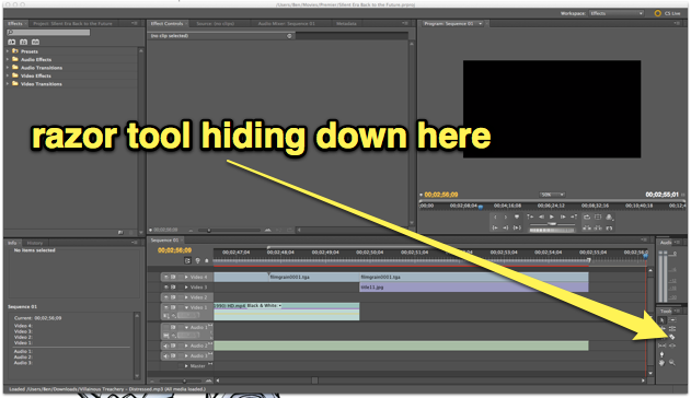
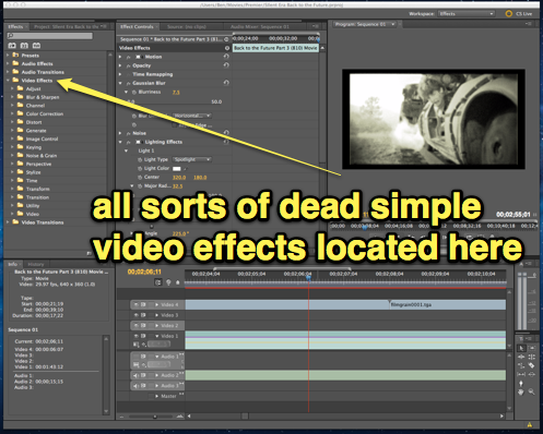
You can find the razor tool with all the editing tools, but I couldn't find a keyboard shortcut
After slicing and dicing the original video clip to remove a few unwanted portions (although in retrospect I would have cut a lot more out to create a more polished flow with the music), I was ready to start playing with the “aging” process. Apparently there are a a lot of thoughts on how to best make a piece of footage look like it came from the silent era using Adobe Premiere Pro. Some people suggested using posterize and fast blur effects on keyframes to produce the “jumpiness” and uneven exposure of old silent film. I wasn’t quite ready to dive into key frames (perhaps on the next project), so instead I just focused on the degradation of quality, black and white, and film grain.
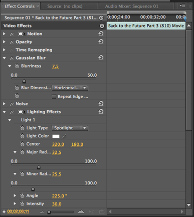
I selected all of my video footage and then applied some of Premiere’s built in video affects by dragging them over to the Effects Control pane. Noise, Black & White, and Gaussian Blur effects helped produce the right low quality look I was looking for, while the Lighting Effects allowed me to add that “vignette” like effect with a few soft spotlights.
Merely making the film look old didn’t quite do it for me. I played around with a lot of the other video effects (there are a ton more than what I’m used to in iMovie), but none of them seemed to add what I was looking for without investing a lot of time fine tuning each setting. That’s when I decided to go digging around the internet some more and came up with this great Particle Illusion project that had a video overlay of 8 seconds worth of film grain, scratches, noise, and flickering. I simply looped the 8 seconds over and over for the entire length of the film to ensure that it had all of the same noise from beginning to end. Making the film look like it had come from the silent era was only half of the task, however. After making sure that the video footage looked reasonably old, I had to make sure that it sounded right (since silent films were typically accompanied by a piano), along with some title cards to share dialogue spoken on screen.
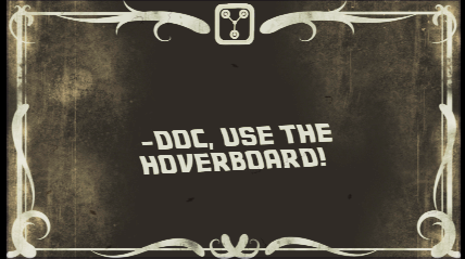
I decided to complete the title cards first, since I like to save music and audio for the very end. By finalizing the video and stills first, I have a clear idea of just how much music I’ll need, so I started looking for a “silent film” title card. I came across this awesome silent film title card by Farrin who blogs over at CopyCatFilms. Not only was this a high quality piece of work that she had produced using Adobe Illustrator, she had provided it for free, yay! If you take a look at an image of the original title card below and the final version you’ll notice a few changes. I opened up Farrin’s title card in Photoshop, removed the fleur-de-leis, and replaced it with a snippet from this graphic of the flux capacitor (it’s what makes time travel possible, don’t you know). I’ve already blogged about the awesome Back to the Future font that I found on dafont.com, so I just used it again to create each of the title cards. I turned down the opacity of the flux capacitor image and the text to help age it a bit to match the aesthetic of the original title card. Notice the “yellowish” tint to the final card? That’s from the film grain and noise video overlay that I mentioned in the previous paragraph.
Once I had successfully spliced together all of the title cards, my aged video footage, and the video effects, my last stop was music. While many people have commented that they would have liked to have seen this video with an “old timey” piano version of the Back to the Future theme, I was hard pressed to find one. Oh sure, you can find plenty of piano renditions on YouTube of the main theme, but many of them aren’t terribly polished, and none of them really captured what I was looking for. It worked out for the best, because I was able to find this amazing collection of royalty-free silent film scores over at Incompetech (such as awesome name) by Kevin Macleod. I used a couple of tracks from the site, one being “Iron Horse Distressed” which was perfect for producing that stereotypical “silent film train chase” atmosphere while Doc Brown and Clara are struggling to hold on for their lives. The second piece, “Merry Go Distressed” was a chance to be a bit playful with the storytelling, as this much more cheerful music kicked in after Doc successfully rescues Clara with the help of Marty and the hoverboard.
The original speed of the tunes didn’t quite fit well for me (they were too slow for the action in the video), so I used the Clip Speed/Duration pane in Premiere to adjust the speed of the audio clip to produce a much more “frantic” train chase. Although I didn’t alter the speed of the video, having the faster music almost makes it appear as though the action is sped up as well to me. Having access to “distressed” music also helped add to the ambience of the piece in my mind.
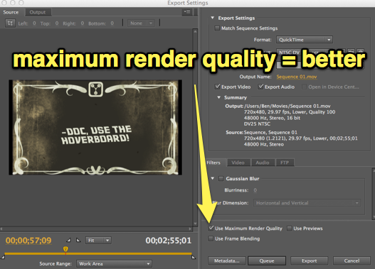
Once everything was tweaked to my liking, I then had the the fun task of learning a new way to get my finished project out of Adobe Premiere and uploaded to the internet. It seems as though no two video editing application are alike for even the simplest of tasks like exporting your final piece; iMovie uses the Share menu, Windows Movie Maker Live has you Publish your videos, and Adobe Premiere uses a much more straight forward Export command. My first attempt to export the video resulted in a helper application being opened, the Adobe Media Encoder. While it was quick, I realized I had exported a low quality version of my movie, so I went back to the FILE>EXPORT>MEDIA command, choose the Quicktime format to export too, and then checked a tiny little box that I hadn’t before called “Use Maximum Render Quality” which took a bit more time, but apparently didn’t need to open the Media Encoder (at least I didn’t see it open), and produced a much higher quality video.
With that, my day long editing and remixing task was over! While I had worked on this piece off and on for the better part of the Friday before Spring Break (I had the day off of school), in total I must have spent about 5-6 hours editing this together; not terribly long or difficult, just time consuming as I learned what each of the video effects did, searched for tips and resources, even stopping to figure out just how to export the final product. It probably took me longer than if I had followed some basic tutorials in a text or watched a few prescribed videos, but the end result was a labor of very playful love, and I value the time spent with the entire project that much more because I was able to play, and fail a few times, on my own!
Want to try remixing one of your favorite films as a “Silent Era” movie? Head over to the ds106 assignment bank and give it a try!


