Pods Embed Error: Pod not found.

An Overly Dramatic Reading of Itsy-Bitsy Spider

I love the idea of playing with tone.  With video-editing, I’ve always enjoyed creating video mash-ups that significantly alter the tone of a movie (usually making something seem entirely more dramatic than it should be).  As such, the over-dramatic reading assignment naturally caught my eye.  Making anything over-dramatic generally entails looking for decidedly non-dramatic source material to create some nice contrast.  Thus, what better material to use than a classic children’s nursery rhyme?  I ultimately chose to use Itsy-Bitsy Spider, as when not sung, it becomes apparent that the spider’s story is somewhat epic.  I mean, being washed down a water spout is certainly life-threatening to a spider.  So I opted to read the rhyme (using Audacity to record the piece) in such a way as to emphasize this dangerous event and the subsequent triumph of the spider.  I essentially ignoring the song-like nature of the piece and down-play the built in rhyme, and emphasize certain dramatic words (washed, dried, again).  Overall this was a fun little exercise that outlined the importance of tone in any form of sound.

audio assignments

“sound effect story”

For this assignment I used iMovie to create a “story” using five sound effects. On the iMovie application there are a list of many sound effects to chose from so I didn’t have to use freesound.org to create my story. I had a little trouble getting my sounds to upload to soundcloud, but I am sure to be more aware as to how to use soundcloud very soon. Below I have attached my sound effect story, I had a lot of fun creating this. https://soundcloud.com/user-157350536/my-movie-1 This assignment is worth 3 1/2 stars ….

“music mash”

To create this assignment I, once again, used iMovie to be able to blend two songs together to make a ‘music mash’ of a sense. I wasn’t able to download the file to soundcloud but I will provide a copy of what I did to this post. I used “Don’t” by Ed Sherran, and “Should of said No” by Taylor Swift in my music mashup. This was a lot more difficult than I expected it to me. Also the inability to upload to soundcloud didn’t help either. This assignment is worth 4 stars and is attached below.

 “what a song means to you’

https://soundcloud.com/user-157350536/audio-recording-on-friday

https://soundcloud.com/taylorswiftofficial/mean

For this assignment we were to find a song that means a lot of us and have the song play with an audio of why it means so much to you. Due to audacity not working I had to use soundcloud for this assignment and was able to have the music and audio together so I uploaded them separate. Mean by Taylor Swift means a lot and is a song for anyone who is being bullied or going through a hard time to know that you can do or be anything you want in life and one mean person can’t tare you down.

This assignment was worth 3 1/2 stars!

Wonder Woman ca. 1918

I was intrigued by the idea of aging a movie trailer to make it appear to be from the silent era.  It essentially admits that silent films are a separate art in and of themselves, with unique pros and cons (while of course also providing the opportunity for a humorous editing project).  As such I immediately began to rack my brain for recent movie trailers… Then I hit upon the new trailer for Wonder Woman.  Not only is it a beautiful example of a modern movie trailer, but the setting of the film is WWI.  I could essentially edit the trailer to match the time-period of the film itself!  As such, I realized that it would be the perfect candidate to return to the silent era.

This video assignment posed a unique challenge, in that I have a great deal of experience with editing video, but haven’t had much need to use effects.  So I began playing around with different options in the effect room of Cyberlink PowerDirector (my video-editing software), and found an effect called “Old Movie” that seemed to fit my needs.  However, I adjusted the background color, as the original seemed to filter with a strange sort of mustard yellow that just seemed odd.  I also realized that my video still seemed too smooth.  It now was black and white with aged lines, but the actual playback wasn’t jumpy.  I ultimately decided to combat this by adjusting the playback speed.  I’ve actually been searching for a way to edit speed for a while now, and now had real motivation to properly investigate.  Combing through the designer options yielded nothing, nor the effects room.  I ultimately opted to try a Google search, and voila!  The answer turned out to be in the Power Tools section of my software.  I then sped up my footage to make it jerkier.

After adjusting the playback speed, I began to work with title cards (specifically this one), stretching my selected card to fully fit the 16:9 aspect ratio.  I opted to use subtitles to insert the dialogue.  This was a bit of a pain, as it was difficult to center the dialogue, and timeline adjustments usually meant adjusting the placement of all the following subtitles.  I also used Incompetech to select my silent film music, ultimately choosing a bouncier intro piece and a more dramatic distressed piece for the latter half of the trailer.  After making small adjustments here till the video met my satisfaction, I published the final product on YouTube.

The final product looks relatively well aged.  Personally, I most enjoy the mashup of WWI battle scenes with this silent film style.  The two mash together quite well, and helped affirm my trailer selection.

Wonder Eowyn: Warrior Princess

I loved the humorous example I saw while browsing this assignment.  The idea of mixing an image, quote, and signature to trick unwary viewers seemed intriguing.  I wanted to try my hand at finding similar characters and see how one could mash them into essentially one super-character.  But on a more serious note, the assignment immediately reminded me of the various quotes that pop up on Facebook.  Many of them have an image of either a celebrity, or a particularly emotionally-compelling image with some form of quote.  Oftentimes in the comments I will see astute observers pointing out that either the quote is misattributed or completely false.  So while this certainly was a fun exercise, I felt that it also reinforced the need for skepticism while browsing information on the Internet.

For the actual creation process, I first had to decide on the characters I wanted to include in the piece.  Xena and Wonder Woman immediately came to mind, followed by Eowyn as another popular female warrior.  But then came the question of which aspects of each to include.  At first I considered using Xena’s famous quote of “I have many skills”.  But it then became apparent that such a choice would mean I would have to use an image of Wonder Woman with the signature of Eowyn, which I felt might be more easily spotted as a fake (as the two are fairly distinctive).  I then considered that many fans reacted to Gal Gadot’s first promo image as Wonder Woman by comparing it visually to Xena.  As such, perhaps Wonder Woman and Xena would be more likely to be confused with each other.  This led me to use Eowyn’s quote of “I am no man,” (especially fitting since all of the chosen characters are female) paired with that particular promo image and Xena’s signature.

To create this image, I opened the promo image in paint, and cropped out extraneous space on the righthand side.  I then changed the word coloring to white (to better contrast with the darker background), and experimented with various fonts for the quote itself.  I ultimately opted for Papyrus, which had a more ancient/timeless feel to it (especially fitting since Xena and Wonder Woman have Greek backgrounds).  After fiddling with font sizes, I saved the work, and voila!
wonder-woman-eowyn-xena-mashup

I felt that the final product looked quite convincing, but was pleasantly surprised by the reaction of my parents.  My dad’s reaction was, “Did Xena really say that?” apparently missing that the image was of Wonder Woman.  But better yet, my mom didn’t notice anything odd at all about the picture, which cemented in my mind that the image appears perfectly plausible to a casual viewer!

IRL Emoji’s!

For this ds106 post, I completed a Mashup assignment – ‘Mashing Friends and Emoji’s

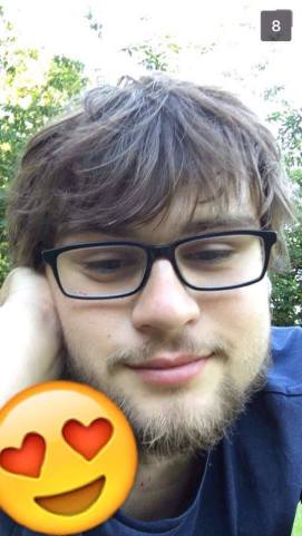
We were instucted to take a picture of one of our friends, or just a person that is in the moment doing something exactly like an emoji, and then to mash them together for comparison.

In the example image, it seems that photoshop (or other similar computer photo editing tool) may have been used to put a large emoji next to the photo like it for comparison, to create one larger image. To create my comparison images I took a different (easier) approach. All photos in this post were taken using camera phones (Iphone 6’s and 5c), and then, using Snapchat, I added the relevent emoji onto the actual image for a cleaner look.

Rather than just posting one, I thought I would make a few!

14030722_10208906568413931_157281237_n

This one would make a brilliant reaction image.

14089581_10208906567733914_991835_n

I believe he intended this selfie he sent me to look sarcastic, but it really didn’t!


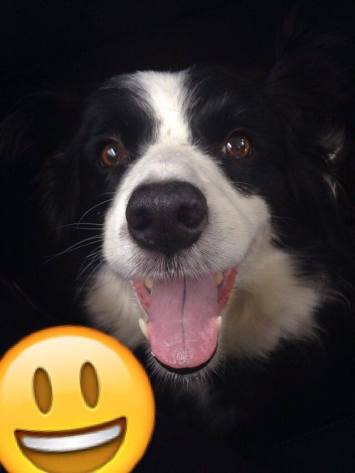
I even managed to get a great one of my dog!


14089583_10208906568213926_1520792923_n

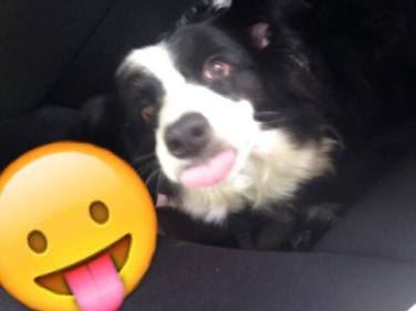
A candid photo of Meg in the back of the car heading home from or holiday in Wales. SO CUTE!


14081487_10208906568333929_284785170_n

14088880_10208906568573935_1604744622_n

Who does it better? Dan? Or Meg?


Snapchat is a social media type app (available for IOS and Android) where users can send images to each other, and chat. But unlike other similar types of app, the images and chat-logs aren’t saved…

Using the new ‘Memories‘ feature of snapchat, I loaded my chosen images into snapchat from the camera roll on my phone (Iphone 5c), and added stickers to the images in the form of the relevant emoji’s! I then dragged them into place and resized them to make them larger and more visible. I wanted it to be an obvious comparison, while making sure the emoji was large enough to easily identify, while not covering any vital parts of the photo. I then saved them back to my camera roll (after sending them to a few people!) and uploaded them into the post. Easy-Peasy! I highly recommend this method, as there are no difficult editing softwares involved. The pictures can even be taken through Snapchat, making it even easier!

I also submitted this as a tutorial, as this was the only one mentioning Snapchat as a method.

Good luck everyone and get snapping!


This Is Awkward…

I wanted to switch this assignment up. It called for a mashup of clips from a period piece, so I decided to do a mashup up of a modern piece of film instead. The movies I used clips from were Mean Girls, The Vow, and Dear John, all of which have the actresses Rachel McAdams and Amanda Seyfried in them. I decided it would be funny to mash it all up to create a dramatic love triangle scenario between their characters and the steamy dreamboat: Channing Tatum.

78b5247d312fbedeeb5ff11071028630

I was inspired from this meme I saw on Tumblr once. If you’ve ever seen Mean Girls, you will get this hilarious reference to Gretchen Weiners. I think it is so weird that they used Channing Tatum in two romantic dramas (or chick-flicks, if you will) back-to-back like this. If I remember correctly, they came out not too far from each other. They’re both super mushy, cry-your-eyes out movies but they used two girls who famously played together in Mean Girls. Were we not supposed to notice?

How I made this video was pretty easy peasy. I downloaded clips from YouTube using KeepVid. I found the segments of all of the movies from trailers and other compilation videos on YouTube.

Screen Shot 2016-07-12 at 6.38.48 PM

Then I imported the clips onto my iMovie application. I cut out the clips I wanted and inserted them in the perfect spots. I edited text over the segments using the title slide feature. The sound effect I used was called “Record Player Scratching”. It’s one of the generic sound effects that come with the program. The music I added was Bad Blood by Taylor Swift but I reduced the pitch to avoid any copyright issues on YouTube. I did that by selecting the song in the editing bay and manipulating the audio effect option.

Screen Shot 2016-07-12 at 6.39.19 PM

I wish I had the physical copies of The Vow and Dear John because then I would have more access to specific scenes I may have wanted to include, but I had to work with what YouTube had. I think for those constraints I did well in this assignment. Hopefully, I conveyed the joke of the situation that the meme above had got me thinking about. Even if you’re Regina George and Karen Smith, you shouldn’t have to share your boyfriend with your best friend!

Assignment Rating:

four-star-review

The Hills Are Alive

jpsom

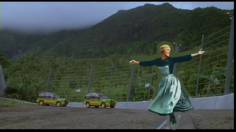
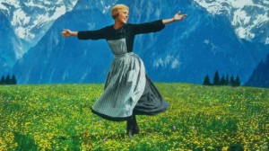
For this weeks Assignment I chose to do another mash up. I chose Assignment151 This Doesn’t Belong Here. The assignment was to mash up two movie scenes that don’t really belong together. The first image I chose was from the Sound of Music.

julie andrews

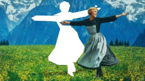
I then opened the image in GIMP. I cropped the image just around Julie. julie andrews crop

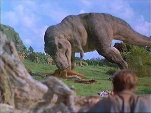
I then had to decide where I should put her. I was trying to think of another movie with great scenery and going through my old pictures for this class I saw a Jurassic Park picture. I first tried to put her in the picture where the T Rex is eating another dinosaur. 1187274150

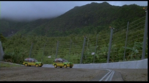
I could not get Julie to match proportionally. She was to close to the T Rex’s size. If I made her smaller you could not tell it was her. So I then decided to go find another picture from the same movie. I happened upon a scene from the beginning where the cars are on the track and there is great scenery in the background.

fHT4u

I then decided to put her in front of that photo. I added Julie and was then faced with the problem of blending her in. I used the color picker tool to pick up the color around her then used the paintbrush to paint around her. It is not perfect but I am getting closer to blending two images.


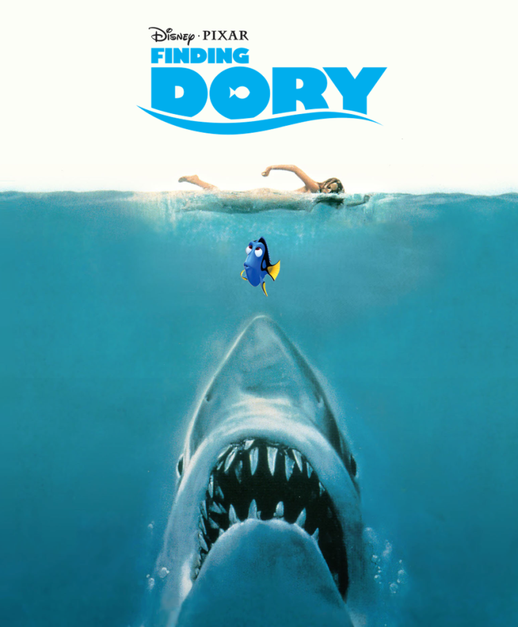
Finding Who? – Design Assignment Bank – Week 5

Movie_Mashup

This week’s mashup assignment was to take elements from multiple movie posters and mash them up into one. Change anything – the caption, the title, the main image, etc. Also, make it seem like it could be a real movie.

Each year, there is one week that I dread more than any other – Shark Week on the Discovery Channel. My sister is a major fan of sharks. I know that I will not see my sister for a week, and she will post about it on Facebook and talk about it for well over a week. I would rather be watching a Disney movie. As you can imagine, we have a hard time deciding on a movie that both of us approve. For this assignment, I chose to merge elements of the movie posters for Jaws and Finding Dory.

My chosen story theme is the Myers-Briggs Type Indicator (MBTI). This movie poster mashup features two distinct MBTI types, the ENTJ great white shark, and the ESFP Dory. I thought this would make for an interesting dichotomy.

The Great White Shark (ENTJ)

  • Strategic
  • Assertive
  • Confident
  • Analytical
  • Efficient
  • Curious
  • Thick-skinned
  • Leader
  • Goal-oriented
  • Impersonal
  • Intellectual
  • Ambitious
  • Decisive

Dory (ESFP)

  • Sociable
  • Cooperative
  • Creative
  • Excitable
  • Spontaneous
  • Adventurous
  • Harmonious
  • Fun-loving
  • Talkative
  • Lively
  • Sensitive
  • Friendly
  • Carefree

I created this mashup in PowerPoint. I used the Jaws poster as my background. I removed the background from the Finding Dory movie title using lunapic.com. I found an image of Dory with a transparent background, no lunapic needed. I created a box the same color as the cream background and covered the Jaws title. I added all of the elements to the original Jaws background poster and took a screen shot. A quick upload to Flickr.com and I was done.

I had a lot of fun creating this poster. I think my sister would enjoy this movie more than I would. I would root for Dory. My sister would root for Jaws.


Why So Angry, Alien?!

Click to view slideshow.

For this weeks Assignment Bank assignment I chose one called This Doesn’t Belong Here.  This assignment you need to mash up two different iconic movie scenes. However, you should aim to be as subtle as possible. Perhaps a famous prop that simply doesn’t belong or a character that looks a little out of place.

So my photo-shopping ended up a little less than subtle.  However, this was a fun assignment to fit this angry little alien from my childhood into iconic science fiction movies.  I tried to pic my favorite one, but then just decided to share them all here.

Scribbled to Death: Star Wars Battlefront Rotoscope Animation

This ds106 mashup assignment was fun to do. I have wanted to do something like this for some time. The first time I saw …