Pods Embed Error: Pod not found.

…or You’ll Be History!

This assignment in pretty simple, yet very powerful. Mash-up your own work! Take at least 3 things you’ve done this semester, and combine them together to make one cohesive thing.

My third and final mashup assignment for this grading period is worth four stars exactly at the time that this post goes up. Entitled “Mash Thyself, Before Ye Trash Thyself,” my entry for this challenge consists of five separate audio clips created over the course of this semester. The clips in question are my article on wedding rings; my “Egyptian” bumper; my “Trump Nektar” commercial; a second ad, which updates the “How Many Licks” ad campaign that immortalized Tootsie Roll Pops in the eyes of kids for 45 years now; and a second article – on dentures and dental implants – cobbled together from the recordings I sent to my teammates during that particular grading period.

As for the story of this remix, it’s a makeshift episode of the Wacky History podcast I wrote a portion of the script for, as part of my mid-term exam for DS106. Basically, I wanted to provide an abridged version of the podcast I was a part of, the way I, for the most part, originally envisioned it. The first half of my “minisode,” on wedding rings, remains untouched, as are most of the clips in this remix; in fact, the only real edit I make here is cutting my short monologue on dental implants to make room for the unedited George Washington follow-up, before closing both the segment and the entire “podcast” with the remaining audio from the aforementioned “Implants” portion.

With regards to scheduling, the “minisode” opens with my segment on wedding rings, before cutting to a “commercial break” consisting of my “How Many Licks” parody, followed by “Trump Nektar;” we then hear the “Egyptian” bumper before completing the abridged podcast with a segment on dentures and dental implants. Once again, I basically took old footage from this last semester, and spliced them together using Audacity to make this “minisode,” mostly by aligning the various tracks so they all start the second the previous one stops, but also by cutting out any excess footage to make the final product run as smoothly as possible, something that was especially true when I edited my segment on dentures.

This mashup was made with the central goal of showing my intentions for the mid-term – providing listeners with the zany backstories of household objects – as well as showing how versatile I can be in terms of editing, as the audio goes from Radiolab in the first half of the podcast to This American Life in the second. Overall, the sudden shift in tone definitely provides a feeling of unpredictability within the podcast, as everything in life, including history, can and will be unpredictable.

This project, as bizarre as it is, is an experiment on two different styles of editing, to see which one worked better for me, and to make a long story short, I think I like both. This is essentially a split of personalities for me: I tend to keep things straight and narrow for dentures and implants, and I give my listeners twists and turns for wedding rings. The final product is a work of modern abstract art, something that really has to be seen – or heard – just to be believed.

As always, once I was satisfied with what I had, I saved everything the way it was, exported it as its own MP3 file, and uploaded it onto my SoundCloud account, for a total of twelve stars this grading period.

1(131)

1(132)

1(133)

1(134)

Isn’t That Kinda Like..?

“Take a movie that you really like.  Now think of a movie that has been compared to it, and make a new movie poster that incorporates the two!”

– 4.5 stars

Real


When I graduated high school in 2012, the first of the Hunger Games movies was released. I was excited because it was a book series I had read a year or two earlier and one I really loved. Not to mention, the final Harry Potter had already been released and I was itching for another book-to-movie franchise to hook onto. Little did I know, the release of the Hunger Games was just the beginning of what would turn into several years of dystopian thrillers, one right after another.

The next major book-to-movie series that followed this post-apocalyptic story line was divergent, which follows Tris as she fights against the corrupt faction system. It’s plot, characters, and setting were eerily similar to that of the Hunger Games trilogy, and likely contributed to the success it has enjoyed since being released.

Because of their similarities, I decided they would be the perfect movies to use for this particular assignment. I did some digging on google images to find movie posters where the characters were in similar poses, were around the same height, and where the lighting was close to the same. I figured having these aspects of the posters match up would equal a more cohesive ‘mash-up’ in the end.

Unfortunately, I forgot to take screenshots during the process so I’ll just have to settle for explaining it here. It’s been awhile since I worked on any assignments using GIMP, and it took some readjusting before I was able to get comfortable again. I decided to use the Hunger Games Poster as the base layer since it featured a rocky cliff that would help cover up the fact that Tris has no feet (they weren’t in the frame in her poster). I also just really liked the water color-ish background and wanted to keep it. Using the free form tool on GIMP, i very carefully traced over Tris’s outline until I had moved all the way around her and connected the trace. I cut her image out, opened the window containing the Hunger Games poster, and pasted her in. I decided to place her in the corner because 1) her dang feet, and 2) I liked the idea that it looked as if she was standing on some kind of cliff just out of eye shot.

When I cut out Tris, there were a few white spots that made the poster look pretty hastily thrown together and bad. I decided to use the color matching tool and the paintbrush to match the color near the white spot and fill it in. Once zoomed out, you can hardly notice that the brush spots seem more blurry than everything else and the poster just looks a little less choppy altogether.


Movie posters sourced from:

Divergent poster

Hunger Games


Two Movies, One Line

For this mashup assignment, you must pick one line from two movies and combine them into one line. You can choose to have one line be a response to the other. You can follow the example video and start the second line on the last word of the first line. You can choose to do this assignment in any way you want, just be creative with it.

Watch What You Say…

Make your own song using other lyrics. Complete this assignment by combining the lyrics from at least 5 different songs in order to make a song with flowing lyrics. This song should be at least 2 minutes long.

My next mashup assignment was my toughest one to date, worth four-and-a-half stars at the time of selection. Since this was yet another case of a task that’s exactly what it says on the tin, I decided to go for an a cappella number. For those of you that called yourselves “Gleeks” during the first half of this decade, you can probably understand what that term means; for those that didn’t, I basically had to sing my lyrics without any instrumental accompaniment of any kind – only my voice, and nothing else, could be carried over to the final project.

I also decided to push myself further, and do everything in one take, much like my infamous “One-Man Play” from earlier this semester, and use a form of storytelling that wasn’t used in a song before. Since Bob Dylan just left the verses out of order when he recorded “Tangled Up in Blue,” it meant that I had to pull off an illusion previously used by the likes of Christopher Nolan and Jason Robert Brown.

In both Nolan’s 2000 film, Memento, and Brown’s 2001 musical, The Last Five Years, the central storytelling mechanic was that half of the story was told from beginning-to-middle, going forwards in time, and the other half was told from end-to-middle, going backwards. For this story, I went with a street performer being increasingly heckled by rowdy patrons in the first half, and the performer getting his revenge on the perpetrators in a violent bar fight in the second, with the point where the two acts intersect being when the performer locks the door to the bar, so that the hecklers can’t escape.

The songs I chose were a mix of classic rock and country music, including “Who Are You” by The Who; “God’s Gonna Cut You Down” by Johnny Cash; “We Will Rock You” by Queen; “Hypnotize” by System of a Down; “Coward of the County” by Kenny Rogers; and “The Stranger” by Billy Joel.

After finding the lyrics I needed, and setting them up for the desired effect – a key example of this was reversing the order of the verses sampled from “Hypnotize” and “Coward of the County” to raise tension for when the door was locked – I recorded everything in one take, saved it as it was, and uploaded it to my SoundCloud account.

1(128)

1(129)

1(130)

Smile! You’re on “Candid Camera!”

You’ve probably seen those videos where people take a photo of themselves every day for a year or seven years or some crazy length of time. Make a DS106 version! Take a photo of yourself every day for a week (7 days, 5 if you’re lazy), and put them into a video. Try to make your face line up in the video for a seamless transition.

“A Week in Five Frames,” my first official foray into the world of mashups, is an example of “A Picture A Day,” which is exactly what it says on the tin. After taking five photographs of myself from November 16-20, I edited them together to make a seven-second video, where every frame, including the opening and closing credits, lasted for precisely one second, and no longer. Thankfully, the pictures I chose kept a specific theme of moving the camera slightly, while my eyes still kept their focus on the lens as it moved. Since some of the assignments we’re allowed to take part in include recycling old footage, I decided to use the drumroll intro from my Morse Code Challenge as the basic theme for my video. The timing of the cymbal crash, with the final photo’s reveal, makes everything worth it for me on that front. The illusion of the camera moving while the shots are counted off was also my idea, as it really felt like a stop-motion version of a home movie, with the pan-and-scan “effect” coming along nicely, to say nothing of having the eyes stay focused on the lens at all times, like a modern-day Mona Lisa. After the editing process was completed, I saved it on Windows Live Movie Maker, and uploaded it onto my YouTube channel, for three-and-a-half stars.

1(126)

1(127)

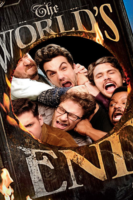
This is The World’s End

This Is The Worlds End

It was just a normal day for this group of friends until something went wrong. The world began to shake and split open. All Hell broke  a loose and now these guys are trying their best to scavenge and survive  while finding a way to be accepted into  Heaven. Little did they know, some other guys in Britain are trying to prevent the from ending by heavily drinking in a pub. That’s an odd way to fix things, but will they be able to before time is up? Find out what happens when this mashup film hits theaters this summer!

For this four and half star assignment, I decided to take two similar movies that released within the same year  and mash their movie posters together. I don’t remember the movies, The World’s End and This Is The End, ever being compared, but it’s interesting that they both released around the same time and basically had the same plot. They also had similar ratings with about 50% on Rotten Tomatoes, so nothing could go wrong mashing them together. Combining the two movie posters was pretty simple using software like GIMP.

After saving the images to my computer, I opened The World’s End poster in GIMP and used the Ellipse Select Tool to add transparency to the image.e

The next step was to open up the This Is The End movie poster as a layer and move it behind the other poster. I then used the Scale Tool to make the image larger and help it fit well in the circle.s

The last step was exporting the file and upload it to Flickr for it to be viewed by everyone online.


My Favorite Friends and their Emoji Twins

For my first Mashup Assignment this week, I decided to complete Mashing Friends and Emojis for 3.5 stars! I was very excited for this assignment, and I am obsessed with emojis and using them in all forms of texting conversation. The express your feelings in a unique way that words cannot do on their own. Words definitely hold a lot of meaning, but I think it’s very cool how a symbol/picture can also hold just as much, or more, meaning than the word itself! I decided to use two pictures of my favorite people, Douglas and my sister Diana. Surprisingly, this assignment wasn’t too hard because I have a number of choice pictures of the two of them making funny faces. Here are their emoji twins!

BeFunky Collage

I created this collage through BeFunky! It’s a great website that gives many templates and options to create picture/video collages. All I had to do was pick my desired template and then upload the images from my computer. I found the emoji images through a Google search, and already had the images of Diana and Douglas saved on my computer. I love that without even trying, they both perfectly match their emoji twins :) Douglas got the annoyed face emoji. In this moment he was definitely annoyed because I was taking too many pictures. He usually lasts for about 3-4 pictures, then gives up and shoots me one of these faces. My sister stole my phone at one point this year and took several beautiful pictures like the one above. I chose this one because it immediately made me think of the emoji sticking its tongue out!

What do you think? Are they twinning?

She’s the Twelfth Night

Movie Mash-up:   Take a movie that you really like. Now think of a movie that has been compared to it, and make a new movie poster that incorporates the two! (4.5 stars).

For this assignment, I had to use two movies that are similar in themes, or really, just been compared before, and make a new poster that shows this!

I have watched She’s the Man, which is a great movie about Amanda Bynes’ character Viola, pretending to be her brother in order to play soccer because her team got cut. Here is the poster for this movie:

dfad

The next movie that has been compared to She’s the Man, is Shakespeare’s play, The Twelfth Night. This play, which is much older than the first mentioned, weirdly enough, shares a lot of the same character names including Viola, Olivia, and Orsino. Another big give away is that the main character in the play, Viola, disguises herself as her brother who she thinks has died at sea.

Twelfth_Night-_Or_What_You_Will_FilmPoster

The similarities are crazy, and here is a YouTube video I found comparing and contrasting them.

Anyways, I made a cool poster combining the two above. I found both images on Google, and cropped the title from She’s the Man and pasted it on the Twelfth Night poster using Preview on Mac. It was very simple to just cut and paste.

Screen Shot 2015-11-18 at 7.54.47 PM


I covered up the original title to replace She’s the Man with. I wanted to have both movie/play highlighted in the new poster because I thought this would bring in the crazy similarities from both to show them together. Its also cool to note the difference in times of them. She’s the Man came out in 2006, while The Twelfth Night was first performed in 1602.

Here is my final poster of the mixed, oddly similar movies. I really think the similarities are crazy.

jnkn

—SALTY SKINN

Serena Changing

A Changing Character: For this assignment you need to pick any chacter and follow thier progression that they have had (TV characters from a long standing TV show will probably be best). Use video clips to show how the character has changed and grown up over time. Try to make their progression seem as dramatic as you possibly can. (4.5 stars).

"The Wrong Goodbye" -- Blake Lively as Serena Van Der Woodsen and Ethan Peck on Gossip Girl on The CW. Photo: Colleen E. Hayes/ THE CW 2011 The CW Network, LLC. All Rights Reserved

For this assignment, we needed to create a mash-up video of a character. I chose the show, Gossip Girl, which is my absolute favorite show. I chose my favorite character as well, Serena Van der Woodsen, (played by Blake Lively) to show this character progression over the show’s period.

I used iMovie, which is so great! I found many show clips on YouTube and used Fltvo.com to easily convert my video and add it to iMovie. I inserted a title page which is on the left hand side under “Content Library”. I also used Transitions which is located here as well.

Here are my clips I found on YouTube:

Blair and Serena Taking Pictures, Blair and Serena Fighting, Dan and Serena WeddingPilot,  Blair and Serena Fight,  Dan and Serena, Last Chance.

Screen Shot 2015-11-18 at 6.56.50 PM

This was simple to create, and I really enjoyed going back and seeing different clips of her character, who really does change throughout the show. Her fashion sense, her personality, and her love life changes many times and it’s so cool to see. I loved her character and always thought it would be cool to make something like this mash-up to view how she changes.

This mash-up assignment showed me how this could be an awesome progression of anyone, not just a TV show or movie character. These mash-ups are great evidence of anyone’s progression that can be documented for special events like graduation, birthdays, and holidays. This really is a great memory capturing piece of work.

Here is my video of Gossip Girl’s Character: Serena

—SALTY SKINN

review 11-15-15

This week was how we say EHH!?!. I was not a fan. It seems to me that in reality this course is full of mashups, whether you want to call em that or not. I can think of only a hand full of times I have been asked to create my own content. I find this extremely disheartening.  Oh well, I guess, I would like to do some work though that applies to the real world. Something that requires planning and coordination, maybe even team work. Any how, my projects this week were short and sweet which is not a bad thing considering the course load I am under currently. Here are a few links to my assignment this week.

http://digitalmediakiller.com/creative-work/to-bad-he-isnt-british/

http://digitalmediakiller.com/creative-work/that-doesnt-belong-there/

the second one was ehh, risque’ but I am not really worried. we are in college and also adults if there is a problem please contact me so I can let you know I am not concerned with your offence.