That Number 2 In 3D for Prisoner106

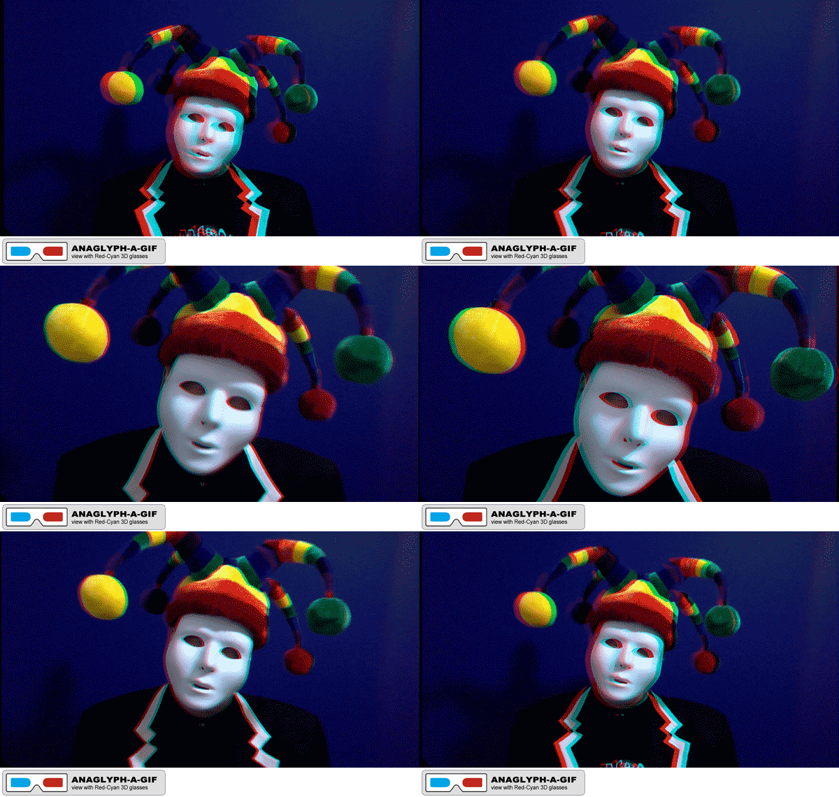
"Number 2 in 3D" Anaglyph-a-GIF by @aforgrave

“Number 2 in 3D” Anaglyph-a-GIF by @aforgrave

I was quite taken aback with the introductory video for the #Prisoner106 Week One: Assimilation Week. That getup of that Number 2 (@ds106Number2, on Twitter) was wearing and the odd behaviour Number 2 was displaying jumped right out of the screen and and gave me an immediate dose of that old #ds106 affliction of mine, GIF-eye-tis. Throw in a long absence from making 3D Anaglyphs (something I really got into last summer) and it was time to dust off the old 3D glasses and see if I could remember how I made things happen last year.

As it turns out, I started a series of Tutorials last summer for making Anaglyphs and Anaglyph-a-GIFs (I’m having to refer back to my terms from last summer — the badges are down a ways now in my sidebar)  but it seems I only got as far as the 2nd tutorial of 5. Something called end-of-summer (or August, judging by the date of the last Tutorial) must have gotten in the way. Fortunately, a short bit of experimentation had me back in the saddle and crafting a 3D Anaglyph-a-GIF in no time. The result is up above!

I’ve checked back and see that I was about to embark next on Part 3, which is the real key, the colour separation step.

  • Next: Step 3: Colour Filtering (link to follow)
  • Then: Step 4: Positioning the Layers to Simulate Depth (link to follow)
  • Then: Step 5: Extending the Technique to make an Anaglyph-a-GIF (link to follow)

Since Tutorial posts link separately into the Assignment Bank, I will leave off here and pick up with Part 3  in a subsequent post. I’ve already got some static frames captured from Number 2 to explain the process. Onward with the Learning!

I think this one qualifies for multiple assignments, which is good, as I understand from Number 2 that the electricity to my bungalow in The Village gets shut off if I don’t earn enough Credit Units throughout the week.

I’m tagging it for the following:

John Gets His 3D Glasses On!

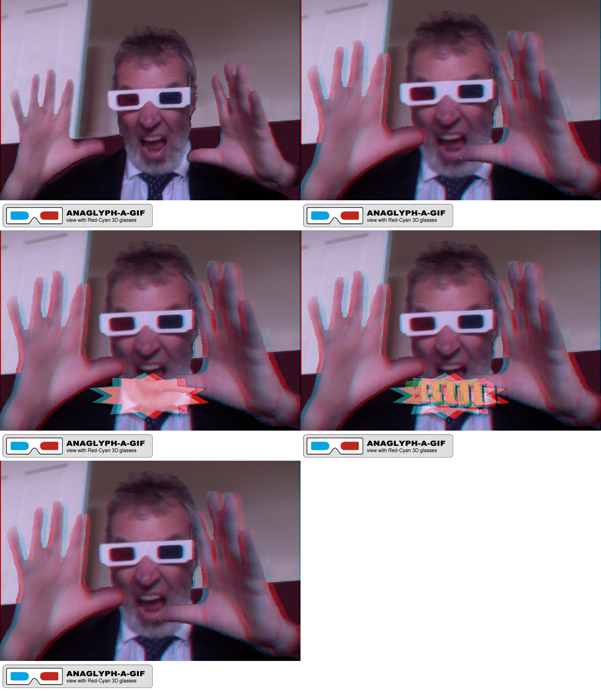
"John Gets His 3D Glasses On!" animated Anaglyph-a-GIF by @aforgrave, based on a photo by @johnjohnston

“John Gets His 3D Glasses On!” animated Anaglyph-a-GIF by @aforgrave, based on a photo by @johnjohnston

John‘s (@johnjohnston, on Twitter) new 3D red/cyan anaglyph glasses arrived today, and he immediately shared the news on Twitter.

With John’s kind permission, I have taken his shared image and turned it into both an Anaglyph and an Anaglyph-a-GIF as part of the Anaglyph Tutorial (link to follow).

Thanks, John! We are looking forward to seeing your anaglyph and anaglyph-a-GIF art in the near future!

3D Anaglyph-A-GIF

Combine your love of creating GIFs with your love of creating 3D Anaglyphs. Create a 3D Anaglyph-A-GIF! Like an exemplary animated GIF, your Art will celebrate a still image that just cries out to move in GIF form. And like any great piece of 3D, your Art will have have depth and reach out and “grab” the viewer with thrill and gusto! Design with red/cyan viewing glasses in mind. 

If you get really enthused about exploring this artform, consider promoting your art with the Anaglyph-A-GIF tag. You can even add a badge


Depth of a Field with Skeleton

Now that the Anaglyph-A-GIF has been a little more clearly defined, I’ve decided to add it (along with the simpler, static 3D Anaglyph to the ds106 Assignment Bank.

I did a search for anaglyph and 3D, and didn’t really turn anything up that is similar aside from Bill Genereux’s Wiggle Stereoscopy (Visual Assignment 352),  the similar 2-frame stereoscopic wiggle gram Stereo GIFs (Animated GIF assignment 991),  and iamTalkyTina‘s Monster Chiller Horror Theatre 3D GIF (Animated GIF Assignment 1191). So I think it’s a safe bet that these two items featuring a cyan/magenta anaglyph can be added in.

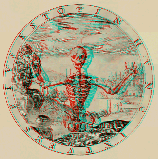
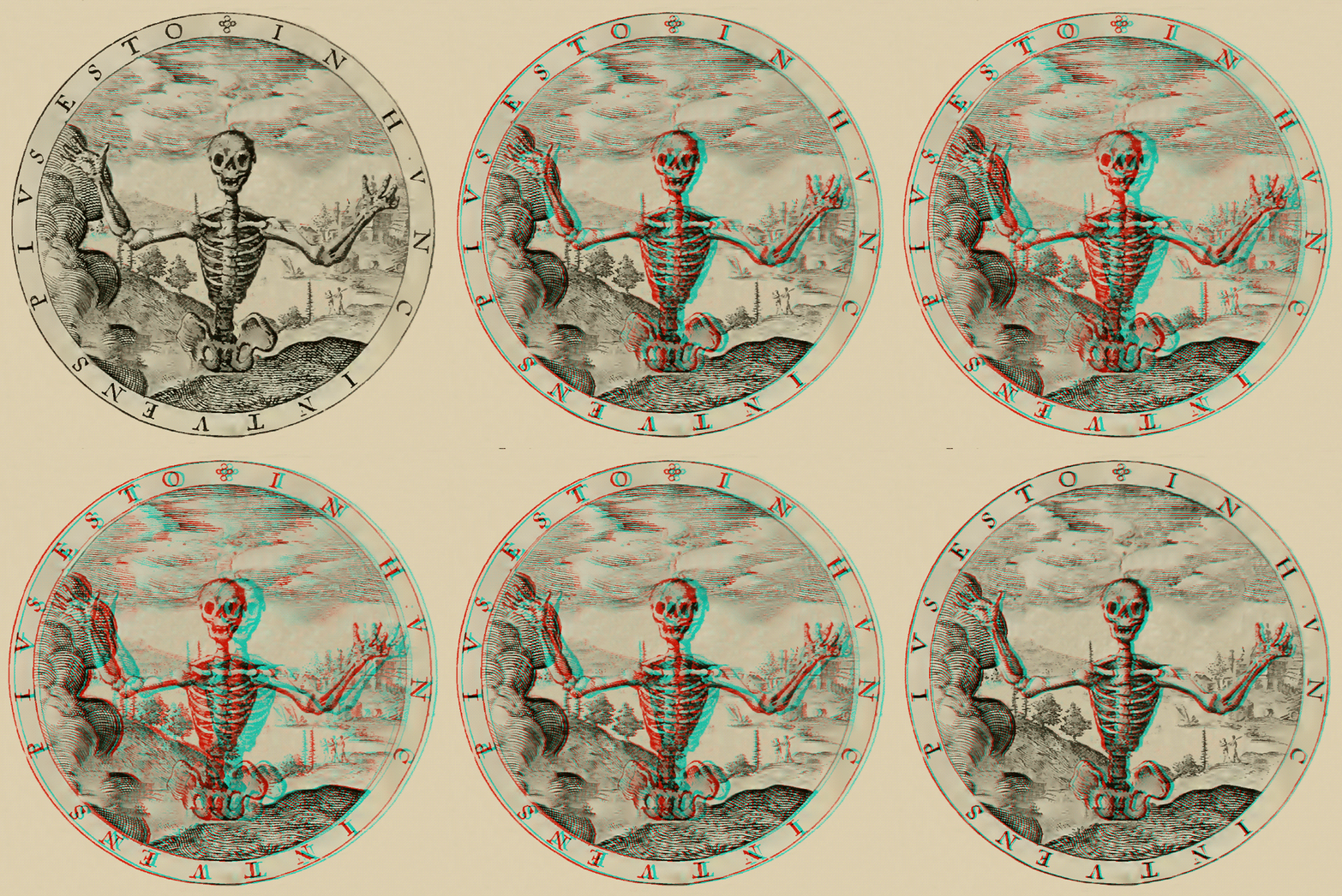
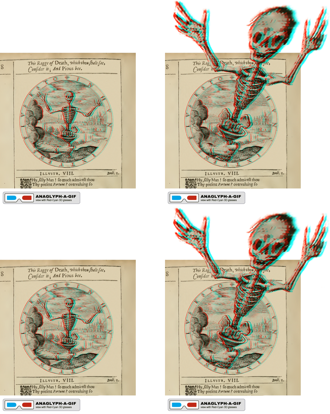
Having decided that, I then spent a bit of time revisiting the George Wither illustration 8 to come up with a couple of clear examples for the assignment pages. One needed to move, and the other needed to illustrate the static “popping out” that seems to be nice to have in a 3D image. Knowing that the assignment bank GIF thumbnails are best at 300 pixels square, I wanted to plan to fit into that space. The extra space required in my original “Boo” Skeleton GIF wouldn’t work well there.

With that in mind, I revised my original Depth of A Field image (separated layers) and added the Skeleton back in (minus the hand, stick, and cup). I scaled the skele up a bit to obscure the bits of content-aware fill that existed in the existing background layers that were previously hidden by the hand. (I had branched off from the original Depth of a Field .psd to create the Boo image with the Skeleton. The Boo .psd simply had a merged and static anaglyph background and so editing in that file wasn’t going to work if I wanted to stay within the bounds of the circle. I decided to remove the bounding lines to result in something with as clean and distraction-free as possible.

The Results

First, the static “Depth of a Field, with Skeleton” image, with the popping out skeleton.

"Depth of A Field, with Skeleton (Static)" 3D Anaglyph by @aforgrave based on Geo Wither Illustration 8 (1635)

“Depth of A Field, with Skeleton (Static)” 3D Anaglyph by @aforgrave based on Geo Wither Illustration 8 (1635)

And the new badge to go along with it:
3D Glasses_FLAT AnaglyphBADGE GREY fill BLACK

Second, the animated “Depth of a Field, with Skeleton” GIF.

"Depth of A Field, with Skeleton (Static)" 3D Anaglyph-A-GIF by @aforgrave based on Geo Wither Illustration 8 (1635)

“Depth of A Field, with Skeleton (Static)” 3D Anaglyph-A-GIF by @aforgrave based on Geo Wither Illustration 8 (1635)

And the other new badge for the animated GIF anaglyphs:
3D Glasses_FLAT Anaglyph-A-GIF BADGE GREY fill BLACK

New Assignments

The new assignments in the ds106 Assignment Bank are as follows:

I’ve been working on a new George Wither Anaglyph/Anaglyph-A-GIF over the past day, and I’ve been assembling some components for illustration and tutorial purposes. I hope to post a tutorial in the next day or so.

Let the submissions begin!

A Newly Improved Boo

REVISED version of "Boo" animated Anaglyph-A-GIF by @aforgrave, based on p8 from Geo. Wither's Emblemes (1635)

REVISED version of “Boo” animated Anaglyph-A-GIF by @aforgrave, based on p8 from Geo. Wither’s Emblemes (1635)

Interesting.

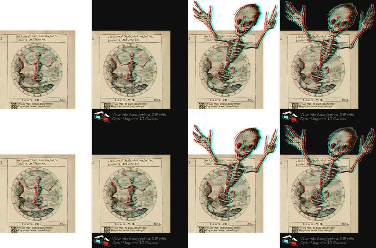
In revisiting the George Wither, page 8, ‘Boo’ GIF in order to update the misspelling in the “view with Cyan-Magenta 3D glasses” text, I have uncovered another issue and made another little improvement.

I had originally provided a transparent background for the full image. My thinking was that a uniform, white background might telegraph to the viewer the actual size of the image — and thus raise a question of “why the empty white space?” before the larger skeleton makes his appearance there. With a transparent background, the natural background colour of the page would border the smaller art image, and folks would assume that edge to be the boundary within which to expect motion.  I think that remains the case.

However, in the intervening day, I’ve noticed two things.

  1. As originally published, there appears an unintended black “shadow” extending upwards from the top edge of the page scan, appearing behind the skeleton when he emerges to his “boo” size. It’s somehow an artifact of the transparency that only appears when viewed with the anaglyph glasses.
  2. When viewed on Mariana’s Jux page, the black page behind emphasizes all kinds of jaggies around the large skeleton, and also around the “view with Cyan-Magenta 3D glasses” text.

In both instances, it’s noisier than I had intended.  And noise (aural or visual) can be a distraction to the art.

Experimenting with a white background layer in Photoshop seems to do away with the “shadow” behind the skeleton.  It also decreases the emphasis of the jaggies around the skeleton’s head and hands — allowing for a fuller appreciation of the scariness!

FIXED "Boo" on White Background, previous jaggie "Boo" on Lux site.

FIXED “Boo” on White Background, previous jaggie “Boo” on Lux site.

I’ve also selected and inserted the finalized Anaglyph-A-GIF badge. I replaced the Propaganda font from the draft badges with the cleaner Arial Black. It’s still a bit blurry for smaller resolutions, but not as much as with the stylized font. So the GIF at the top of the page has those two changes — a white background, and the updated badge.

And now, I’m off to finish the next George Wither piece …