“3 STAR DESIGN ASSIGNMENT #2 ” “DS106 THE MOVIE”

For this Design Assignment I had to take the poster of a original movie, and change it to depict a movie about my design class “DS106″.This was very fun for me because I got a chance to mess around with numerous amounts of tools from the website which I used to complete this assignment called Picnik.com. For my movie poster I chose the movie “Transformers”, I chose transformers because it is one of my favorite movies and I think the graphics and animation used in this movie are amazing. Now.. getting to the poster I created, well I chose to make it look exactly like the Original poster….but with a little twist. I used the shine-away tool on Picnik.com to eliminate the text that said “Their World.Our World.” from the original Transformers poster. Next I replaced it with the same format, just with words relative to DS106 which says, “Their Class.Our Designs.” After that I used the contrast and brightening effect tool to lighten up the poster since the original was to dark and I wanted my texts and the characters to show and blend in more. Next, I used the text tool to write the text, “DS106″ and I used the fonts from Picnik.com, to choose the fonts. However, I had to choose light colors for my movie poster since the background was very dark and if I wanted my text to be legible I had to make the texts lighter, so I chose light blue since it is my overall favorite color. In order for me to eliminate the Transformers title I once again used the shine-away tool and it disappeared. Finally, I used the contrast effect tool once more to make the poster look more blended and even-toned. This assignment took me about 30 minutes to complete I would say, but I enjoyed doing it:)!!! 

“2 STAR” Design Assigment #1 “CARTOON THE HEAD”

This Design Assignment is called “Cartoon the Head” , for this assignment I had to find a image of an animal and a cartoon and paste the cartoon’s image on top of the animals face as if that was the cartoon’s actual body. For my character I chose Bart Simpson from the cartoon show called “The Simpson’s”. I chose Bart because he is my favorite cartoon character on the show and I think the facial expression he has in this picture best suites the body image of a camel. The reason I chose a camel was because I think they have such a bizarre and funny shape that would look great on Bart Simpson LOL !! The process on completing this design assignment was very simple. As I stated in my other posts I simply just used www.pixlr.com, and imported the images which I saved on my desktop. Next, I used the “lasso tool” to trace the section of Bart’s face that I wanted to paste on top of the Camel’s face. After that, I used the paste button from the edit tab and placed Bart’s face on top of the Camel’s face. Finally, I used the arrow tool to arrange the face in the right position that I wanted it to be in.

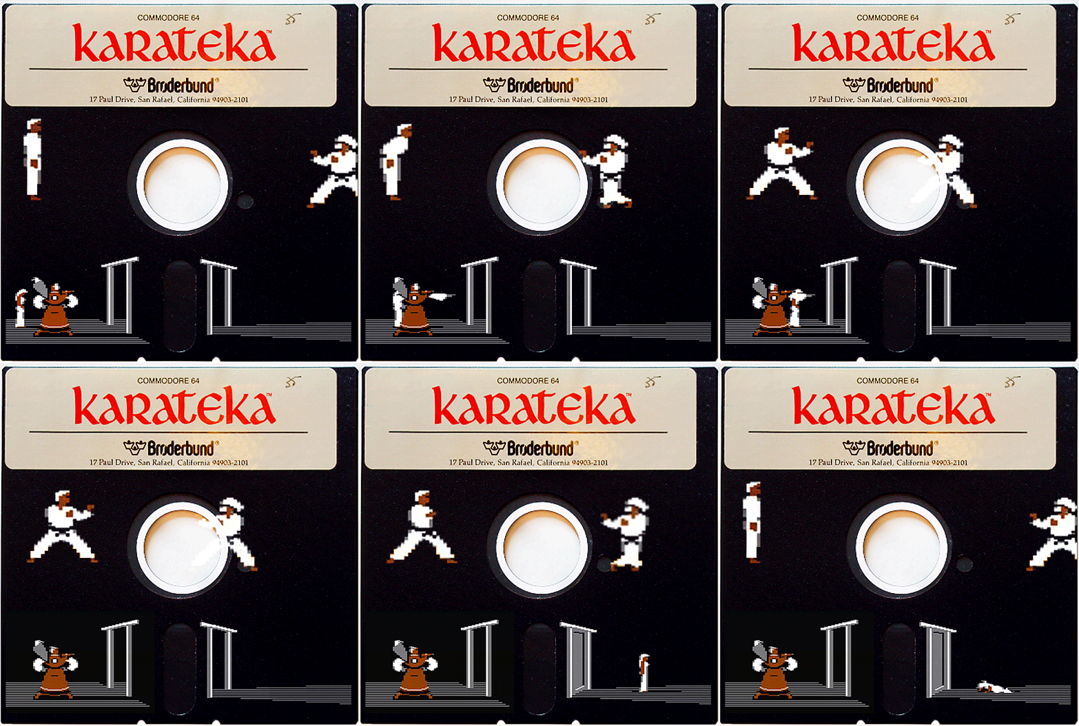
Karateka – Animated Floppy GIF

If there is one videogame I’m certain that I spent a few hundred hours playing, it’s definitely Karateka on the Commodore 64. Karateka a simple fighter game, which like most games of that time was really hard to complete, as there was no option to ‘save’ and pick up where you left off. The game gives quite an extensive narrative introduction, defining the role of your quest, including this text which rolled in the beginning with this music:

High atop a craggy cliff, guarded by an army of fierce warriors, stands the fortress of the evil warlord Akuma. Deep in the darkest dungeon of the castle, Akuma gloats over his lovely captive, the Princess Mariko.

You are one trained in the way of karate: a Karateka. Alone and unarmed, you must defeat Akuma and rescue the beautiful Mariko.

Put fear and self-concern behind you. Focus your will on your objective, accepting death as a possibility. This is the way of the Karateka.

This kind of narrative foundation was fairly unusual at the time of Dig Dug and Donkey Kong, and even more compelling to me was the minimalist aesthetic that went into Karateka.

The bottom half of the animated GIF shows Princess Mariko being locked up by Akuma. The color palette is restricted to black, white, gray, and the tan of Akuma’s costume. Also, the game was effectively ‘letter-boxed’ into a more cinematic wide-screen format.

So this is not exactly an remixed game cover, but it is in the spirit of that particular assignment. I wanted to give homage to the media of the day, the floppy disk, which allowed me to participate in my first bit of software piracy.

It was common to have dozens of boot-leg games copied to 5 1/4″ floppy disks. Back in the 80s you could rent videogames on floppy disk from video stores, and the only piece of copy protection was a little piece of aluminum foil sticker. It was a bit of craftsman’s work to remove and replace it without leaving behind a hint of your deviant copying behavior.

To create this particular animated GIF, I used this lovely scanned copy of the original C64 Karateka floppy. And to make the animation of the characters, I used an emulator of the C64 for Mac OS X called Power64 and then loaded up a Karateka ROM. The whole culture around rebuilding games from scratch and creating emulators is quite remarkable actually – there’s some real amazing geek efforts to preserve game history.

Once I loaded the game, I used Quicktime to do a screen capture of the intro and some game play. These movies were then opened in Photoshop to do work on the frame-by-frame animation in multiple layers. More to describe about that another time.

Guess that Single

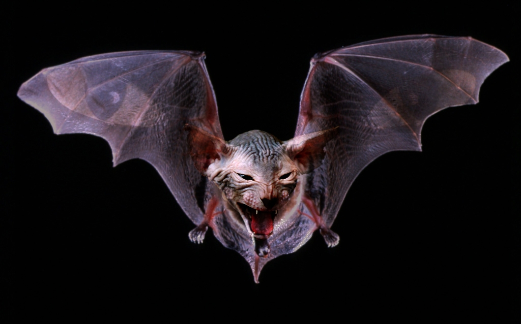
SO can you Guess The single? Ill give you a Hint its By a band called Mogwai. The process for making this is fairly simple, finding 3 images and combining them through using the quick select tool in Photoshop and magic wand tool to select the parts I wanted and attaching them to the rest. along with setting the opacity to a lower level for the cat eyes and and using layering effects such as multiply. to allow for translucency and setting up a Chanel mixer layer to adjust color.

Expression of Myself (through others)


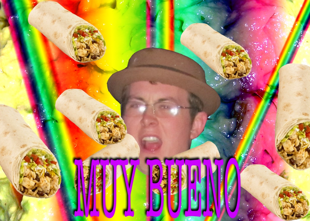
With this Assignment The point was to Express yourself in an Image but I decided to mix it up a bit and express my Friend Tanner in an Image. Tanner is From San Diego California and enjoys all things Mexicano. We have a burrito club here in Japan for our Hunger for burritos and must consume at least 1 a week. Also Tanner makees his own special Guacomole so the background is some good ol’ Guac. This picture is indeed Muy Bueno! (Very good for those of you who don’t speak the Espanol.)

Week 5: Busy Little Gergy

Yes, a busy little Gerg am I.  I’ve got some more Daily Creates and some more Design Assignments, just like I promised.  I’m a man of my word.  You’re anxious, I can tell.  So let’s get started.

Daily Create 30 – The Place of Losing

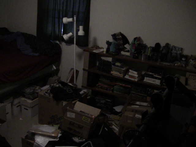
I should have posted this one a while ago, but, to be perfectly honest, I forgot I even took this picture.  The assignment was to take a picture of a place you lose things in your house.

IMG_0107

Lots of books.  Comic boxes.  Sword rack.  Stitch, wearing a leopard-print santa hat.  Zim’s house.  Boondock Saints flask.  Statue of Silent Bob.  Animatronic hamster that sings “Kung-Fu Fighting”.  Yup, this must be my bedroom.  Hard to imagine losing stuff in there; it seems to organized.

Daily Create 42 – The Job

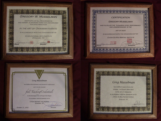
Take a picture that represents a current or former job.  Gladly.  Having recently resigned from my soul-crushing call center job, I turn my attention to a much more fulfilling (albeit less lucrative) job:

Certificates

I’m pretty impressive on paper.


Design Assignments!

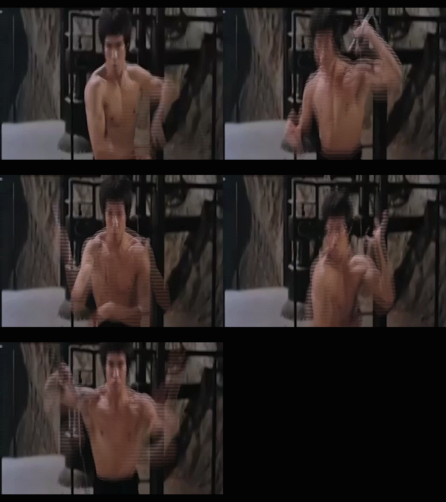
Pop Culture Gif;

Photobucket

This was the easiest.  Downloaded the clip from youtube using keepvid, then trimed it down with Roxio Creator and plugged the result into Adobe Media Encoder and bingo! Gif.  (Adobe CS5.1 makes my life so much easier)


Messing with the MacGuffin

DaVinciMacGuffinThis was a bit slapdash, honestly.  It may be hard to read.  After opening titles, we have Tom Hanks, as Robert Langdon, running toward the crime scene, noting a message in blood.  Then, the message by the body reads “It’s downstairs.”  Finally, Langdon kneels by the pyramid at the Louvre under which the Holy Grail is burried, noting “That was easier than I thought.”

Is that it?  I think that’s it, for the time being.

“What’s Inside of You?”

I had fun with this assignment, however, I found myself regretting the program I used to create it as I tried to save it in a format that would allow me to open it in this post. I used Microsoft Powerpoint to create my poster detailing what’s “inside of me”. I found it interesting to… Continue reading →

hoedown throwdown

This image was actually taken in disney world by myself. My post card was inspired by The Hannah Montana Movie. I can honestly say that I HAVE seen this movie. I watched it with my sister when it first came out. I wrote the post card from Tennessee because that is where the movie takes place. I also wrote it from a child’s point of view. I did all of the editing, pasting, etc in paint artist!

name that tune

The third image is a representation of images that go with popular songs. The background image is one of my all time favorite songs, Firework by the beautiful Katy Perry. The domino represents, top charts hit, Domino by Jessie J, and the flower is an Iris, by the goo goo dolls. I actually used photoshop for this process so I could cut, lasso, edit and color the images in order for them to look real!

Novel in disguise

The second design is an alternate book cover to Nikki Grimes’ novel, Bronx Masquerade. The actual novel is about a class of mixed race, ethnicity and gender during the time of the Harlem Renaissance. The students create poems about their lifestyles and come to realizations that they have more in common with one another than they thought. When I hear masquerade, I immediately think masks, gowns, costumes, the whole nine yards. The book cover I went for certainly has more of the masquerade ball effect. I did all of the editing to this image in paint artist as well.