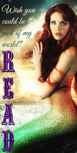
Enter “A Whole New World” … READ!

So, going along with what seems to be the theme of heroic princesses (see last week’s BRAVE-themed music vide0), I created a READ poster as required by the Design Assignment worth three-and-a-half stars.

I obtained a whimsical photo of my doppleganger Holland Roden, in which she was awesomely edited into a real-life Ariel by Tumblr user “Bluemethy”. I then took to PicMonkey once again to work some Disney-esque magic by editing away!

Reading is Magic

Also, can we take a moment so I can just say how inspired I am by this DeLovely Ames dame, by the way?! And trust me, I am not one who is easily impressed. But, no matter how much she might disagree, I see a lot of her in me, most especially her astounding awesomeness. I mean, just look at this tweet (I have no idea what this “Super Mario” that she speaks of might be, but I like the way she thinks)!

Create a Read Poster

This assignment (3 and 1/2 points) was creating my own READ poster. I used my noir character, John Brown as a model of this poster.

create a reading poster


It was kind of odd choice of doing this assignment, because that I described him that he does not like reading any books. However, his job is a lawyer, so he had to read many books when he was studying, he could not just run away from it. So, he made his mind that if he could not evade from reading, he would just enjoy it. This is what I put “Reading, if it is unavoidable, enjoy it”. With this mind, he was able to graduate from Law School with reading many books. However, he still does not like reading. He does not have favorite books or favorite quotes to remember. He just reads whenever he needs it for his job.

Design Assignment: Create a READ Poster (3pts).- Sebastian Crane poster

6314c3ca47c8104f9aab8f7d842944b2a

This READ poster is made with a photo of Sebastian Crane (Scott Eastwood) as he would sit in a study and read. Since he works with the newspaper, he must be actively reading and this photo can represent that part of his job. As Editor-in-Chief, he must be well-read and this is why he chooses to read on his free-time to hone his reading and critical thinking skills as well as writing. When he is alone at night, he enjoys reading a few chapters of a book to help him fall asleep and so that he is constantly practicing being a critical reader.

Making an acronym for READ seemed simple enough to do for this design. I chose “re imagine” since literature can bring forth new ideas that reshape the world you see. “Explore” because literature can contain places, stories, and emotions that we have never been to or experienced before; literature can allow us to explore something new and unknown to us. “Awaken” since new ideas will awaken or arise when reading literature that makes you think internally about strange and unfamiliar ideas; ideas you never really thought about before reading that piece of literature. The last word I chose was “dream” because literature can take us to any point in time, place, etc. and it is like being in a dream: somewhere we picture in our minds and grow attached to.

It is important to have these kinds of posters because reading does enlighten us in various ways. With advertising these posters, it is wise to show well-known faces so that viewers can see that even people they revere read as well and that reading is universal.

Creating a READ Poster

Dystopian literature reading memes

READ DUMMY!

Read

http://assignments.ds106.us/assignments/create-a-read-poster/

Alright here is my take on a READ poster. I created this with powerpoint like all of my other pictures. If the picture is of lesser quality, it is because I resized it. The process of creating this was fairly simple as usual.

On the other hand,

The inspiration for this is more of a story. I originally wanted to find a picture of Brother Mouzone (my favorite character now) reading. However, I did not find a picture of him with a book after searching for about thirty minutes, I stumbled upon this picture. Where Lester was seated looking at this device and everyone else had a strange look on their face. When I realized that the person did not necessarily need to be reading a book, I had my picture!

The second part of my inspiration came from the Boondocks comic strips. The whole phrase, “READ DUMMY!” was inspired by Huey Freeman and his campaign to get more people to read. It generally came with him yelling that at someone and throwing a newspaper or article at the person he was yelling at. I figured this would be perfect for Lester, since he is the one sitting at the laptop (as I called it).

Let me know what you think!

:)

“Go ahead…”

So for this assignment, I decided to use a photo of Stringer Bell.  He is shown in SO MANY episodes reading or with a book somewhere around him, so I figured it would be pretty easy to find an image of him to use.  The image I decided to use was one that was borrowed from “The Guardian” (article here).  I believe Stringer is at someone’s court appearance in this shot.


The actual creation for this was fairly simple.  I saved the image from the site and simply added some text using Sketchbook for Mac.  While doing this assignment, I was thinking about reading the book that spawned “The Wire”, Homicide: A Year On the Killing Streets (you can buy it here, if you wish).  I think that will probably be awhile though, since I have no time for reading this semester.


Screen Shot 2014-10-05 at 5.33.39 PM

I said.. READ!

I always tell my friends, “You always can replace your friends, but you can’t replace your family.” It’s true. I mean I love my friends. I treat them as my brothers and sisters. So for this assignment, I was surprised of this one. I was like thinking what am I going to do and be creative how will it be attracting the audience. I saw some good ones especially Syd’s one. I was like

72499-minion-WHAT-gif-Imgur-02n6inventionsthatrockedtheworld


But hey you know like I said before, no one is perfect. Just do what you do best and see what the result is. So here’s the picture I did for this assignment:

isaidread


I remembered this scene well. Prez’s father-in-law comes at him telling him to go with him back since he’s fed up how they are working and not catching Sobotka right away. Then his father-in-law kept putting his finger at him like he kept poking him. Prez had enough and hit him. So this particular scene made me think for this assignment.

I know that at the part when it shows like above Prez’s father-in-law pokes Prez to move, I had to screenshot this and make it a JPEG to use for this assignment. That’s when I imported it to GIMP 2 and added text from Tools to put that.

Prez says READ

It was so difficult to find someone actually reading! Now everything is high tech, no need for paper! I ended up just finding a picture online. I decided to do Prez because I think his character is so underrated. The show often focuses on McNulty or Herc and Carver as the “heroes.” Prez is always in the background. He deserves a lot more credit than he is given. In Season 2 Episode 10, the whole opening scene is of him rearranging the board to make it easier to read. He is the mastermind behind many of the wire taps and tracking. I think he is perfect for a Read Poster because he is probably one of the most intelligent characters on the show.

Prez Says READ

Create a READ poster

This week I am doing a bit of a “Harry Potter” theme. I really liked this assignment because I am a huge supporter of reading and Libraries. I like the idea of having a campaign that uses celebrities and other famous people to promote reading. This is a smart thing to do because children always look up to celebrities.

The official campaign was from the American Library Association (ALA). They sought out celebrities to represent reading. There were a wide variety of celebrities who had done the camping. The whole process is lengthy which makes me appreciate the effort that went into the campaign. First they had to contact celebrities’ handlers, ask the celebrities to do the shoot, and contact a design company to make the poster.

Most of the posters were fairly simple. Most of them just had a slogan. I chose to keep it simple with my poster as well. I used an online design program for my poster.

For me, choosing Hermione was perfect because a young girl I looked up to immensely. She was such a powerful and strong character, which is a perfect role model for young girls. I played with this design for about 45 minutes before I settled on this design:

Screen Shot 2014-10-03 at 11.01.36 PM

It is pretty simple but I think it bring a strong message across. The campaign went on from 1985-2010. It makes me pretty sad that it did not continue on. I feel like this was a good way to incorporate design and advertising to teach people about reading.

My personal design I used techniques such as typography, balance, and minimalism. I chose to place the type down in a straight line down. I think that it made it look more poster-like.

Over the past week I have been observing posters to figure common themes. A lot of posters bring their text down vertically. I balanced out the design on both sides. I like more symmetrical designs.

Minimalism is used in the poster through my design concept of less is more. I wanted to make this design simple. I think that it made it more solid to be simplistic.

Assignment:

Screen Shot 2014-10-03 at 11.33.40 PM

Read… it won’t kill you

I don’t know how you can watch Brother Mouzone and not want to make a READ poster. I know I’m not the first one to do it. But since I’m all about the GIFs, I had to animate it. I was going to use a different shot, but I thought that one was too obvious. Then I remembered that little hand-off with his helper Lamar, gun for books, and decided to work with that.

Vignelli mentioned the Golden Rectangle in his Canon. There’s something about the height/width ratio that’s naturally harmonious. So from the Wikipedia page about it, I found an image of a Fibonacci spiral for the proportions.

I felt like putting a border around the poster, so I did an image search for poster borders and found the Gwenzula Wanted Poster Supessoups Deviantart HD Wallpapers and downloaded it.

I put everything together in Photoshop. I rotated the spiral and the border 90 degrees and adjusted the pixel dimensions of both so they had the same height. I pasted the spiral on the border, and then scaled the border layer so it was the same width as the spiral. That gave me my Golden Rectangle. I changed the layer blending so you can sort of see some of the spiral. Then I put in my type. I used Garamond, a classic old style typeface known for its readability, and used the eyedropper tool to choose the type colors from the border. That gives a bit of color harmony to it.

The next trick was to get the GIF in there. I knew I wanted to paste the poster as the top layer of the GIF, but I had to get the pixel dimensions right first. I copied one of the frames from the GIF and pasted it on the poster, and it was way too small. The GIF was 640×480, so I made the width of the poster 700 pixels and pasted again, and that seemed okay. I went to the GIF and used the Image->Canvas Size function to make the size match the dimensions of the poster, then I pasted the poster as the top layer in the GIF. This covered up the GIF, so I changed the layer blending mode to Darken. Because the white of the poster background is lighter than the scene, the scene shows through. I tried to tweak it a little to bring the scene down just a little bit, but I couldn’t get that to work across all the frames of the animation, so I left it centered.

Was it worth it? I don’t know. It’s all in the game though.