This week I chose to do the Design Assignment A Wolf in Sheep’s Clothing. I decided to do this assignment because the concept was interesting and sounded challenging. I love designing and creating logos so getting the chance to mesh two opposing company’s logos together was right uo my alley.
Coming up with two companies to use was challenging. I thought about shoe companies, fast food companies, and even computer companies. I eventually thought about car companies and loved that idea so I rolled with it. I ended top using Ferrari and Lamborghini as my two companies because in reality, one company is the result if a guy leaving and starting the other one.
In order to design the cross-logo, I used my trusty iPad and loaded up Procreate, a design app. I inserted the logo badge of Ferrari on the first layer and inserted the Lamborghini logo on top of it. I then proceeded to use the eraser tool to erase everything around the Lamborghini Bull so it would be the only thing left of its logo. After some resizing and precise erasing, the bull was positioned exactly where I wanted it, on top of the Ferrari logo badge.
I loved this assignment because it gave me the opportunity to see a new type of Italian sports car company that would only exist in a parallel universe to our own. My Procreate skills were put to the test on this assignment and I believe it made me much better at using the app in the future.
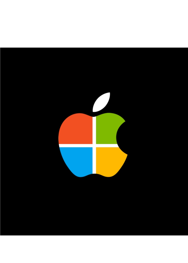
For this assignment I was tasked with combining two rival companies logos. I’m a fan of Microsoft and I’m against almost anything Apple makes so I thought it’d be a good idea to mash the two logos together. It makes Apples logo look a little better.
? In touch with the ground UPS I’m on the hunt down I’m after you FedEx Smell like I sound I’m lost in a crowd And I’m hungry like the wolf ?
Duran ‘Melody’ Duran
I have been hungry like the wolf waiting for the right time to parody that song! My last design assignment was A Wolf In Sheeps Clothing, which tasked designers to:
“Imagine your favorite company whether it be food, clothing, or any other company. Now imagine their enemy or competitor in the business. Your goal for this assignment is to take your favorite company’s trademark image or logo and reinterpret it in a way that reflects the design of its enemy. Look for the elements that make the competitor’s logo what it is. What is the color scheme? Is there any metaphors or hidden meanings? What is the form of the logo? How can you use its balance, proportion, or rhythm? The important thing is to still have the original company’s message and essence within the new design, but masked by the competitor’s look.”
For this design challenge, I decided to use my favorite logo example, FedEx! Why FedEx? Because whomever design the FedEx logo thought carefully about the message that they wanted to convey.
FedEx
Color scheme:
The FedEx color scheme is Purple and Orange. But why those colors? As it turns out, our brains tend to associate certain feelings with certain colors, and designers know this. The purple is a soothing color that conveys sophistication and high quality products. The contrasting orange is an energetic color. These colors together mean: we’re going to get this package to you fast, but we aren’t going to compromise on quality. (Fun Fact: the orange in “Ex” used to designate ‘express,’ while a red “Ex” designated ‘freight.’ The colors were a way of separating individual businesses within the company. But the Purple/Orange combo has become so widely recognized, that the company decided to use it for all FedEx sectors).
Form and Hidden Meanings:
The other great thing about the FedEx logo is in the way that it uses negative space to convey hidden meaning. Take another look at “Ex,” but look at the white space instead. It’s an arrow! Once you see it, you can’t un-see it. The logo designer for FedEx came up with a way to convey expediency by using the letters ‘E’ and ‘X’ to form an arrow. Taken a step further, you can even see that the ‘d’ creates a dot of white space, which makes it look like the arrow is going from point A to some point B really quickly. Our eyes naturally flow from left to right when viewing this logo, and our brains unconsciously think, “hey, that FedEx is pretty fast! I’ll use them to send my package.”
So what about FedEx’s arch-nemesis, UPS?
UPS
Color scheme:
The UPS color scheme is brown and a dark yellow. Where FedEx wanted customers to think of speedy, high quality products, UPS wanted customers to associate their company with reliability, security, and confidence. UPS developed the phrase, “What can brown do for you?” as a play on their brown logo. Seeing that sturdy brown color gives customers a sense of dependability. When we see this logo, we unconsciously think, “hey, that UPS is pretty reliable! I can feel safe knowing that my package will arrive at it’s destination.”
Form and Hidden Meaning:
The UPS logo is actually a shield if you look closely at it (or not closely, the shape is pretty shield-like). But, what you probably didn’t know was that UPS has had 4 iterations of it’s logo throughout the years! (Fun Fact). The first version of the logo was designed in 1916 and was of an eagle carrying a package across a bronze shield with the words, “Swift, safe and sure” as their slogan. In the second version (1937) the eagle was scrapped (aw) and the letters “UPS” were stamped across the shield. The slogan changed to “The Delivery System for Stores of Quality” to reflect their growing customer base. The third logo was designed by the famous Paul Rand in ’61. This version was a simple black and white design of a string-tied package over the shield with the letters “UPS.” (Extra Fun Fact: Paul Rand was so confident about his design, that when UPS asked if he had other design options, he said, “That’s it”). The latest version is just the 2003 version without a gradient and is the brown shield that we all know and love. This current version reflects the company’s newest slogan (“What can brown do for you”)?
Now to combine the two logos! FedEx is clearly more clever in their design, so I decided to make them the wolf in sheep’s (UPS’s) clothing. I brought the two logos in to Illustrator and did an image trace so that I could delete the “UPS” letters in the UPS logo and the background on the FedEx logo. I placed FedEx on top of the UPS shield and changed the colors to the UPS yellow. I couldn’t make all of FedEx yellow though, since “Ex” had to be separate yet connected to “Fed” for the logo to work and the FedEx orange felt too out of place with the UPS colors. Making it white though fit right in! I had my wolf.
FedEx hiding in UPS clothing:
FedEx really does look like it’s lurking where it doesn’t belong. This assignment plays tricks on your brain. We normally notice color first, so my first instinct is that this is the UPS logo that I’m looking at. We are so conditioned to recognize brands via shape and color that we may not even notice that something is up with UPS! But I see you there, FedEx! Hungry for mail like the corporate wolf.
This assignment I did was called A Wolf In Sheeps Clothing where you must pick your favorite company and recreate their logo with their competitor’s logo design. For this assignment, I chose to do Apple because that is my one of my favorite companies. Therefore, that meant that I had to recreate their logo with Samsung’s logo design. However, this was not too difficult since Samsung’s logo is quite basic and simple. To do all of this, I typed out “APPLE” using Word, with a blue outline in a font that I researched to be one of the closest to Samsung’s logo font, but not exact. Then, after doing that, I created a blue oval, sent that to the backs and aligned the text properly in front of the oval as according to Samsung’s logo design. Overall, I enjoyed getting to play around with text, shapes, and so on. Take a look at my new logo for Apple below.
This 4.5 star design assignment piqued my interest by the interesting logo that was designed; it combined McDonald’s and Burger King. I immediately wanted to do this assignment because of the cultural relevance of the project, and because creative thinking is required. I love Starbucks and sometimes go to Dunkin’ Donuts, but I am biased towards the more trendy (and expensive) Starbucks.
Once I decided to tackle this assignment I knew I wanted to do a really well known company and it’s slightly lesser counterpart (in my eyes), kind of like the McDonald’s and Burger King example. I chose Starbucks and Dunkin’ Donuts because in high school people chose either one or the other, so it was a fresh debate in my mind. I also love coffee. I wanted to try my hand at integrating designs, especially with logos. Vignelli’s booklet really connected to this assignment because it gave me tips about design and balance. It also gave specific logo suggestions, like not changing classic and engrained logos. I somewhat challenged this notion by altering the classic logo just a little. I chose to keep Starbucks as the overall logo because I figured it was more universally recognizable. Here’s how I did it!
I first Googled the Starbucks logo, and started with this image.
I then decided to use Powerpoint because I had tools in mind that I knew that application had. I started with a blank Powerpoint slide and imported the original Starbucks logo. The first editing step was to insert > basic shapes > donut onto the slide. When the donut is selected, alter the color to match the green logo. I did this by trial and error until I got to a color that was close to the original green.
Next, insert > textbox >wordart and type Dunkin’ into the box. While that box is selected go to effects > transform > arch up to make the text curve.
Then insert another textbox and write Donuts, but this time choose arch down. Next, insert > shapes > stars & banners > 5 point star to add the stars back to the logo. Color the star white, then copy and paste that star onto the other side of the circle.
Then, go to insert > shapes > basic shapes > oval and click and drag to make a circle around the mermaid.
While the circle is selected, click the paint bucket and choose no fill.
Keeping the circle selected, click the pencil and choose white as the color of the outline. Then select line weight and choose a thick option that fits best.
After this step the editing is done. Make sure to save as a JPEG or PNG file so that it will save as one image.
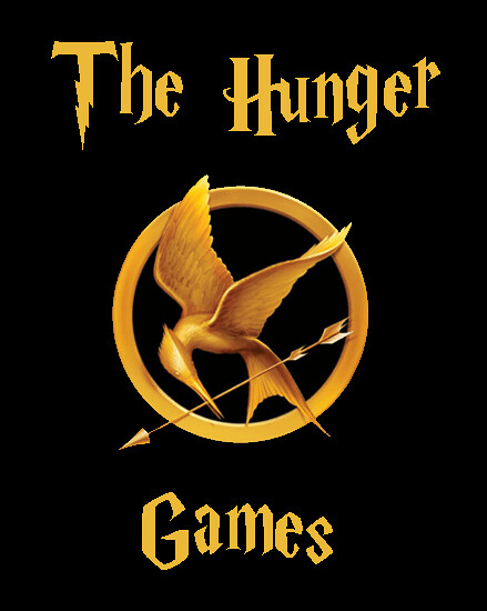
For this assignment, I redesigned the Hunger Games logo to reflect the design of the Harry Potter logo. I chose these two books because they both have a very large fan base. Here’s what I made:
This assignment calls for choosing a company and reinterpreting it’s logo in a way such that it reflects its competitor.
Link to Assignment: http://assignments.ds106.us/assignments/a-wolf-in-sheeps-clothing/
Stars: 4
Process: The first rival companies to come to mind are Adidas and Nike. I began by taking the logo of each company off of Google Images and placing them into Photoshop. After searching around for the Adidas font, I subsequently realized I can’t access it or any very close lookalikes. This being the case, I stripped the word adidas from their logo, replaced it with Nike, and chose a font of my own (Verdana Bold).
The first assignment I did was the “A Wolf in Sheeps Clothing” assignment. My task was to take a logo of a company and redesign it representing the company’s rival. Thus, I chose to do the Jayhawk representing K-State. I chose the Jayhawk because I’m evil and like to create controversy. Link to assignment:
The colors actually turned out different than how I saw them on Adobe Illustrator. When I made it, the blue you see was the K-State purple. Recoloring the Jayhawk was the difficult of the assignment. The normal Jayhawk uses 3 colors, and I only had two to work with.
Triple Rocktroll Lyrics
Continuing with the theme of being a troll, I went with the assignment that told me to make a very confusing picture. I took a photo of Dave Grohl, lyrics by the Beatles, and Mick Jagger’s name and put all of it on a picture. Confusion ensues. Link to assignment:
The only challenge here was to find the right place to put the text. I chose a color that I took from the picture for the text. I experimented with making the quote one line above Dave, but ended up going with what you see above.
Can You See What I See
For my last assigment, I decided to do some work with Photoshop, since it is not my forte. My Photoshop skills are something I need to work on. This assignment had me take a picture of an eye, and make it so there was something reflecting in the eye. Sounded easy, turned out to be difficult for me. Link to assignment:
I consider this assignment to be a failure. What I mean is that I hold myself to a higher standard than what you see above. I think I accomplish the main idea of the assignment, but I think the picture lacks realism. It might look like something is really reflecting in the eye if you take a quick glance at it, but anything past a glance reveals that it is just edited in Photoshop. I think my problem is that there a lot of depth to the eyeball, but almost no depth to the picture of the fireworks. Perhaps I could have warped the picture of the fireworks more to match the depth and curvature of the eye.
I picked this assignment because I happen to be a waitress and the diner that I work at happens to only sell Pepsi products. Don’t get me wrong, Pepsi isn’t bad or anything. But, I definitely prefer my beloved Diet Coke to Diet Pepsi. It’s nothing personal, it’s just preference. It really comes down to the difference in the taste of sweeteners, but I digress.
To make this logo, I went to dafont.com and found a Coca-Cola copycat font and downloaded it. I went into GIMP made myself a new image, typed out my new logo and painted the whole thing ruby red. Easy as pie. But, do you know what goes great with pie? Coca-cola.
Anyways, the Coca-Cola/Pepsi debate is nothing new. I can’t tell you how many times people come in and order a Coke product and I have to say: “Is Pepsi okay?” Sometimes the customer is cool about it and I’ve even had people say, “Even better!” However, the most common response I get is “ohh…” and then they change their drink order. It’s kinda sad but the Pepsi business is alive and thriving so I know there is plenty of happy customers. I just don’t happen to be a Pepsi girl.
This assignment was interesting because I got to use dafont and browse their endless supply of fonts. I want them all. I’m such a sucker for a good font. I just wish I was as talented as the graphic designers and calligraphist who actually make them. *Sigh*
I found this assignment to be fairly easy. First, I went to Google and searched Nike and Adidas logos. I saved the Nike logo to my desktop and opened up the paint application. I copied the Adidas logo onto the same document and combined the two logos together by cropping. I believe that Nike and Adidas are two great sporting goods companies who compete with one another so it was only right to combine the two together!