A Two-for-One Special!

Everyone loves a bargain, right? Well I do too, and that’s exactly what I got with this assignment! Not only does it complete a Daily Create, but it is also an assignment, worth 3 stars! Lucky me, yippee!

Today’s Daily Create:

Combine two of your most favorite store logos and put them together, make them look cohesive.

A Wolf in Sheep’s Clothing Assignment:

Imagine your favorite company whether it be food, clothing, or any other company. Now imagine their enemy or competitor in the business. Your goal for this assignment is to take your favorite company’s trademark image or logo and reinterpret it in a way that reflects the design of its enemy. Look for the elements that make the competitor’s logo what it is.

What better “feud” than between a place that loads up the toppings and serves 5-pound burritos, and a place that wants to seem like a healthier choice, with soups and sandwiches? I think we’ve got some restaurant-ception going on here!


Chipotle - Panera


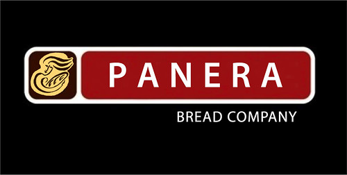
In order to create this image, I found both Panera and Chipotle’s logos in a Google image search. I then saved the images to my computer and opened them in Photoshop.  I then painted over the Chipotle lettering, and replaced it with the Panera lettering in a similar font.  The logo was a bit more tedious. I had to erase all of the white space that was around the Panera image, so it would look like it belonged.  It wasn’t that difficult, because I’ve worked with Photoshop before, but it was detail-oriented, because it involved a lot of zooming in, and small clicks with the eraser..

What’s Really in Your Burrito?…

A Wolf In Sheeps Clothing – (3 Stars)

Everyone seems to rave about how great Chipotle is. And its much healthier than Taco Bell…right? But what if Chipotle was really run by Taco Bell, just so they can create that illusion. Mind Blowing isn’t?

chipotle_logo

To create this logo, I had to get original copy of the logo of Chipotle. I had first clear out the word Chipotle. Then I had to paint the background with the same red color. Once that was done, I created the Taco Bell font with the same white color and paste into the logo. The reason changed this logo because I love Taco Bell, but I also enjoy Chipotle. So I found assignment particularly interesting…

Taco Bell as a Chipotle Logo

A Wolf in Sheeps Clothing

WOTgUlzlThis assignment, earning 3 stars, which takes my total now up to 13/15 stars, so one more 2 star assignment will finish this section. For this, I had to combine two major companies logos, both enemies, so I chose Nike and Adidas, which are two HUGE sports companies. I simply replaced Adidas’ logo with the Nike tick logo, to do this I used Photo Shop and just brushed out the adidas logo with black and placed the Nike one over the top. This one was cool too, it made me think for a while in which two companies I could actually use.

DesignAssignments, DesignAssignments1445 A Wolf in Sheeps Clothing

A Wolf in Sheep’s Clothing  (3 stars) ( DesignAssignments, DesignAssignments1445 )

In this assignment, Omar wanted to mess wit yo head by designing a pack of Newports dressed in a Marlboro box.  Pretty tricky yo.  Ain’t nobody gonna get one over on Omar.  You gotta problem wit dat you better speak yo mind.

Take over Melinda…

I will finish this post for Omar.  I helped Omar design a Newport box that would mess with your head by being designed like a Marlboro box.  I will be writing up a tutorial to describe this assignment in full.  I saved two images from the internet, one a Newport box, and one a Marlboro box.  I then went to the website Pizap.com and altered the image to create the new box.

Good Job Omar.  It was his first time on a computer!

Here is Omar displaying his work:

https://www.flickr.com/groups/2764673@N23/

Here is the image:

Newport in Marlboro


Newport in Marlboro  A little clearer image from my Computer


Tutorial For My Design Assignment

This assignment is a little harder than it appears, but certainly not overly so. Once you having your two competing companies it would benefit you to take notes on the design aspects of the enemy of your favorite company. For there your going to want to use a photo editing software such as Photoshop to edit the original enough to mimic the design elements of the competitor’s logo.  Changing color, shapes, amounts of space, and topography are very important tools for you in this task.

Here’s an example:

imagesJOFY02P9

In this example the McDonalds logo is changed to mimic the Burger King logo. You can see the color scheme is changed to match the yellow, blue, and red Burger King is famous for. It also retains the space in the sandwich bun (yellow space) as used in the original Burger King logo. Finally the topography of the McDonalds namesake is edited to resemble the round bold print used by Burger King.

Its all about changing the original while keeping the original message. However, don’t just put the old company’s name on the new design. You want to mimic the rivals elements but in a new fresh, yet recognizable way.

A Wolf in Sheeps Clothing

Imagine your favorite company whether it be food, clothing, or any other company. Now imagine their enemy or competitor in the business. Your goal for this assignment is to take your favorite company’s trademark image or logo and reinterpret it in a way that reflects the design of its enemy. Look for the elements that make the competitor’s logo what it is. What is the color scheme? Is there any methphors or hidden meanings? What is the form of the logo? How can you use its balance, porportion, or rhythm? The important thing is to still have the original company’s message and essence within the new design, but masked by the competitor’s look.