Menu and Valentine’s Placeholder

Here is my menu so far, scroll down for an original spin. Decided I would start off by listing my favorite foods: https://docs.google.com/document/d/1z3_9rcDU8jqq4_AGPnykK08ZH_ojOyCTdwayj3apGBM/edit?usp=sharing

Excited to edit this in the near future!

Planning on making some meme Valentine’s and 80s ones, too.

Be My Valentine?

For my last design assignment from the assignment bank I chose to create a valentines day card. I chose to do this with a twist including our class theme of the 80’s. For this assignment I used Canva since I already had some previous experience using it. I selected a template that already existed, deleted some words and effects that I didn’t want, and added in my own picture and text. I decided to use my 80’s theme and make the valentine of Cyndi Lauper saying “I love you a Lauper” on it. This design showed me the detail needed to achieve a solid piece of work. I think the blue and pink represent valentines day well and communicate the message of the card.

Love that is Strong & Fierce

Happy Belated Valentine’s Day

The bank assignment from Valentine’s Card to create a card that has a cool effect and someone would get a kick out of it.

I uploaded a picture of jaws and used PS Express to edit to change the color and add the sparkles to it since it’s a Valentine’s Day card. I also edited the vignetti and made it darker. The font is white and bold to fit the image.

The point behind the picture is that it’s from an 80’s film of Jaws III. It was a fun project, I will send to my husband, who will get a kick of it. Enjoy!

Sharknado Love

Time to poke fun at Sharknado. My friends and I used to watch these movies to get a good laugh so why not continue to laugh at them.

Happy Late Valentines Day?

Who says you can’t celebrate valentines day a week late? We could all spread a little more love right?

For my final design assignment of the week I decided to finish up with an assignment called valentine. This was a four star assignment bringing me to a total of the necessary 12. My other two previous assignments were four and half stars and three and a half stars. Any who this project asked that individuals create their very own valentines day cards. It said that you could make your card as sentimental or as funny as you wanted. Upon reading this I definitely wanted to make my card funny, everyone could use a good laugh. However the more I thought about it I decided to make my card a combination of funny and sentimental. Ultimately I relied on using quality love puns.

Like all of my design assignments I used canva again. At this point you all are probably tired of me gushing over how awesome it is. But it really is awesome. While I have definitely utilized their templates I also however like how you have the ability to change any and everything in regards to what you’re creating. This ranges from colors, fonts, sizes, backgrounds, graphics, images, etc. I think the best part about it is that I really relied on graphics for this particular assignment and canva gives you the ability to utilize thousands of graphics that are completely free.

My valentines card is honestly kind of cheesy but I think thats what makes it so great. By being corny it helped add to the funny factor I was seeking to achieve. The past two assignments I participated in were a bit more serious and involved the character I created for this class. When it came to this assignment I just wanted to have fun with it and work aimlessly.

The main colors I chose to use were duh valentines day colors. I relied on red and mainly pink to convey a since of love and that overall valentines day feel. From there I began brainstorming and looking up different puns regarding love. I enjoyed reading them so much I figured it ultimately would make for a cute card if it was covered in funny love puns. I mean who wouldn’t want that. So from there I looked up the graphics I wanted on canva and placed them on my card strategically, adding their pun as followed. I certainly focused on proportion and space when it came to creating this master piece. I felt if I over did it with the puns the card would turn out clustered and messy. When it comes to design it’s all about creating that aesthetically pleasing feel. That was the goal I kept in mind when I worked on all of my assignments and particularly this one.

We always here the statement “less is more”, this is something I keep in mind when doing numerous projects or when contemplating design. Sometimes the simplicity in something can tell a greater story than one thinks. Don’t get me wrong sometimes chaos is the answer, but ultimately it’s finding the balance and what works for that particular project or story you’re working on. Design holds more power than we think.

Be My Valentine?

Hello everyone! My last assignment for this week was to create my own Valentine’s Day card. I was tasked with making an image and modifying it with a cool effect. I was especially supposed to be *funny* and *witty*. This assignment really jumped out to me because Valentine’s Day just passed and I wanted to rediscover my self-loathing for being single (ahh fun times). Moreover, being me, I decided that ïmãg?š âr? ?ámè and that videos are ~cooler~.

Below is what I came up with.


Behind the Process

To start off this assignment, I somewhat storyboarded what I wanted to happen in my video. And by storyboard, I mean wrote a list of clips or objects that would be cool to include. The list looked a little like this:

  1. You’ve Got Mail
  2. Transmission Received
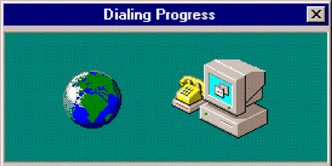
  3. Dialing Progress video
  4. Card opening up
  5. Explosion then the 1010101 thingo show up
  6. “Thank you for surviving the apocalypse. I wish you a happy Valentine’s day.”
  7. Love, cypherpunk106
  8. Card close
  9. Some running script shit
  10. Transmission done

Whenever I make videos, I usually have a rough list like this and follow it partially. When I am actually down in the trenches, cranking out the video some of my ideas will change as I am inspired by myself.

So with these ideas in mind, I dove deep into the interweb and downloaded a whole heaping of videos and audio. I also translated the text of the card into binary or the 101010 thingo. I used this handy dandy tool to do that because weirdly enough *i don’t speak binary*. I then went into Final Cut Pro and worked my magic. Once again my magic involved speed changes, layering, compound clips, crying, angst Strokes music to make me work quicker and some transforming and gif ? mp4 conversions. After suffering in Final Cut Pro, I exported my video and uploaded it to Twitter.

One difficult thing about this assignment was using the square canvas (1080 x 1080). I consistently struggled to make sure my videos fit the square and filled the space properly. I ended up exporting my video like five times because a few of my videos were a few pixels short of the edge. To be honest, I think I didn’t fix all of them so there may be some videos in the final product that aren’t stretched to the canvas. This is something I want to improve because if I was more careful and checked to see if the video was stretched I could have had an even better video.  

Something I learned in this assignment was how to keyframe the Opacity of a title in Final Cut Pro. I honestly did not even think to adjust the Opacity in Final Cut Pro before this assignment. So, this video prompted me to look into it and find the tool. Not only did I find the tool, but I learned that you can indeed keyframe with it. NOICE.

source

The part of this assignment I found easy was downloading the videos and audio. I just have a knack for finding things and then converting them into the file type I need. Moreover, I think that this knack led into my skill for adding cool filters. Specifically, I think that my addition of the Low Tech Audio Effect to the Make You a Man Reprise Audio was pretty dope. I also clipped this audio and reversed it to add to the backwards effect of the final sequence. Overall, I think that these video and audio techniques I used were something I did well.

I really liked this assignment and was able to have fun with it. I really like how I mixed up this assignment and made it my own. If I had a choice, I would do this assignment again. Next time I would be even goofier and maybe even a little more sarcastic.

Well folks, that is it for now. I’ll catch you on the flipside.

Featured Image

My Funny Valentine

For my third design assignment, I picked the “Valentine” assignment. It tasked me with designing a Valentine, preferably a funny one. I liked the sound of this, because it reminded me of the types of creative projects I loved to do as a kid.

Here’s my valentine:

Valentine

I made in in Canva (unsurprisingly). I brainstormed for a little bit on how to make it funny. I considered redesigning one of my favorite humorous valentines, but ultimately I decided I wanted to do something more personal. I came up with the rhyme as a nod to how ridiculous my boyfriend’s sleeping patterns are. He’s effectively nocturnal (he works nights), whereas I have a very regular sleep schedule, so sometimes spending time together means shirking our circadian rhythms. The color scheme is based on my favorite colors, keeping with the personal theme.

It was a lot of fun to make. We’ll see if my boyfriend likes it as much as I do.

An Unusual Valentine

The Valentine design assignment asks us to

Create you very own Valentines Day cards. Go ahead and make a funny spoof valentine that would make people laugh! Use at least one image and modify it in some way to create a cool effect. Afterwards, go ahead and send that baby out to people who would get a kick out of it. You can be sentimental if you want to, but funny cards are prefered!

Untitled document (70)

To make it, I followed the process.

Untitled document (85)
I started off with a random image I had on my computer, which I pasted into a Drawing in a document on Google Drive. For more details on this process, reference my other posts: its really not that complicated!
Untitled document (86)
Then I clicked on the textbox option, which lets you draw a textbox wherever you want with editable text.
Untitled document (87)
I drew the textbox by dragging the cursor to expand the textbox. To move it around afterward, just select it by clicking on it, and then drag the textbox until its in the desired position.

Untitled document (88)

Untitled document (89)
Click on “More” while the textbox is selected, and it gives you the text editing options.

Happy Late Valentine’s Day

To continue along with my design assignments this week, I selected to do another 4 star assignment called valentine. This makes for a total of 8 design stars out of 10. This assignment tells you to make a valentine card of your choice. It could be funny or sentimental. I wanted it to be funny. I heard this quote yesterday so I decided to make it into a card. I did this all through paint. I first painted the background pink and then free-handed the dinosaur. Finally I added the text to the right side of the picture. Hope you like my late valentine! I think it turned out great! I would have given it to my boyfriend yesterday!

valentine

El Jota

One assignment I did this week is focused on my new husband (of course). I wanted to make him a Valentine’s Day Card since we weren’t married on Valentine’s and I love the holiday. I also just wanted to show how much I love him! Hope this doesn’t make anyone jealous…

Screen Shot 2015-03-15 at 2.38.13 PM

http://assignments.ds106.us/assignments/valentine/
Worth: 3 stars
Completed with the help of http://www.faceinhole.com/v2/home.asp and Adobe Photoshop.