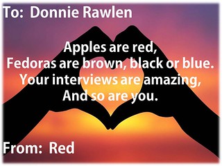
This is unfinished, but it’s a start.
Design
Listening to the course lecture on design, it was interesting to hear how much simplicity and directness plays into design, with the ability to connect or send a message being tantamount as opposed to being flowery or rich, which risks being overly obtuse. Using symbols, metaphors – things that are recognizable – aren’t necessarily the things I think about when it comes to design, and yet it makes perfect sense – tapping into people’s cultural, personal and psychological sensitivities and memories to help the designer communicate. Ira Glass’ encouragement to keep practicing was also interesting. It opened my mind to think of art and writing as more of a discipline. Although I write for a living, I typically think of it as separate from my creative work. But in this case, I suppose I can take the same mental approach to both – keep working on it, keep fine-tuning it and the work will get better.
Design Safari
Typography – I believe this ad demonstrates the juxtaposition between various types of fonts. The Disney logo is prominently displayed at the top, but the biggest headlines isn’t about anything in particular – it just says to Embrace Vacation memories in a magical type of font. The year is prominent, I suppose so you know it’s a limited time offer.But the main points get through – and your eye is drawn across several different points by differing fonts.

Color – This Trix box is full of color. Not only does it underscore the excitement the rabbit is obviously feeling for the cereal, it also shows the colors of the cereal and uses different colors for each letter in the word Frutier so your eye will be drawn there. (Maybe having a form of the word “fruit” helps convince parents to buy it?). Anyway, there’s not one bland color on this box outside of the rabbit – the name of the cereal is green to stand out from the red and the text of the tag line is in colors that match the picture of the cereal itself. This is a bold use of color that is meant to grab kids’ eyes and make them go nuts.

Rhythm/Form & Function – This is a picture of the bar upstairs at the oldest bar in America – the White House Tavern in Rhode Island. While I looked at it, I definitely got a strong sense of texture and felt there was rhythm in the way the slats echoed the backs of the chairs and how everything seemed to be very vertical (out of necessity because it’s a small space). But as my friends and I tried to guess at why the bars were on those swing-down doors in the first place, I get a sense of the form and function. We assume they are there to keep people from reaching in and grabbing drinks whenever they’d like. But the doors were clearly made in such a way as to continue the design of the chairs and mesh with the feel of the space.

Balance – this is a beautiful example of balance – the way the symbols ring the outside of the disc and are perfectly proportioned and spaced out so as to give the entire image a sense of symmetry. Although the figure in the center is not perfectly symmetrical, the fact that he is placed in the center and touches no edge provides the sense of balance.

All of these pictures were uploaded to Flickr, and after screwing around for a while, I figured out where the share link was and linked them all to the Found Examples document in the DS106 page.
Design Assignments

This one is called Valentine. This might be my favorite creation so far. I started thinking Valentine’s Day and of course, it turns to the physical. Of course I mean kisses! Hence, Gene Simmons with a pop art effect from Picadilo. Three stars. Unploaded to Flickr – DesignAssignments1619.

This one is called Advertising using a Cartoon Character. I enjoyed this one as well. I discovered that I couldn’t combine two images into one using Picadilo. Therefore, I used Microsoft paint to put the two images together, then saved that as one JPEG, re-opened it in Picadilo and raised the temperature and hue on the ascots to get them as close to Fred’s orange. (They were originally dark blue so this is as close as I could get). Put in the text, and there ya go. Using both programs definitely added to my flexibility. Three stars. Uploaded to Flickr – DesignAssignments1538
Wait – Where’d that guy come from? – three stars – DesignAssignment149
Professor Groom Poster – 4 1/2 stars – DesignAssignment1413
One Story/Four Icons


Designing posters (3 stars)
Summary
This unit has helped me see how deliberate design is meant to bring my attention to certain things – to increase beauty in the man-made world. Also, it’s given me more of an opportunity to see design as it occurs naturally.


