Here is the actual assignment.
Enrepreneur.com states that no one should work more than 80 hours in two weeks. One reason for this is that the quality of the produced work will suffer due to worker exhaustion.

You might think that working beyond normal hours would only slightly reduce the quality of production. This is not often the case as detrimental contributions become more common after-hours, a net-negative result compared to one who did not overwork.

You may wonder then why someone might overwork someone? There are several possibilities:
- To establish a ‘culture of fear’. If it is unusual for someone to question the amount of work that is required each week, then it is less likely that someone will go about addressing the issue. This allows the person to avoid problems that are affecting others, all while remaining dominant and in control.
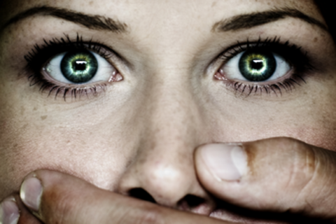
- To hide one’s inner-fears. This is the usual reason behind overworking. When someone has unresolved conflict within him/herself, and knows not how to express it, that person will often lay that burden on others. What’s worst is, the fear created stifles others from assisting to resolve the person’s inner-fears.

- Because of a general lack of empathy. If the person in control does not feel comfortable talking with the team about business problems, then there is little hope for those problems to be resolved. Also, if the person in control can’t take feedback, or does not advocate feedback, then there is a low likelihood that people can enact change in the corporate culture.

I made a T shirt to represent the above ideas:
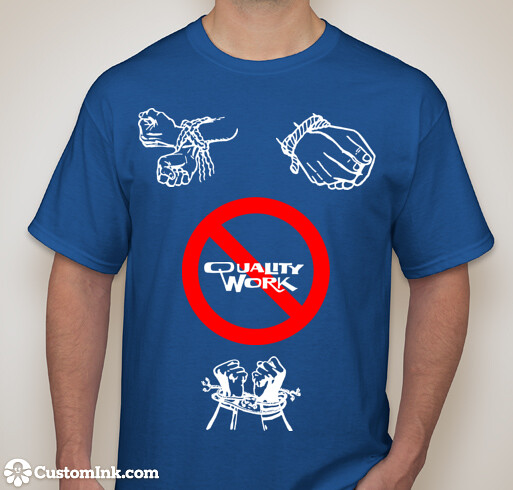
The tied up wrists represents the inability to act against the company culture. The crossed out “quality work” represents the idea that high-quality work cannot be created when operating within a culture of fear. The blue represents the potential for freedom & change.
Process
To create the T-shirt, I used customink. The site allows you to provide a base color, add art/text, and rearrange components in order to craft a one-of-a-kind design.
To keep to design week, I kept in mind the spacing between the symbols. This spacing allows for the eyes to circle around the symbols of bondage, all while realizing the result of the bondage will be low quality work (centered to stand out).
Also, in terms of color, I chose to use only 3: white, red, and blue. The blue and white are rather calm to the eyes, while the red in the center contrasts sharply. This draws attention to the core idea expressed by the shirt, that low quality work will be produced when operating under a culture of fear.


 Here is my creation: