Contradiction Creation

This was the third assignment that I chose to do. This was another one that was relatively easy to do in Photoshop. First I chose a background, in this case it was a peaceful beach. Then I simply used the text tool to place text on top of the background. The design around this assignment was to create a stark contrast between the two things. The first was the background. I picked a beach which most people have fond memories of. The image has cool and calming colors in it which help add to the calming nature of it. Then I put some text on top of it which completely contradicts the background. In this instance, I chose “You have so much work to do” (which is completely true!). The worry of having work to do and the stress it adds contradicts the calming nature of the beach.

Contradictions

This is a picture I took while driving through Charlottesville and I think it’s beautiful. I love nature and spending time outside because there’s a reminder that there’s more to life than the computer your on and the phone sitting next to you. One thing I find frustrating is when people want to get on the internet instead of enjoying the beauty this world has to offer. Asking for the wifi password in the mountains sounded like a good contradiction to me.

This is for the Contradiction Creation assignment.

A Beautiful Day at Sea

I love contradictions.

Having survived a number of heavy rolls at sea I always found it funny when my land lubber friends would wish me smooth sailing as I would depart for another 9 month deployment at sea.

DesignAssignments DesignAssignments 2075

Cheers mean their upset: Contradiction Creation

This picture is at the Nationals baseball game. As you can tell the crowd is very excited over something happening, but thought I’d change it up a bit and make the text saying otherwise. I’m a big Washington Nationals fan and found this picture of mascot Teddy jumping up and down, thought it’d be comedic to say that everyone is upset, when that is clearly not the case.

In the eye of the storm. Wait, wrong weather metaphor

It’s been a wild year. I think a lot of people would agree. Sometimes there’s so much going on it’s like being caught in a tornado of unending crappiness, and all the debris keeps hitting you in the face and saying, “you thought that was the worst it could get? Look at THIS!” Smack! I’d definitely say the past year has been rough. Maybe the past two years. Who knows when it started? We’re all stuck in this crapnado now!

There are some things that are sort of nice though, when you stop to look around. I saw a cardinal on my front porch today, and there’s a new swath of honeysuckle growing along the fence. The very chubby black and white cat that stopped coming around our house after our own cat’s passing has started coming by again and sunning himself on the wooden bridge that crosses over our creek. I got to see a lot of my family two weeks ago, despite some rather unfortunate circumstances! It almost feels like..

design3

I chose to take the Contradiction Creation assignment in this direction because sometimes I feel like it’s easy for me to come up with a negative thought to slap onto a nice photo. I think a tornado best encapsulates the feeling I get from checking the news or talking to people about anything other than silly things. It’s just overwhelming, terrifying, and it can change at the drop of a hat. I remember as a kid, I would be watching cartoons and the audio on the TV would cut out for a few seconds to play that loud, unforgettable BEEP! BEEP! BEEP! and there would be a red ticker at the bottom of the screen telling me which counties were affected by the tornado warning. I would bag up my stuffed animals and hide in the basement. That’s what I feel like doing sometimes, but I just gotta remember… some things actually seem pretty okay.

For this assignment, I started by searching for images of tornadoes on flickr through Creative Commons. The final image above is an edited version of “nssl0054” by NOAA Photo Library and is licensed under CC BY 2.0. The gallery below details the steps I took to create my version of the image. This is all done in Paint.net, and the colors chosen for the text and details were provided by DeGraeve’s Color Palette Generator.


Need a Little Motivation?


Archives

This one was fun. I had to find an image that conveys a feeling and then create a quote that conveys the complete opposite. Then I had to combine them.

To begin with, I couldn’t really decide which way I wanted to go. I ended up just google imaging until I found a picture I liked. Then came the hard, the wording. I decided to take one of my favorite quotes and just reword it a bit. Here is the final product!

Sunny Day

It was such a beautiful day out so I thought I would post a picture that expressed this. I hope this gives everyone motivation throughout the day! This blog post was inspired by a motivational quote.

http://assignments.ds106.us/assignments/contradiction-creation/

“Insert Quote Here”

This assignment was to create our own contradiction creation. The directions were to have a background and a quote that differ in meaning.

Lets go where the wifi is weak

Here is my creation. Today everyone lives off of their phone and mobile devices. These people treat their devices like life support, withering away into non existence when the plug is pulled. In the background is a photo of Tokyo, a city driven by technology, performance, and innovation. The slogan above is often found on outdoorsy tumblr posts about exploration and going outside. These people are found in the ‘wild’ their Eno, hanging from trees all along campus, and drive a Jeep because it’s rugged and utilitarian, believing it can take them anywhere. As long as anywhere is to their local Starbucks and strip mall parking lot. In this photo, two worlds collide. A life in the city, where the connection between each device is parasitic to each person connected, and the adventurous and outdoorsy crowd, going on hikes and adventures but still somehow live tweeting every step up the mountain.

Canva is my new favorite tool. Everything it offers is so simple, so easy, my dog could probably learn how to work it (she’s pretty smart).  There wasn’t much to do other than finding a photo and quote and using the header tool to insert text. White was the easiest and most visible color choice for text.

Contradiction Creation

For the Contradiction Creation, I decided to find a negative picture and put positive text over it instead of the other way around. The quote is by Bob Ross, and is probably one of his most famous quotes about positivity, so I wanted to match it with “happy” and positive typography. I had to actually choose an image that showed a funny accident.

Lol

BLEH.jpg

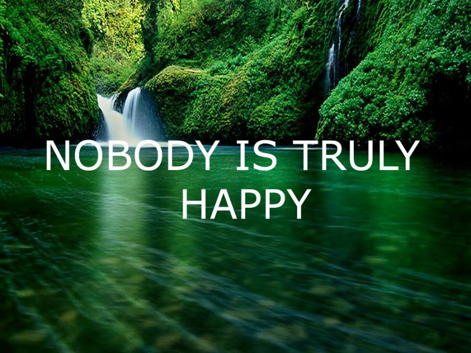
So for this I just searched “peaceful pictures” and saved that to my laptop.  Then I opened pixlr and added a text box and just changed the color and position of my letters. It was funny to try and think of something awful and gloomy to put on this when it’s such a great picture, but I can respect the concept lol.

-Tay