Inside the Man Cave: The Autobiography

Original assignment(2 Stars)

ManCave

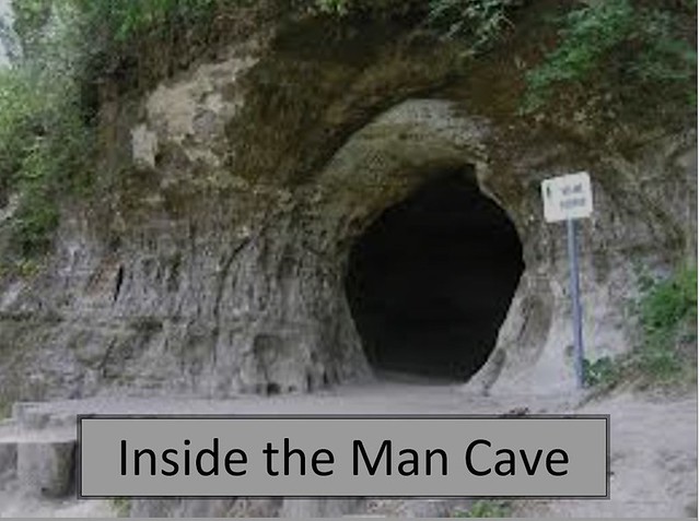
If I had a cover to my autobiography it would be this. This design is a picture of a cave entrance. Before college I was always an introvert and shy. I didn’t go out of my way to meet many people. If I was talking to someone it was probably through the headset from my Xbox. The past four years I have spent outside trying to meet more people. So this photo cover would represent the first 18 chapters of my life. I would need a different cover to the last four chapters of my autobiography.

I created this photo using Microsoft Word and Snipping Tool. I uploaded the photo to Microsoft Word. I inserted a text box and typed in “Inside the Man Cave”. I used the Snipping Tool to crop the photo a created a .jpg file. I then uploaded the file to Flickr.

I’m usually open about my past. I don’t have high school friends anymore. I stopped talking to most a couple years ago. When I came to the University of Mary Washington I was expecting to pick up where I left off in high school. That all lasted until I rushed a fraternity which lead to huge changes in my daily life.


A Curious Child by Isabelle Franklin

Screen Shot 2015-02-14 at 8.19.07 PM

One of the design assignments I chose to do for this week was for my character, Isabelle Franklin. I chose to do the Autobiography Cover design assignment for 2 stars. I used a picture I actually took for my photo safari assignment of my friend, Kelly, working in the lab. I really liked the angle I used and thought I could incorporate it into Isabelle Franklin’s autobiography cover. I tried to keep the fonts fairly simple and minimalistic. The title is A Curious Child because the autobiography is focused on her childhood- growing up and moving to the United States and how her desire for knowledge developed. I debated including her personal motto but eventually decided to add it to add another layer of interest to the cover. I originally tried to place it on the sleeve of Kelly’s lab coat but upon being unable to format it the way I wanted, I chose to put it between the goggles and the glassware as if Kelly is looking through the quote and focused on the ideas behind what she’s trying to do. I found the placement of this quote to be quite powerful while not distracting from the overall cover.

SupraCharged: My Story

I just did a quick cover for an idea of what I would have for a cover on my autobiography. If I had one, but I’m not that cool. Yet. Anyways, it get’s the general point across without making you read too much and gives you an idea of who I am.

DESIGN MEGAPOST!

This week we had to do 15 stars worth of design assignments. This is what I meant by the hardest part of my week. I always thought I knew how to use Photoshop but I guess I was very, very mistaken. I used Photoshop because it is and extremely common program so it’s easier to [...]

The Utterly Dark and Endless Turmoil of Mynheer Noir

For this assignment I designed the cover for what would be my autobiography cover. I always thought of my life as a dark comedy and feel this cover perfectly represents that shadowy humor I hold so dear.

My Autobiography Cover (2 stars)

For this assignment, we had to create our Autobiography cover page using any software we wanted. This was worth 2 stars and here it is….

I chose the picture I took when I was at the Semain Mountains in Ethiopia because A. it was something I will never repeat. B. The scenery was sooo beautiful that it felt unrealistic and finally, even though society tells you to live a certain way …doesn’t mean you can’t create your own reality. Thus, my title would be …My Reality.

My Autobiography Cover

For this assignment, I tried to reflect on myself before I started. I came up with the idea i wanted it to include water, sun, and sand. Then once I got the picture I wanted into pic Monkey, I spruced it up changing some of the contrast and saturation. After just looking at my finished picture for a while the idea for title just came to me and I ran with it.

Design Cover of your autobigraphy


Design Assignment #5

Almost done, here’s the assignment I chose for number 5, worth 2 stars.

autobio

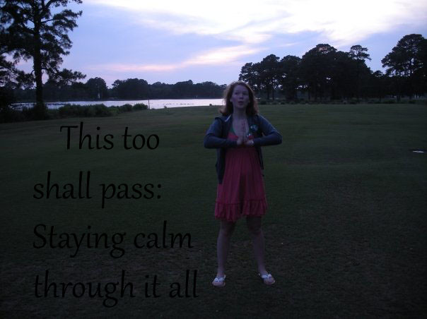
This is probably my favorite of the week. The hardest part was finding an image that had a meaningful message to me. I liked this one the best because I look peaceful and it went with my concept. My mom is always saying to me, ‘this too shall pass’. I have grown to love that quote because it’s a reminder to not sweat the small stuff, or make mountains out of molehills (even though I inevitably do sometimes.) My dad has been absent from my life in recent years, so to me it’s a reminder that it’s his loss, not mine. I have also had things in my life that really stress me out for no reason. That’s where the staying calm through it all comes in! I tend to be slightly dramatic and probably drive people nuts because I have a hard time letting things go. I can keep dredging up the past for days, so in a way this cover also reminds me of my flaws.

Back to the image and design. I found the image, put it into photoshop. I added a text box and chose the font that most looking like my writing. The first time, I went super cliche with “this too shall pass: and other life lessons”. That didn’t really seem to express my individuality as much, so I changed it. Also, I had to kind of move the text around because I couldn’t find a spot for it where it looked readable. I settled on moving it down into the grass part of the picture. This picture was taken on a golf course, which at sunset happen to be the most FUN things around (and if you’ve ever been the Eastern Shore of Virginia, you’d understand that there’s not much else to  do at night). Speaking of the ESVA, it’s my hometown and I lived there until I was 11. So the image also is a homage to my past.

2 Stars: The Tragic Tale of Mr. Wine

Tragic Tale of Mr. Wine

It was early morning on June 6, 1991 when the tragedy of Nathaniel Francis Wine began.

For this assignment, and to kick of design week, I chose to do the assignment “Design a Cover of your Autobiography.”  It was a fairly easy assignment: just choose a picture that you think summarizes who you are.  Naturally, I think who I am somehow involves being crushed beneath the wheel of a moving vehicle.  This was a photo I took back just before I graduated high school in 2009.

I chose to desaturize the color in GIMP because I felt it added a rustic feel to the image, as if I really had passed on and this was my surviving autobiography.  Then I came up with the title and made sure that the white text would stand out against the gray background so that the reader could actually, you know, read it.

2/15 Stars down.

All Things Must Change

A design assignment I really liked was Design the Cover of Your Autobiography

“Design the cover of your autobiography. What pictures would you include? What would you title it? “

My autobiography would be titled “All Things Must Change” and the cover picture is a photo of changing leaves in the fall that I found through the creative commons site. I like that the photo is focused in front and blurry in the back, which to me symbolizes not knowing what’s coming next.

My autobiography would be a story of change. In the past few years my life has completely changed in ways I did and didn’t expect, and I know more change is coming this year after graduation. Life is always changing, and my story would be about recognizing opportunities and challenges are usually temporary in the grand scheme of things, and making the most of both while you can.

I realize this explanation is a little cryptic, if I actually wrote the book it would be more clear, but that’s the jest of my theory on life.

I made the cover by uploading the photo to Picasa and adding text. I choose a  simple font as to not take away from the photo and made it green to be visible, but cohesive.