Minimalist Scotland


Can you guess what TV show this is based off of???

It’s one of my favorite books too!

I created this image on gimp its not as good as I would have liked but I have a lot of trouble using gimp but I’m slowly learning. I wanted it to be more minimalist and flow better but I know the pattern is too tight and there isn’t really a flow between the color is just blocked. I will try and work it out better for my next minimalist design assignment.

Harry Potter Minimalist Poster

Harry Potter Minimalist Poster

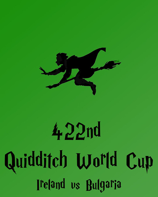
For my last design assignment of the week, I made a minimalist poster  (worth 3 stars) for the 442nd Quidditch World Cup. I used photoshop, and a Harry Potter font to make the poster, as well as editing a picture from a Harry Potter coloring page online, to make it all black, to create the minimalist look. I also played around with adding more to it, like the hoops and some balls, but I think it ended up looking best (and the most like a minimalist poster) with just the player.

FINAL PROJECT: Peytonnnn

Peyton Sawyer from “One Tree Hill” is a character that in the beginning represents the definition of a “stereotype”. Her character is misinterpreted completely and through her confusion within herself she becomes a mystery to everyone. What people think of her…… isn’t who she is ……. What she sees is simply …….. a MYSTERY. This Pinterest site created by Peyton exemplifies who is is, what people actually think, & the mysterious secret that no one knows about her ….that Peyton Sawyer can see EVERYTHING.

Get a little glimpse of Peyton… HERE
(Although DesignAssignment563 suggested a screenshot, I made an entire pinterest instead.)

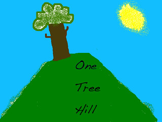
…. Peyton has spent all of her life in a small town where everyone knows everything…. The person that she is today has a lot to do with growing up in Tree Hill. This poster that she made represents the loneliness that she experiences along with the desire to want MORE. One Tree Hill is a mystery within itself…. where are all the other trees? Why does Peyton always feel so alone?
(Inspired by DesignAssignment57 asking for a poster of a tv show location)

One Tree Hill Poster

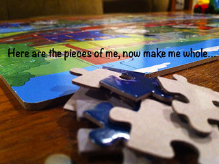
Along with my mysterious town….. I wonder who’ll ever figure me out? I find myself feeling like a puzzle sometimes. A stereotypical high school cheerleader with an awesome boyfriend and a “great” life…. Who am I? Why don’t I know? I see sooooo many weird things on a daily basis, when is it all going to be figured out? I know I ask a lot of questions…. but when I figure out the answers, you’ll be the first to know. – Peyton has always been a form of mystery, to herself and to her surroundings. Her creativity and artwork show her secret cry for help, her cry for attention and to no longer feel alone.
(Inspired by DesignAssignment64 to caption a photo found on the ds106 flickr page)

Mystery?

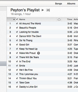
Peyton was always known by her love for music music and her meaningful artwork…Although no one knew what she was feeling at times, her music always seemed to tell some type of story… It was as if she was writing poems to express what she saw, that no one else saw. Or even what she felt… that no one else was aware of. The world around her was always so confusing, but one thing she knew was that she had the support of her father who was always there, since her mother had passed. This iTunes playlist that Peyton created simply shows her hidden feelings in the way her Playlist is organized. It’s almost as if she’s crying our for her help, or thanking her Father for always being there….
(Inspired by VisualAssignment46, to create a poem playlist.)

Peyton's Playlist


One of the amazing things about Peyton … is her ability to talk and express herself, even if she is confused and can’t put everything together. Peyton holds a Podcast (nearly every night) and talks about her day … to the public viewers online. The idea of her being a mystery to herself changes once she posts all of her stuff online and expresses herself as well as seeks for help. Through this podcast the world learns about Peyton Sawyer…. and over time she’s more than mysterious…. she’s finds her place.
(I created a video using clips off of Peyton’s actual podcast from “One Tree Hill” and inserted photos of Peyton and her artwork.)

Visit England!

Minimalist Travel Poster inspired by the film Pride and Prejudice. I love the scenery in the movie. The lighting, the colors, the various shots. Its all so beautiful. So, I tried to replicate it the best I could while keeping it minimalistic. I tried to replicate the colors and the iconic tree in the distance that is often seen in the movie. I created the background myself using Gimp and found an oak tree silhouette on the internet.

3 Stars

Visit Buddy in the North Pole!

This is 3 star design assignment 57, “Minimalist Travel Posters Based in Movies.” The instructions were “Create a minimalistic travel poster for a location in film, TV series, etc.

I decided to create one for the North Pole. I love watching Christmas movies in the winter! Elf was my inspiration for this project. It was kind of hard coming up with a fake place for my poster, but I gave it some thought and decided why not the North Pole! The North Pole always looks like so much fun! I used to want to be an elf that worked in Santa’s workshop. (I was a weird kid, I know.) I used Paint to create this. The grey curvy area is suppose to be the frozen water for ice skating. I did my best to make it as simple as possible.

Limbo

Limbo by wanderthisworld
Limbo, a photo by wanderthisworld on Flickr.

This is a travel poster for Limbo. This project was inspired by the ds106 assignment to create a minimalist travel poster based on a movie. I was initally drawn to this challenge for the travel context, but I was a bit stumped as far as a movie location. All of my favorite movies have such a strong sense of place (India, Australia, Italy, etc…) that there would be little to differentiate it from a standard travel poster. But then I realized that the beauty of Up in the Air is that it has no consistant location, and instead the recurring theme is the idea of living in a state of limbo. So I decided to turn the state of limbo into a literal State of Limbo for this project.

In this movie, the main character, Ryan, spends most of his time flying from city to city to tell people they’re fired from their jobs. He states that the purpose of his work is to, “make limbo tolerable,” which is the line that inspired this poster.

The irony of the movie is that while Ryan has to force employees into the supposedly intolerable state of limbo, he thrives on living in this in-between state. He enjoys living on the road and having nothing to tie him down.

The tagline, “everyone needs a place to call home” comes from a conversation in which Ryan’s brother-in-law is making a case for buying real estate. Ryan shudders at the idea, because to him, living in Limbo is home. Therefore this poster is designed from Ryan’s perspective, to demonstrate the freedom of living in Limbo.

As a traveller, I can certainly relate to this feeling—I feel most alive when I’m on my way to somewhere else. Limbo is an exciting place to be.


Design Assignment: Minimlist Travel Poster

The assignment was to “create a minimalistic travel poster for a location in film, TV series, etc. Look at these awesome examples using the various locations in the original Star Wars trilogy: http://screenrant.com/sr-pick-minimalist-star-wars-travel-posters-robf-44551/”

I (am embarrassed to say this, but) made a few versions this bost (6 variations…) a poster for Narnia.  I used photoshop, of course, and used the Cutout effect quite a bit.   My biggest trouble was dealing with the words.  I found a website that allowed me to use the font, but I had to screen shot what I typed (“Visit Narnia”) to put it onto photoshop.  I did find a cool font, but when I download it, photoshop wouldn’t read it for some reason :(

I think this is my favorite one, as far as being the most minimalistic.  I found an image of the wardrobe from  The Lion, The Witch and the Wardrobe,  and I put it into photoshop, quick mask moded it and put it onto a new canvas.  I used the Cutout tool to get the visual effect. But then I decided that I wanted to try something different…

So I created this one.  I found a picture of Narnia and I cropped out a part of it and put it inside of the wardrobe, and used the Cutout tool again.  Next I found pictures of trees covered in snow, applied the Cutout effect, and placed it in the background.  I wasn’t sure what to do about the wording, as it seemed awkward visually (see photos of trials below).

And these are a bunch of trials that came before the previous ones.  Visually, I think I would prefer no words.  But for the assignment, I thought that might be too ambiguous.


Assignment worth 3 stars.

PHOTO CREDITS:

http://www.publicbroadcasting.net/kunc/news.newsmain?action=article&ARTICLE_ID=1745391

http://www.fonts2u.com/narnia-bll.font

http://flickrhivemind.net/Tags/ucy/Interesting

http://jaguarhero.blogspot.com/2011/11/for-narnia.html

I sure do love me some movies

I’ve done a couple of design assignments this weekend.  There will be a few more to come, but I was pretty excited about these and wanted to post them now.

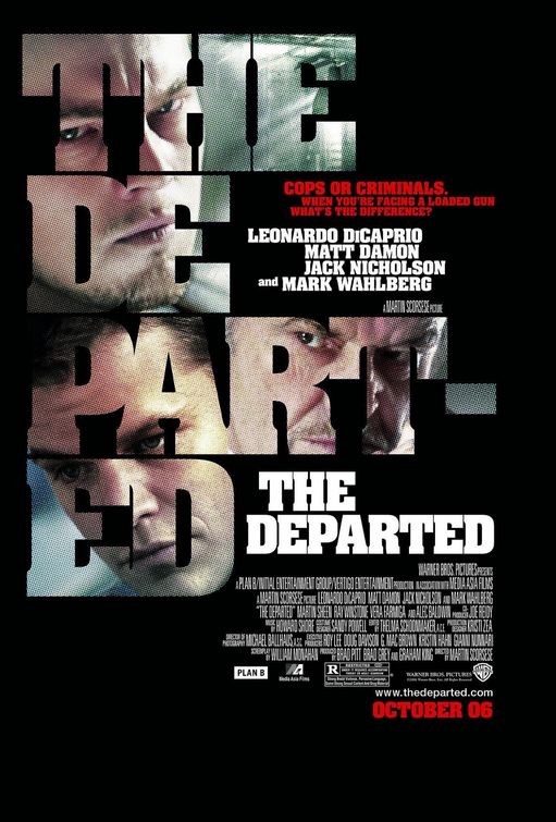
This assignment looked like a lot of fun.  It also seemed somehow familiar.  Long ago, my friends and I renamed “The Departed” with a much more apt title: “Head-Shot: The Movie”.  So I started with this

And ended up with this

Head-shot: The Movie

Not great, but I think it does the job.  By the time I finished, I really wished I had used a different font.  I was unwilling to start over though, because just doing this version took me quite a long time.


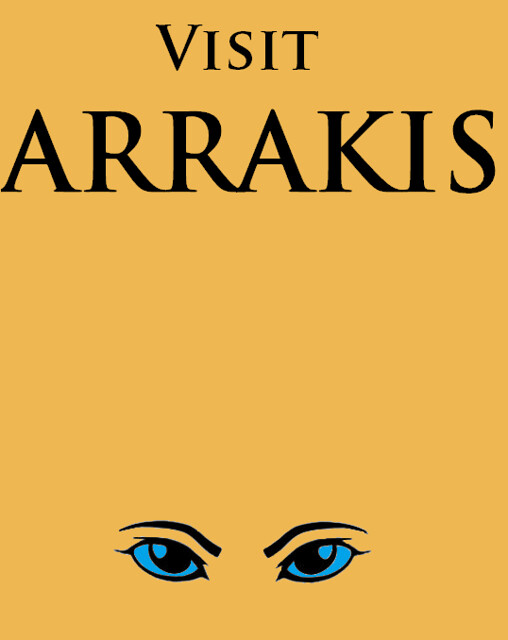
Then there was this one that I honestly chose because it seemed easy enough that I could actually do it. And since I’ve been rereading Dune this week:

Dune travel poster

These were both pretty simple.  I had someone show me some basic photoshop layering for Head-Shot and then had some annoying trial and error adventures.  For the Arrakis travel poster, I just used mspaint.  That one was easy.  Really, simplicity is key.

More design assignments on the way, probably mostly movie related as well.  There will also be more daily creates too.  I know you’re thrilled.

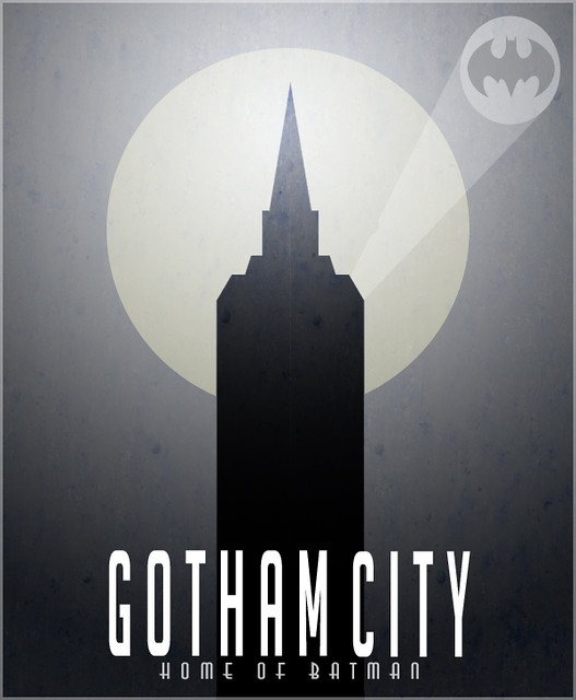
Gotham City – Minimalist Travel Poster + Tutorial

I had to think about this one – which movie location to choose? As I was going through my DVDs I came across The Dark Knight and then thought GOTHAM! It would be an easy one to portray with minimal graphics. So I went on to google gotham city to get some ideas running and the most prominent building I saw was that tower, so I decided I would use the tower in front of a large moon. Well, here’s how it turned out:

Gotham Poster

Using Photoshop CS5 (Tutorial):
To create this I first found a rust background online that would add some texture to the poster. I then applied a gradient layer over the rust layer and turned the opacity of the gradient layer down to make sure the rust would show. That took care of the background of the poster.

I then got the circle shape tool to create the moon and turned the opacity down a bit (again, to have the rust texture show through). Then on top, I created a new layer and I used the polygon lasso tool to outline half of the towers side. I then simply filled the outline I just made with black. I then duplicated that half tower layer and flipped it horizontally and placed it right beside my previous tower layer to create a symmetrical tower. I merged those two half tower layers and turned the opacity down a bit.

For the batman signal, I used the circle tool and then the polygon lasso tool to create the light path. I then applied a batman logo I found online by cropping it out and sizing and positioning it right over the circle.

Finally, I added the text at the bottom, and turned the vertical scale up and the tracking down on the ‘Gotham City’. Then to finish it all off, I created a new layer on top of everything, hit Ctrl+a to select the whole poster, and went to ‘Edit’ > ‘Stroke’ to apply a 3px white stroke and then turned the opacity of the stroke layer down.

6. minimal (ds106 #2)

Since I haven’t really been able to keep up with the Stranger Portraits assignment like I wanted to, I felt I should take the time to at least make a submission for one of the other assignments in stead.

This is one that I had my eye in early one while browsing the ds106 database: the Minimalist Travel Posters Based In Movies. I Had to think a bit about what location I wanted to feature since I watch more reality-based movies than not. In the end I decided to do an ad poster for Yubaba’s bathhouse, from Studio Ghibli’s spectacular Spirited Away.

The Process: I spent on and off about and hour and a half putting this together, haha. Overacheiver. Perfectionist. Geek. Anyway. Though I’ve been using Photoshop for about six years now, I’ve mainly used it for photo editing and simple graphics. I feel like this sort of poster would have been better made in Illustrator – if only I knew how to use it ><. Anyway. I was a bit up in the air about whether the poster should feature onsen imagery or an image of the bathhouse; I decided to go with the bathhouse itself because it's more recognizable. For about a second I played with the idea of sketching it out freehand in PS, but having no tablet and no drawing skills I instead went with finding an image and manipulating it.

The base image is a beautifully sketched drawing by deviantArt user Yuko324. At first I used the Filter > Artistic > Poster Edges option, and then continued to add layers in Mode > Hard Light against a blue background (#C5E2E6, found through ColorLOVERS) to create thicker and simpler lines. Then I used the Filter > Artistic > Cutout option to remove even more details for the minimalist look. Added some Layer > Adjustment Layer > Curves and B/C to up the contrast of the white to remove even more details for minimalism sake. It took a while to get it right – I wanted the bathhouse to be recognizable while still removing as much detail as possible, not to just look like a blob of white, black and grey. Ack it’s been too long since I did anything but photo editing.

Anyway, then I tried to figure out a slogan and text of some sort to go with the image. Having zero creativity in that department, I simply went with having Yubaba’s Bathhouse as the name, and the “get spirited away” as the tagline. Figured an obvious reference to the movie couldn’t hurt too much. I don’t much like the fonts, but since I’m doing this on the school Mac I don’t feel like downloading a bunch of stuff for it (and unfortunately I no longer have PS on my own Macbook ><) Played with the kerning and line height for the text, used a copy in the blue background color and moved it to create a "shadow" for the white text so that it wasn't too harsh.

At first I was just going to leave it in blue and and shades of white for you know, even more minimalism – but it was kind of boring so i decided to color the tree to the right in the poster. For this I turned to ColorLOVERS again and found a beautiful palette bassed on Chihiro (the main character)’s in the beginning of the movie and used two of the colors, era smoke and sen to chihiro, to do the tree.

So yeah, basically. This is the result. I probably spent more time on this than necessary but graphic design is something I always wish I could learn, so I don’t mind spending a lot of time on it. Learning experience. Plus a lot of my time was spent searching up images and scenes from the movie, and browsing for color and other inspiration, which beats most of my other homework by a mile! Makes me wish I’d actually pursued a creative degree…. Anyway.

Get spirited away.