Neo Tokyo

This is my first DS 106 assignment. I chose it so I could  play with the image editor, Gimp. It was a good experience. It can do just about everything Photoshop can. I took an image of the city from the film Akira and adjusted the contrast and saturation to get the warm effect for the central building. I used the wand tool to remove the sky and layered a rising sun image behind the skyline. In the film, Tokyo was reconstructed as a giant artificial island in the middle of Tokyo bay. Hence the term ” city inside the bay.”

picture

Minimlist Travel Posters Based in Movies

_cokwr: Create a minimalistic travel poster for a location in film, TV series, etc. Look at these awesome examples using the various locations in the original Star Wars trilogy: http://screenrant.com/sr-pick-minimalist-star-wars-travel-posters-robf-44551/, _cpzh4: Design, _cre1l: http://cdn.screenrant.com/wp-content/uploads/bespin-cloud-city-travel-poster-570x880.jpg, _chk2m: Jim Groom, _ciyn3: 57, _ckd7g: , _clrrx: , _cztg3:

Experience the “Magic” of the Fire Swamp for Yourself!

You'd love to come visit now, wouldn't you?

It’s a Monday, it was a relatively uneventful weekend for me, but I did manage to create a little bit of ds106 art. The current incarnation of ds106 recently received a large influx of students from Japan last week, and they’ve been blogging, creating art, and accomplishing new assignments at an amazing rate, so I decided to take Michael Branson Smith’s advice to complete one last Visual/Design assignment for this portion of the course.

Behold, the “minimalist travel movie poster” inspired by this assignment for ds106. Alright, in full fairness, it was actually inspired by some artwork from artist Justin Van Genderen, a graphic artist that seems quite fascinated, and masterful, with manipulating iconic images and scenes from pop culture, specifically science fiction cinema. I wanted to do something similar, and pay homage to cult-favorite “The Princess Bride”, turning the treacherous fire swamp into a seemingly attractive tourist destination. I found the assignment incredibly challenging, as I forced myself to try to make this as minimalist as possible, with the end result still lacking in my opinion. I feel as though I didn’t strip down the image enough, and while I cheated and remixed the icon for the fire, and took the little bit of spanish moss from another image, the overall effect just isn’t what I was looking for.

At any rate, the point to this post (if there is one) is that teachers need to PLAY more, and USE less. When we simply “use” tools that have been handed to us either physically or digitally, it can often become quite easy to become critical of their design, without any attachment to the actual creation process behind them. Whether it’s a new digital “whizz bang” interactive on the web, or a graphic organizer that’s been designed to help writers design and formulate better arguments for a persuasive essay, too often teachers can become discouraged with the limited abilities of a learning tool, and write it off as junk, without considering the hours, the research, the creativity, and the expertise needed to put together a working toolkit for instruction. It’s actually one of the reasons I was attracted to ds106 in the first place…..it’s forcing me to explore new tools, and surrounds me with a supportive community, that encourages me to create more.

Case in point, this assignment alone went through 3 major revisions during the creation process, and several of the ds106 people pitched in to comment, inspire, and push me forward. Thanks Jim Groom, Michael Branson Smith, and Dr. Garcia! Oh, and the “magic” of the fire swamp? That it took the courage, fortitude, and teamwork for the protagonists to survive it, much the same way that educators come together to support one another’s creations and endeavors in the classroom.

The Goon Docks

Inspired by Tech Savvy Ed‘s ds106 work-in-progress on twitter for a minimalist travel poster (see assignment here) I decided to try a quick one to keep me sharp. I am absolutely in love with the vintage “See America” travel posters and after seeing the gorgeous blue-tinted cavern poster I got an idea for linking it to the most famous film I know that deals with caves—enjoy.

First minimalist travel poster!

So in case we’ve missed the red flags, I’m a gigantic nerd.

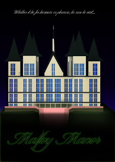
On that subject, my favorite book/movie series is the Harry Potter series. But even though I’m not a fan of the dark side, I made a minimalist travel poster depicting one of the main locations where dark magic tends to take place. First attempt at doing this also made me realize that I need a tablet if I want to draw things. A Magic Mouse is nice, but doesn’t let me draw EXACTLY what I want.

Font: DAFont.com

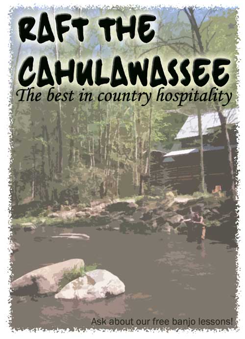
Take a Friendly Trip Down the River

Take a fine trip down south, maybe just a wee bit of adventure. Meet our local friendly folks who just want to say “hi”. You will squeal with excitement.

This is a minimalist travel poster assignment for ds106, though not quite minimal in graphic design, maybe concept?. In photoshop I use the Cutout filter to give it a more graphic look and feel.

Minimlist Travel Posters Based in Japanese Game

This is for Digital storytelling.
I created this based on Persona4 which is Japanese Video Game.
You can see promotion video below ?

This promotion video is also cool!!
I created this picture by Windows Paint.
First, I found some useful image of Persona4, and down load it.
Put some Pictures and texts on the image by Windows paint.
Tada!! DONE!! lol
If you are interested in Persona4, go to Wiki and read what kind of game Persona4 is.

Spend a Night in The Box

Spend a Night in The Box

In the picturesque Everglades, enjoy your getaway in this minimal needs bungalow. Included with every night’s stay, a lovely linen evening shirt, water, bread, and a tin can for your excrement. After a few days rest, you’ll feel refreshed and ready to get back to work with the gang.

Fly With Roy

I’m relaxing in a coffee shop in Golden, Colorado, checking the ds106 streams and missing the creative play. Seeing Jim’s efforts made me wonder if I could whip one together ove lunch.

Since I am traveling, I was thinking maybe one of my photos might be a start point… Then I remembered Dr Garcia’s comment on my sunset photo of Castle Rock and said yeah, that movie.

So I searched flickr via compfight and found this beauty of the scene:


cc licensed ( BY NC ) flickr photo shared by lindsayloveshermac

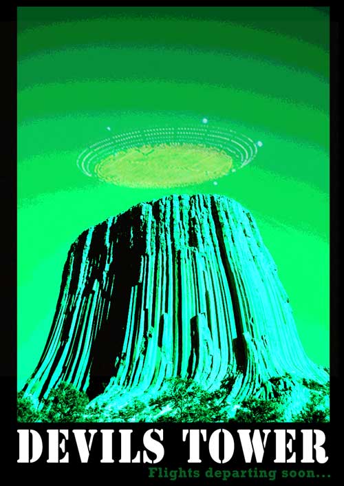
Bringing it into PhotoShop, I looked to colorize it, and under ImageAdjustmentsChannel Mixer I played with sliders to give it a green eerie hue. I then noticed under the same menu HDR Toning, which must be new in CS5. I used the Photorealistic High Contrast setting which gave it a lot more pop. I then gave it the Posterize effect (5 levels, which added that funky banding.

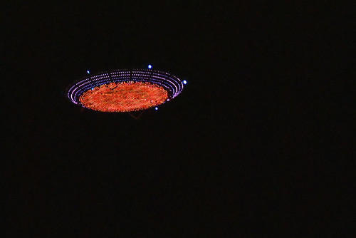
Another compfight search on “flying saucer” got me this photo:


cc licensed ( BY NC SD ) flickr photo shared by Badger DJ

Pasting it over the mountain, and using the Screen blending mode, dropping opacity got the spaceship looking good.

So here is my travel poster, go fly with Roy Neary– and you know what the landing chimes sound like:

Explore Hope

This comes from the not perfect department. I had problems making the background of my minimalist travel poster design assignment cleanly mesh with the text I covered up and the new text I added. The background is not one consistent color, and I couldn’t get a swath big enough to fake it well. I tried playing with the blur tool to no real avail. I would love some advice from folks who know Photoshop how I might make it look better.

The reference in this poster may be a bit obscure, but I couldn’t help but be reminded of Johnny Rambo in the mountains of Hope when I saw the original here. As you can see I simply changed the titles and the context, but this is a work in progress. I’ll hopefully be putting out another, cleaner version soon.