Animated Magazine Cover

Well, this took a lot longer than I expected. I think it’s pretty ok even with the hair bouncing around a bit but that’s because I got lazy. Whoops. My least favorite part of this was my attempt to recreate the clouds in the background. Basically I took the Doctor Who Entertainment Weekly Cover and cut out the still of the Doctor. I had to recreate some of the font (only for it later to be covered up by the gif). Then I took a gif from an episode of Doctor Who and that was that. A little bit more description can be found in the read more section.
What the original looked like:  So I had a fair amount of recreating of the background. I did discover two nifty tools to use in photoshop while working on this: the background eraser tool and the content-aware fill feature.
The background eraser tool shows up in photoshop as a circle with a crosshair in the middle. It then erases all the pixels within the circle that match the one(s) under the cross hair.
The content-aware fill feature looked like it would be useful, especially while trying to recreate the background once I erased the Doctor. It could be useful in other projects but for this one it just didn’t work. The content-aware fill feature is a way to repair damage to a photo, but I think this one was just too big so the result was something like
which made me laugh, then sigh, because I am lazy. I stink at describing this feature, so if you don’t know about it check it out in action in this video tutorial.

GQ’s Newest Man of the Year Abides

It’s bad form, I know, but I can’t stop doing my own awesome assignment for Animating Magazine Covers. Although I blame this one on Paul Bond, whose animated cover of Parenting featuring a heart-to-heart between Jack and Danny Torrance inspired me to go back to this animated GIF by IWDRM and put The Dude on the cover of GQ. I mean let’s face it, he deserves it, man.

What I love about this take on that assignment is it uses pre-exisiting GIFs to culture jam pre-conceived ideas and expectations of a particular magazine’s agenda. And given how many magazines there are, there could potentially be an endless supply of inspiration. I guess the tabloids are next ;)

A shining example of parenting

Inspired by Groom’s animated magazine cover, I decided to try my own. I thought of those creepy Jack Nicholson GIFs from The Shining, and how they really belong on the cover of Parenting magazine.

So I did a search for Shining GIFs to find the right one, then did an image search for Parenting magazine to find a good one to work with. I picked this particular issue for the pixel dimensions. (If you hover over one of the search result thumbnails, you’ll see the size. This one was something like 1600 pixels tall. Most of them were 200-400, which wouldn’t give very good results.) It was a nice bonus that it had an article about tantrums. I tried using Select-Color Range to pull out the type, but wasn’t too happy with the results.

Instead, I used the rectangular selection tool to replace most of Kourtney with the background color from the cover, and then used the paintbrush tool to clear up the parts where her sweater gets behind the type. I duplicated the second “n” to fix the part of the title covered by her hair, and had to do a little more manual work to fix the “e”. It was a little tedious, but not too much.

Then I used Select-Color Range to grab the background color, played with the fuzziness a little, and inverted the selection. A flash of insight told me to change the Image Size of the GIF to match the height of the cover before trying to put the two together.

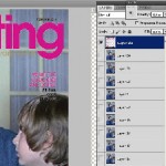
I pasted it in as the top layer, and the animation plays underneath. I didn’t like the way the GIF aligned with the type, so I undid my pasting and cropped off some of the right side to bring Jack’s head more towards the center. Repasted the type layer and cropped the whole image to magazine proportions, then reduced the image size to make the resulting GIF under 1 MB.

Electronic Games Animated Magazine Cover

As soon as Jim created this assignment and seeded it with his terrific Famous Monsters of Filmland animated magazine cover, I knew I had to do it.

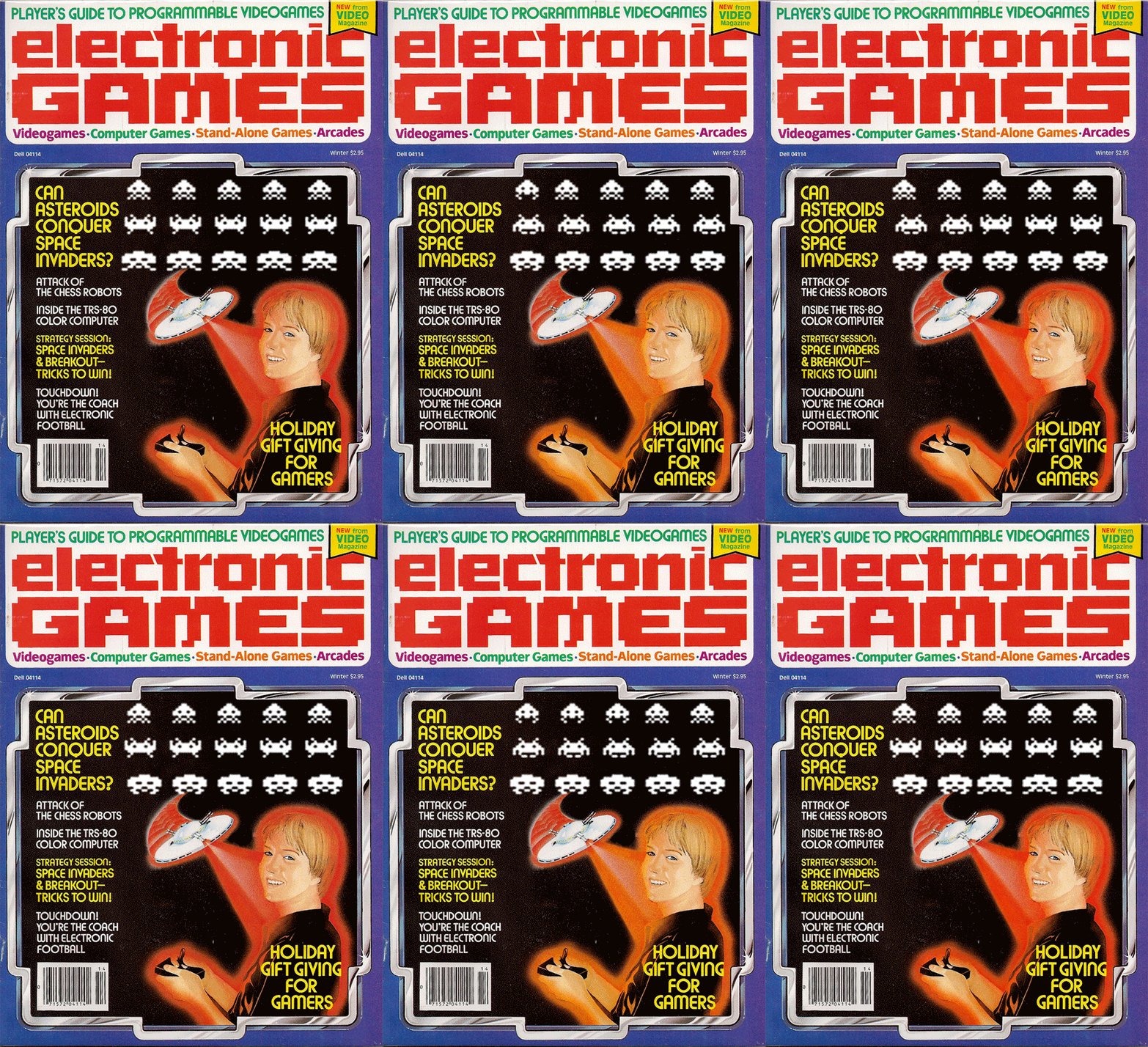
This is cover of the first issue of the fan magazine Electronic Games published in the Winter of 1981. Nightrob has a great set of EG cover art in his Flickr stream if you’d like to see some quintessential 80′s game art.  The moving 8-bit creatures are from the famous game Space Invaders, sadly I was never particularly good at that game but I love the look of the graphics.   Take a listen to some sounds from the original play – I love the old-school oscillators and beeps.

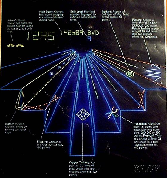
In the era of stand-up arcades, I played occasionally at a roller skating rink called Great American Skate (and yes I did skate too, badly). My favorite stand-up by far was Tempest which had a dial instead of a joystick to rotate a shooter about a variety of almost crystalline spaces. Various geometric objects would attempt to climb toward the exterior of the crystal and you were to shoot them back.

But I spent much more time playing games on the memorable consoles built by Atari, Colecovision, and Intellivision. I played a lot of 8-bit Donkey Kong, Pit Fall, and Pac-Man. But I didn’t really go over the gaming deep end until I bought my Commodore 64, a system that almost single-handedly destroyed the still young video game industry. The C64 used rewritable floppy disks, instead of ROM based cartridges which made it very easy to copy and trade games. I made an homage animated GIF for my favorite game on that platform – Karateka.

Probably for the better, I peaked as a gamer at around 13-14 years-old. I’m a total novice with games today and mastering a controller that requires every single one of my digits to perform independently isn’t going to happen anytime soon. Joystick #4life.

Firewalk with Me

I decided I wanted to do a design assignment today, so I started browsing the Assignment Repository. There’s so much great stuff in there (although I do think some of our “Design” assignments need to be re-categorized as “Visual” assignments). I settled on Alternative Book Cover

To get inspiration, I started browsing my digital book downloads on Amazon. (Yes, I know I’m the loser who pays more than eBooks are really worth, but, goddammit, I’ve read more in the last 18 months than I had in the last 8 years thanks to my Kindle and iPad). A few years ago I ploughed through the Stieg Larsson series and loved it. It’s not fine literature, but it’s riveting and the characters are pretty fascinating. I decided to do an alternative cover for The Girl Who Played with Fire. I thought I’d find some cute kid shot of a kid. . playing with matches. Then I realized that wasn’t so cute; it was scary. 

THEN I started to think about scary kids and fires, and I remembered conversation Jim and I had yesterday about our favorite Stephen King novels. Aha! I decided to photoshop a picture of Drew Barrymore from Firestarter onto a book cover for The Girl Who Played with Fire

THEN I thought about the animated magazine covers that Jim’s been doing, and I knew what I needed to do: 

This was pretty tough for a few reasons. I wanted to stay as true as possible to the original cover of the American edition of the Larsson novel. It’s a pretty stark layout, and the letters are heavily fragmented. But, with some work, I was able to clean them up and add a dropshadow that matches the original. 

I did have to change the spacing of the title to make room for the image. In the end, you can see how the text design of the Larsson book works great on THAT cover, but it’s not nearly as effective on this cover. 

That’s okay, I still think it’s a cool cover. 

I have two problems with it, I guess. First, it’s way big: 2.2MB. Second, the animation doesn’t seamlessly loop, but to do that I’d have to add more frames and the file would just get bigger. 

Famous Monsters of Filmland Cyclops Animation

I bring you this so I can share the tutorial for creating an animated magazine (or movie poster) that is to soon follow. This is a brand new ds106 design assignment, and you can find it here. Now back to polishing off the tutorial—it’s actually a lot easier than you would think. The original magazine cover is here if you would like to do a little comparison.

Update: Video tutorial for this assignment posted here.

Animated Magazine Cover

Animate a magazine cover. Preferrably one with monstrous cyclops pounding on dragons.