The Monopoly We Need

Original DS 106 Assignment: The Ultimate Merger (4 stars)

My two biggest things in my life right now are the gym and my cat, Muffin. I am a resident goer of my local Gold’s Gym and an everyday owner of my cat. Imagine going into the gym and kittens laying on the machines watching you workout or running on the treadmill with you? The gym’s do NOT encourage weight slamming so I would be even more cautious not to do so if I knew I could smash a kitten. “Yeah I went to the gym today, I almost crushed Lia.” A danger dream… but not a nightmare… It’s what we need. An adoption center and gym collide and conquer.

Step 1: Select the two logos of the ultimate merger for you! For me obviously Gold’s Gym logo and a cat adoption center logo will be used.

Step 2: Open Microsoft Word and add both images to the page.

Step 3: Select the image that you want to be on the forefront and remove the background from it. This can be used by clicking on the photo, clicking on “Picture Format” and “Remove Background” I spent entirely too much time trying to be precise, but for it to be a funny low budget gym/adoption center theme, we left the extra fuzz. Wait for below where an avid gym goers is interview about this Ultimate Merger!!

Step 4: Edit and place the photos to your liking.

Step 5: Invoice the person who is asking for this merger logo because once they see it… they might not want to pay. Or they will probably love it.

Step 6: Use Snip & Sketch feature! This can be used to further crop and filter the logo.

Membership is $24.99 with unlimited petting available

Live Interview with a member of the local Gold’s Gym!!

Honda-Walmart Merger

This assignment that I chose to do is called The Ultimate Merger where you must take two companies and merge their logos together. For this assignment, I just randomly chose two companies off the top of my head, and I chose Honda and Walmart. This actually turned out great and really funny in my opinion because its Honda and Walmart. To merge these logos together, I took the Honda logo, cut out the “H”, leaving the rounded square around the “H”, and then I added in the Walmart logo inside the rounded square where the “H” was. I did all of this using an app on my iPhone called Photofox. Overall, I enjoyed this assignment because I was able to let loose, have fun with it, and humorously merge the logos of two companies who would probably never ever merge together. Below is my merged logo of these two companies.

The Ultimate Logo-Merger

Hey there everyone, it’s me again, with another completed weekly assignment. This one gives me 4 stars, which puts me well over the 12 star target for this week. This logo merger assignment is something that reminds me of a daily create that we had near the start of the semester.

In this daily create, I used the label off of a 2L bottle of Coke to paste it onto a Heinz bottle. Interestingly enough, my new logo also has to do with Heinz. Initially, I thought to reference this old Coca-Cola mashup and to just do it again, but better. Instead of this, I chose to move forward with something kind of funny.

Onto the new Logo

Anyone who has looked into the world of modern fashion- particularly streetwear, has heard of the ultra-famous brand: Supreme. People from the outside are often mind-boggled at the thought that people pay hundreds (and sometimes thousands) of dollars for their clothing items. Here’s an example of their most popular tee, that often costs $200 or more- used.

One might ask, “WHY?”- and they’d be mostly right. At a deeper look- though, they’d find out that these shirts retail for just $40-$60 dollars most of the time. The price inflation comes from their limited-number runs and extreme exclusivity. They treat their shirts as if they’re a precious commodity- and it has worked. Many people drool over these shirts simply because of the exclusivity of them.

With that background given, here’s the logo I made.

Heinz-Supreme mashup. It wouldn’t be their first. They have collaborated with many brands- most notably, Louis Vuitton (yeah, seriously).

Here’s what I started with.

Their simple, legendary “bogo”, as it is called. A slang term used to mix “box logo” into one word.

The process:

This was taken midway between the two logos. I used the color-matching tool to take the background color, and cover up the old “Supreme” logo with it.

I then took out the text editor, put “Heinz” in, and matched the font to the best of my abilities (I think it’s actually pretty close if you ask me). The final touch that made it really look close was italicizing the letters in the box. Anyway, let me know what you think! How much do you know about supreme? I know it’s kind of a meme now, and I suppose this Hienz-‘Preme mashup isn’t helping its case.

Thanks for reading!

Design Assignment – The Ultimate Merger

This assignment, called the Ultimate Merger, has you combine the logo of two companies together, as if they merged. I tried to think of two logos with a similar theme, rather than think of two companies that are similar. Eventually, I saw the twitter logo, and wanted to use another bird. I remember that NBC’s logo is that peacock, and though it would be pretty cool to mash up the two logos. Below are the logos I used.NBC_logo.svg Twitter_logo_blue

And this is the final result. I did everything in Photoshop, besides finding the font NBC uses, which is Kabel Demi. If you look at the NBC logo, you’ll see that the body of the bird is white, and everything else is one of the colors. I wanted to replicate this effect, even though the twitter logo doesn’t have 6 feathers, so I used the beak and tail. I used the pen tool to trace the path of the feathers, which was slightly difficult because they aren’t clearly defined besides the protrusions. There was a little bit of guesswork, but I think it still looks pretty smooth and sleek. After getting the shape, I filled it in with the right color, and added an interior stroke to get that white border effect. This required some finagling, but I got it right eventually. I also had to change my blog color to have the white show up, but I actually like this theme more anyway.merger logo

“The Ultimate Merger”

The Work Itself

This assignment asked to merge two business logos together to create one. I chose the “Fedex” and “Exxon” logos. These two logos mesh well they share common letters. The difficulty level of this assignment is 3.5 stars.

Screen Shot 2015-09-30 at 9.37.17 PM


The Process, Narrated

I googled a “Fedex” and “Exxon” logo. I then pasted both photos into Microsoft “Pages”. I deleted “ex” part of “Fedex”. I cropped the images so they were touching each other, thus eliminating any white space between the two logos. Then, I took a screenshot, saved it, and pasted it directly onto my blog post. It was a very simple process. It merely was just erasing part of “Fedex” and then cropping and positioning the logos together.

The Story Behind the Story

Fedex and Exxon recently decided to merge together to survive and thrive in this tough economy. The fact that these two companies would merge may seem strange given that Exxon is a American multinational oil and gas corporation, and Fedex is a global courier delivery services. However since gas and oil is a necessity, the CEO of Fedex reached out to Exxon introducing the possibility of shipping and mailing gas and oil. This possibility became a reality.  The merge of both companies saved employees and families from financial disaster. Their move has incited other companies to merge all across the globe.


The Ultimate Merger

Nike x YouTube Collaboration, I present “Just YouTube It”. I chose these two because they both play a huge part in my life. I’m on YouTube everyday and I can’t seem to get enough of Nike’s shoes! Enjoy
LOGO MERGE

Panda Express : WWF

design assignment 1

At first glance, this image looks exactly like the typical Panda Express logo. But look again; notice anything different about the Panda? It doesn’t belong to Panda Express, but to the World Wide Fund for Nature (WWF). One of my digital assignments this week, worth 4.5 stars, was to create a logo for a business merger.

“Businesses merger together all the time (at least that’s what Mad Men has taught me). For this assignment create a logo in which you combine to famous logos. Humor is encouraged.”

I decided to merge the logos for Panda Express and WWF because a real life collaboration between these two companies could be a potential gold mine for fundraising. Panda Express is a well known chain Chinese food restaurant whose signature image also happens to be their namesake. The WWF, founded in 1961, is a major conservatory groups and works to reduce human’s impact on the environment. While a collaboration is not necessarily a ‘merger,’ I think that if the two were to pair up to raise funds for the organization, a re-designed logo would be in order.

I tried to keep in mind what Vignelli talked about in his design guidelines and create a logo that had purpose. Replacing the Panda Express Panda (pictured below) with the WWF Panda is a subtle, yet meaningful, change. It demonstrates the partnership between the two companies clearly and without significantly altering either logo, which are both well known and recognizable.

panda_1

To create the new logo, I used Windows paint to combine the images. After pasting in the original Panda Express logo, I used to free form select tool to outline their panda. From there, I cut out the image and pasted in the WWF panda. I then used the paint dropper tool to match the red background in Panda Express’s logo and used the bucket/pencil feature to fill in the white space around the new panda. I also went over the black of the panda with the pencil tool in order to fix some of the warping that happened when I adjusted the size of the image (the original was too large and covered portions of the text).

Overall I’m really happy with how the logo turned out. The panda looks like he belongs there but is still noticeably different from the original. I may not have had the humor that was encouraged in the assignment’s directions, but I think that merging these two companies makes sense!

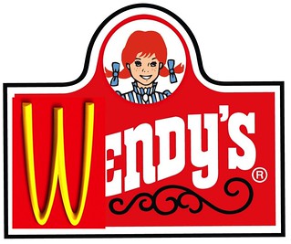
McWendy’s

The Ultimate Merger (4 and 1/2 Stars)

Description of Assignment:“Businesses merger together all the time (at least that’s what Mad Men has taught me). For this assignment create a logo in which you combine to famous logos. Humor is encouraged.”

The Ultimate Merger

The Story

In 2017 McDonald’s and Wendy’s were both losing business to each other. So the CEOs of both companies met in person to figure out if one of them could buy each other out. During the meeting neither of them could figure out a deal that work best. Finally one of them suggested a merger of the two companies. They worked out the details and it became official. They would be called McWendy’s and the logo above is a mash of both logos together. They would sell both McDonald’s and Wendy’s at the same location. They became the most profitable fast food chain in the world.

The Process, Narrated

For this assignment I first found the two logos McDonald’s and Wendy’s on Google Images. I then used Pixlr.com to mix them together. I first uploaded the Wendy’s logo. I erased the W from Wendy’s and uploaded the McDonald’s M. I then flipped the M upside down so it spelled Wendy’s. I call it McWendy’s.

Screen Shot 2015-07-03 at 3.46.22 PM

When Two Worlds Collide

Nipple


For this design assignment I had to create two companies merging as one. I’ve always imagined what it would be like if Nike and Apple merged. It would be legendary and they would be known as, Nipple. I could see this company taking over the world.

I edited this in photoshop.

Worth 4.5 Stars

http://assignments.ds106.us/assignments/the-ultimate-merger/

Creating a Logo

I also made time to create a logo from Aconitum.Napellus this week. I drew inspiration from a ds106 design assignment, The Ultimate Merger (which is rated at 4.5 stars). I chose to use Fisher Scientific’s logo set up, seen below:

fisher


I mimicked the fonts and colors to create my own logo for Aconitum.Napellus. All work was done in a word document so that I could compare the sizes and styles of the fonts as well as have proper alignment. The final image was saved as a screenshot. I plan to use this image throughout my webpage, and it is currently featured on The Mission Statement page.

Screen Shot 2015-04-05 at 12.32.23 PM