Assignment Bank: Warning Label

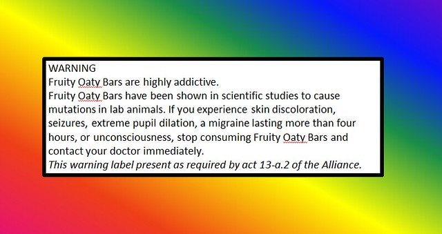
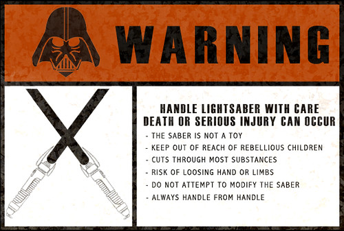
For this assignment, we were required to make a warning label for a futuristic technology. Valve’s Portal 1 and Portal 2 were great games, and saw this as a great way to showcase the Portal Gun. The Portal Gun is a device which can create two portals which connect any two points in space. I used Microsoft Paint, and given that Portal is copyrighted, I did not want to risk using an in-game screenshot, in case of copyright concern. With Portals, things like infinite falling become possible when not careful, and added stereotypical warnings commonly seen in medicine advertisements.

The link to the assignment: http://assignments.ds106.us/assignments/warning/

Beware of the Failed Franchise

WARNING-create a warning poster for a fictional hazard.

The Story Behind the Story-

You would think, that after six films, that if the characters did not adapt to be able to more intelligently navigate a world overrun with horrifying aliens, then at least the creators of these abominations would find the means to create a new plot. I have seen almost all of the movies in the Aliens Franchise, and they are startlingly similar. I do have to admit that the first and second installments of these movies were very much enjoyable, but they have repeated their story lines each and every time.
I have witnessed impassioned debates over the meaning and symbolism of the elements of each new installment of these films, but I fail to see how either one differs from the other, except for the very clear disparity in quality. The original movies staring Sigourney Weaver were far more entertaining and well-crafted. I can’t help but think that she makes the iconic face pictured in the warning above with each additional sequel. In the initial stages of producing this design, I intended to create a warning for Xenomorph sightings, but as I worked on this orginial design my mind was swayed for two reasons. The first being that my original content was quite ugly, lacking many of the aspects of color, typography and use of space that I had researched in Vignelli’s cannon earlier this week. The second being that I felt I was betraying my own feelings of annoyance to this undying franchise. This is a necessary warning to all those who can still be spared: watch the first and second installments of the Aliens franchise, and then never (ever) look back.

The Tutorial-

To begin this process, I downloaded the image I wanted to use and opened it in GIMP.

Then I selected Color>Colorize and decided to use the default blue hue that the program selected. I thought this tint would soften the original image a little more, making it less obvious that it had been cut from a different background.

Next, I selected Tools>Selection Tools>Free Select and cut out Sigourney Weaver’s face.

I then copied and pasted the image to a blue background in a PowerPoint and began adding the text I wanted and repositioning the images to make hide the sharp edges of the face that had been cut out.

Fruity Warning

Hmm…imaginary warning label. The only question is, what can I think of that could be dangerous enough to warrant a warning label? How about whatever inspired this commercial:

Not stated in the commercial is the following.

Fruity Oaty Bars Warning

How could they neglect putting that in the commercial? Must be the Alliance’s payment for letting them put subliminal messages in the ad.

Most of the description is modeled after things that you actually see in the advertisement. Anything that claims to do what the commercial claims would have to be highly mutagen, and probably affects the mind as well. The doctor contacting is a homage to medicinal warning labels in an attempt to give a more bizzarre feel to the product. The note on the Alliance is a homage to the warnings put on tobacco products, which were originally a brainstorming idea for a warning label (though ultimately abandoned because I wanted to be a little more lighthearted). Throw in a rainbow background courtesy of powerpoint’s gradient background fill, and we have a warning label atop a fruity oaty bar wrapper.

In the end, my biggest enemy was lack of space. You can only fit so much warning on a label of consumable size, and you cannot get to the truly outlandish until you cover your bases, else the warning becomes too fantastic. I like the overall look of it, the thick black box and contrast of the white label and the rest of the “wrapper” makes the warning label pop quite nicely. In the end, the best side effects can be joked about in person after seeing this.

I should probably just staple this to my forehead

Procrastination Station

Yeah. It’s pretty self-explanatory.

The assignment to create a warning sign was by far the easiest design assignment from this week, but I also learned a surprising amount getting it done.

Creating the sign was easy enough: I found a simple Hard Hat Area sign, drew over the original text with white and red, respectively, and then slapped some new words on there (and yes, that is Arial. It’s a warning sign, it needs to be readable, not pretty). A few adjustments with the scale tool and voila! One more assignment down.

Like I said though, I learned a lot here. Attempting to fit the word “Procrastinating” on the sign made me realize that not only does a warning sign have to be legible, that legibility depends on what words you’re using. Words that are too long won’t be read, especially on street signs when people are whizzing by in cars. There’s also the ever-important issues of color and placement; if you don’t use colors that stand out in contrast to each other and if your message is cluttered, it’ll also make it impossible to read. On a warning sign, that’s more than essential, it might actually be life-saving.

It made me realize just how much work goes into creating the little design elements we see around us every day and take for granted. Somebody (or a couple of somebodies, or a committee of somebodies) had to sit down and figure out what would be visually striking, clearly readable or understandable (in the case of signs that just use images), and could be easily replicated over and over again. Someone figured all of that out, spent hours or days or weeks designing it, and now it’s become part of our cultural landscape.

How awesome is that??? I think it’s awesome.

Warning! Trolls on TALL Bridges!

The [design] assignment, Warning, by Tom “Lots of things today have warning labels. Create warning labels for things that exist only in movies or your imagination.”  Allowed for me to be able to focus on what keeps me awake sometimes.. now this is embarrassing but I have nightmares of trolls on tall bridges.. don’t ask me to explain because I wouldn’t know where to begin.. I made the photo a tad ironic considering I wanted to make it more fun than scary (: I just combined two pictures on Paint and here is the end product:


Warning Labels (3 stars)

Everything these days have a warning label. Some make sense while others actually tell you that the product you’re about to use cause more harm than help. This is what I came up with…..

Coming from the procrastinating queen, I wait to do EVERYTHING last minute. I swear I try my best to do things on time, but it’s like the little voice in my head wants me to have all this pressure while I complete an assignment. Therefore, this warning is not only useful for those who procrastinate on assignments but is a warning for all who live everyday life as if tomorrow is promised.


How I created it: I took a picture, uploaded it on the Picasa software, then finally used bighugelabs.com to complete the picture.

Warning!

I really wish I could do something with a little more detail and color for these design assignments but Gimp is giving me a run for my money.  Here’s my design for the Warning assignment.  Unicorns are always portrayed as docile and do-no-evil type animals so I though I’d take a different spin on things:

Unicorn!

I know what you’re thinking, “She did this in Picnik…again…”  But you’re wrong!  I went old school and used PowerPoint.  Yeah, that’s right, I used PowerPoint for graphic design.  Please don’t judge me.  Really, if anything you should send me some links for Gimp tutorials.  Help a girl out!

But yeah, I got the unicorn image off of Google and then used basic shapes and text boxes to make a slide in PowerPoint.  The most complicated step was saving it as JPEG.  I’m beginning to realize design isn’t really my thang and I might be ok with that.  Three more stars to go…

Assignment Details

DS106 WARNING

Original Assignment Link

THE ASSIGNMENT: The assignment was to create a warning label for things that exist only in movies or your imagination.

THE PROCESS:  The first step was to find a generic fire exit sign from the internet, and download it to my computer.  I then modified the image in a program called Gimp.  I cropped the top part of the sign and deleted it, then, used the lettering tool to create my own personal warning sign.  To make it look more official, I found a picture of a brick wall online,  saved it, and created the brick wall as a background layer in Gimp.

Here are the original pictures:

Picture links: Brick Wall, Fire Exit

THE STORY:  I know the original assignment was to create a warning sign for something that happens either in movies or in your own imagination, but I chose to design a warning sign for something that may happen in “real life.”  I believe that social networking is becoming a major issue in the world, and created this warning sign to raise awareness to this “social problem.”  Imagine that you’re in a burning building and have 10 minutes to evacuate before the building collapses, (maybe not you personally) but I can guarantee that someone would want to log on Facebook or Twitter and share this tragic event before thinking about their own personal safety.  This is a PROBLEM people, always be tweeting, but don’t endanger yourself in the process.

WARNING – Lightsaber

Below is a warning label you might find on a lightsaber:

Saber Warning Label

As you can see, a saber is no joke. It can cut through anything (except other lightsabers or that force shield stuff). While I was making this label, I thought, what happens if you drop an open lightsaber facing down? I suppose it would just cut through everything and come out the other end of earth (or w/e planet). It’s something to think about.

Anyways, that’s the label. The official one too… believe me, if you look close below, you can see for yourself…

Anakin Warning Label

Are you looking for a career change?

I guess it is human nature to ask yourself if you might have chosen a different career path? Educators, like many others, sometimes have second thoughts about their teaching profession during our long, cold winter. My solution for such mid-winter “blues” is to compare the tasks that others must do in order to better appreciate my own job. I attempted to capture this strategy in my “Design” assignments that are the focus for Week 5 in my DS106 course. The one I selected to begin with was named “Warning” and was described as:

Lots of things today have warning labels. Create warning labels for things that exist only in movies or your imagination.

We all have seen warnings to help prevent the injuries that are caused by repetitive tasks whether it be tendonitis, Carpal Tunnel Syndrome or rotator cuff strain. As an educator I placed a tremendous value on my eye sight. However, I think that, like-minded, readers will be thankful that we do not work on the assembly line at the U. Khant Duit Corp.


[Please click on above to see details]

Take care & keep smiling :-)

Fair Use Educational Image Credits: