Those Illiudium Q-36 Space Modulators are DANGEROUS

(click for the full diagram in all its martian glory)

Inspired by Ben Rimes post today I wanted to take a spin at the ds106 Warning Design assignment:

Lots of things today have warning labels. Create warning labels for things that exist only in movies or your imagination

I felt that as a weapon of planetary destruction, the Illudium Q-36 Space Modulator wielded by Marvin Martian would definitely need some warning labels.

That thing is dangerous. The users manual is about 800 pages long. Marvin is lucky he does not blow his Martian head off.

The real device was rather simple, almost just a stick of dynamite. I did a google search on the device and landed on the complex device from a tumblr blog. Building this was just some PhotoShop layering. I placed the device at the center. For each callout, I just copied a selection, pasted to new layer, and resized. Then I overlaid the items with text or graphics.

Danger, Marvin, he lives dangerously.

Hover Boards as Digital Storytelling Devices

"Hey McFly, you bojo! Hoverboards don't work on water!"

What is digital storytelling? Rather than bore you with a rather lengthy history of the term, and how it has been applied in the past to both the realms of education and entertainment, allow me to illustrate how I see it with a highlight from Wikipedia:

You can continue to read on, and ponder why someone would arbitrarily decide that 8 minutes is the acceptable limit for digital stories, but what’s most important about the term is the practice of “ordinary people” creating meaning through the use of digital tools. Further exploration of the term through the lens of ds106 could even cause someone to conclude that digital storytelling is in fact, NOT just movies. The use of movies to tell a story is merely one facet of the digital storytelling spectrum, and as far as I’m concerned, a much better definition of the term exists further down that same entry on Wikipedia:

“One can define digital storytelling as the process by which diverse peoples share their life story and creative imaginings with others.”

As I prepare for a presentation on digital storytelling at the upcoming 2012 MACUL Conference, I’ve begun to ask myself how teachers can more easily adapt newer technological tools to allow students to share their own “creative imaginings”. Not being someone who is comfortable “talking the talk” without producing some actual goods, I decided to create another entry in my “Warning to the User” series, which is my own creative take on the Warning Assignment on the ds106 site. The assignment in question asks creators to imagine a warning poster or label for something that exists only in your own imagination or a movie. I had previously created a warning poster for the flux capacitor (the device that makes time travel possible in the Back to the Future movies), and I wanted to extend upon that thread in a playful way, hence a warning poster for the hover board used by the main character in the series, Marty McFly.

The first in my series of warning posters for BTTF

What speaks to me most about this assignment is that while I put a considerable amount of time into the process using Photoshop to assemble the images and the text (even going so far as to find and install a custom font inspired by the movie), it’s actually a rather simplistic assignment.

Any teacher or student could achieve the same with a word processing program and some clipart quite easily. Making sure that images are set to floating or “wrap behind text”, it would be quite easy to fill a page with a few choice elements from a film or book, and then use text boxes to place key points, main events, or themes from the story. I could see elementary students using a “warning label” to describe the main events in the book Hatchet by Gary Paulsen, or perhaps some magical warnings for using a wand from the Harry Potter series (highlighting all the times wands were mishandled in the series). I choose to mix plot points, scenes, and over-arching story elements from the first Back to the Future movie in my warning poster (lightning storms and technology don’t mix well in any timeline). However, any teacher could ask students to focus just on main events to practice sequencing, or include quotes from the main characters to help identify how mood is established in a story.

While all of us in K-12 continue to “hover” around the impending implementation of the Common Core Standards, it might serve us well to begin to explore how a little bit of creativity might help students (and ourselves as educators) figure out how to reintegrate some of the process standards and college readiness standards in ways that will encourage students using a diverse set of tools to write, produce, and publish. Case in point; I used Google image search, an image editing program, and a blogging tool to create, narrate, and publish this particular piece. Toss in a little piece on using the advanced image search or a creative commons search for images and you have yourself quite the well-rounded 21st century project for your students!

WARNING! Lightsabers!

Original photo from Wookieepedia.com

DS106 Assignment:

Lots of things today have label warnings. Create warning labels for things that exist only in movies or your imagination.

The Process:

First, I found a picture of a lightsaber here. Then, I used photoshop to copy the photo onto a larger canvas and add text around the picture.

The Story:

Warning signs can be somewhat comical at times. I feel the way the warnings are worded often downplay the seriousness of the issue. So, I decided to make my own sign which would, perhaps slightly comically, convey a warning. So, the first thing I thought when I saw this assignment was ‘lightsaber’. Think about it: a blade of pure plasma which can cut through almost anything?! Highly trained Darth Maul was cut in half by a lightsaber! Although lightsabers are typically custom designed for the user and by the user, I imagined this is what the warning label would look like in the Owner’s Manuel of a lightsaber.

~NOMNOMreeses~

Warning

_cokwr: Lots of things today have warning labels. Create warning labels for things that exist only in movies or your imagination. Examples, _cpzh4: Design, _cre1l: http://superpunch.blogspot.com/2011/02/science-fiction-danger-awareness.html, _chk2m: Tom, _ciyn3: 87, _ckd7g: , _clrrx: , _cztg3:

BE CAREFULL!

Assignment: Warning

I describe myself a cookie monster because I really love cookies!
It is just so addictive to me.
I feel extremely happy when my friends buy Chips Ahoy from America.
They usually get me a couple of big box, but I finish eating them in a few days.
I cannot stop eating them!!
So,
DO NOT FEED ME COOKIES TOO MUCH!
Otherwise, I would end up eating cookie all day for a couple days, which is not healthy at all…orz
But please do feed me cookies sometimes :P
Creating this image was fun!
I used paint function for the picture and aviary.com for the text.
Making image of cookie monster with only using back and white was a little difficult and a lot of work, espacially fluffy part was hard.
I am glad the image turned out well!
I have to ask my friends to buy me Chips Ahoy again :D

My Own Warning Sign

Did you notice it?
AND, can you understand it?

If not, BEWARE!!
Coz I NEVER am a female despite of my body born in a female form!
(I actually am a neutral-gender dude, though…)

…WELL, I’m not gonna tell you descriptions of what the words mean, coz
THEY JUST MEAN IT.

NEVER believe the person’s physical gender in respect of perceptions for gender-image.
Just see how the person behaves like, and what the person dresses like.

The physical gender worth for NOTHING but medical scenes and making love with somebody.

Warning Sign

For my warning sign assignment I wanted to do a warning sign for Gizmo from the movie Gremlins. I got a warning sign jpg off of google and put it in MS Paint, then I found an outline of Gizmos face and made all of the colors black and yellow so that it would blend in with the sign. It got a little hard towards the end when I was trying to make the outline of his head, because I didn’t have one originally I had to free hand this one out. It’s not the best but I don’t think it’s half bad. Enjoy!

Flux Capacitor as Digital Storytelling Device

created for a ds106 assignment (http://ds106.us/2011/02/20/warning/)

As a part of the increasingly mind boggling and transformative ds106 course that I’m currently participating in, I created this warning poster for a rather infamous piece of fictional technology; the flux capacitor. The assignment itself was based on the work of an excellent graphic artist with a streak of dark humor. However, I wanted to personalize it a bit, and thus I choose a device from a film that formed the basis for what I know of excellently cheesy science fiction flicks. Rather than choose the standard “ray gun” warning poster, I opted for a machine that could produce irrevocable harm to the entire space/time continuum rather than just blasting a hole in someone in a futuristic bar fight.

Besides the humor that I tried to inject in the piece, and the design work that went into assembling it (no, I didn’t draw the flux capacitor myself), I wanted this assignment to serve as a practical way for teachers to leverage visual media as a way for students to practice summarizing, recalling, and recognizing plot development. While not every teacher and/or student is going to be able to put together a visual “road map” of a piece of literature using Photoshop, there are plenty of other ways to do it!

My example above simply boils down to the major plots of the movie in a rather mundane bullet-pointed list, but presented from a humorous angle. It would be just as easy for students to use any word processor to arrange text boxes and clipart, or an online tool like picnik or piclits. Those would be much more limited explorations of visual summarization techniques though, as building and creating something from scratch would allow for ultimate creativity and ownership on the part of the students. And it’s not like it’s something they haven’t done before; graphic organizers, Kidspiration, and other mind mapping tools get wide use in schools as teachers look for ways to help their students brainstorm, scaffold some understanding of a new concept, or just try to visualize learning connections.

If you’ve never done it before, creating a stylized visual narrative for trying to convey a larger body of work is a blast, and you can download a free 30 day trial of Photoshop CS5 and then use the awesome resources at Adobe TV to get your feet wet with it. That, or find a student to show you the ropes (they know everything these days).

WARNING

This time around, I chose the design project “Warning“.  The task of the assignment was to create a warning label for something that exists only in a movie or in your imagination.

My first thought: the time traveling Delorean from Back to the Future.

But I couldn’t find a cool picture that I wanted to use.

Second thought: the briefcase from Pulp Fiction.

But I wasn’t sure how many expletives was too many.

So, I did some more brainstorming, and tried to think of an item from a movie that a lot of people could recognize. I settled on the “red pill” from The Matrix.  Now I feel like I need to take a second and defend myself–I’m not a giant fan of the movies. Anyways, back on track.. so I did some googling (odd that Google Chrome doesn’t recognize “googling” as a word in its Dictionary), looking for a cool picture of a red pill, and then took it to Photoshop.  This project was pretty straight forward, so there isn’t a whole lot more left to blog about it.  So here it is, the end result:.

Star Wars Warning Labels

I saw this assignment pop up the other day and thought it looked fun but had no idea what to do. Then, on what turned out to be an almost 6hr trip from Fredericksburg to Philly, I thought of something. I remembered reading a list of ridiculous warning labels like a chainsaw’s “Do not attempt to stop with hands” or coffee cups saying “Caution: Contents hot,” so I took the chainsaw one and altered it a bit to work for the lightsaber.


Here’s my first attempt at it. It’s hard to see on the smallish picture but I added yellow and white onto the hilt (?) of the lightsaber. Drawing, even little lines, is tough without a mouse.

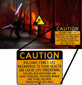
After making these two I made one more from when Anakin and Obi Wan were fighting. I couldn’t find a picture that I liked of the fight so I had to take a screen shot. I got the signs from websites but photoshopped them into my screenshot.

The warnings I made didn’t really help the characters in the movie though since Anakin (with Obi Wan’s “help”) fell into the lava and Luke ended up losing his hand on a lightsaber. Yay irony :D

Also, I need to do a post outlining what I’m doing for my final project. I shall get on that in a couple days.

Links:

Luke picture: http://frontrowreviews.co.uk/wordpress/wp-content/uploads/2010/03/Luke_Skywalker_blue_lightsaber.jpg

Cliff warning sign: http://www.monkwhy.com/images/blog/0808/tkdsign.gif

Volcano warning sign: http://sophia.smith.edu/~jmoulton/Hawaii/images/volcano%20warning%20sign.jpg