Literal Lyrics

Another fun assignment I found in the bank was the Name that Single assignment. In this one, you use a simple design to describe the name of the song and your readers have to guess what it is! It sounded like it would be entertaining and not too difficult.

I decided to try something new for this design and use Canva because I wanted more color than The Noun Project offers.

I knew that this would be a good assignment to apply the 80’s theme to. Even though I know a lot of 80’s songs already, I always have to go back and look at the Spotify playlists/genres to refresh my mind. As soon as I looked at the playlist, I immediately knew what I wanted to do.

So I got on Canva, chose a basic background (the assignments wants it to be simple so I didn’t go all out with it) and chose the icons that I wanted that would represent the song. Because some of the icons are limited by purchase on Canva, I didn’t have too many options, so I couldn’t get everything to look similiar or be drawn in the same style. But, I think it looks a little fun anyways.

Can you guess the 80’s song?

Illustrating a Song

This is another 2 star assignment that finishes my week with 16.5 stars! I had to make a design representing a song without writing any words.

I made this using Pixlr.com to represent one of my favorite songs, Cosmic Love by Florence and the Machine. This is actually three stock images lined up against each other in separate layers. I cut them out to fit together in this way using the cutout tool. It was really tricky trying to cut them all out nicely to fit this way.

This song is very ethereal and beautiful. It compares lots of aspects of love to parts of space. I thought these images would make a cute cover photo for the song. I love how the lighting on the two hands work with the firework heart in the middle. This felt almost more like a visual assignment than a design one, but I think I’m getting better at photo editing and designing.

The Hits Keep Coming…

One of our ds106 crew had the brilliant idea to put an 80s twist on the Name That Single assignment, so I thought I’d give it a shot. I wonder if we can make a trend out of this.

I didn’t know what to do, so I googled “1980s hit songs” and got a selection of links to videos. My first thought was to take the opportunity to do a rickroll, but I couldn’t think of a way to visualize “Never Gonna Give You Up.” But another song on the list gave me an idea, and it had GIF potential.

I tried to take the easy way out and find the GIF I was thinking of online, but I couldn’t, so it was DIY time. It’s a Blade Runner scene. I was able to find it on Youtube, and use a Firefox extension to download it. I know there are easier ways to make GIFs, but I use the old-school ds106 method, except I use Photoshop instead of the GIMP. I do it that way because it gives me more control and ability to manipulate the image and timing. I came up with this thing:

but it really doesn’t say “single,” does it? I needed to square it off and put a hole in the middle. I found an image of a 45 single sleeve and one of a 45 adapter, so I screened that over the GIF frames and cropped the image like so:

Design-wise, I think it’s weak. Maybe I should have added some graphic elements. I used a posterize effect to make it look more “designed,” but it’s really more decorative. I consider design to be a deliberate decision making process to achieve a desired end – to convey a message or solve a problem. If it’s done for the sake of appearance rather than meaning, it’s decoration. I like the idea of an animated image on a static object though. I don’t know if it really conveys a sense of the song or its title, but it was fun to do.

I’m also wondering to what extent “single” is an 80s concept. I see the 80s as the cassette era, and singles as more of a 60s-early 70s thing. Singles never really went away,  but I think they were esoteric at that point, more of an indie band thing.


Name That Single

For my final design assignment, I chose to do “Name That Single” (2 stars): Create a design for a favorite song by using just simple designs and NO WORDS…Basically a design assignment with the rules in charades.

I decided to use the song I’ve been listening to non-stop for the past week. I’ll let you look at the image before I say what it is! I knew I wanted to make an image of a man walking down the road, so I looked up stick figures, and found this unique, sketched one.

man walking


Then I looked up a picture of a road:

curved-road

Uploaded both to Gimp, edited the two together, messed around with the filters a bit more, and here’s the finished product:

500miles2


The song is “I’m Gonna Be (500 miles)” by The Proclaimers- although the version I like and am referring to in the picture is a cover by Sleeping At Last. Their version is a bit more slow and acoustic, so I thought this black and white version represented the simplicity of the song. Hope you enjoy.


Photo credits:
Stick figure sketch, Curved road

What Song?

I picked this design assignment because I love music. I picked one of my favorite songs that is by a female country singer (hint). Even though I don’t think I am that good at drawing, I tried my best and since it is one object that describes the song, I picked the most prevalent thing. I even quizzed my mom and she guessed right! I did have a sign to go along with it, but when I reread the description it said no words, so I took that out.

PicsArt_1412448734218


2Stars


“Let Me Take You Down” **

While browsing through the design assigments of the ds106 assignment bank, I found an assignment called Name That Single!  Worth 2 stars, this activity was to create a design for a favourite song without using words.  So, basically charades but ds106 style!

I thought of a lot of songs I loved, but they wouldn’t have been easy to make a design out of.  Instead, I chose an easier one (I think) that is still one of my favourites.

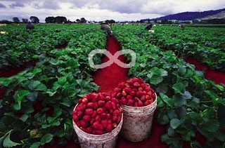
I found the photo on Google from here, which I then saved to my computer and opened with Picnik via Picasa.  Using the doodle button, I drew an infinity symbol above the plants.

Can you guess the song??

Strawberry Fields Forever

12/15 stars completed

Name That Single

This assignment is an interesting one because you have to guess the song from the design. So like charades for DS106! This was cool to think about what song to design for. At first I thought it would be funny to do another Adele song, I thought Set Fire to Rain would be fun to try to design, but I wanted to try something new. So here is what I created:

http://www.flickr.com/photos/laurstray20/8065096508/in/photostream

I’ll give you a few hints: the thumbs ok is more contextual not really literal, that’s a certain kind of insect that loves honey, and the singer of the song, her last name starts with an M. Can you name that single?!?!

2 STARS

TOTAL STARS: 14/15


Randomly Randomly to Name That Single

What do you do when not sure which ds106 Design Assignment to do? Spin the random chooser. Seems like a good thing to do, hence this little bit of design work.
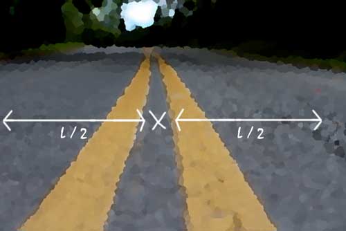
The assignment this is for is Name That Single:

Create a design for a favorite song by using just simple designs and NO WORDS…Basically a design assignment with the rules in charades. IE: for No Doubt’s “I’m Just a Girl” I would just have a symbol of a girl.

Shall I give a clue? The lead singer of this band is female.

Some might quibble that I have violated the instructions for no words with my math symbol. So what? Who cares? the point is not to just stay within the lines, but to experiment with the concept.

To select my song, I also used the randomness of the shuffle in my iTunes to pick this song.

I’m standing in the middle of life with my pains behind me.
But, I got a smile
For everyone I meet.
Long as you don’t try dragging my bay,
Or dropping a bomb on the street.

Got it? Half of the length of the run, puts you.. in the middle? Yes

Gotta dig Chrissie’s shiny telecaster.

There’s more synchronicity here. I’ve been taken a few times to taking photographs of curvy roads, and like those quite country roads where you can just lay right down on the stripe and get the photo- the one I used to make the image above was in Newport Virginia and is the road to Gardner Campbell’s house where I stayed in August:


cc licensed ( BY ) flickr photo shared by cogdogblog

To get the more abstract effect I used the Palette Knife filter in photoshop which can make a photo more like a painting, but not as overdone as the watercolor one. The markings where just some paint brush and text for the arrows and math.

But what I thought about was that it was only after doing something similar here in Vermont:
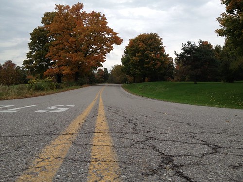

cc licensed ( BY ) flickr photo shared by cogdogblog

That it would be fun to do a collection of what I tag now as BellyOnTheRoad photos. There is something just real… real about doing that. I only have four, but as a reminder, if your photos are geotagged (usually automatic for mobile phones or can be done manually in flickr via the map tools) you can assemble a map for a tagged set of photos.

If you go to the “Your Map” link under the flickr You menu you get to the map tool; mine is http://www.flickr.com/photos/cogdog/map/. You can tell it to search everyone’s photos or just your own, and give it a search term, in my case the tag of BellyOnTheRoad. Cool! I get a map for where my four belly on the road photos are from:
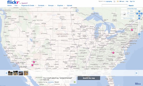
(click map for flickr version)

So yet another way flickr can help you organize not only your photos, but any ones you can search on.

Kind of funny where you end up when you start out clicking “random”

Name That Single!

For the name that single assignment we were supooseed to Create a design for a favorite song by using just simple designs and NO WORDS…Basically a design assignment with the rules in charades. My symbol is general that you basically have a 50/50 chance of getting it. I bet if you are from the 90′s era you’ ll get it in no time, Ccan you guess what song this is…?

toxic

Guess that Single

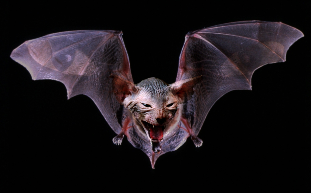
SO can you Guess The single? Ill give you a Hint its By a band called Mogwai. The process for making this is fairly simple, finding 3 images and combining them through using the quick select tool in Photoshop and magic wand tool to select the parts I wanted and attaching them to the rest. along with setting the opacity to a lower level for the cat eyes and and using layering effects such as multiply. to allow for translucency and setting up a Chanel mixer layer to adjust color.