Good Omens: A Children’s Tale


Rating: 3 out of 5.

For this next assignment this week, I decided to create a children’s book cover for the “Mashedup Children’s Book” assignment. Lately I have been excited with the news of there being a Season Two of the Amazon Prime Show Good Omens, so I wanted to create a mash-up book cover that reveals some of the plot without fully giving it away.

For anyone not familiar with it, Good Omens (1990) was written by Neil Gaimen (of Sandman fame) and Terry Prachett (of Discworld fame). They are two of the greatest British authors in recent times, and Good Omens has had a devoted cult following since its release in 1990. Amazon Prime adapted the book into a six-episode show in 2018, starring Michael Sheen as the angel Aziraphale and David Tennant as the demon Crowley. The show is a marvelous adaptation of the book, and I would recommend it to anyone looking for a platonic love story between former enemies, which also has some very dry comic bits in-between. The book does this more than the show, and some parts will have you doubled over laughing as how off-track-without-actually-getting-off-track it is at times. 10/10, glowing recommendation from me!

Anyways, I started by looking around for some Good Omens fanart. There’s quite a bit, since the book came out in the 1990s. However, I found a wonderful piece by Chocodile on Twitter that portrays Crowley driving his 1933 (in the show; it’s a 1926 in the book) Bentley as it’s on fire. This is something that occurred in both the book and show, and I immediately knew the title I wanted to go with. First off, I do not own this fanart! Chocodile is the artist, and I only repurposed it for this project! The original Tweet that contains the art can be found below!

To make the book cover, I downloaded the image then used Pixlr to create a canvas that was approximately the size of a book cover. I wanted to keep the yellow background, because I liked the way it looked and felt it really complimented the children’s book aesthetic. I messed around with shading a bit before deciding it looks better as the original. From there I generated the title “A Demon’s Guide to Stopping the Apocalypse” by Neil Gaimen and Terry Prachett. I personally like to image there’s a sequel out in the world somewhere, titled “An Angel’s Guide to Stopping the Apocalypse” or something like that. This one is from Crowley’s perspective, so that one could be from Aziraphale’s. There could actually be an entire series! “A Witch’s Guide…,” “A Witch Hunter’s Guide…,” “The Antichrist’s Guide…,” etc., etc.! These are all references to the book/show, by the way, so I apologize to anyone unfamiliar with it. Basically it’s a motley crew consisting of an angel, a demon, the antichrist, three human children, a witch, a witch hunter, a former witch hunter, and a medium who team up to stop the apocalypse. It’s quite fun(ny) actually!

Here’s the final product! Please let me know what you think in a comment down below!

A Demon's Guide to Stopping the Apocalypse

Good Omens: A Children’s Tale


Rating: 3 out of 5.

For this next assignment this week, I decided to create a children’s book cover for the “Mashedup Children’s Book” assignment. Lately I have been excited with the news of there being a Season Two of the Amazon Prime Show Good Omens, so I wanted to create a mash-up book cover that reveals some of the plot without fully giving it away.

For anyone not familiar with it, Good Omens (1990) was written by Neil Gaimen (of Sandman fame) and Terry Prachett (of Discworld fame). They are two of the greatest British authors in recent times, and Good Omens has had a devoted cult following since its release in 1990. Amazon Prime adapted the book into a six-episode show in 2018, starring Michael Sheen as the angel Aziraphale and David Tennant as the demon Crowley. The show is a marvelous adaptation of the book, and I would recommend it to anyone looking for a platonic love story between former enemies, which also has some very dry comic bits in-between. The book does this more than the show, and some parts will have you doubled over laughing as how off-track-without-actually-getting-off-track it is at times. 10/10, glowing recommendation from me!

Anyways, I started by looking around for some Good Omens fanart. There’s quite a bit, since the book came out in the 1990s. However, I found a wonderful piece by Chocodile on Twitter that portrays Crowley driving his 1933 (in the show; it’s a 1926 in the book) Bentley as it’s on fire. This is something that occurred in both the book and show, and I immediately knew the title I wanted to go with. First off, I do not own this fanart! Chocodile is the artist, and I only repurposed it for this project! The original Tweet that contains the art can be found below!

To make the book cover, I downloaded the image then used Pixlr to create a canvas that was approximately the size of a book cover. I wanted to keep the yellow background, because I liked the way it looked and felt it really complimented the children’s book aesthetic. I messed around with shading a bit before deciding it looks better as the original. From there I generated the title “A Demon’s Guide to Stopping the Apocalypse” by Neil Gaimen and Terry Prachett. I personally like to image there’s a sequel out in the world somewhere, titled “An Angel’s Guide to Stopping the Apocalypse” or something like that. This one is from Crowley’s perspective, so that one could be from Aziraphale’s. There could actually be an entire series! “A Witch’s Guide…,” “A Witch Hunter’s Guide…,” “The Antichrist’s Guide…,” etc., etc.! These are all references to the book/show, by the way, so I apologize to anyone unfamiliar with it. Basically it’s a motley crew consisting of an angel, a demon, the antichrist, three human children, a witch, a witch hunter, a former witch hunter, and a medium who team up to stop the apocalypse. It’s quite fun(ny) actually!

Here’s the final product! Please let me know what you think in a comment down below!

A Demon's Guide to Stopping the Apocalypse

The Grinch in the Hat

For the assignment (3 stars), I decided to mashup two Dr. Seuss books. I started by thinking about what I children’s books would be fun to put together. I then found found a blue background to imitate the Cat in the Hat background. I then found the grinch and his dog and cut them out. I put the pictures together using the “Photoshop Mix” app on my iPad. I then added the hat and bow tie to the grinch. I could not figure out how to get the hat to fit properly on the grinch’s head which was frustrating. I then found a font that was similar to the type on the Cat in the Hat book. I played with the size and arrangement. I then saved the picture and uploaded it. When I put it on the blog, it became a little blurry which is annoying. I really liked this idea for the assignment and the end result.


Until next time,

Emily

Goodnight Sailor Moon

Goodnight-Sailor-Moon

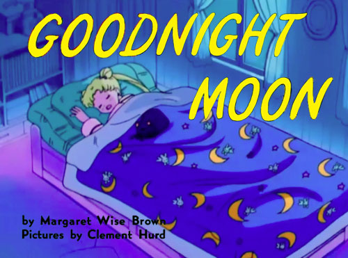
In case you can’t tell, this is a mashup of the classic children’s book Goodnight  Moon and the anime Sailor Moon.

My father is a HUGE anime fan. Fullmetal Alchemist, Bleach, Rurouni Kenshin, Gurren Lagann, InuYasha, Fate/Zero – you name it, he’s watched it. That is the power of Netflix.

All this anime watching has also turned my dad into a big fan of Japanese pop music. I’ll pop by his house and the most random, bubble-gum Japanese lyrics will be streaming from his computer and he’ll be rocking out in his chair as he works on his great American Sci-fi/Fantasy novel that he’s been working on for the last few years.

One thing my father is not is a big social media participant. That being said, my dad chimed in on Facebook last week for the first time in more than a year and updated his status with:

“Call me weird if you want, but I like some Japanese pop music.”

The second I saw the post, I felt guilty. For all my talk about accepting my family’s quirks, I’ve been guilty of giving him a hard time about his anime-loving and Japanese pop-music obsession.

Pot guilty of calling kettle black.

What makes this worse is that my dad has never given me a hard time about my many weird obsessions namely Godzilla (and other kaiju) movies, kung-fu movies, crime documentaries, and refusal to use blue pens (except on legal documents) not to mention a pathological hatred of bananas, long toenails, hairy toes, and people who don’t return shopping carts to their proper location.

I guess it’s fair to say that I need to get a little better at practicing what I preach. His quirky pastimes are just as valid as mine and I should stop giving him a hard time about them.

Jessie and the “Candy” Factory

WalterFactory

Well, I’ll be honest. I haven’t watched any Breaking Bad. Honestly, I haven’t watched a lot of popular shows or movies. Which means, when doing the Mashup Children’s Book assignment (2.5 stars), I had pretty much no idea what to do! It was a fun idea, and I love looking at these kinds of mashups (even if I don’t understand the pop-culture references). But I was basically grasping at things, thinking “This makes sense, right?”

I also haven’t read Charlie and the Chocolate Factory. Or any of Dahl’s novels. What a sad childhood I lived, what kind of English Major fraud am I! But I’ve watched both the movies multiple times, so I kind of had an idea of what to do with it. Plus, I didn’t want to use a Dr. Suess book, like the example and many of the previous students’ assignments. I thought, “What’s another popular children’s author? Roald Dahl!”

Then, after seeing the cover of Charlie and the Chocolate Factory, I decided that it would be pretty easy to convert that to Breaking Bad. I don’t know if this has been done before. It probably has. But I didn’t look up any examples, and I created this with my own bear hands, so I’ll just pretend that I am fully innocent of any similarities to other arts.

Process:

Step 1: Get a picture of the original cover (I used this one)

Step 2: Open it up in GIMP

Step 3: Basically just paint over it, trying to emulate the style of the original image.

Step 4: For the meth, I took one of the candies originally on the cover, copied it, and then rotated/flipped/scaled/and moved it around in various ways (and then drew the little baggies over them)

Step 5: Use the text tool and just type out what’s necessary, editing the size and line spacing as necessary

Step 6: Export the image, and that’s it!

Are You My Father?

For 2.5 stars this week, I completed the Mashedup Children’s Book assignment.  When I first started, I didn’t quite know where to start.

Mashup a children’s book based on another cultural artifact. For example, framing Dr. Who as a children’s book in the aesthetic of a Dr. Seuss’s work.

From the example given, I knew that I wanted to play off of the Dr. Seuss theme. I started out by searching for Dr. Seuss books and thinking about which one would be a nice play-on-words. My original idea was using “One Fish, Two Fish, Red Fish, Blue Fish” and maybe mixing it with power rangers, but that would be a mouthful to say, especially for a children’s book… I mean think about it, what adult would want to read “One Power Ranger, Two Power Ranger, Red Power Ranger, Blue Power Ranger” to a kid?? I’d need to stop for a drink of water after every page!

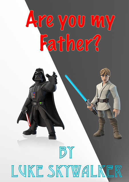
I finally found the book titled “Are You My Mother?” and immediately had a brilliant idea of what to do.. Change it to father instead of mother, and what have you??


Are You My Father?


I used Photoshop to create this cover, and although it is not in the theme of Dr. Suess, it still is a decent cover! I found the images of the characters in an image search, and then added the text and the gradient.  I chose to have Luke on the darker background and Darth on the lighter to juxtapose their roles in the films.  The text color reflects their actual sides in the films, and Luke’s name matches his light saber color! I couldn’t decide on the angle to have the gradient. The angle I ended up using reflects the divide between the two characters and their placement in this image.  The other option was to have it from corner to corner.  Using the angle I did also makes the cover less symmetrical, which I think adds to the aesthetic. Although I have never seen any of the Star Wars movies, I still think this would make for a comical children’s book..

Snow White visits the Mile High City

This week’s Mash up assignment was particularly difficult for me to conceptualize.  I read through every option and was not inspired to do any of them right off the bat.  I found one finally that sounded like something I could relate to my Denver theme.  The directions were to mash up a children’s book based on another cultural reference.  I would have to say the most difficult thing about this assignment was thinking about what people thought about this state.  Aside from legal marijuana South Park immediately came to mind.  I searched Barne’s and Noble and Amazon for books and nothing seemed to tie into South Park (which as I reflect back makes sense).  I made a 7AM I phoned a friend who said why not use Snow White?  Perfection!  The south park characters would seem like dwarfs to her so the tie in was exactly what I was looking for.  No one said the inspiration had to be my own.

I researched various programs to use to accomplish merging several different graphics.  After seeing Kirk’s work in the last screen cast I was hoping to learn how to use Adobe.  No such luck was made as you have to pay for this service or download it as a 30 day free trial.  I was working on this project at home and at work so I was unable to download it.  I found Kirk’s work to be inspiring, although it made me feel a bit like I was lacking in the technical department.

I ended up finding a great back ground picture of South Park and I snipped a picture of Snow White.  I wanted to make it seem like she was much larger than the “dwarfs” from South Park.

SW1South Park

I then located a picture I liked of the 4 main characters from South Park which I individually inserted into the picture.

South Park 2

I then googled “Disney font” and found a free websites you could enter text and it converted the font in your chosen color. I threw all the pictures together and used Paint on my computer.  I used the “color matcher” snip(for lack of a better term) to fill in all of the edges that were left from snipping so many different pictures in one.  All of these instructions may sound simple; let me reassure you this is a very time consuming process.  I am not sure if anyone knows of a better program than this??

I love the results and I think it fits in as best as I could make it, with my theme.

Snow White visits the mile high city

Even the Baltimore Police Department Does It!

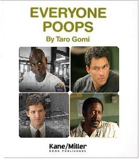
This Mashed Up Children’s Book assignment made me chuckle. I am studying to be a teacher so I loved this idea. It took me awhile to choose the book I wanted to do. At first, I was going to do something like Charlotte’s Wire (Charlotte’s Web) or No, McNulty! (No, David!) I then decided to go with the classic story, Everyone Poops.

I found the book cover online and used Paint to put the pictures of the four faces on the book. I was going to use photos of all characters. I tried to find photos where the characters looked stressed to add comic relief but decided that these photos did more justice.

Everyone Poops Mashup

If You Give a Donkey a Waffle

If You Give a Donkey a Waffle
Mashup Children’s Book: Mashup a children’s book based on another cultural artifact.

I really wanted to do something with If You Give a Mouse a Cookie since it was one of my favorite books growing up. Since the author made numerous sequels about pigs and pancakes and moose and muffins, I knew I had to keep the pattern of having sweet food given an animal. Immediately I thought of Donkey from Shrek and how he sat on Shrek’s armchair talking about how he wants to make waffles in the morning, and so I mashed up the children’s book If You Give a Mouse a Cookie with the movie Shrek to get If You Give a Donkey a Waffle.

Since I have no talent in the field of drawng, I knew I had to look for Creative Commons images or even better, public domain images. I went to Pixabay, which has a bunch of free images. There, I searched for donkeys, waffles, armchairs, and wood paneling that way the cover could emulate the scene from Shrek.  Once I found my images, I went to Pixlr, an open and free image editor web application that is less advanced than Photoshop but better in my opinion than Gimp. I layered my images together, added the title text in font that kind of reminded me of powdered sugar, and then saved it. I really wanted to convey that this cover is definitely for a children’s book, so I stuck with cartoon/illustrated images instead of realistic photos. I think the cover turned out really cute, and I would have totally read this as a kid.

twitterredditpinterestlinkedinmail