Ebay through time

This assignment was to look at how a website has changed over time. Take a look at eBay since 1999 (the year I was born)

1999:

2001:

2004:

2007:

2010:

2014:

2018:

As you can see, Ebay has changed quite a bit over time for the last 19 years. The amount of ads on the eBay page has increased greatly. The colors and eye-catching parts of the website also had increased. There is also less reading on the page as time went on which was very strange.


Take a Trip Down Web Lane

This blog is my submission to an assignment called Way Back Time Machine found in the web assignments section of the ds106 website.

The assignment itself struck out to because of the name of the title ‘Way Back Time Machine’. I found this assignment unique because most of the assignments require us to create a piece of digital media, whereas this is more of a research assignment and the piece of media we create is the story and screenshots we provide along the way in our blog.  The aim of this assignment is to use the WayBack website tool provided in the assignment brief. We had to look through screenshots of any website you enter in the search bar. The WayBack website is basically a archive of screenshots of any website it has in its records. So for example if I entered youtube.com into the search bar here is what appears:

youtubewb

As you can see by entering youtube.com  in the search bar you can then chose a year, I chose 2005. After choosing a year you can see in the calendar that which ever date is circled blue there is a link to a screenshot of what that specific link of website looked that day of the year.

Choosing a website was quite a difficult choice because I wanted to find a website that captures time well. I initially thought of looking into Wikipedia as it is a very popular, well used website. As Wikipedia is always being constantly updated and having new information added I believed it would have changed quite dramatically through the years, however this is not the case Wikipedia has kept the same plain style throughout the years making it hard to guess what year the screenshots had been taken if you had not seen the date. I then decided to look through YouTube’s archive of screenshots however after looking through the different screenshots you can’t directly tell what year it is by looking at them as all you can see are thumbnails of videos and the titles, it’s not detailed enough for me. After a few more ideas a found that Amazon was the perfect website to look at all the archived screenshots.

As the brief required us to take screenshots of our chosen website through the years Amazon was great because you can really see the comparison and contrast between the older and new archived shots. The comparison isn’t just great because of how well and advanced the website has become but mainly because of how Amazon sells products you are able to see what was in demand and how those products have also dramatically changed.

One of the best comparisons within the time change of Amazon website is the change of mobile phones here you can really tell which the earlier screenshot is.

2ndphone2006

2006
phone2017

2017


It’s very clear the left-hand shot is the older of the both, the easiest way to tell is how outdated the phones on the left are; flip phones, slide-up’s and the once popular Blackberry style phone have all been ditched for smart phones, specifically touch screen. The improvement on the site itself is also clear, you can see the website has used screen space better by not having large blank gaps between products and mainly way more information before clicking on the category of phone you want.
Whilst still on the topic of the products on Amazon probably the best example which shows the biggest change in the products and the website is the ‘video’ tab section.

video

1999


The video section on Amazon from 1999 is actually mainly selling VHS tapes of current films during that time period like The Matrix and The Mummy. I find this very interesting because in the left hand column there is a link to DVD’s. So at this point in time DVD’s were a small feature in the video section and VHS tapes were still the dominant top seller.

video2017

2017

Now you can see in 2017 the video section is predominantly based on Amazon Prime, which is their TV/film streaming feature. What’s also interesting about this apart from the clear change in the design of the website and the new shows and films is the change in the way we watch them. Amazon along with a lot of other companies like Netflix offer shows and films to be streamed on their websites which requires a subscription and most importantly internet connection. The progression has happened so fast that looking at both of these screen shots you would never had guessed that DVD’s were as big as they were. The screenshot in 1999 shows DVD’s up and coming whereas the 2017 screenshot has no surface link to DVD’s meaning there time has been and gone.


The inspiration in doing this assignment was to showcase a website like amazon that has changed with time and I wanted to show the clear change in how the website has changed and how the content has also changed based upon the buyers want. Amazon is a perfect example because it is not only changing with time it is actually adapting with time and that’s why the difference in screenshots is so crazy. I think the video tab is clear evidence of this, you would not have been able to tell DVD’s were a house hold item or even Blu-Rays. Amazon have adapted to the needs of what people want that is why the current video section is mainly selling instantly downloadable video content and not hardware like DVD’s and VHS tapes.

LLBean Website Flashback

I visit LL Bean on those occasions when I just need really, really well-made clothing that’s actually meant to last outdoors. In fact, I just got two new flannel shirts for the winter, plus two camisoles. Only two, because LL Bean is sadly expensive, and even though my mom treated me, I still don’t like spending money.

So when I saw the 2 star Way Back Time Machine, I knew immediately what website I wanted to present.

SO: PRESENTING THE 1996 VERSION OF THE LL BEAN WEBSITE

llbean1996

Wow. Flashback to the early days of the internet. I mean, I started playing computer games in the early 2000s, and the start screens of ALL of them kind of looked like this. TBH, a lot of start screens still look like this. It’s very pretty, though, and shows you very clearly what kind of person their target demographic is. I like the link that (I guess?) shows you National Parks? Or state parks? Plus the outdoor sports tab. It’s very interested in getting you engaged in the outdoors. Ahhh, the early days of the internet and internet shopping.

Compare this to the LL Bean of today:

llbeannow

(Fun story, I used the website provided to find the website as it looks today. Then I realized I was an idiot; I had the website up as a separate tab from when I’d been shopping for flannels.) There’s still the effort to get you engaged in the outdoors as well as spending money– look at the “Outdoor Schools” tab on the far right. Lessons are surprisingly cheap (still, 25$ is a lot of money for a broke college kid like myself, plus they’re not exactly accessible to someone without a car). However, the Parks tab has disappeared, and there’s definitely more emphasis on shopping. Also, with the advent of clearer photography, people now expect defined photos on websites, not slightly blurry watercolors. That gorgeous scenery in the background says that LL Bean isn’t just selling you clothing; they’re selling you experiences in nature.

The website they gave you to look up the archived website was fantastically easy to use; you just put the url from the current site into the search bar and it brings it right up. It also says at the top what the earliest date is that they have an image for. I clicked on that and the 1996 site came right up. Then I just took a screenshot and cropped it in paint. Same for the modern site. The effort from production is worth one star; it’s the thinking about what the sites say that gives it the next star.

Target.com Waaaaaay Back

For my last assignment, I chose to use the way back time machine to look at the Target website in the past and today. It is listed as 2 stars, but I would say it’s worth 1 star because all you have to do is type the address in. The earliest I could find a good screenshot was in 1999:

screen-shot-2016-10-22-at-7-50-22-pm

It looks a lot more modern than I was expecting!

Here is the website in 2016:

screen-shot-2016-10-22-at-7-52-05-pm

Biggest difference was that basically every website today has their categories under a drop down menu. It definitely makes websites more aesthetically pleasing!

This assignment was interesting because I was 4 years old in 1999, so I was not using the internet. I was surprised at how the website looked in 1999, I was expecting it to be a lot less modern looking than it is!

Vintage WMWC Radio

I am the technician for the radio station on campus, WMWC Radio, and I love it. We are the oldest club on campus, although no one knows we exist. For this assignment, I decided to look at how the WMWC website has changed over time.

I used Wayback Machine to go back and see previous versions of the WMWC homepage, which was awesome because I was able to find versions of the website all the way back to 1996.

Click on the photos below to see what WMWC’s website looked like (the date of the photos are in the url):

October 19, 1996
January 28, 1998
October 22, 1999
November 21, 2008
March 24, 2010
October 6, 2011
October 13, 2012
August 19, 2013
September 27, 2013
March 1, 2015
September 9, 2016

I definitely think WMWC’s website is much better than it used to be (not because I designed the current version myself or anything…).  I think the 2008 and 2011 versions are some of the nicer versions. They’re cleaner and more functional than previous versions. Overall, the website design has slowly gotten better each year, and I hope to help improve it even more as best I can.

Wayback When UMW’s Website Was Young…

I was first drawn to this assignment simply by reading the title.  I had heard of the Wayback machine, but had never used it myself.  This seemed like the perfect opportunity to do so!

The first thing to do was select a website to examine.  Originally I considered Wikipedia, but then the idea of examining the school website struck me.  This seemed like a great way to make the assignment especially engaging to other UMW students by using a website that is relevant to them.

In terms of assignment completion, please note that I opted to use the snipping tool to grab my screenshots, as I haven’t yet totally figured out how to use my screenshot option (I’ve used it in the past but forgotten how to use it, as the process isn’t very intuitive on this laptop).

My earliest screenshot was from 2004, and I immediately note the immense amount of white space…

may-20-2004
May 20, 2004

In continuing my search, I kept finding that the website links were covering the background with the school title.  At first I assumed this must be a mistake in the loading of the Wayback Machine.  But this mistake was consistent until late 2010…  Also note Professor Giancarlo!

oct-2-2008
Oct 2, 2008

Over time, the link coverage was corrected, and much more color was added, in addition to more dynamic features, such as shifting images (This made it a bit harder to grab screenshots.  At one point I accidentally grabbed one mid-fade!).

may-27-2013
May 27, 2013
aug-31-2016
Aug 31, 2016

Ultimately I think I prefer the modern design to the previous options (though that may simply be because the current site is most familiar to me).  I think its also interesting to note the changing color patterns over time.  Now, excess white space is generally discouraged on most website (a problem of the 2004 version of the site, which was later corrected).  Some color pairings are now considered a bit off (the 2008 grey and orangeish-yellow seems an odd combination to me, and apparently the UMW web designers agreed and thus adjusted in latter versions).  And now more dynamic sites are popular (as seen in the image-shifting 2013 and 2016 versions).  In addition, one can see the new dashboard of the 2016 version, which includes icons as opposed to simple links (again emphasizing the importance of visual richness).  Ultimately I think these changes are consistent with the advice we currently receive regarding keeping websites engaging and user-friendly.

Some Things Never Change

?????

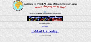
For my first assignment from the Assignment Bank for DS106, I’ve decided to do the Wayback Machine Assignment. I’m supposed to use the Wayback Machine to look at versions of a website in the past, and compare it with later versions. Instead, I’ll be looking at a website that doesn’t have versions to compare.

Space Jam was released in November of 1996. Warner Bros. had a website created to promote the film, a bold move at the time. In 1996, there were 36 million internet-users. In 2016, there are 3.6 billion (a 100-fold increase in 20 years). For this relatively small audience, the glorious Space Jam site was created.

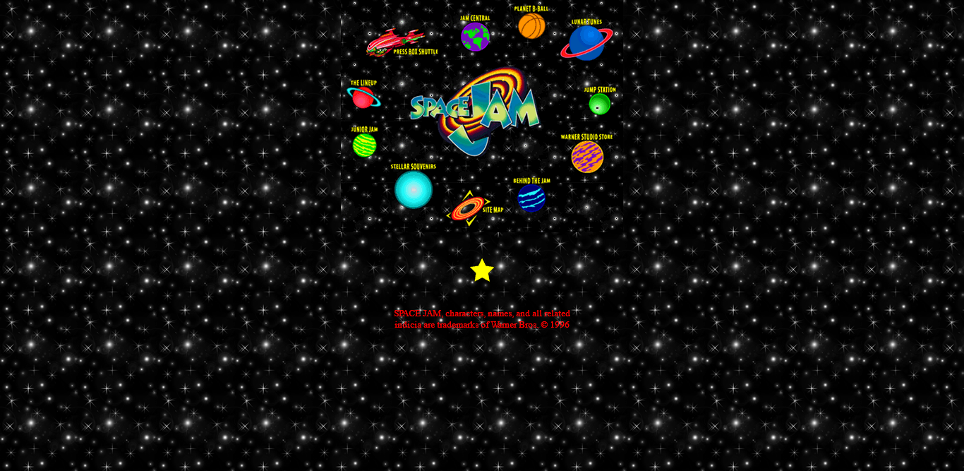
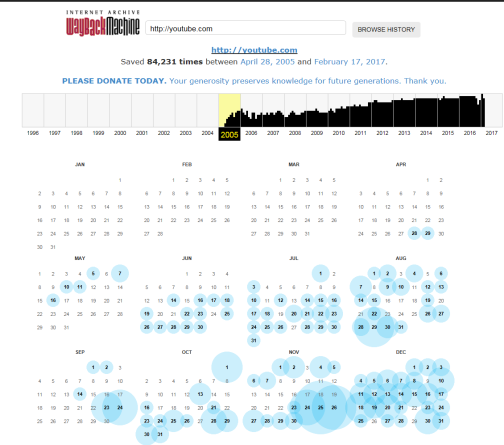
January 24??, 1997 is the earliest date the Wayback Machine has an archived version of the main page of site for. There’s also an archive of the intro page from December 27??, 1996, but the main page is more important:

The Space Jam website has been moved to a different address on Warner Bros.’ main website, but it still exists:

20 years later, and the only differences are:

  1. The star that takes you to the site credits is gone.
  2. There’s a link to legal information.

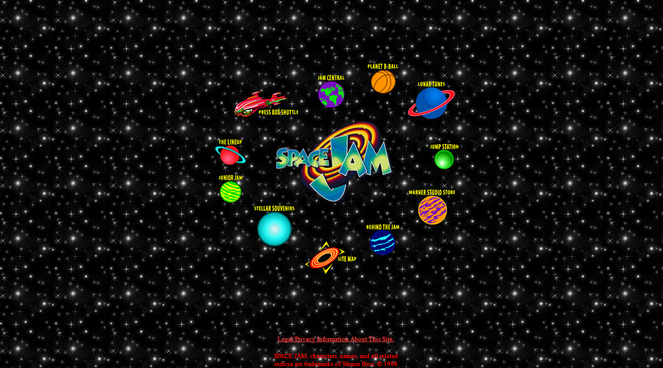
That’s it. The Space Jam website is interesting not because it has changed so drastically over the years, but because it hasn’t really changed at all. It’s become something of a digital museum, a relic of an internet that no longer exists. Exploring around the site can show you just how much digital media has changed over the years.

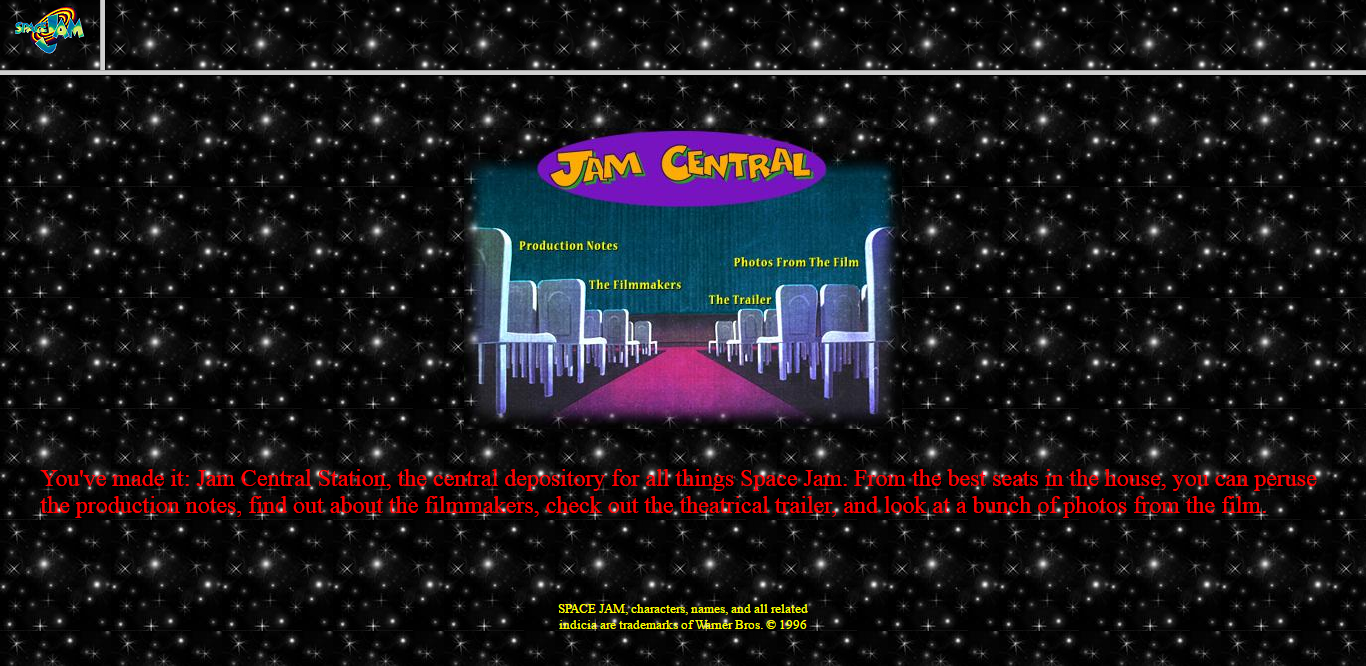
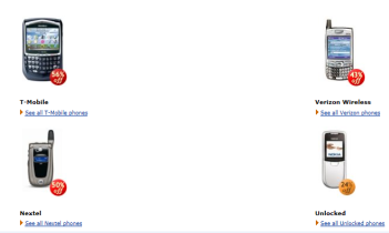
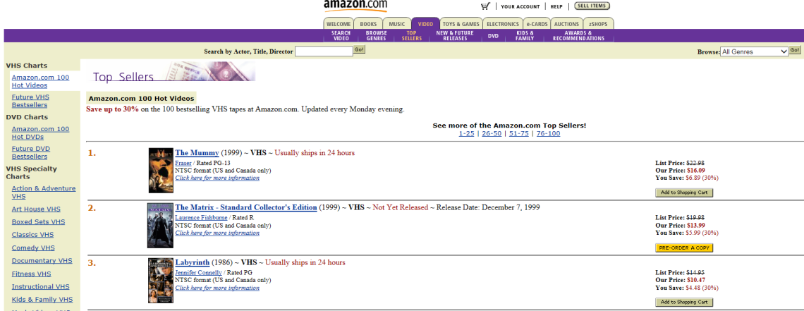
It has it all: horrendously 90s choice of red Times New Roman on a starry background, an unusual and broken navigation bar at the top, and super fun orange letters on a purple background. Every page of the site looks similar to this. All except the page that links to the Warner Bros. Studio Store:

This page is interesting because it still has the Space Jam navigation bar on the left, while the remainder of the screen is filled by the WB Shop site. The stark contrast between the 1996 and 2016 web design makes this page especially interesting. While the Space Jam site as a whole serves as a preserved relic of the internet’s ancient past, this particular page gives a side-by-side comparison, showing how different things have become in the 20 years since the site went up.

Space Jam‘s website is interesting not because of how much it has changed in the past two decades, but in how little it has changed. The internet has increased in size a hundredfold, and websites have gotten exponentially smoother, cleaner, and larger, but the Space Jam site has stayed the same. It hasn’t been taken down, found only in some third-party’s archive; it isn’t lost forever; it hasn’t been updated. It’s one of the internet’s few constant values.

ESPN Time Machine

Another assignment I chose to complete is the Way Back Time Machine. The assignment called for “Using the Way Back Time Machine website on Internet Archive, take screen shots of a favorite website overtime. Then, look at how the website has changed for better and worse.” The site I chose to analyze is ESPN , and I am going to check the site’s progression in 2 year intervals, beginning with 1998. Here, the site looks rather bland, as was the standard in the 1990′s. If this were the ESPN site today, it would not be looked upon as the “worldwide leader in sports” anymore.

Screen Shot 2013-03-24 at 9.45.27 PM

Next, we have ESPN in the year 2000. As you can see, the site has become more interactive with a score ticker, as well as a survey on the right sidebar. There is also a lot more color present. Clearly, there has been much progress since ’98.

Screen Shot 2013-03-24 at 9.49.43 PM


Next, the year is 2002. The webpage content is similar to what it was in 2000, however the major difference is the new logo. I have to agree that the new logo is more aesthetically pleasing.

Screen Shot 2013-03-24 at 9.55.08 PM

Next, in 2004, all whitespace has finally been eliminated from the homepage, which is customary for webpages today.

Screen Shot 2013-03-24 at 9.57.37 PM,

In 2006, you can finally see the resemblance to what the site looks like today, with links to the main stories of the day on the side of the page. These links are helpful as they provide a detailed title, which gives the user an idea of what links will interest them.

Screen Shot 2013-03-24 at 10.00.17 PM

In 2008, you can see the first mention of mobile integration of ESPN. They are advertising their podcasts that can be listened to on your phone. How innovative! Also, we get a first glimpse of the top score bar that is used today.

Screen Shot 2013-03-24 at 10.02.57 PM

In 2010, the site is essentially the same as we know it today. This is also the first instance we see the option to choose your city on the top of the page.

Screen Shot 2013-03-24 at 10.05.50 PM

And finally, here is ESPN.com as we know it today.

Screen Shot 2013-03-24 at 10.07.40 PM

All in all, this was a very interesting experience to see the progression of ESPN’s landing page throughout the years. From the times of Dial-Up connection to the Wi-Fi today.

Travelin through Yahoo!

For the rest of my assignments, I decided to do the Way Back Time Machine Assignment, which reminded me of my radio show so I couldn’t resist! It involves looking at a website and just seeing how its changed over the years, either for better or worse through internet archive.  It was actually hilarious to look back on websites such as Myspace, but for this assignment, I decided to look at Yahoo! and take screenshots!

2000:

2000

2005:

2005

2010:

2010

2013:

2013

There was a drastic change in the past decade, and it’s definitely for the best! This easy breezy assignment was two ?’s but it was a pretty cool tool to go back and see different websites and how much they’ve changed over time!

Wally World over time

The first web assignment I completed was the 2-star Way Back Time Machine and it was really interesting. For this assignment we used the WayBack Machine to search for a particular website and see how it’s changed over the years. In doing so, we must provide commentary on whether the changes have been beneficial or not.

While I admit I’m not a personal fan of Wal-Mart, I decided it would be interesting to see how its web design changed over the years. So first lets take a trip through time.

Wal-Mart’s website went live in 1996 and it looked like this on December 29th, 1996:

12:29:96

Fast Forward to November 7, 2000 and it received a bit of a makeover:

11:7:00

Two years later, December 3, 2002,  its more colorful:

12:3:02

On December 29, 2004 the website has more tabs and its slogan is added under its name:

12:29:04

Just one year later, in 2005, the color scheme is all blue and white, much more dull and it takes away a full row of tabs on the top.

12:29:05

In 2008, the site has pops of orange and yellow. There are more tabs on the sidebar as well.

12:29:08

December 29, 2010, the site is just a little more tailored and has been this way ever since.

12:29:10

The way the Wal-Mart website looks now is the best it has been over the years. Clearly it has made a big transition since its first design in 1996.  In 2005, it had a period of very dull colors and looked very drab. But I think the pops of orange and yellow, against the blue really make the site stand out.

It’s design now is very user friendly and easy to navigate. The front page highlights specials and deals the store has and then a person can look under different categories for the specific product they are looking for. Anytime I’ve had to search for a product, its been easy to search and find. I think that Wal-Mart has created a website that appeals to its consumers and is user friendly and organized for everyone.