Way back when

For my final assignment this week, I decided to do one called the Way Back Time Machine.

Using the Way Back Time Machine website on Internet Archive, take screen shots of a favorite website overtime. Then, look at how the website has changed for better and worse.

I’ve done this before, just for fun, on sites like Facebook and Reddit, so I thought it would be interesting to see the progression of a different website. I chose to work with YouTube mostly because no one else had done so yet, and also because the site has changed so much recently I figured that there must have been changes over time that I didn’t notice.

I stuck with one month throughout the years–October. I don’t really know why I chose October, but I just went with it.

YouTube began in 2005, so my first screenshot is from that October 1st of that year.

After looking at all these different snapshots of YouTube, I have to say that they still haven’t gotten it right.

The first two years, 2005 and 2006 were the worst, of course. So many tabs and links, I don’t even know what I’m looking at. Then, 2007, 2008, 2009 all have this really strange “Videos being watched right now.” I never understood that. I don’t think I ever saw one video that was in English when I would go onto YouTube during those years. At least the developers reduced the number of tabs at the top of the page. They also introduced “community” into the mix. I wonder if this was in an attempt to draw in the MySpace/Facebook crowd?

I say this because in 2010, this tab disappears. Also, thankfully, the “Being watched right now” section disappears. Trending videos were added as well as a section for “recommended videos.” Big brother begins. In 2011, the developers changed pace and made the homepage about different categories for videos. Completely ineffective. Who really looks up videos under “Music”? I have a feeling that most people know what they are searching.

In 2012, the developers must have been upset with somebody. I remember looking at this homepage and going, “Where is everything?” The site began to look a lot like social networking sites that updated you on what your subscribers and people you have subscribed to are doing. I don’t want to know who liked what video.

Finally, we end here in 2013. Probably the MOST effective website layout so far, but definitely not the most efficient. I wasn’t sure what was on this homepage for a long time. Are these just random videos? Are they the most favorited? Most liked? Most viewed? In addition, the sign in button is up in the upper right-hand corner. For someone like me who goes through multiple gmail accounts in a day, this has become the most frustrating aspect of this layout. I can never easily get to it unless Google Chrome takes up my entire screen.

Overall this was an interesting exercise in frustrating website layouts…


October 1, 2005

October 7, 2006

October 1, 2007

October 2, 2008

October 2,2009

October 2, 2010

October 2, 2011

October 2, 2012

March 23, 2013


Web Assignment #2

For assignment number 2, I did this one. The Way Back Time Machine is absolutely fascinating. I looked at history.com, because it was the first thing that came to my mind.

history.com-3

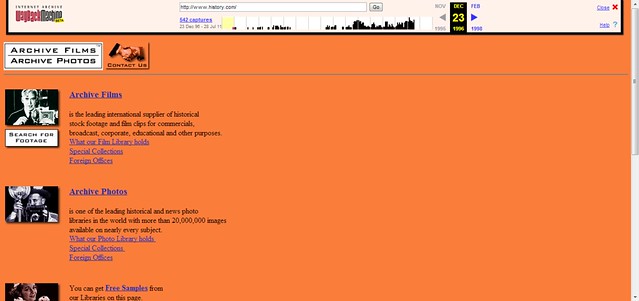
This is the first image, from 1996. I took a screenshot with jing and uploaded it to flickr. It’s pretty cool, because it seems to be more of an archive rather than the sensationalized thing it is today. Also, the resolution looks like it didn’t adjust (which annoys me). The colors are also horrendous.

history.com

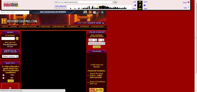
This one, from 2004, is an interesting one. It appears that the history.com briefly changed the url to historychannel.com, which would be more accurate anyway, since their archive is not especially history-ized. Also, the big red space to the side bothers me a little, but the color is a little better.

history.com-2

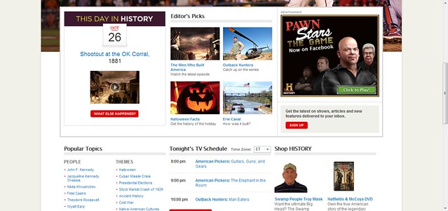
This image is from present day. Here it is clear that the history channel has done some serious reworking of the concept of history and has become more like TLC with the entertainment aspect. Swamp People and Pawn Stars sure are entertaining, but are they really deserving of the url history.com? Also, the site sensationalizes itself now, but if you were to type in an actual historical event, they misinterpret it and are usually a bad source.

WayBack Wikipedia

Wikipedia.org is one of my favorite and probably most used sites. It’s a tool which can help be gain a basic understanding of things before I delve deeper into them. I’ve learned a lot from Wikipedia, as well as the sources they link to.

Today Wikipedia is a slick site with a cool globe puzzle thing with different letters from a selection of languages as well as language selection portals orbiting around it with a simple sleek white background. Now when we look back to 2001, the year it was created, it is very blocky and cluttered. The page is full of blue links to different articles because that was the only way to go about it have all the links on a single page for the viewer to choose from. Their selection of articles was severely limited too, as is to be expected from a site in its infancy. Skipping forward to 2003 we see the well known wikipedia puzzle globe thing. the page also get much more organized and less harsh. The page is still loaded with links to everything they have to offer but the included a search box. they also separate certain sections and color coded them. Now skip to 2009 where we see a much more organized and more friendly visual for the homepage. there are different articles linked and referenced to but not a cluster of blue links attacking the eye. In reality the 2009 homepage is just like the one today though they added that intermediary step that I mentioned in the beginning which aids in the use of the site especially since it has become such a wide used site all over the world.

This was an easy enough thing to do using The Wayback Machine though screen grabbing was a bit of a pain. I’ve never screen grabbed on my current computer and you have to use a certain program to  do so. I guess it works out so you don’t have to edit out the stuff you don’t want like your home bar and search bar and everything in the shot as well.

Time Machine For a Website

So this assignment for time traveling through your favorite websites is awesome!  It’s funny how quickly we forget how certain websites looked before the last update,  You constantly hear people complain about every new Facebook update but how quickly we forget how we hated the last update just as much. Way Back is a great tool to look back at how things were!

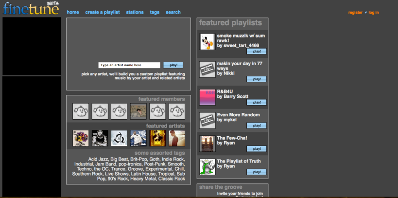
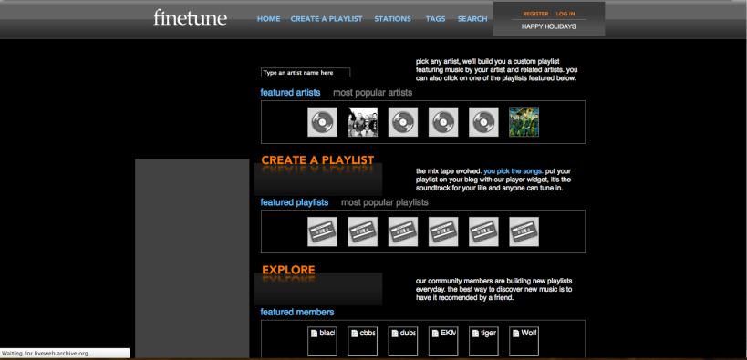
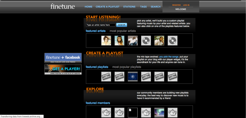
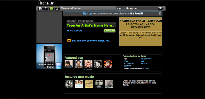
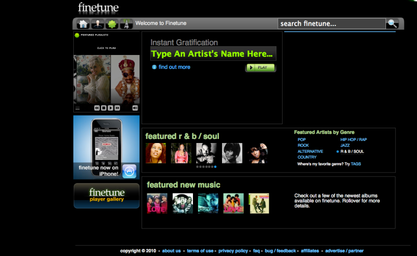
But for the purpose of this assignment I chose to do a website that’s not Facebook.  I picked one of my old favorite music websites called finetune.  This website offered the ability to comb through their music catalog and create playlists.  The only catches at first were you were only allowed 3 songs from the same artist per playlist and the playlist needed to be at least 45 songs long to be playable.  This website opened me up to a whole world of music that would never known about through suggestions from similar artists and listening to other people’s playlists at my own leisure.  It was a really good tool to get to know specific bands and songs because of listening to your playlists randomly being played multiple times.  I spent many nights just going through music and learning about artists and new genres.  Sadly the website is not what it once was.  Because of the massive funding necessary to maintain a website like this and the money that would be due to record companies for using their songs, the website no longer offers the playlist building ability, This practically brought the community and usage of the site to a standstill, They are still in existence and have tried a few branch off ideas such as an online DJ similar to Last.FMs scrobbler that allows the website to access your iTunes and broadcast what you are currently listening to others but it never took off.  Fine tune also offered a few different players that could let you use your Wii to stream music to your TV and another app to stream to your I-Phone.  There are plenty of other websites that have developed like Fine tune such as Last.FM, Pandora, Grove shark and 8-track, but it is just inconvenient to have made all these playlist and not be able to add to them anymore.

I think flaw finetune had to its structure was poor programming, it was prone to freeze up and load things in an odd way.  Your player could often freeze or not load something causing you to have to restart the playlist.  Also later on skipping songs became a limited ability, they did not want you to make playlists solely for the purpose of listening to one song and just skipping the rest as filler.  This is true for most music player websites now though, with the exception of grooveshark.  Music sharing is a touch subject, the lines of ownership, stealing and radio have become blurred because of the internet and how we use it.  I don’t think these big companies and record labels that are against sites like fine tune and last.fm understand how greatly these internet radio sites affects the amount of people it brings to their artists.  A lot of people do buy the albums and pay to go to concerts and buy the merchandise simply from finding the music on their own through interactive sites like this.  It’s a shame that they are constantly being threatened by being shut down under different copyright acts.

Finetune.com

All images are from http://archive.org/web/web.php and Finetune.com.

Debian: An Examination of its Web Presence 1997 – 2012

1997
1999
2001
2009
2011

Assignment: Entitled ‘Way Back Time Machine‘ (ds106), it tasks students with looking up their favorite websites and seeing how they’ve changed from the earlier years of the internet using the tool of the same name, Way Back Time Machine (tool).

Initially I didn’t know what website I would choose. Some of the websites I wanted to do, such as Firefox’s, were too new and some, such as Google, would be too generic.  Instead I chose to look at the website for Debian Linux.  This Linux distribution began in 1993 which meant their web presence would have a much longer history than other popular websites today. Above is the gallery of images I took which all represent major changes to the website. Here are some comments:

1997: Debian’s first website is very simple and simply composed of a graphic logo and text.  The design is not at all focused on looking good, it’s only meant to show information.

1999: This new look was a marked improvement over its predecessor and brought in a lot of new design elements. It doesn’t simply show information anymore, but actively tries to present it in a more aesthetically pleasing way.

2001: A very subtle change, but you can observe rounded corners on the top and side navigation bars.  The logo for the project has also changed and is now centered.

2009: Eight years later the layout remains much the same, but does have wider spacing between navigation areas and content.  Looks rather outdated for a site in 2009, although the graphic prominently displayed looks modern and nice.

2011: Finally, in 2011, the website layout was changed.  Perhaps as a 10th anniversary gift to the old layout they finally put it out of its misery. This new layout is still minimalistic and very white, but they’ve finally ditched the ugly ‘serif’ font that had remained with the site for 14 years! Even though the design is simple, I feel this website is serviceable and fairly modern looking, something that couldn’t be said about it previously.

As of today, the layout is the same as 2011. Although I’ve never used Debian*, I still enjoyed taking a look back at its web presence history and seeing how the project represented itself. Very glad that I chose a website that wasn’t mainstream and that I wasn’t familiar with, it made for a much more interesting “Way Back Time Machine” adventure :D

- Paul

*Linux Distros I’ve used: Mandriva, SUSE, Fedora, and Ubuntu. Go Linux!


DS106 Assignment ~Way Back Time Machine~

The Assignment: When I was choosing what to do for  my first DS106 assignment, I found this assignment but nothing came up on me mind to connect with Alan Turing at that time. So I thought to myself this is a great opportunity to do it. Way Back Time Machine  was my second challenge for the DS106 assignment. The assignment instructions tell us to:

Using the Way Back Time Machine website on Internet Archive, take screen shots of a favorite website overtime. Then, look at how the website has changed for better and worse. Blog about what makes a website effective and how that changes.

Process: First of all I did a google research on Way Back Time Machine website as I never heard of it. I got really surprise after founding out what this service is all about. Basically, this website is an Internet archive where allows users to access to web pages of the past. Amazing right? I just didn’t imagine of such website existences. My next step was to search for a website that impacts my readers and myself. I started with Facebook but unfortunately, they did not have the record for Facebook which I found really weird and got disappointed as it is one of the most popular websites on the Net. I look for Youtube, Google, Wikipedia, Yahoo! and other services and actually was pretty fun looking at how these websites have developed through the time. However, non of these websites impressed me a lot. There I was lost thinking of a known website that can be attractive and that can had a radical change. I was at the computer lab sitting with my boyfriend, and he was looking at the NBA website. He got interested in my work, so I looked up at the NBA website on 1996 and it was just shocking. He was surprise as much as I was when we saw the differences. Instantly, I knew that this was the perfect website to use. Simply I looked at the recent website of NBA and took screen shot same as for the old one. Here I learned a new thing about the computer. I do not know if its embarrassing or not about not knowing the existence of the ScreenShot. Well, I did not know and the first thing that came to my mind was taking picture of the screen with my camera (Yeah thinking it now, it is really embarrasing). When I knew the existence of that button told by my boyfriend I was embarrassed and realized that there is so many stuffs that I do not know of the computer and if I knew it before, my life using the computer will be way more easier. After, taking screen shot, I use Gimp to modify each image.

Story: Here I am going to blog about how the website improved during 16 years.

According to Way Back Time Machine this website is a record of the October 22nd 1996.

As everyone can see it is very simple, but what surprise me about is that it has actually colors and a image like the one on the top of the website. When I was looking at past websites like Google and Wikipedia, they did not have any color or image at all, just letters. Also, it impressed me that this website have the category of buy online and live on the Internet. It was not too simply like the others websites on 1996. In my opinion it is quite a pretty well organized website for at that time.  Now, lets have a look at the recent website.


As everyone can imagine, the picture below is the recent NBA website taken on January 25th 2012. One of the obvious changes in the website is the quantity of information that the website provides

?It shows how many games are going to play and the time schedule of it of that day, the day before and the day after.

? The top of the website provides lots of categories where a user not only enjoy looking at the news but also reading blogs, watch videos or get informaion about the players.

?At the top and bottom there is a store link. The previous website had this category however, it has improved by putting pictures and do propaganda like “get 30% off”

? At the center you can enjoy the top news and pictures for the date. Previously, it had one picture, however it has improved by showing several of them as a slide show

For the top of the website I think those are the main points, now let’s have a look at the center of the website

? A variety of videos categorized

? Information about the website writters and their pictures

? Users are able to participate through voting

Mainly videos are shown up in the center of the website

At the end of the website, not only votes, galleries are avaiable but also, access to NBA with other services such as Twitter and Facebook are shown to follow.

Some informations provided here you can find it at the top of the website as well as at the center. I imagine that the purpose of this, is to give access to mainly information at anywhere of the website the user is on.

Another difference with the old website is that, here you can see that each category is divided with a frame which make the users easy to read. Also, as the recent website has more variety. The old one contains information such as news, schedule, results as well, however the recent one made it easier for the readers to have a look at the main information in the top page without having to wait for page to open. One can enjoy exploring at the website with the new one and enjoying it better. This shows how the technology has advanced and how throughout the time, websites became easier to use.

I found a website talking about the Modern Websites Using HTML5. Apparently, HTML 5 is the fifth major revision of the basic language of the World Wide Web. It is still in experimental mode but already used by many web developers for its progress, improvements and benefits. According to HTML5 Tutorial things such as 2D/3D graphics, web applications and more awesome new technology will introduced on the web. I wonder how the future NBA website will look like in 50 years :)

Way Back Time Machine

_cokwr: Using the Way Back Time Machine website on Internet Archive, take screen shots of a favorite website overtime. Then, look at how the website has changed for better and worse. Blog about what makes a website effective and how that changes., _cpzh4: On/In the Web, _cre1l: http://blog.jessicamas.info/2011/04/way-back-machine-assignment/, _chk2m: Jessica Masulli, _ciyn3: 115, _ckd7g: , _clrrx: , _cztg3:

Aol over the years

A site that I like to look at often is aol.com. I remember a long time ago when my parents bought our family’s first computer, and we used aol screen names for the internet and had to pay for it. It’s crazy to think how much things have changed in such a little amount of time. I mean, to us, 15-20 years seems like a long time, but when you consider the time-line of the earth, 15-20 years is like the period at the end of this sentence (actually probably smaller). I really liked this assignment because I didn’t even know a website like this existed, and now I’m probably going to be addicted to the wayback machine. I also really enjoyed this assignment, because, like I explained earlier, it was interesting to see the drastic change that has taken place in such a small amount of time.

This is aol.com in December of 1996. It looks likea pretty general, pretty boring screen. There aren’t many pictures and there aren’t many different sections of text, they are just kind of all in one column. But the interesting thing is that this would have been, visually, a well made website. So yeah, I guess I would describe it as pretty bad at this point in time, but there are a few good things about it. It’s got that whole header and icon at the top thing, which I think carries over to many websites today.


Here it is in July 2000. As you can see, it gets a little more colorful in 2000. You can see the navigation buttons at the top that are still present on many websites today. Even though the ads aren’t showing up, there seem to be a few more ads in this one as well. The design seems to be getting better, however, it is still missing some key things that make good websites today, like a variety of pictures and the screens that flip through top stories.

Here it is in October 2005. It gets even better and more user friendly in 2005. We start to see more headline photographs and the information sections are divided up. That’s because there is more information on the page in 2005 than in 2000 and 1996, which I think is an improvement. But when you look at this one compared to the future pages, you still see that there is some room for improvement. The pages aren’t customized and there are no videos.

And here it is in April 2010. And finally we arrive at a pretty up to date web page design. The things this one has that I like are the personalized backgrounds and there is a video. I know I might sound picky because I just complained that the previous websites didn’t have enough information, however, I also believe that there is such a thing as too much information and I feel like that is what we have come to in 2010. The websites are throwing too much information on a page and it gets confusing.

It was interesting for me to see the change in the website over time. The shift from such a plain, boring website to a well laid out website that is very interactive. There were things I didn’t like about the old website and there are things about the new website that I still don’t like, but I think the constant feedback from consumers keeps the designs constantly changing and they will do nothing but get better and better over time.