Mary Sue and the Anti-Mary Sue

I recently read the infamous essay “Mary Sue, what are you?” from the Tumblr Adventures of Comic Book Girl (the site is no longer up, but she has a blog here). This made the rounds on the interwebs a year ago, giving rise to a lot of debate, though the argument that Batman, or any other wish-fulfillment hero, would be  highly criticized if cast as a woman has a ring of truth to it.

Of course, even heroines (or sheroes if you will) that are decidedly not Mary Sues, who have flaws and struggle with real problems, are often criticized for these facets of their characterization. Buffy the Vampire Slayer experienced a lot of fan backlash during season 6 when Buffy suffered from depression and engaged in self-destructive behaviors.

This also occassionally happens with male characters. Prior to the publication of Deathly Hallows, I knew many Harry Potter fans who said that Order of the Phoenix was their least favorite book because of Harry’s angst. Nevermind the fact that the boy clearly has PTSD and most teenagers go through a moody period even when they aren’t orphans being stalked by a sinister dark lord and recently witnessed the brutal death of a classmate. Moody Harry is annoying.

I decided to create two Venn Diagrams, one of Batman and one of Buffy, to demonstrate the difference in characterization:

As a clarification, “people” refers to other characters in the series, though it also parallels viewer/reader reactions with the exception of Han Solo. Viewers love it when Han Solo is douchy. Just think of the Han shot first debate.

How to Photo Collage

There are several great ways to create a photo collage.

One great and free source I found for this is :

http://www.picmonkey.com

When the homepage for this website comes up there will be a “Create Collage” button on the left. Click that button and allow it to load.

Next, choose the format of your collage. For this Visual Assignment You will need to collage two pictures side by side. So, on the left side of the page click the icon with 3 boxes. The  ” Ducks in a Rom” format will have what you need. Click on “Ducks in a Row” and select the option with 2 rectangles (should be the first option).

Two boxes should now be on the main part of the page. Above these boxes click “upload” and upload the two pictures you’d like to collage.

After uploading you can drag the photos to the box you desire.

WAHLAHH!

DON’T FORGET TO SAVE!

Try this Visual Assignment

http://assignments.ds106.us/assignments/real-life-to-cartoon-collage/

I created a visual assignment today! You should all try it!

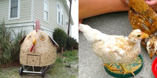
Chicken Collage

Over the summer I had chickens and for some reason thought that was super cool. I was so excited to collect my own eggs for breakfast in the morning. The real chickens in this photo are the one’s I had. I named the bright yellow one sunshine for obvious reasons ( haha that’s questionable). Sadly, she ended up being a he. Roosters are not fun early in the morning. So, I went to college and my mom gave them away. But, with chickens on my mind that summer, I couldn’t help but notice this strange contraption in someone’s yard. A family in South Carolina mad a chicken coop that  WAS a chicken.

I used several Tools to created this Collage. I used iphoto to upload, and edit my photos. Then I used http://www.picmonkey.com/ to create the collage. More details on the process to come in my tutorial on this assignment. So stay tuned!

Broccoli … and an assignment proposal

Okay, so I have this awesome map of the results of the 1988 presidential election:
It breaks down the popular votes by county, with an inset map showing the electoral votes break down. And there are two small charts, one showing the total number of poplar votes and the other showing the total number of electoral votes for each candidate (Bush: 48.9 million, 426 electoral; Dukakis: 41.8 million, 111 electoral).

I love this map for two reasons. The first is that it very eloquently demonstrates how a candidate who only received a strong majority of votes in a handful of locations (color intensity indicates how much of a majority they had) and won by a margin in the popular vote (Bush received 54% of votes) can still achieve a landslide victory in the electoral college. The second is that it predates the “Red State, Blue State” system introduced back in 2000. In looking at this map today, our instinct is to assume that Dukakis won in the blue counties and should have won the election. Nope. Historically, red is the color of liberals (like how red is equated with communism).

When reading the description of the GIF-fiti visual assignment and looking at the examples of Animated Banksy gifs, this map came to mind. I though it would be really cool to animate some sort of graffiti message across it, or perhaps do something funky with a couple of the states. My ideas, however, exceeded my Photoshopping skills. I probably could have used some sort of graffiti font or brush set, but I didn’t feel like digging, because I decided to do something a bit more educational…

If you have trouble viewing the animation, open the image in a new window.

This doesn’t even remotely fit the assignment’s instructions, so I’m going to be submitting it as a suggestion for a new visual assignment on creating animated gifs that are semi-educational (akin to The Oatmeal’s famous gif on SOPA). Here’s hoping my idea is accepted!