Steps for making an Artful Video

Get an idea and start planning!

First for any artwork production is the idea. You might already have one. If not you might know about various brain storming techniques. However, even then you need a start.

This can be a question, for example:

I want to show my artist friends something really awesome. What would impress them?

Often we got ideas from assignments a school provides.

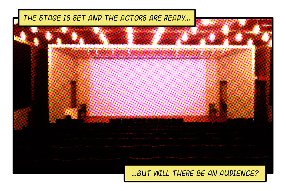
You may follow the idea I provide here, which is to juxtapose the visual (photograph) to the audible (narration) in a video and to share this in the Internet.

Please note, this is not just about creating a video. You need this steps for any kind of artwork, although the term pre-production is normally used for the video production process.

When you got your idea, write it down. One sentence may be enough.

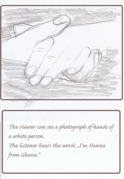
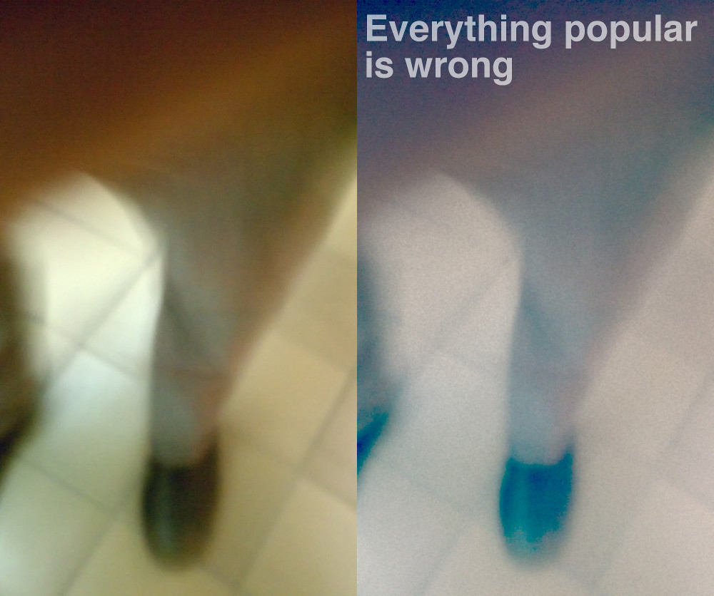
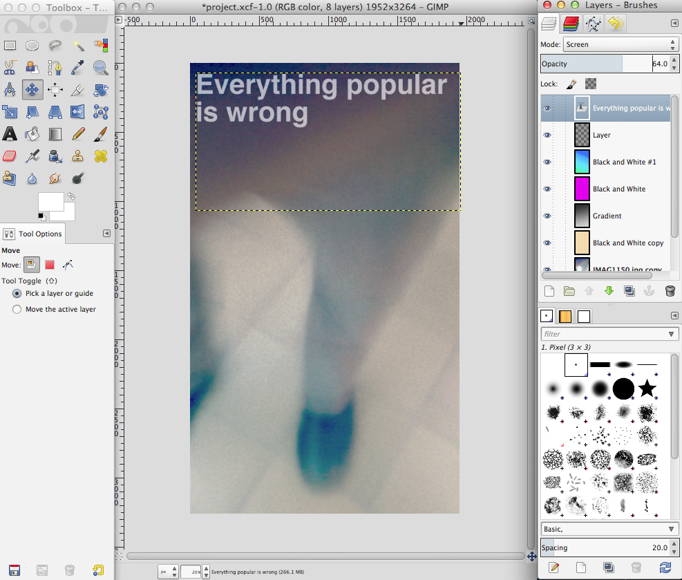
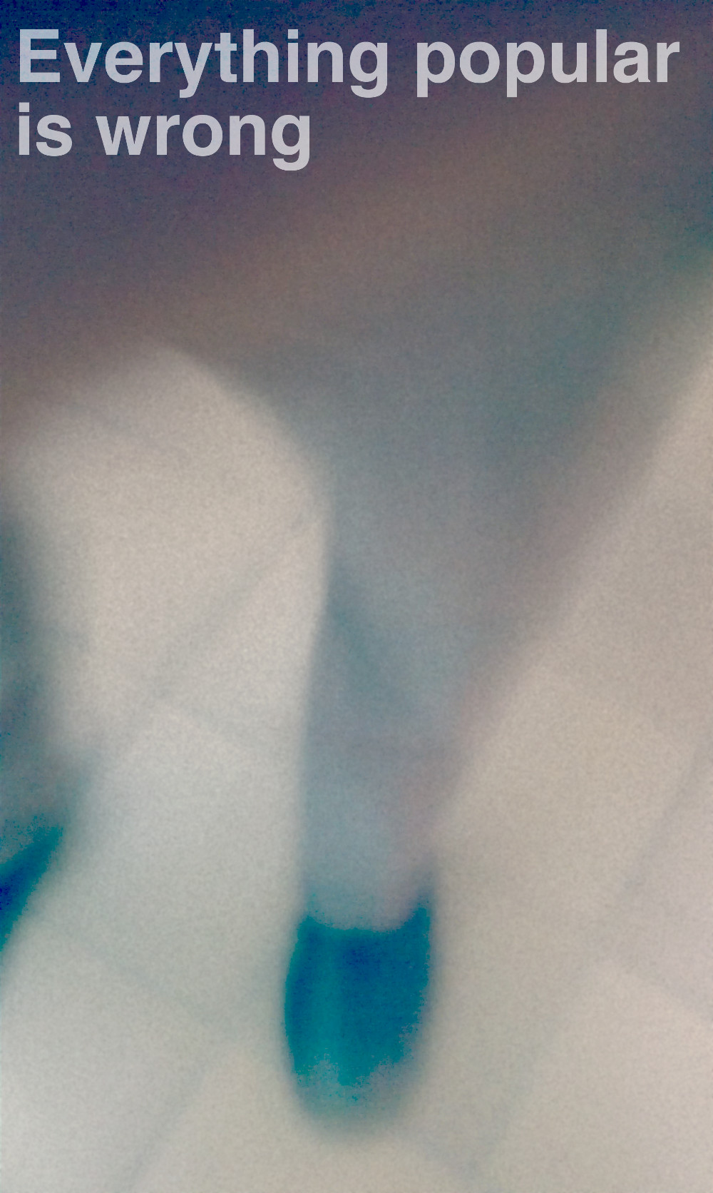
I want to make a photograph of white hands on a dark background and add the narration “I am Hanna from Ghana”.

Say something about the meaning you want to convey.

I want people wondering about the juxtaposition of the visual and the audible to make them think about their ideas from skin color and origin of a person.

(you may choose any other picture like the mouth of a bearded man sounding like a child and saying: I am Hans from a Grimm fairy tale. Or you show the back of a woman’s head with braided hair saying in a man’s voice “I am Jimmy from Pimp Town.” – Sorry for this, but art sometimes must be provocative to make people think.)

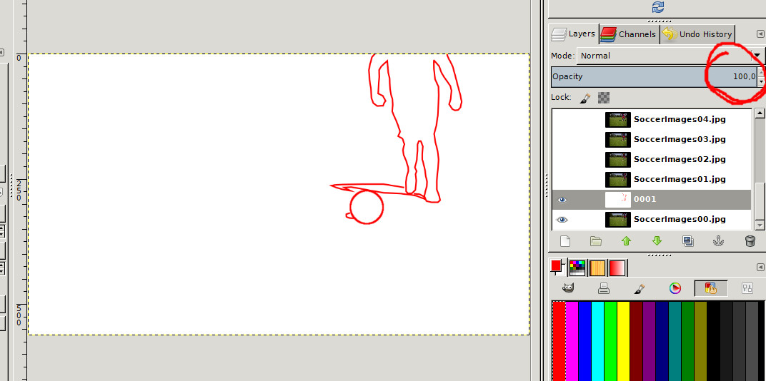
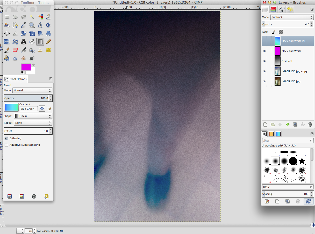
After this for visual ideas you should do any kind of sketch. For a video you might create a story board. For our purpose you can use any form you like. Look at my one frame story board.


You can do something similar for music and sound, like a time line or musical notation.

Now you have to explore what you need for your production. Compare it to what you have. Write it down. If you do not have what you need write down an alternative.


I need


I have
time, about 2 hours
I actually have two hours of time this Saturday.


hands
I will take my own hands.


a dark background
I have a cardboard box I will use.


camera to shoot the picture or the hands
I ow one myself and will use it.
(You may lend devices.)


a microphone to make the narration
I do not have any microphone.
alternative:
I have my zoom recording device and will use it for a microphone.
(You may have a microphone, which I recommend for a better quality, or you use your build in microphone.)


a software where I can make the narration with
I know I can add a narration to a video in the Movie Maker. I will use this option for my production which anyway results in a video.
(You may have to download it:
Click to get the Movie Maker
Or use any other software you know.)


a software where I can produce my video with, which is combining visual and audible and export this as a video


I will use the Windows Movie Maker.
a platform where I can share my video
I have heard tumblr is a good place to share. I will get an account there and share my video via this account.


Now go on and produce!

This will be the production part of your work. For the idea we are following here it will be just taking the picture you need. You can also see the narration as part of the production.

The following picture shows how you can shoot for example and eye of yourself. I have to mention that I can take single pictures with my video camera. You may have any other device and an appropriate tripod construction.

I also show you a picture that displays how I have set up my microphone which I have connected with an USB plug. You may have a microphone that uses a jack plug, which also can be connected to your computer.

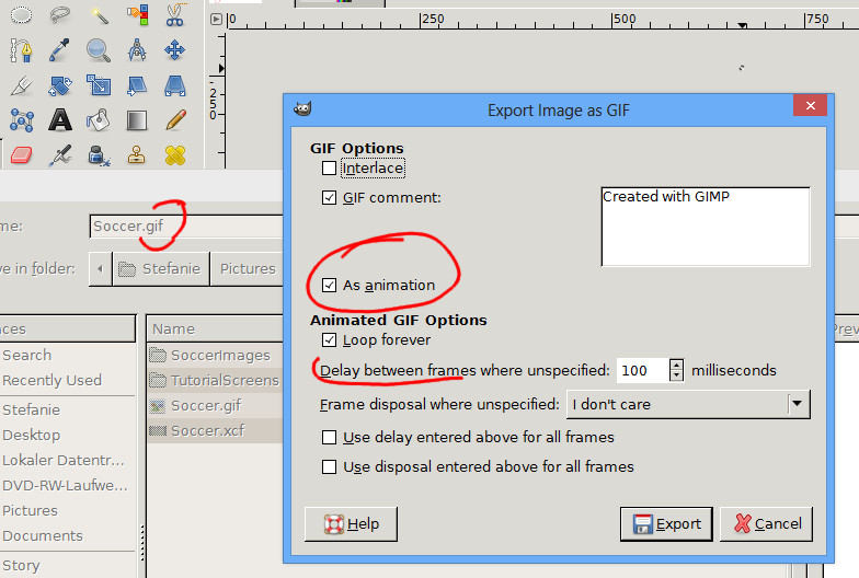
Next I will show you how to load the picture to the Movie Maker, how to make the narration and how to export your work as a video you can share, which can be called the post-production.
 

Share your artwork!

The next video shows how to share your artwork on a tumblr blog. (Naturally you can use any other blogging page.


One Way to Photo it Like Peanut Butter

A quick screen cast showing how to make an animated gif for the photo it like peanut butter assignment:

Rather than making animated GIFs from movie scenes, for this assignment, generate one a real world object/place by using your own series of photographs as the source material. Bonus points for minmal amounts of movement, the subtle stuff. See a bunch of examples at http://cogdogblog.com/2012/02/10/photo-gif-peanut-butter/

from: ds106 Assignments: Photo It Like Peanut Butter

Same procedure for the ds106 Assignments: Say It Like the Peanut Butter

Make an animated gif from your favorite/least favorite movie capturing the essence of a key scene. Make sure the movement is minimal but essential.

So this is a double tutorial;-)

I like Fireworks for giffing as it clearly separates layers and frames in different palettes. I’ve not used multilayer frames in this video, but it is handy for other gifs.

The video does not really show how to opne the different palettes, I didn’t plan it that well. I added text to explain a couple. Basically I used the Frames.
, layerers and optomise palettes. All open from the Windows menu.

Unfortunately Adobe is discontinuing Fireworks. I am still using the one that comes with CS3. It works fine on mac 10.8.

Although I’ve done a fair number of these to assignments I have no idea why peanut butter is involved.

Tina Sounds


Yesterday my friend Tina told me she liked the way I gave Jim some music to dance to. I though I’d show her, and anyone else how to play a sound when a gif (or anything else) is clicked.

I made a quick gif of a scene from Tina’s work that shows what a committed and brave actor she is, I believe she does all her own stunts.
tina_stairs

click the image to hear the soundtrack.

Video grabbed from ? Talky Tina — Living Doll — Two Minute Twilight Zone Project — Season 5, Episode 6 – YouTube just a screen capture using ScreenFlow.
A few frames extracted with MPEG Steamclip, pullined into fireworks and exported as a gif.

I then searched Freesound for a sound of someone falling down the stairs that was cc licensed: Freesound.org – “Falling Down Wooden Stairs.wav” by Benboncan.
In Safari I viewed the source of the page, searched for .mp3 to find the link to the low quality preview:
www.freesound.org/data/previews/80/80916_634166-lq.mp3 (I took the http:// off here as wordpress embeds if I do not)

I knew that Freeview provides previews in mp3 and ogg so that we can play then with html5 and do not need any plugins (Firefox on mac needs ogg other browsers handle the mp3, this is a moving target). the ogg files have the same url but with the .ogg extension.

I started this blog post, switching to the Text (html) view in the editor and put in an audio tag:


	<audio id="tinastairs" preload loop>
	  <source src="http://www.freesound.org/data/previews/80/80916_634166-lq.ogg" type="audio/ogg">
	  <source src="http://www.freesound.org/data/previews/80/80916_634166-lq.mp3" type="audio/mpeg">
	  Your browser does not support the audio tag.
	</audio>

If you are going to do this more than once on a page you need to give the audio a unique id here I used tinastairs.

You could copy the block of code above, replacing the id and the urls.
Update: The way wp adds paragraphs, it is best to take out all the line breaks when you use this.

This addes the audio to the post, it is preloaded, and will loop when played, but it does not show on the page (I’ve left out the controls parameter).

I then added the gif in the normal way. In the text view this gives me:

<img src="http://johnjohnston.info/106/wp-content/uploads/2013/08/tina_stairs.gif" alt="tina_stairs" width="420" height="260" class="aligncenter size-full wp-image-854" />

I added a snippet of JavaScript to play the sound when the gif is clicked:
onclick="a=document.getElementById('tinastairs');if(a.paused){a.play()}else{a.pause();}"
As a parameter of the image tag like this:
<img onclick="a=document.getElementById('tinastairs');if(a.paused){a.play()}else{a.pause();}" src="http://johnjohnston.info/106/wp-content/uploads/2013/08/tina_stairs.gif" alt="tina_stairs" width="420" height="260" class="aligncenter size-full wp-image-854" />
You can see I use the id of the audio tag, again you could copy this code and use a different ID.

Hopefully Tina will love this?

tinaeyes

I used the same process here, with different IDs but exported mp3 and ogg from Audacity, after recoding the sound from youtube.

Gimp Rotoscoping Tutorial

I’m going to explain how you can contour something in Gimp with the Path Tool to gain an exciting animated gif. You also can use a tablet and pen, it is just not what I’ll show here. I thought people without a tablet should also be able to do this assignment.

For this tutorial you need to know how to make single images from a video clip and how to import the images into Gimp. You can read about this in the ds106 handbook.

Once you have imported the images do the following:

Choose Shift + the eye symbol of the bottom layer in the layer tab to make only this layer visible.


Next create a new layer by clicking the New Layer symbol (1) in the layer tab. Choose a white background (2) and name the layer 0001 (3).  (The next will be 0002 and so on.)


After This set the Opacity of the layer to 50%..


Now it is a good idea to zoom in where you want to start drawing the outlines. Just enough to keep an overview.
(Zoom Tool or Ctrl + Mouse Wheel together with Space Bar + Left Mouse Button)
 
After you have selected the Path Tool, click along the outlines. (If possible don’t move the mouse while clicking, you may come into the edit mode, where you can shape the path.)
If you reach the edge of the screen just use the Space Bar together with the Left Mouse Button to move the visible part or just use the scroll bars.
Don’t overdo this, we are going for the motion, not for the detail. Maybe I’ve already set too many points.


?
?
When you’ve finished your first outline, click Stroke Path (1)  at the Tool Options palette of the Path Tool. Then choose a Line Width (2) and confirm.  (I’ve chosen 3 appropriate to the resolution of my image. You may need a different width.)
Normally the stroke will appear in black, which is the default foreground color. For changing the stroke color, change the foreground color.
 
 
?

To position the path tool anew you have to select another tool first and then again choose the path tool. (There may be a better ways which I don’t know.)
For the ball you can use the Ellipse Select Tool plus in the Edit menu Stroke Selection.

When you’ve finished the outline of your first image set the layer opacity back to 100%. The result should look something like this.

 
You now can delete the layer with the original image or you can do it when you’ve finished all images.
 
Go back to the start of this tutorial and do the same with any of the imported images.
 
When you’ve removed the original images you can play back the action.
Go to Filters in the menu bar and choose Animation -> Playback.
 
Maybe you have to scale the image now. For an animated gif the image should not be larger than 800 in width. In the end this is up to your choice, but note if you save something as a gif file the file size is restricted. The more images you need the smaller they have to be.
 
Just try to save your work as a gif file now (File menu -> Export to -> Filename.gif). If it is too large you will have a pop up window which tells you about this.
 
Don’t forget to check the option As Animation.
 
You should also experiment with the delay between the frames, to find out which speed is the right for your animated gif.
 
 
Go to your gif file and open it in any preview. I personally open it with the internet explorer. If you’re fine with the result you’re done. If not correct what ever you want, but don’t forget that there are many more assignments to do.
?

It’s Vacation time! {Tutorial}

Here is a quick tutorial on how to make my own assignment “It’s Vacation time“.

First you need to decide what vacation you want to make a video out of and gather all the pictures. I find it easiest to create a new folder on my desktop and save them there, this way they are all together.

pictures


Now you are ready to put them into iMovie. Of course, iMovie is on a Mac so I don’t know if this is true for Movie Maker. But all you have to do is click, drag and drop each picture into iMovie.


Screen shot 2013-04-28 at 12.47.10 PM


Next add in your Title and Closing Credit slides (seen here in the orange). To do this, you will select the “T” on the right middle of iMovie and different designs come up. Select what you like.


Screen shot 2013-04-28 at 12.59.39 PM

tutorial 1

Now edit the video as you so choose, adding some titles on to the pictures and anything else you want.

Then add some music. I went with “Good Life” by OneRepublic. I already had the song, so I went to iTunes and drug it into iMovie.

Screen shot 2013-04-28 at 1.17.25 PM

Screen shot 2013-04-28 at 1.21.22 PM


The Green line is the music. Make sure to make it fade out at the end, so the music doesn’t stop abruptly. TO do this, click on the gear symbol and edit audio, you can decide how many seconds out you want to fade it.

And from here you are done. Make sure to finalize and upload it to youtube.


A Capella With Yourself Tutorial

Here’s a bit of a Garageband tutorial for the “A Capella With Yourself” audio assignment (if you’re still interested in audio that is!)

Step 1: Write a song, OR pick a song that you like.
Tip: When you’re picking your song, make sure it’s within your vocal range so you dont sound like a shrieking cat or a deep throated whale.

Step 2. Listen to the song over and over again
Each time you listen to the song, you should be listening for the beat, the lead singer, the background singer(s), and if possible, the music key. This can be very tricky if you don’t have a musical ear….but here’s a page that could possibly help you called Song Key Finder which tells you what key the song is in and what scale it is (you might find your song on this site under “Popular Songs”.) Once you have the song key, you can sing ANY note within that scale in your a capella and it would sound good.

Step 3. Open Garageband and Create Tracks

When you open Garageband, create 3 tracks (or however many “people” you’re singing with) by going to Track–>New Track. What this does is give you the chance to overlay each voice’s part.

Create Track photo Picture5_zps765f4acc.png

Step 4. Start Recording in Parts

On one of the tracks, click the red circle button at the bottom of the screen to start recording. The first track should be the lead singer’s part, singing the main theme of the song (this is the part of the song you’re used to and probably sing in the shower.) When you’re done, press the spacebar to stop recording. It should now look like this:

Vocal Track photo Picture6_zpsc724749e.png

The next track should either be the backup vocals or the beat. In the image, I started with the backup vocals since I wanted to get all of the vocals out of the way. I dont really know how to explain singing a backup chorus other than taking a guess with the notes and hoping they sound good. After a few recordings, they’ll eventually sound nice. (or that’s just my luck.)

Background Vocal photo Picture7_zps43421baf.png

Lastly you should make the beat of the song. This can be done by snapping, clapping, or beatboxing (making “tss-tss-tss-tss” sounds). The point is to sound like some sort of percussion instrument to keep the song on track. If you cant find the beat of the song, try counting 1-2-3-4 OR 1-2-3 and see which one fits. (Most songs are in 4/4 so its 1-2-3-4)

Beats photo Picture8_zpsb3fe83d3.png

Step 4.5: Put some attitude and emotion into it!
No one likes a flat sounding song! Add some color to it to keep it interesting!

Step 5: Make Sure all the Sounds Align

Now that the hard part is over, all you have to do is make sure all of the beats and vocals line up to form the song. You can move each recording to fix it up if something sounds off.

Step 6 (optional): Add Effects

How would you like your singing group to be on stage in a concert hall? To make this sound effect, look to the right side of the screen and look under vocals to find the “Epic Diva” effect. This effect produces an echo and something called a reverb (not the repitition of an echo, but an open sound.)

Effect photo Picture9_zpsb85352d6.png

After clicking this for each track, under the Epic Diva options turn off the Chorus and Track echo buttons by clicking the blue light. Also go to the bottom and turn the scroller on the Master Reverb to about 44%. This is the concert hall effect.

Moar effects photo Picture10_zps509b4353.png

Step 7: Save it

To save the project, head up to the Garageband toolbar and select Share–>Export Song to Disk. This turns your glorious song into an mp3 able to be shared with everyone.

Aaaand you’re DONE!! Listen to yourself, yourself, and yourself now! You all are ready to have your own world tours!

Visual Personal Project: Comics Via Photoshop

One of the past assignment options we had was to create a comicbook effect. There’s a video tutorial for GIMP (via Brian Short’s blog). However, I didn’t use GIMP for this assignment because it’s lacking some useful features that will let me get things done faster for this effect. Instead, I tried to see what I could do with Photoshop. Here’s the end product:

The comic book effect I produced via photoshop

The end result of my experimentation

Process tutorial/details after the break.

Base Image

For a base image, I decided to use something comparable to the one that Brian used in his post. I’ve uploaded the full version of the image here, so feel free to download and follow along.

The image I used as the base of the assignment.

The raw image I used in the assignment. Feel free to download it and follow along; I’m releasing it for use under the Creative Commons 3.0 Attribution License.

Making the Halftone

The Base of the Image

First, I open the image in Photoshop and select the whole thing by pressing Control-A (Command-A on OSX) or by choosing Select > All through the menu. I copy it to the clipboard by pressing Control-C (Command-C on OSX). Then I create a new image by hitting Control-N (Command-N on OSX) or by choosing File > New through the menu. Click Ok without changing any of the size settings; it should automatically be the same size as the image in the clipboard. Paste the copied image into place by pressing (Control-V). To get the effect to work neatly, you’ll have to increase the contrast a bit. So go to Image > Adjustments > Levels.

The levels settings I used and the resulting image.

These are the levels settings I used. You don’t have to use the same image or the same settings, just make sure fine details you’d like to keep in the final image are in high contrast to their surroundings.

Once you’re done adjusting it, double click the layer name, which should at this point be Layer 1. The layer name will become editable. Enter Ink Color into the box and press enter to name the layer.

Copying Layers

Now Right Click (Control Click on OSX) the Ink Color layer near its name. A context menu should appear. Select Duplicate Layer from it. In the box that pops up, enter Smooth Glow into the box labelled As, and click Ok. Alternatively, you can click Ok and rename the layer the way I first showed you.

Now make a third instance of this layer, except name it Halftone Effect instead of Smooth Glow. The layers should now be named (from bottom to top) Ink Colors, Smooth Glow, and Halftone Effect. Don’t worry if the layers are named diferently or in a different. You can rearrange the layers by dragging them into place within the Layers dialog. You can also rename layers by double-clicking the name of a layer and entering text. You can hit enter to finish editing the layer name. Now click the eye icons next to Smooth Glow and Halftone Effect to hide them. You can click in the same place to unhide them, but right now we need to create an inking effect.

Using Filters

Now click on the Ink Color layer and make sure it’s selected, and let’s get filtering. Choose Filters > Filter Gallery from the menu. Then under the Artistic folder, choose Cutout. See the screenshot for the settings I used.

The Filter Gallery previewing the settings I used.

The Filter Gallery previewing a cutout filter. I used the settings on the lefthand side of the screen, but feel free to experiment.

Click Ok. Then click the space where the eye icon was next to the middle copy. The image should go back to looking like it did before you applied the filter. The layer you just made visible should be named Glow Effect. Select it by clicking the thumbnail icon directly to the left of its name. Choose Filter > Blur > Surface Blur. You can just crank the sliders to the right and hit Ok, but experimenting is OK too. In the Layers dialog, click the dropdown box that currently reads Normal. Instead of Normal, set it to Screen mode. Then set the Opacity (to the right of the mode drop-down) to around 35%. Don’t worry about precision; you fiddle with it later.

Now select the topmost layer and make it visible. It should be named Halftone Effect. Choose Filter > Pixelate > Color Halftone. In the box that pops up, leave all but the topmost box unchanged. Set that to somewhere between 8 and 30 (try experimenting). Set it to Multiply mode instead of Normal mode, and set its opacity to around 85%. You should now have an image that resembles the final product somewhat.

Making it a Panel

Tidying up the Layers Panel

Layers can be grouped into folders to help keep them organized. You can do this by holding down shift and clicking the top-most layer that will be included in the group and then clicking the bottom-most layer to be included. The layers in the layers box should all turn a shade of blue to indicate that they are selected.

how layers look before grouping them

This is how layers should look before you group them.

Then, click the menu indicated by the red arrow. This is called the Layers Menu. Choose Layers Menu > Group From LayersIn the resulting pop up box, enter Comic Panel as the Name and click Ok.

An image of layers successfully grouped

The comic book effect layers grouped into a folder.  You can expand the folder by clicking the down arrow next to it. You can also ignore the layer named Backup; I made to help to experiment with this process.

You can move all members of a group by selecting the group folder and using the Move Tool. You can also expand the group and move specific members by selecting them.

Making the Canvas Bigger

Now we need a white space around the panel to put the panel into. Normally, the panel would be placed into an existing document, but this way will teach you about resizing the canvas. Choose Image > Canvas Size.

Photoshop's Canvas Size Dialog

This is how you adjust the size of the image canvas without scaling the image. The grid of arrow buttons at the bottom is used to tell photoshop where to add or remove canvas area from. Experimenting with this is the best way to learn how it works.

In the dialog that pops up, don’t touch the grid at the bottom unless you want to experiment. By default, it adds pixels on all sides of the image.  If you’d simply like to proceed forward, set the units to pixels. Then, add a few hundred pixels to the give the comic panel some breathing room. Don’t worry about making the image too big, you can always crop it down later. Once you’ve entered the new dimensions, click Ok.

End product of canvas size expansion

Now the image is starting to look more like a comic book panel.

Making Borders Easy with Layer Styles

This one of the cases where Photoshop is much better than GIMP. Double-click the grey area to the right of the Comic Panel group’s name. The Layer Styles dialog should appear.

A screenshot of the Layer Styles dialog.

This is one of the most powerful features of Photoshop. We’ll just be using it to give things borders.

Click the stroke checkbox on the left to enable it, and move the window so that you can see the previews it generates. Drag the Size slider up to around 20px and set the Color to Black. Then click Ok. You have now applied a style to a group of layers. You can also apply styles to individual layers.

A partial screenshot of the Layer Styles Dialog in the Stroke subsection

The Stroke segment of the box allows you to give anything a border as long as it has a shape, regardless of whether it is a raster or vector object.

An important thing to note about layer styles is that they can be saved as presets, or even copied and pasted between layers or groups. This makes them very powerful and very convenient for making things look similar quickly, among other things. You’ll notice that the layers dialog now displays the style on the layer group.

Yellow Boxes

A shape added with the shape tool

I added a textbox with the Shape tool. See the leftmost side of the picture to find the icon for the shape tool and where to look for it in your own copy of photoshop.

Now we’ll add the text boxes. Pick a yellow color to fill the two boxes you’ll be adding. Now, select the Shape Tool from the Toolbox on the left. Then click and drag on the image to add a new shape. It will show up in the Layers panel at the right as Rectangle 1. Then, right-click the Comic Panel group and select Copy Style from the context menu. Then, right click the rectangle’s layer and select Paste Style. The rectangle should now have the same outline as the Comic Panel group. Now, select the font that you would like to use for your text. I chose Universal


Exporting for Posting

Design Create #1: Do I still hate GIMP?

I hate GIMP. Every single version of GIMP I have used in the past was frustrating. Tasks I found easy in photoshop seemed to have no equivalent in GIMP. However, I was willing to give the program a second chance.  I used the latest version to complete an assignment for my Digital Storytelling class: “Pick A Bad Photo, Apply A Vintage Effect And Write Something In Helvetica.”  The image below on the left was the base for the one on the right. This post will detail how I did it. At the very end, I’ll describe my current opinion to gimp.

Side by side comparison of the initial photo and the end product

Left: initial fumbled cellphone image. Right: Final product.

A warning: If you’ve never used GIMP before, you should start with a smaller image as your base so some of the steps detailed here don’t take forever.

I open my base image in GIMP and get started by duplicating the base layer. This gives me something to compare against the original version. I do this by going into the layers window and right clicking (CTRL-click on stock OSX w/o a mouse) the current only layer and selecting “duplicate” from the dropdown. So what next? I think that tan region at the top that appears to be my fingers is a good place to put some text. But it’s not exactly as faded as I’d like. I need a region with less detail for the text to shine through. Here come layer modes to the rescue, after the break.

Adding a Gradient

Gradient Tool Settings

This is what my settings for the gradient tool look like.

I make a new layer: Shift-Command-N, or Shift-Ctrl-N if you’re on Windows (you can also reach it through the new layer quick button or the layers window menu). Now I have three layers: a blank one, and two containing the photo. Then I select the gradient tool by clicking the a square with a gradient in it from the toolbox. I make sure the upper color in the color selector is black, the lower white, and the “FG to BG (RGB)” gradient is selected (see left). Then I drag it from the top of the screen to the bottom. If you didn’t downsize your image and/or your computer is slow/low on free RAM, GIMP might take a second to think at this point. But then you should have a screen of black turning to white. Here’s a screenshot of my workspace:

This is zoomed out. the toolboxes are a little bit cramped in this because I scaled them down to fit into an easily recognizable screenshot.

This is a zoomed out view. You can drag the gradient tool in different directions to get different orientations of the gradient.

Now, go over to the layers window and click the drop down labelled “mode” that currently contains “Normal”. That is not what we want. From the dropdown, select “Multiply”. And bam: you should now see an image that’s darker at the top and like the original at the bottom.

After Setting Layer Mode.

You can adjust how much darker the top is by clicking at different points in the “Opacity” box or the arrows on it. You can also type a number if you click on the number, or you can try to click and drag (this does not work very well however)

More Vintage Effects

Film Grain: Bringing The Noise

The dark areas of any layer set to multiply darken whatever is underneath. I’m going to add some film grain to this photo by adding some noise. With the same Gradient layer selected, I open up the filters menu. I choose Filters > Noise > Noise Generator. I go through each of the tabs and drag the slider way over to the right. The preview window will show up as black with white spots on it. That’s what we want. Don’t worry.

The Noise Generator filter in GIMP

Pushing the sliders to the right adds more noise. Don’t sweat a perfect amount of noise here. Just drag the sliders to where you like it.

If your image still looks exactly the same, that’s okay.  The larger an image is, the less 1-pixel sized noise will show up. Choose Filters > Blur > Gaussian Blur from the menu. If your image is large, choose somewhere between 4px and 9px as the size of the blur. Otherwise, 2-4px will do fine. Click Ok and wait for it to finish softening the noise. You should now have some actual grain.

This is what you'll end up getting after blurring the noise a bit.

It should look somewhat like this. Undo and play with the blur settings if you’re unhappy.

Maximum Instagram

At this point, I’m thinking we need more instagram. Select the copy layer. Choose Colors > Levels. From the drop down labelled Channels, select Green. Drag the black (left) triangle under Output Levels to the right towards the middle. Select Blue from the Channels drop down. Repeat. Select Value from the Channels dropdown in the levels window. In the Input Levels section drag the left (black) and middle (grey) slider towards the right. Play with these values until you get something that looks decent. Then hit OK.

I took some additional optional steps that tried to emulate my favorite features of photoshop (fill, gradient, and adjustment layers). Beware, these can be slow in large images. First, I made a new layer. I filled it with a bright pink color. I then set its Mode in the layer box to Soft Light and turned the opacity down to 17. Then I made another layer and used the gradient tool on it with a preset called Blue Green. I set its mode to Subtract after trying a few, and cranked its opacity down to 4.0. You will probably have to play with the settings here to get something that looks good for your image. But at this point, I think I have a perfect instagram effect going.

This is where the above instructions got me.

This is where the above instructions got me.

At this point, this is looking a little too dark for my tastes. So I’m going to lighten it up. Remember the gradient layer? I turn down the opacity on that to about 38. That leaves the pink a little strong. So I turn the opacity on that down to about 4.0. But it still needs a bit more Sepia tone. So I make an new layer and open the color picker. Then I choose a nice tan color and set the layer mode to multiply and the opacity to 18.0. And now, I get this:

An almost completed instagrammy image

This looks much better. It’s not quite as dark as the previous one.

Adding Text

See that darker space at the top? That’s where text is going to go. Step 1: click the big bold A in the toolbox. Enter Helvetica Bold into the textbox. I chose a size around 200px. You’ll have to play with it to find one that’s good for your quote. Make sure Color is set to white in the font toolbox. Then click and drag to indicate the area where your text will go.

A Gimp Text Area and Tool Settings

A text area freshly defined. See the Tool Options on the left side of the screen for the settings I used.

Click inside of the text area and type whatever you want. I’m going to take this assignment’s “instagram hipster photo” thing to 11 : “Everything popular is wrong” suggests that Oscar Wilde beat the hipster stereotype to the punch by over a hundred years. After entering the text I select the text layer, set its mode to screen, and reduce its opacity to 64.0.

A near-final photo

Almost finished with the photo.

Now I just need to save it for posting to the blog. At this point, I have a lot of layers so I first save the image: File > Save. .xcf is GIMP’s file format. Now I’m ready to export it. I flatten the layers from the Image menu: Image > Merge Visible Layers. This should bring up a dialog box.

These are the settings I used.

I used these settings. I may have had a layer I forgot about as Image > Flatten Image changed the look of the image.

Now I have one layer. I’m more or less ready to export . If you have a huge image, you might want to scale it down through Image > Scale Image (this is optional). Otherwise, simply choose File > Export and save the image as a .jpg wherever you want to keep it. In the settings dialog, you can ignore the quality slider and just hit Export. Let it save and…we’re done.

The end product.

The end product. It’s not quite instragram-y as I’d hoped, but it’s close enough. I’m not going to try to imitate bokeh or color streaks in this software.

Do I Still Hate GIMP?

The short answer is no. I’m mostly just disappointed. It does have highlights. For example, the text tool is drastically improved. It also has some unique filters and effects it includes look like they’re fun to play with, and can use some photoshop plugins through an add-on. However, the program is missing crucial features. Its current approach of making everything into raster layers is unacceptably slow; adjustment and fill layers would speed up editing drastically.  Layer styles are another crucial feature I miss from photoshop. You want to apply effects to text? A simple bevel perhaps? In Photoshop, you’re done in under a five minutes. If you’d like to change the text or the effect applied to it later, you can do so whenever you wish. In GIMP, you’re out of luck. Instead, you have to re-enter the text and re-apply the effect. Why? Because the effect is rendered to a raster layer. Also, better OS integration would not hurt GIMP. Spacebar to preview on OSX is also a convenience I’ve found myself missing.

I’ll post a more detailed examination of why GIMP needs to add these features later. However, that information doesn’t change the bottom line: I’ll only use GIMP when I absolutely have to. It’s too much of a hassle when compared to photoshop, but it can get the job done in an emergency.

Animated Movie Trading Card Tutorial

As promised, I’ve created a tutorial for the “Movie Trading Cards—Now With More Animation!” assignment I did earlier today. The tutorial was written in the spirit of the Animated GIF tutorial I wrote a while back which seems to have proven useful to more than a  few people. Man, I’ve been doing assignments and tutorials for #ds106 this weekend, what has gotten into me :)

You can find the tutorial titled “Creating Animated Movie Trading Cards Using GIMP” on the ds106 wiki.