The first web assignment I completed was the 2-star Way Back Time Machine and it was really interesting. For this assignment we used the WayBack Machine to search for a particular website and see how it’s changed over the years. In doing so, we must provide commentary on whether the changes have been beneficial or not.
While I admit I’m not a personal fan of Wal-Mart, I decided it would be interesting to see how its web design changed over the years. So first lets take a trip through time.
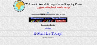
Wal-Mart’s website went live in 1996 and it looked like this on December 29th, 1996:

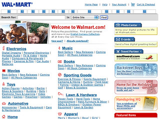
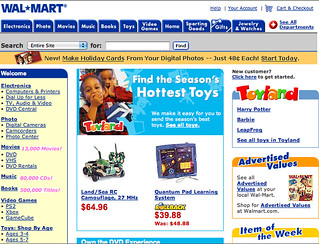
Fast Forward to November 7, 2000 and it received a bit of a makeover:

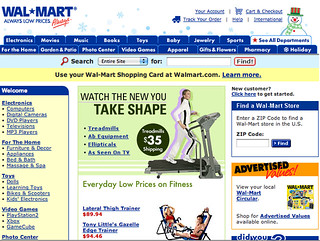
Two years later, December 3, 2002, its more colorful:

On December 29, 2004 the website has more tabs and its slogan is added under its name:

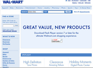
Just one year later, in 2005, the color scheme is all blue and white, much more dull and it takes away a full row of tabs on the top.

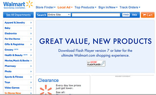
In 2008, the site has pops of orange and yellow. There are more tabs on the sidebar as well.

December 29, 2010, the site is just a little more tailored and has been this way ever since.

The way the Wal-Mart website looks now is the best it has been over the years. Clearly it has made a big transition since its first design in 1996. In 2005, it had a period of very dull colors and looked very drab. But I think the pops of orange and yellow, against the blue really make the site stand out.
It’s design now is very user friendly and easy to navigate. The front page highlights specials and deals the store has and then a person can look under different categories for the specific product they are looking for. Anytime I’ve had to search for a product, its been easy to search and find. I think that Wal-Mart has created a website that appeals to its consumers and is user friendly and organized for everyone.


