Love at First Shot

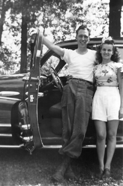
For this assignment I had to find or take a picture of a couple who are in love and write them a background story. I chose to use an old picture of my grandparents:

Love at First Shot

My grandfather was in the army and my grandmother was a nurse for the army. They met through mutual friends and were married for 51 years. I didn’t know my grandfather for long but was always told that the one thing that made him truly happy was his family. Even after his death, my grandmother would talk about him and think about him all the time. She would always celebrate their anniversary even though he was gone and never took off her wedding and engagement rings. For they never truly left each other’s side and I am proud to have spent as much time with them as I did.

The Pen Is Mightier than the Sword (Apophenia)

My third and final visual assignment of the week is the required assignment, Apophenia. It’s a 3 star assignment, bringing my total for the week to 9 stars. The instructions were

Find something in your house. Take a picture. Let your imagination churn. Make as many different augmented versions as you can think of. Help others see what’s in your head.

A link to the assignment page can be found here.


The image I started with was a picture of my pen that I took with my iPhone.

Original

The images I was able to create with the original picture are below.

JoustFinal

SurferFinal

PinocchioFinal

EmpireFinal


For this assignment, I wanted to use an item that people use everyday. I looked around the room for something I could use and my pen is what jumped out at me. It’s something that most people use everyday and it’s not terribly difficult to edit into photos if you’re still a beginner when it comes to using GIMP. I wanted to make at least three images, with the pen playing a different role in each image.

My first thought was somebody using the pen as a sword, hence the title of the post. I imported my photo into GIMP and used the Free Select Tool to outline the pen. I zoomed in 400% to make sure I got all the curves of the pen and as little of the floor as possible.1

When I had the whole pen outlined, I copied the selected region and pasted. I right-clicked the pasted layer and chose the “To New Layer” option to isolate the pen.


2

I searched for an image of jousters, found and saved the image I wanted, and then opened it as a layer in GIMP. I used the Rotate Tool to try to match the pen to the angle of the sword.

3

The pen was much larger than the sword, so I right-clicked the pen layer and scaled the layer down to a better size.4

I added a transparent mask to the pen layer to bring the knight’s hand back over the top of the pen – the technique I used in the Splash The Color assignment. I merged the two layers together and had my first image.


I forgot to get screenshots for the second image. I used a tactic similar to the one employed above. The pen and surfboard were not as good of matches as the pen and the sword though, so I had to do a bit of editing around the edge of the pen. I copied small patches of the water of the remainder of the surfboard and the back end of the pen. Then  I used the Smudge tool to try to make the pen blend in better.


For the third image, I started by removing Pinocchio’s nose. I copied over most of it with patches of white or the color matching the rest of his face. For the outline of his face that was originally covered by the nose, I copied a small section of his cheek from above and pasted it several times to complete his face.

5

Then I added the pen layer. I resized and rotated the pen to make it have a similar size and orientation as his nose.


My original thought for the final image was to have the pen completely replace the Empire State Building, but then I realized that the building was wider than the pen at the bottom. I would have had to do a lot of blending work at the base of the pen, something I’m not great at yet. I decided to just have the pen as the top of the building. For this image, I did something a little different. Since the pen has clear sections, you can see the color of the floor in some of the images. I used the Color Picker Tool to try to color in those sections to match the color of the sky.


Having completed the other visual assignments beforehand, this assignment was a little easier than I expected. The techniques I picked up and the practice with the tools made my work much quicker. I didn’t have to Google around for instructions on how to complete any of these steps, which is exciting. It’s fun to be getting a handle on a fun tool like GIMP.

Highlighting the Highlighter (Splash the Color Assignment)

The second visual assignment I chose to complete this week was “Splash The Color.” This is a 3 star assignment. The assignment instructions were

Color splash is a technique to emphasize details- you remove all color from a photo, and then restore original color to a single object, e.g. a green apple on a table. Think of the Girl in the red dress from Schindler’s List.

Here is a link to the assignment page.


First, the final image:

Final


Since this assignment focused on the color on an individual object, I wanted to find something with a vibrant color located in a busy setting . This orange highlighter was exactly what I was looking for. It’s stashed in among many other writing utensils and its bright orange color really stuck out.

I’m happy with the way this image turned out. In the previous visual assignment, I attempted to selectively color something much more complex and it didn’t turn out as well as it could have. Selecting an object with a simpler shape definitely made it easier to get the borders right. As I get better at using these tools, I’ll be able to work on more difficult pictures, but I think selecting the correct image for your skill level is important.

The instructions I used for the rest of this process can be found here.  I took the original picture with my iPhone and emailed it to myself.

Colored

I downloaded the photo onto my computer and opened it up in GIMP. I duplicated the picture and went to Edit->Mode->Grayscale to convert the picture to black and white. I copied the image into a new layer sitting above the original color image.1

I right-clicked on the B&W layer and selected “Add Layer Mask.” 2

I accepted the options seen above and then selected the Paintbrush Tool. I zoomed in a bit and began painting in the middle of the highlighter.3

When I had everything except the edges colored in, I zoomed in further and decreased the size of my brush to get clean edges. I had to zoom in to 800% to get some portions of the border colored correctly. The edge of the highlighter blended fairly smoothly in grayscale in some spots, so I had to zoom in and out several times to see what else needed to be colored.45

After finishing up some spots with a brush as small as 1 pixel, I had completed the coloring. I saved the file in GIMP and then exported it as a png image file so that it could be embedded into this post.

7


Thou Shalt Drink It With Pleasure (Album Cover Assignment)

One of the visual assignments I chose to complete this week was the album cover assignment. The assignment is worth 3 stars. Here are the instructions for the assignment:

So here’s something fun for everyone to do, should be quick and easy, but try to make it pretty. First, go here:

http://en.wikipedia.org/wiki/Special:Random The title of the article is now the name of your band. Next, go here:

http://www.quotationspage.com/random.php3 Go to the bottom of the page. The last four to five words of the last quote are the title of your first album Lastly, go here:

http://www.flickr.com/explore/interesting/7days Select the 3rd image. It is the picture for your album cover. Manipulate the picture, resize it, add some other color, whatever. Do the same with the band name and album title, put them over top. However you wanna do it. Make it look cool.

This is a link to the assignment page, if you want to take a look.


The title of the Wikipedia article I was directed to was “Montenegrin Navy.” The random quote I got was “Forsake not an old friend; for the new is not comparable to him: a new friend is as new wine; when it is old, thou shalt drink it with pleasure.”  I was pleased to see that the three parts I drew actually worked well together. Album art of a shark matched up very well with the band name Montenegrin Navy and the bible quote was appropriately strange (out of context, anyway).

Here’s what I put together:

Final


I used GIMP to create this image. I started by making a duplicate of the original, colored image. Using directions I found here, I selectively colored the eye. I had to zoom in to 800% and use a 1-pixel brush to get the border right. When I zoomed back out, I decided that I wanted a bit more color, so I decided to color the mouth as well. I started off with a large brush and filled in most of the center before going back with a much smaller brush to get the borders. Most of the teeth were a blue color, so I used the Color Picker Tool to copy the color of one of the whiter teeth and then brushed over the other teeth with it. There’s still a decent amount of blue, but it definitely looks better than it did. With the cover art complete, I used the Text Tool to add the band name to the top right corner. I chose to color the text red because I wanted something that would pop out of the gray color of the background. Sharks and the color red also just go together so well. Next, I worked on the album title. I added the text first. Then, I used these instructions to make the bubble around the text. I merged the text layer down into the bubble layer and edited the border to make it black. The original image of the shark was rectangular, so I used the Crop Tool to cut it down to a square and then exported it as a JPEG image.

Overall, I’m happy with what I was able to do. I realize now that I had the text bubble start a little to the left of where it should. The eye and the left side of the mouth turned out well, I think, but the right side of the mouth was much more difficult and you can see where I had trouble. I tried to go back to convert some of that portion back to grayscale, but that was harder than I expected and I ended up just moving on. I figure that each of these assignments should help me get better with these tools, but that doesn’t mean that they need to be perfect. I’ll be doing the “Splash That Color” assignment next and I think that I’ll be able to do a better job with that now that I know how difficult it is to go back to correct mistakes.

I forgot to grab screenshots of my work as I went, but I’ll be sure to do that for the next two assignments I complete.


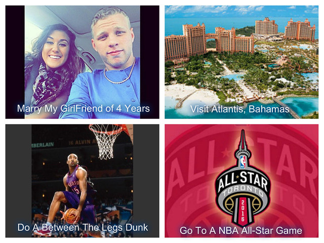
Bucket List

pizap.com14429555512741


  1. First on my Bucket list is to marry my high school sweetheart of 4 years. A very big step in life, but I couldn’t see making it with anyone else.

2. My number two is to take a vacation to Atlantis in the Bahamas. This place is CRAZY! It has got to be one of the coolest vacation spots.

3. Might seem weird to some but my number 3 is to do a between the legs dunk. I can never get it, but before I die I will master it! HUGE accomplishment.

4. Last but certainly not least is to get tickets to an NBA All-Star game, seeing them on TV every year is so exciting I can’t imagine how it would be in person.


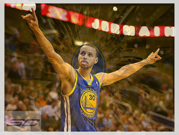
Sports Poster

pizap.com14429536332331

Sports poster I made for my favorite player, the NBA’s 2015 MVP Stephen Curry.

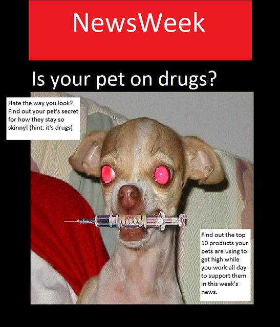
This week’s news from… NewsWeek! (3.5 Stars VisualAssignments737)

newsweek

I chose this assignment because it’s right in my wheelhouse.  I have to admit, I struggled a bit this week, I’m not a photography or Photoshop guy, but I’m good at writing and being witty and funny.  Stuff like this that I can do in paint and then add value with words is where it’s at for me.  “I googled crazy pictures” and scrolled down the list making up headlines for everything I saw.  I originally skipped this image because I thought the premise was too simple.  I came to the conclusion that a simple premise was probably best for this medium, as some of the other jokes I came up with couldn’t properly breath on just one image.  I still wanted to add some depth though, so I took on the optional task of writing some additional blurbs eluding to other articles.  I wanted to make sure everything tied in, and I wanted to still have the main focus be about my cover story, so I did one blurb that was more to add depth to my simple idea and add a legitimate sort of feel to the obviously satirical cover, and one blurb that kind of punctuates the idea in a joke.

Revenge of the bucket list! (4 star)

Bucket List Collage

I chose this assignment because it compliments to writing assignment I did about my bucket list.  I think it adds a layer of depth and texture to that assignment by adding the visual element.  It is my goal that one day I can make a collage of me doing all those things, hopefully sooner rather than later.

My other post about my bucket list

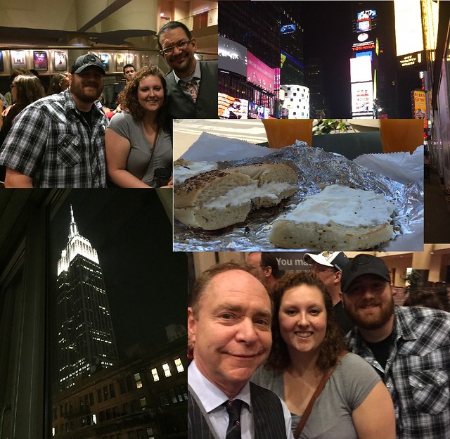
Penn, Teller, Buildings, and Bagels! (2 Star VisualAssignments1674)

Vacation Collage

Easter 2004

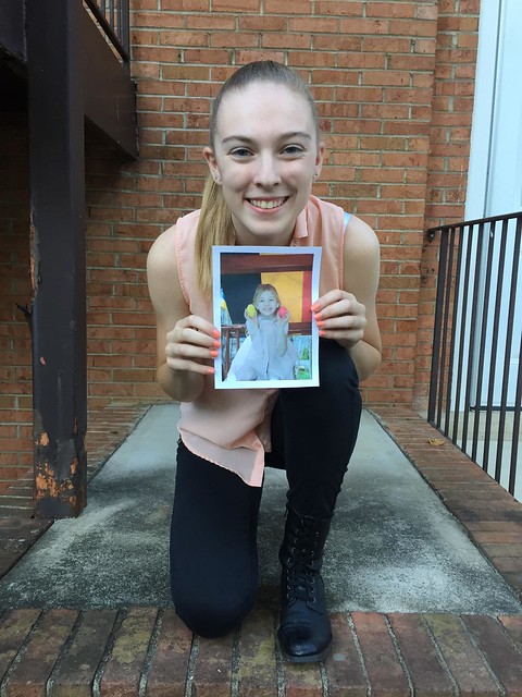
For this visual assignment I had to find a picture of myself from the past and recreate the photo while holding the old picture. I looked through all of my old photos and found this one of me from Easter in 2004 holding up Easter eggs that I found. I thought the pose was interesting and decided to use the picture. I ended up with the following image:

Recreate the Past

I ended up loving it so much that I sent the picture to my mom and she loves it too. She said she was going to print it out and frame it in our house. Who knows if she actually will or not but I enjoyed looking through my pictures of myself as a child and will probably do this again with my younger brother for my parent’s birthdays and anniversaries and any other holidays that come along.