Street View Story (3 Stars)

Screen shot 2013-02-15 at 8.45.26 PM


For this visual assignment, I did another “try random one” and came across the “Street View Story” assignment. Being an English major, I was more than excited to find an assignment that incorporates visual as well as textual elements. The photo is of Ponte Cavour, Rome, Lazio, Italy. Here is the little story I came up with for this picture:

The first time I lost her was because of the lights. I was seven and she was four, and we lived in Rome. First, we went to the river, even though we weren’t allowed. We loved the water. Lily liked to watch her reflection; she thought of it as a friend who she always wanted to meet, hiding down there below the surface. We decided to play hide-and-seek by the bridge. It was our favourite game. But Lily was too good at hiding. It was her turn to hide, and I failed to find her. I kept looking until it got dark, but I had to go home and tell my parents I had lost Lily. Mother wailed when I said it, but Father grabbed my arm, and we ran back to the fields to find her. We brought lanterns and searched for hours, hoping for a glimpse of her thick brown hair, her enormous blue eyes. We didn’t find her until she popped out of the water; that’s how good she was at hide-and-seek.

Hope you enjoyed my story!

Warhol Something (2 Stars)

warhol

So, I was kinda getting bored of the visual assignments that were listed, so I clicked on the “try random one” button to find something new that no one else was really doing. I came across this assignment called “Warhol Something” and decided to give it a shot. At first, I was trying to use GIMP, but I couldn’t find a filter that matched and was getting impatient, so I googled “Pop Art Editor.” One of the first Google results was a site called PicMonkey. On here, I took a random picture on Photo Booth, uploaded it, used the “Warhol” effect (how fortunate for me!), changed the colours, and I’m done! Too bad my picture isn’t as cool as Andy’s are, but hey, I’m not really an artsy-fartsy kind of person.


Colors of the Wind

So since everyone else was doing it (and I needed 3 more stars to finish for the week) I decided to do the Splash the Color assignment. It was actually pretty simple and really fun! I loved seeing a couple of my pictures come alive. I used the tutorial below to teach me how to color [...]

Grammar are everything

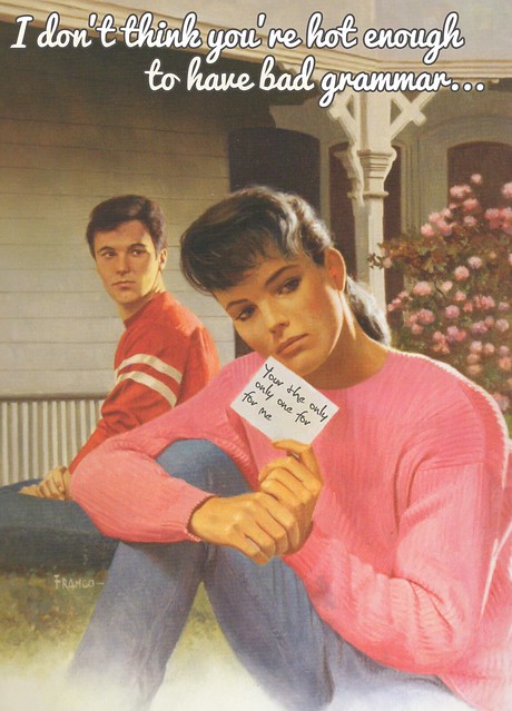
Most of the other postcards could be inappropriate, so I went with something more tame.

Your the only one for me

Before I made this, I was chatting with my friends, and we decided that even if someone is attractive, when they have bad grammar–they lose any appeal they had.

So I grabbed this cover and got to work in Adobe Photoshop CS6!

The first thing that I did was put the text on the note. I wanted it to be a guy’s handwriting, so I used the font Christopher Hand. Then I simply tilted the text box.

I originally had black text, but it didn’t look right. It looked like it wasn’t part of the original picture. So I played around with the Layer Properties. I tried Multiply, Lighten, etc., but none of them were giving me what I wanted.

While I was playing with the opacity for the text, I found that 75% lightened the text enough to where it looked like it was written, possibly in pencil on the card.

After that, the real text of the message needed to be put in.

The font wasn’t hard to decide on. I used Pacifico, the same font that the creator of this theme used.

The text color is #D9D9D9, and the stroke is #545252. I then scrolled through the Layer Properties and found that Linear Light was the best one for this application.


And there you have it!

A Poem of Love

I’ve always had the idea to create a poem out of song titles but I never got around to doing it so I was pretty excited this was one of the assignments I could choose from! I decided to make a love poem partially because it was Valentine’s Day but also because today, February 15, [...]

Milestone Memories

This is going to be a 2-in-1 blog post! One of the assignments this week was to embed a flickr set into a post and write about why we chose those photos and what story they’re trying to tell. the other assignment I chose was to create a series of photos that represent a milestone [...]

Splash the Colour Assignment (2 Stars)

isplash

For this assignment, I found an app for my iPhone called iSplash (which is free, yay!) that allowed me to edit my pictures and make certain parts black and white, or coloured. It was really hard to do considering I had to edit the photo using a touchscreen rather than with a mouse on a computer; however, I think it still turned out really well! I took this photo in December when there were a ton of Christmas lights and Christmas trees everywhere (I wish they kept them out the whole year….) I guess this picture really shows my opinion about Christmas lights: that they brighten up even the darkest and gloomiest winter nights (:


An Album Cover Assignment (2 Stars)

cabin


This picture is what I created for the “An Album Cover” assignment. After seeing Kaitlyn’s submission for this assignment, I decided to attempt this one too!

The directions are super simple. First, you click here, which directs you to a wiki article. The title of the article is your band name. I got this:

Screen shot 2013-02-14 at 8.12.40 PM

Pretty cool name, right?

Next, you click here, which directs you to a site with quotes. The last 4-5 words of the quote on the page is the album’s title. I got this:

Screen shot 2013-02-14 at 8.12.44 PM


Finally, you click here, and pick the third picture, which is the picture of your band’s album. Here, I got this:

Screen shot 2013-02-14 at 8.12.55 PM


So, once I got everything, I went on Pixlr.com again and chose the advanced editor. There, I chose a cool looking filter, added in my texts, changed the colours, and BAM! My first album (cover!) Now, I just need a guitarist, bass player, drummer, vocalist, some songs, and we’re good.


Valentine’s Day Caption Challenge (2 Stars)

ds106vdaycard

For this assignment, I decided to use this photo from Sara’s flickr set. I saved this photo and uploaded it onto Pixlr.com, a website Michael Branson-Smith talked about during this week’s ds106 show. On Pixlr, I used the text tool to add in the text, chose my font (an elegant cursive font), sized it, moved it, and changed the colour to black so it would stand out against the red fire. Then, TA-DA, all done! It was surprisingly easy to do, considering Michael made it seem super hard (but then again, I didn’t need to get rid of any text in the original image…)

But yeah! That’s my Valentine’s day card, even though it’s not super romantic at all (but pretty funny!) Let me know what you guys think (:


A Valentine Controversy from 1965

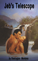
Jeb's Telescopefrom Hatchet Jack

Jeb’s Telescope
from Hatchet Jack

Hatchet Jack posted a Valentine Book cover yesterday that sent my little mind whirling decades back to the sixties. The book, entitled “Jeb’s Telescope,” and written by “Remington Montana,” was very clearly a re-release of a very controversial novel that I encountered way back in 1965.

While the newer cover is in colour, and the title clearly refers to the key plot features of the original (and even the author name is clearly an updated pseudonym), the implications inherent in the original release have been clearly toned down to get the book safely onto to the book shelves and get money out of the book-buyers’ pocket books.

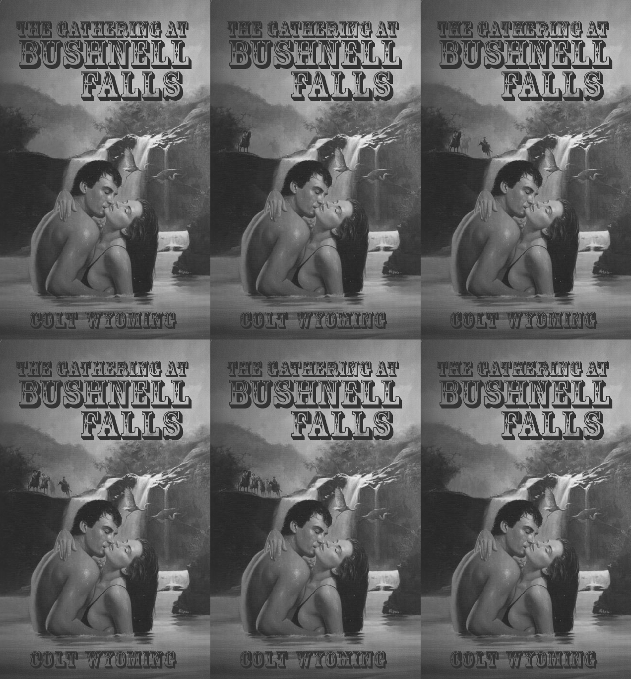
It took me a good day of scrounging around to find a copy of the earlier, release but compare Hatchet Jack’s find above with this:

Image

Original cover (1965) of “The Gathering at Bushnell Falls” (Animated GIF)

I recall a lot of furor in the news when this book first came out. People really raised their eyebrows at the word “Gathering” in the title.  There were lawsuits from manufacturers of optical devices. There was a mitigating attempt to re-issue the book with a more accurate and less stimulating and legally provocative title, “The Five Evil Brothers at Bushney’s Falls.”   But it was all to no avail. The book was pulled, the author moved out of state (perhaps to Montana?), and everyone forgot about it.

To see that the book was re-released later, after all that spectacle (did you see what I did there?), with the relatively passive title “Jeb’s Telescope,” just goes to show how much folks still judge a book by its cover.

Speaking of which, I hope you are are seeing me in a new light, now that I am out of that old musty cardboard box and taking some time to work at helping folks see me as I truly want to be seen. Perhaps you have been enjoying my newly-updated publicity photo, my very first piece of voice work for ds106radio, and my Valentine shared for all of you yesterday.

I am still waiting for comments to float my way. I currently only have one measly pingback — and it is from myself (although those self-links I just added above should get me more).

I do trust that all my new friends here at ds106 aren’t too busy to pay me a little attention. You know that real Friends don’t forget one another.

That would be a sad thing. And a bad thing. Very bad.