

The next assignment I did was the A-Z photo collage. This assignment was worth three stars (which put my total count up to seven at this point).
The first part of this assignment was to pick a theme. I decided to go with Disney characters for my theme. At first I thought this was going to be fairly easy but I ended up realizing that finding an X Disney character was not just hard but impossible. Other than that I ended up finding a character for each letter and inserting them into my collage. I used picmonkey to make my collage. I found it to be fairly simple and easy to customize.
So with out further adieu here is my Disney Characters A-Z:
- A- Aurora from Sleeping Beauty
- B- Belle from Beauty and the Beast
- C- Cinderella from Cinderella
- D- Dumbo from Dumbo
- E- Eeyore from Winnie the Pooh
- F- Fa Mulan from Mulan
- G- Giselle from Enchanted
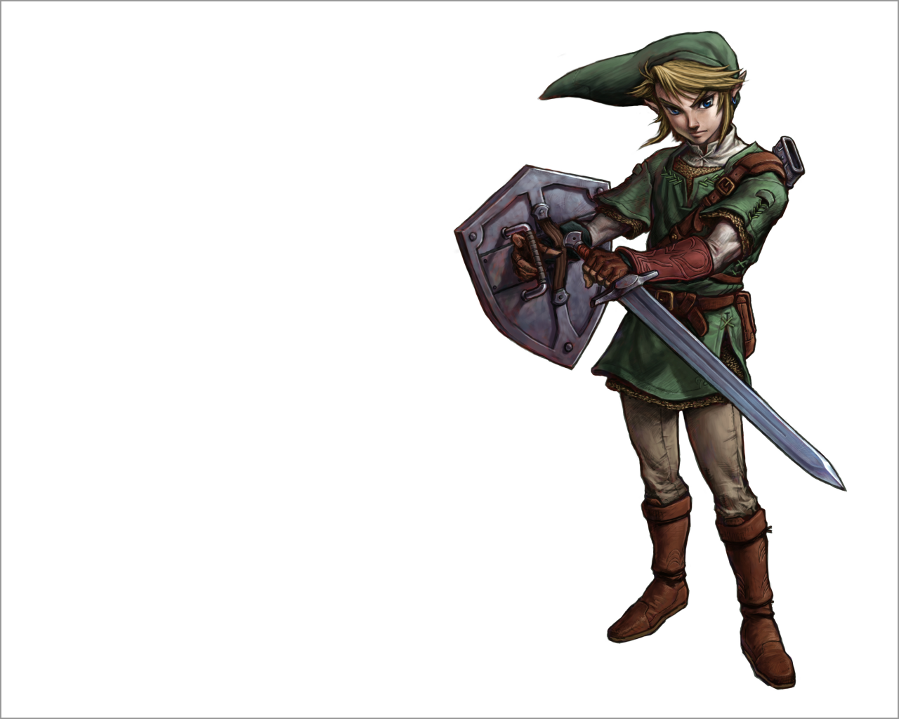
- H- Hercules from Hercules
- I- Iago from Aladdin
- J- Jasmine from Aladdin
- K- Kiara from Lion King 2
- L- Little Mermaid from Little Mermaid
- M- Merida from Brave
- N- Nemo from Finding Nemo
- O- Oliver from Oliver and Company
- P- Pocahontas from Pocahontas
- Q- Queen of Hearts from Alice in Wonderland
- R- Rapunzel from Tangled
- S- Snow White from Snow White and the Seven Dwarfs
- T- Tiana from Princess and the Frog
- U- Ursula from Little Mermaid
- V- Vanellope von Schweetz from Wreck-It Ralph
- W- Woody from Toy Story
- Y- Yao from Mulan
- Z- Zeus from Hercules


