“Paradise is exactly like where you are right now”

I thought of this song when I was reading The Kekulé Problem the other day. In it, McCarthy recalls,

I suggested once in conversation at the Santa Fe Institute that language had acted very much like a parasitic invasion and David Krakauer—our president—said that the same idea had occurred to him. Which pleased me a good deal because David is very smart.

Allegedly, the virus quote originated in William Burroughs’ The Ticket That Exploded, although I could not locate the verbiage in a search of the text. McCarthy doesn’t deal with Burroughs though. He’s rather discussing relationships between language and the subconscious, and language and humanity.

…once you have language everything else follows pretty quickly. The simple understanding that one thing can be another thing is at the root of all things of our doing.

The Open Culture essay on The Kekulé Problem quotes GK Chesterton: “Art is the signature of man.” Art, like language, is symbolic representation and metaphor. One thing being another. I’d also say it’s a mirror, in that what we see in it is determined by what we bring to it, and so it shows us ourselves.

I read Kekulé hoping it would help me grapple with The Passenger. The jacket flap explains it as a “novel of morality and science, the legacy of sin, and the madness that is human consciousness.” On the surface, it appears to be two interleaved tales, one of a young woman’s hallucinations and suicide, and one of her brother working as a salvage diver in New Orleans. But it’s something more as well. There’s a scene at a funeral where the protagonist muses on the scientists who built the bomb and the aesthetics of horror, with this sentence:

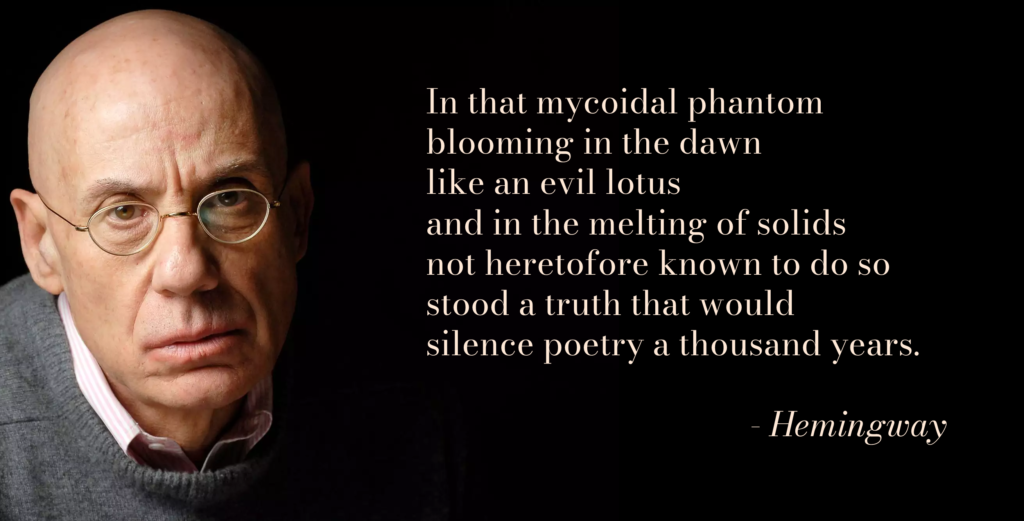
I just had to make a triple troll quote out of that. #MakeArtDammit! I attributed it to Hemingway and used a photo of Ellroy, contrasting the quote to their deceptively simple prose and economy of language.

Anderson’s song connects back to the book with serendipitous lyrics:

Paradise
Is exactly like
Where you are right now
Only much much (It’s a shipwreck,)
Better. (It’s a job.)

The job involves a shipwreck and a sunken plane. I don’t think paradise enters into it, although it appears to be what they like doing. Finding these connections is something I like doing. And it gives me impetus to blog a bit, and maybe get that book club thing going with Jim again.

“Singin’ la la la la la la la la”

ds 106: Wait, Where’d That Guy Come From?

It’s not sure how it got there, but it knows it’s not alone. There are others just like it all around, disguised as flesh and spandex. They go about a fake life, blending into the hectic scene. There’s someone in particular they’re looking for, but he’s nowhere to be seen. The mob searches but alas, no one truly knows where Waldo is. Waldo will not be found so easily.

My first thought for this assignment was to make it based off an I-spy picture. I used to have those books when I was a kid and I always enjoyed looking through them, and when my brain remembered Where’s Waldo I knew I had to have a scene as the background. But who to include? I thought about including random people, and sure they’d work, but at the same time I wanted to have some fun with it. Ditto is a little blob from Pokemon that can shapeshift into anything, and the idea of a hoard of disguised blobs searching for the ever elusive Waldo had a strange appeal that I felt needed to be brought to fruition.

In what may seem like a shocking twist of events, I made this in Google Slides. I copied the background image from a quick search, found a transparent ditto picture, and after some layering and resizing it was complete. While I think it could’ve turned out more believable or smoother had I used Photoshop or Gimp, I thought about how simplistic I could make the process and tried it out just to see if it’d work. It sure did.

ds 106: What the font (4 stars)

This project in particular was something I thought would be somewhat simple, and yet it proved to be somewhat frustrating for me. I couldn’t get a solid idea of what I wanted to do for this despite looking through hundreds of pieces done by other people. Eventually I thought it’d be interesting to make antlers out of letters, so I decided to try and draw a deer with various letters and words. I also wanted to use a fancy font as I felt it’d sell the idea behind deer being graceful creatures.

Similarly to other assignments, I used Grafx2 for this completely. It has a feature that lets you type out text in a wide variety of fonts in whatever colors and size you want, and you can also flip and turn them around. Originally I started with trying out letters that may fit to be the antlers, and as I progressed on the deer I felt that it could use a bit more substance to it, so I added the strings of grass along the bottom. In all honesty, I wouldn’t say this assignment went well. Sure I completed it as instructed, but the end result feels bland and forced to me. Maybe one day I’ll retrace my steps back to this and redo it in a way that makes me proud of it.

ds 106: Minimalist TV/Movie Poster (3.5 stars)

This image started out as a rough idea for a tattoo I wanted to get in the future, and while browsing some minimalist poster designs I got inspired to add some flair to this old idea. Many different medias feature blood moons in different ways, and this one was inspired by cheesy horror movies and the game Terraria. It actually started as a Japanese red sun, and I was going to draw a bridge in which fish would leap over to become dragons in the sky. This idea comes from the legend of the Dragon Gate, an old Chinese tale that describes fish that leap over a waterfall to obtain dragonhood. As I was coloring it in however, I realized it held a more eerie, almost vintage aesthetic to it that really reminded me of old horror posters. I decided to stick with it and altered the palette to be a bit dimmer and more of a flat red gradient rather than the previously red and orange gradient.

Browsing through a wide variety of minimalist art and posters gave me a broad yet somewhat inconclusive idea of what I wanted my end product to look like. Some pieces were plain text with a single shape, others were surprisingly detailed with shading and lots of colors. I wanted my end result to be minimalistic yet interesting to look at, and really bring focus to it. Limited colors that were close to each other in hue, clean lines and shapes, and making sure I didn’t add too many details where they weren’t needed. I considered adding buildings or trees in the background and realized that the more I added the less minimalistic it’d be.

This piece was made completely with Grafx2, a free pixel art program. I made the moon with a circle tool and shaded it in by hand. The bridge, outlines, and water reflections were all done by hand with the help of a copy, flip and paste. The text was made by the program as well, it features hundreds of fonts and allows for various colors, effects and sizes! I wrote out “BLOOD” and MOON” separately so that I could stack the words on top of each other. I considered having both words stretch out across the image but thought the text wouldn’t stand out enough and would feel forced.

ds 106: buddy photo (2 stars)

Me holding Toast

To start with, I cannot figure out why this image is as small as it is. The picture is of me barely holding up my giant teddy bear Toast, who I’ve had for years now and gives wonderful hugs. I went out with Toast to my friend’s work at a school to surprise her and the kids she helps to teach. I couldn’t carry him around with me too much he’s taller than me and is a bit heavy for me, but everyone who got to meet him seemed to have a great time interacting with him. After we left, I took him back to my old home where my parents live and we all got to spend some time together. In hindsight I really should’ve picked a much smaller toy to bring around, as taking pictures and setting up compositions was a nightmare in and of itself. I love him but I won’t be doing this again anytime soon.

ds 106: Common everyday objects (2 stars)

My old laptop

Found my old laptop and I thought it’d make for some interesting color shifts, and sure enough it really did! The image got pixelated thanks to Grafx2 for some reason I’ve yet to figure out, but besides my annoyances with it I like how it turned out! I’m a sucker for warm color schemes, and I couldn’t resist having a purple to orange gradient on something so special to me as my old laptop. Very sentimental and a rather sweet assignment.

ds 106: Splash the color (3.5 stars)

This one gave me a lot of trouble in all honesty. I really wish I started this one sooner because I kept reselecting images based on their complexity and the colors I wanted to pop. I settled on this handsome noodle because of their striking colors, although separating the colors of the hands from the snake was a challenge. I used my main art program Grafx2 (main usage is for pixel art) to sort the color palette by lightness and hue, then picked out the colors I didn’t want and gray-scaled them. The program is free and is lacking in comparison to other pixel art programs, but I’m quite fond of it myself.

Using the “sort” and “Gray” options to get my color splash

ds106: Return To The Scene Of The Crime (3.5 stars)

Firefall

My family has never been big on taking pictures, much less printing them out, so I had to get a bit creative on this one. I have this little collection of post cards I got on a yard sale that feature some gorgeous scenes from all over the United States, and thought it’d look really cool to try and line up the postcards to the scenes they depict. I firstly had to pick a postcard, and that was honestly pretty difficult! With so many options I simply decided to randomly grab a handful, counted them up and randomly picked a number one through six. With that out of the way, I then got to googling around for the scene I wanted, the firefall of Yosemite park. It was somewhat surprising to see one of the first results be the exact postcard I was holding, but after some careful pickings I found a background that fit really well with my card. Angling the card against my computer at the right distance was a bit tricky and my phone refused to focus properly, but overall I really enjoyed this activity!

Road Trip Mems

Original DS 106 Assignment: Two Image Graphic Spread (3 stars)

Avery is beginning her 15 hours trek from Marfa, Texas to Sofi Stadium in California. She’s not sure how long it’ll really take or how much gas she’s going to spend, but it needs to be worth it. She was finally able to get a weekend off from the restaurant (first time in 2 years) and she is anxious actually leaving it in the hands of everyone else. The best thing she can do right now is enjoying her and everything that is yet to come. But first, pictures! Avery was gifted a polaroid camera last Christmas and is excited to use it for the first time and document her journey.

Avery’s Road Trip to the Finale

Step 1: Choose your photo editor of choice. The best and easiest one I have been able to access is Canva. Canva allows you to pick from multiple pre-made templates as well as starting from a blank one.

Step 2: In the search bar type what template you are looking for. Given Avery is early 20’s, she is still heavily on social media, so I looked for an Instagram template that would be aesthetic.

Step 3: Insert photos. Here we are following the guidelines and inserting two photos of Avery during her road trip. One at the Arizona border and the other at New Mexico. These are supposed to look like polaroid pictures, since the vintage polaroid are making a comeback.

Step 4: Export and share! Canva allows you to automatically share to social medias or share to your computer to upload to a blog like this one. Canva has a history of all your projects as well so it is good to go back to templates you like.

Oh no! Now, what?

Original DS 106 Assignment: Design to Shock (4 stars)

This is after Avery’s audition. She just auditioned with her favorite song She Will Be Loved by Maroon 5. This is the song she would listen as she got ready in the morning for school and whenever she studied or cleaned. This is a song she could play and sing-a-long with her mom and for 4 minutes and 27 seconds all her worries went away. This assignment fits perfect for displaying the climax of the story.

Step 1: Find the photos you want to merge. For this I want to make a panel of what happens to Avery at this point after her audition. She’s center stage and this is the audition to have her break into show business. I started with getting a photo of Avery and a photo of an unknown singing show stage to start. I also got a photo of world-renowned judge Mrs. Potato-Head to be the one delivering the news.
Step 2: Go to canva.com. For the length that I wanted this to be, I wanted it to resemble the page of a manga book, so I decided to search for a blank infographic template that I know would give me that length.

Step 3: Begin building your panels. I use the Elements feature on the left hand side to find shapes such as rectangles, squares and lines to divide up the page.

Step 4: Insert images! This is where creativity is key. I want the panels to feel like scenes from a live audition singing show or pages of a book portraying the same. Here I use multiple forms of editing, cropping, adding texts, and more. This is where you build the story.

Step 5: Export! Mine had some moving parts so I downloaded it as an MP4 video, but if yours does not or you don’t want it to, you can download it as a PNG or JPG. It also gives an option to save as a GIF if your specific.