If you were fortunate growing up, you have a Wii. And if you did, you most likely remember the game that came with the console: Wii Sports. The 2006 game featured five sports simulations, tennis, boxing, baseball, golf, and my personal favorite, bowling.
While Nintendo likely created this game with the intention of increasing physical activity among video game users, most of us can agree that we favored the least physically active sport of the five: bowling.
I played so much Wii Bowling, that I acquired the golden bowling bowl TWICE (the first time on our original Wii and the second time after our Wii malfunctioned and deleted all of its data). My friends and I used to see how far away from the console you could get and still have a connection to the game. We would play “long-distance bowling”, and we were pretty good at it.
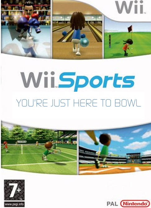
Since I feel like most people played the least active game on Wii Sports, I decided to add a little something extra to the game’s cover. You know, just to get our expectations here clear.
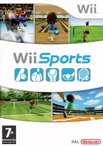
I put the image into a Word document, placed a white square over the original icons of the sports, and using a downloaded Wii font package, I put my mind to work. I choose to use Word because it is a surprisingly good graphic design tool for quick and simple projects. Without further ado, here is the final product:
