The Joy of… Pixels?

There’s absolutely no way I was not going to do this assignment at some point. Not only do I love a creative challenge, but I adore pixel art. I’ve done my fair share, but haven’t really shared any of my work with anyone. It’s been a while since I’ve drawn any pixel art, so I figured this would be a good way to potentially get back into it, too. My favorite video game of all time is called Terraria and is completely pixel art, so even more reason to take on this assignment!

As the title suggests, I wanted to take a stab at making pixel art Bob Ross. As he has been a guiding light for our class and a personal hero of mine, I figured it just made sense. My general strategy while creating this was to block out sections of color first to get an idea of where things would be placed on the canvas. Working with only 16×16 pixels was difficult, but it was a challenge that made any details I could work in that much more important. After blocking out the main shapes, I decided to go back in and refine my edges a bit, shaping things out for my detailing later. I blotted in a few colors to mark tree, water, land, and sky positions, rounded out his hair, and touched up the face a bit. Creating a detailed expression at this small of a resolution is difficult, but that’s where slightly different shades of color come in very handy. Dotting around different shades of each color creates a lot of depth and texture, rather than creating awkwardly smooth areas. I did this technique all across the piece and final–we’re done! Though I was able to sum the process up pretty concisely, this took a lot of trial and error, which means a lot of time. Ultimately, I’m very pleased with how it came out. Let me know what you think!

16-Bit Bones

by Thomas Pulsifer

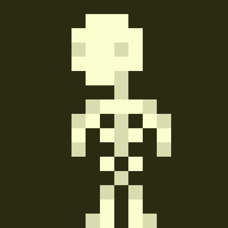
Tapping into my love and appreciation for the artform that is video games, I decided to tackle Jerome Mueller’s 3.5-star prompt to draw an intricate object with only 16×16 pixels. I’ve done a lot of pixel art in the past, so I was excited to see this prompt come up. Though Halloween may be over a month away, it’s never to early to get in the spooky spirit. For that reason, I chose to draw a skeleton.

To the surprise of no one, the 206 bones making up the human skeleton are quite difficult to capture in such a limited resolution. That being said, I feel as though I’ve done a great job capturing it with the limited pixels I was given. Since not every bone could be included, I chose only the the most iconic parts of the skeletal, which includes the skull, ribs, and pelvis. So long as these paramount components remain, a skeleton will be recognizable, even at such a miniscule size. I made use of my photographic expertise by including a contrast between the light bones and dark background. This helps the gaps between the bones stand out, making the skeleton much more identifiable as such. I used Piskel for this piece, which is a free website I use for all my pixel art. I encourage anyone that’s interested to check it out and try it for yourself!

Assignment Bank Assignment 256 Points, 3.5 stars

A 16×16 corndog

Footloose, Ren is here!

This visual assignment on pixel art was a lot of fun to try and create. I did not expect it to be so difficult in such a short project, but the number of pixels really makes a difference with how detailed I can be. This assignment was worth 3.5 stars. I found this assignment from Meggs and Bacon’s blog. I really liked the idea and found the original assignment in the bank. I thought I could make it look realistic pretty easily, while I think I can tell what it is, I’m not sure about telling if you don’t see the original photo first. Their blog inspired me to try pixel art and I was thinking of fun movies I could use. I really like footloose and some of the more musical movies from the 80’s so I figured Ren McCormick from Footloose would be a good choice to try and make a pixel art image in only 16×16 squares for detail. I also figured since the theme for this class is the 80’s what better way to represent it but pixel art because technology was not the same back then as it is now.

This is the image I was using to make my pixel art. It is a scene of Ren dancing at the end of the movie, they are all dancing for the final part in the warehouse. Ren is the dancing star of the movie and seems to be the one in charge of most of the moves so I saw it fitting to make him the star of this blog post.

Like my classmate used I also used Pixilart website. This was a really cool website to use that allowed me to choose the size of project I wanted to do, as well as change to multiple colors for the project. I started with Ren’s head and a skin tone color that I liked, then added some hair around his head. I was trying to make his hair a little spiky like it was in the original picture. Then I started to move down and do his suit. I made the decision that I was not going to be able to do the white color with the limited number of squares I had so I went straight for the black bow tie. After that, I added the red jacket and decided to change the position of his hands because while I like this picture his hands are very blurry because he was moving. I decided to put him outside so I could have more fun with the background. He is outside with the green grass and sun in the sky. Much like the weather today I put a few white clouds in the sky to make it look more realistic. I also used the foreground/ background rule from the reading to make the grass darker as it went further away from the focal point of Ren.

I am proud of this pixel art I created. I think it does look like him as well as it could for the number of pixels I was able to use. I added the details that I could and made up a few of my own to go along with it. I was able to learn more about using my photos to create different types of artwork. I was also able to put the rule of thirds into affect from the articles. Ren is only in the middle third of the page and the sun is in a separate third, while the rest is background sky and grass.

PIXEL ART!!!

I really wanted to try out pixel art after seeing someone else do it. I used an amazing website called https://www.pixilart.com/ that lets you make pixel art directly on the site. So I’ve already mentioned that I like Dirty Dancing, and I thought Baby would make a cute model. This is my rendition of Baby in her little pink dress of the end of the movie.

This assignment called to make 16-bit art, so on the website I adjusted the frame to be 16×16! I started with a square of tan for the shape of her head and I filled in a blob around her for hair. At first, everything just looked extremely blocky, so I tried adding in some additional shades and make her hair stick out in places to create a sort of curly effect. I also followed the part of her hair the best I could.

The next challenge was to make her head connect to her body right. Making a face is one thing, but adding a body was more difficult than I thought it would be. I tried adding a different shade of tan to differentiate her neck from her chest and added the straps of her dress to form where her shoulders are. I attempted to shade in dress folds with the pink as well!

This assignment actually got me more interested in trying more difficult pixel art. I really appreciate the complexity of the art form, and when I play SNES games, I think about how time-consuming it must have been to animate sprites.

This assignment is worth 3.5 stars, so I’m at 7 stars so far.

8-bit Heather

Decided to convert Heather Chandler into a pixel version ?

Sweet 16 Pixels

I am falling in love with editing images and making them something really unique! So just like my baby boy, I made a 16×16 pixel of one of his photos and of course had fun doing it. I will admit, capturing all the important details in the right places in so little space was interesting […]

VisualAssignments1879

  • Take a picture that emphasizes a single color.
  • Two contrasting things, e.g. light & darkness, life & death, cats & dogs.
  • Take a photo that expresses a human emotion
  • Take a photograph of a toy in action
  • Take a picture of anger, or something that makes you angry.
  • Black and white photographs are a classic look.
  • A photo that looks better in black and white than it did in color.

I enjoyed this assignment because of the array of things i could choose to make. i had to find a program to do this, and it allowed me to make small changes to my colors. I would enjoy doing this for other pictures aswell

Wittle Wisti! (Assignment Bank #7)

256 Points

Today, we have the luxury of fast computers with lots of memory and power. However, that wasn’t always the case, and graphics designers had to make due with very limited capabilities. For this assignment, you are to draw a person, vehicle, or otherwise intricate object. The catch is, your image can only be 16 pixels by 16 pixels! Work to express as much detail as possible in the space allotted. If the size is not constraining, you are not setting your standards high enough! Feel free to enlarge the picture before putting it online, but remember that your resolution must still be that of a 16×16 pixel image.

______________________________________________________________________________

For this assignment, I made a little headshot-sprite of my secret agent character created for this class! Here’s a little Wisteria! The first picture is the visible sprite, the second is the 16x16px sprite in itself!

Visible Detail for the Sprite

______________________________________________________________________________

BEHIND THE SCENES

I chose this particular assignment from the assignment bank because I will take any opportunity I can to draw! That, and this assignment posed an interesting challenge! It’s very, very hard to work with this small a canvas. That, and I actually have an interest in sprite-making. It’s a little bit of a growing hobby! So, with this all in mind, I set out to create a 16×16 sprite.

I love drawing Wisteria, and I saw a chance to connect this project to the overall core of this course, which is our characters!

______________________________________________________________________________

MAKING OF THE ASSIGNMENT

— Opened up my art program (Clip Studio Pant)

— Recreated my old Sprite Pen (I had to create a new pen and turn off the anti-aliasing to get a sprite effect)

— Did a preliminary sketch of what I wanted the sprite to look like on a 100×100 canvas.

— Matched the sketch as best as I could with the 16×16 canvas

— Added more accurate color and slight tweaks, then added the black border.

— Screenshot my screen zoomed in so that quality was not lost on the resize

That’s really all there was to it! It was a fun, easy assignment that I wouldn’t have qualms with doing again. Thank you for the opportunity!

Life in Pixels

Today, we have the luxury of fast computers with lots of memory and power. However, that wasn’t always the case, and graphics designers had to make due with very limited capabilities. For this assignment, you are to draw a person, vehicle, or otherwise intricate object. The catch is, your image can only be 16 pixels by 16 pixels! Work to express as much detail as possible in the space allotted. If the size is not constraining, you are not setting your standards high enough! Feel free to enlarge the picture before putting it online, but remember that your resolution must still be that of a 16×16 pixel image.

Assignment Bank- Visual Assignments

Just horsin’ around and making artwork that is only 16×16 pixels. I think it took me longer to find a good application than it did to paint the picture…

This is a picture of a horse I painted on a 16×16 px canvas. I used the application Paintbrush for Mac OS X and it brought me back to when I would play with Microsoft Paint when I was little. I never made anything that looked like this horse, and I am actually surprised that this turned out well. It looks a lot like the picture I was referencing (see beautiful horse below). I don’t know exactly why I chose to draw a horse besides the fact that I felt like drawing a horse. It was the first “intricate object” that I could think of, so I just went with it.

It was challenging to put as much detail in as possible without the whole thing becoming just a giant glob of brown. I figured out that if I use 25% or 50% opacity for a color, then it would be easier to add more details while still keeping the image of a horse. The picture I provided of my 16×16 px masterpiece is a screenshot of the actual image zoomed in, otherwise, it would just be a giant blur. It was also difficult to figure out the sizes for the face, ears, neck, etc. because just taking off or adding one block can completely change the picture since the image is so small.

Overall, I had a really fun time creating this horse. I did find it more challenging than I thought it as going to be. I knew it wasn’t going to be easy, but I didn’t know it would take a while to find a good application to use, figure out how to use it, and then draw a detailed picture on a tiny canvas.