Behind the Cupboard, a Comic

After finding some old photos I dug around the apartment some more and found a page of an old comic:

Page_1

Something told me this was no ordinary comic, I sneaked into the General’s room and, with shaking fingers feed it into the machine:

comic-machine01


As the paper emerged I grabbed it and turned it over:

comic-500

Despite the lack of speech bubbles or callouts I claim one credit for daring the General’s rooms.


Number 6 Ain’t No Comic

"Number 6 Ain't No Comic (first attempt)," animated GIF by @aforgrave

“Number 6 Ain’t No Comic (first attempt),” animated GIF by @aforgrave

Bill Smith (@byzantiumbooks, on Twitter) tackled the Visual Assignment 341: Comic Book Effect earlier today, and the actual task itself popped up on my screen this evening as I was poking around in the Visual Assignments looking for my next challenge. I know I have an iOS app on my phone (called Halftone by Juicy Bits) that effortlessly creates this effect — I wanted to approach the task from closer to first principles rather than relying on a purpose-designed app.

I’d experimented with the halftone filter in Photoshop once or twice before, to it didn’t take too long to locate it and obtain the result displayed above. Essentially, the effect creates four different coloured images of dots and offsets them to created the pixellated look that is so familiar in comic books. The eye recombines the colour layers to create the colour-blended image that results. I did a bit of research just now and determined that the dots originally used in the 50s pulp press were known as Ben Day dots — in that implementation, the dots were all the same size, resulting in a very characteristic look. With halftone, the dots vary in size or spacing (from very small on a gradient up to very large) which allows for a more continuous and even transition.

Photoshop lets you select the maximum radius of the dots, which determines how “fine” a detail your image will have. In the original 631×480 MPEG Streamclip screen image, the ratio of smallest maximum pixel radius (4 pixels) to image was too large — it was too difficult to get a fine enough detail. So I scaled the image size up (Image>Image Size) so that the relative smallest maximum pixel radius ratio would be smaller (follow?) and was able to get a finer halftone from the same image.

"Pixel Composition," animatedGIF by @aforgrave

“Pixel Composition,” animatedGIF by @aforgrave

After fiddling around with the maximum pixel radius and the image size, I took a look back at the assignment description. I noticed that there were a couple of tutorials for the assignment. One was no longer available, and the second one was done using Picnik and Chogger. However, Picnik closed up shop in 2013, and Chogger was only used to add speech bubbles. So I searched for “halftone comic book effect using Photoshop” in Google, and immediately noticed an identical image in the Google Image results to the one that sits in the thumbnail on the Comic Book Effect assignment’s page. Following that image to its source page led me directly to “Give Your Photos a Retro Comic Book Effect,” which I will now apply to the original image for comparison.

Tutorial Exploration

  1. Start with a fresh copy of the image.
  2. Apply Image>Adjustments>Levels, (I liked setting Input to 29/1.22/94, which seemed to give a nice contrast.)
  3. Apply Filters>Artistic>Film Grain, with settings Grain:4, Highlight Area:0, Intensity:10 as suggested
  4. I then created several duplicates of the original photo layer, in preparation for step 5..
  5. Applied a different filter radius (trying maximum pixel radii of 4, 8, 12, and 16) to a each new layer.
  6. Added a light frame, black border, an orange radiant-filled top caption box and a white bottom narration box.
  7. Downloaded and installed the font Digital Strip and used it to add a caption and narration. The leading red M was created by increasing the font size, choosing font colour of red, and applying both a stroke and drop shadow effect from the fx menu.
  8. Used File>Save for Web to create a png file for each halftone variation.

Here are the various results:

“Meanwhile, in the Village PRE1″ by aforgave, on Flickr.

“Meanwhile, in the Village PRE2,” by aforgrave, on Flickr

“Meanwhile, in the Village 4,” by aforgrave, on Flickr.

“Meanwhile, in the Village 8,” by aforgave, on Flickr.

“Meanwhile, in the Village 12,” by aforgave, on Flickr.

“Meanwhile, in the Village 16,” by aforgave, on Flickr.

What the Heck, Let’s Try the Halftone App

For comparison, I uploaded the original photo to my phone and experimented with the Halftone app. It was very easy to replicate the elements, albeit with slightly less control over some specifics of the finished product. Dot size and strength are easily adjusted with sliders, which allows for a rapid experimentation. The app also applies the frame, the border and makes for easy creation of the caption and narration boxes and text. It also applies a rustic antique look to the image.

“Meanwhile, in The Village (Halftone app),” by aforgave, on Flickr.

In Closing

Wow, that was quite a bit of work for 1 Credit Unit. But maybe the value obtained from the learning and the exploration is sometimes more valuable than the actual credit obtained.

BCNU

Visual Assignment Comic Book Effect

Number 6 The Photographer

Number 6 The Photographer

Audio Assignment 341 asks us to, “Take a picture and experiment with the “Halftone Effect” in some photo editing software to create a comic book effect.”

I started with a snip of the Snipping Tool of a scene from The Prisoner episode 7, “Many Happy Returns”. Number 6 finds a camera at the abandoned Village store, and checks out its action. In GIMP, I used a variety of effects, but mostly the edge detect and the newsprint effects, along with adjustment of color and white balance, and some reversing of colors to work with them.

Does isolating one frame and presenting it in a radically different medium enhance our understanding of the subject? Perhaps it can bring out shades of emotion, intent, and interpretation that remains hidden in the swiftly moving video stream.

One Credit Unit, but lots of fun! And something else to pursue…

Make it stop!

Because I love Scottlo!

invaders_scottlo_rif

We all know nothing could be further from the truth given the cool, mellifluous tones of the great Scottlo, but I want to poke fun. This is the Comic Book Effect assignment, which is pretty straightforward. I took a screenshot from the Twilight Zone episode “The Invaders” and brought it into GIMP and added the Filters–>Artistic–>Cartoon effect twice. After that a selected an area on the image with the selection tool, then airbrushed it in white. FInally, I added the text in black and that’s all she wrote.

1 star which makes 19.

Visual Personal Project: Comics Via Photoshop

One of the past assignment options we had was to create a comicbook effect. There’s a video tutorial for GIMP (via Brian Short’s blog). However, I didn’t use GIMP for this assignment because it’s lacking some useful features that will let me get things done faster for this effect. Instead, I tried to see what I could do with Photoshop. Here’s the end product:

The comic book effect I produced via photoshop

The end result of my experimentation

Process tutorial/details after the break.

Base Image

For a base image, I decided to use something comparable to the one that Brian used in his post. I’ve uploaded the full version of the image here, so feel free to download and follow along.

The image I used as the base of the assignment.

The raw image I used in the assignment. Feel free to download it and follow along; I’m releasing it for use under the Creative Commons 3.0 Attribution License.

Making the Halftone

The Base of the Image

First, I open the image in Photoshop and select the whole thing by pressing Control-A (Command-A on OSX) or by choosing Select > All through the menu. I copy it to the clipboard by pressing Control-C (Command-C on OSX). Then I create a new image by hitting Control-N (Command-N on OSX) or by choosing File > New through the menu. Click Ok without changing any of the size settings; it should automatically be the same size as the image in the clipboard. Paste the copied image into place by pressing (Control-V). To get the effect to work neatly, you’ll have to increase the contrast a bit. So go to Image > Adjustments > Levels.

The levels settings I used and the resulting image.

These are the levels settings I used. You don’t have to use the same image or the same settings, just make sure fine details you’d like to keep in the final image are in high contrast to their surroundings.

Once you’re done adjusting it, double click the layer name, which should at this point be Layer 1. The layer name will become editable. Enter Ink Color into the box and press enter to name the layer.

Copying Layers

Now Right Click (Control Click on OSX) the Ink Color layer near its name. A context menu should appear. Select Duplicate Layer from it. In the box that pops up, enter Smooth Glow into the box labelled As, and click Ok. Alternatively, you can click Ok and rename the layer the way I first showed you.

Now make a third instance of this layer, except name it Halftone Effect instead of Smooth Glow. The layers should now be named (from bottom to top) Ink Colors, Smooth Glow, and Halftone Effect. Don’t worry if the layers are named diferently or in a different. You can rearrange the layers by dragging them into place within the Layers dialog. You can also rename layers by double-clicking the name of a layer and entering text. You can hit enter to finish editing the layer name. Now click the eye icons next to Smooth Glow and Halftone Effect to hide them. You can click in the same place to unhide them, but right now we need to create an inking effect.

Using Filters

Now click on the Ink Color layer and make sure it’s selected, and let’s get filtering. Choose Filters > Filter Gallery from the menu. Then under the Artistic folder, choose Cutout. See the screenshot for the settings I used.

The Filter Gallery previewing the settings I used.

The Filter Gallery previewing a cutout filter. I used the settings on the lefthand side of the screen, but feel free to experiment.

Click Ok. Then click the space where the eye icon was next to the middle copy. The image should go back to looking like it did before you applied the filter. The layer you just made visible should be named Glow Effect. Select it by clicking the thumbnail icon directly to the left of its name. Choose Filter > Blur > Surface Blur. You can just crank the sliders to the right and hit Ok, but experimenting is OK too. In the Layers dialog, click the dropdown box that currently reads Normal. Instead of Normal, set it to Screen mode. Then set the Opacity (to the right of the mode drop-down) to around 35%. Don’t worry about precision; you fiddle with it later.

Now select the topmost layer and make it visible. It should be named Halftone Effect. Choose Filter > Pixelate > Color Halftone. In the box that pops up, leave all but the topmost box unchanged. Set that to somewhere between 8 and 30 (try experimenting). Set it to Multiply mode instead of Normal mode, and set its opacity to around 85%. You should now have an image that resembles the final product somewhat.

Making it a Panel

Tidying up the Layers Panel

Layers can be grouped into folders to help keep them organized. You can do this by holding down shift and clicking the top-most layer that will be included in the group and then clicking the bottom-most layer to be included. The layers in the layers box should all turn a shade of blue to indicate that they are selected.

how layers look before grouping them

This is how layers should look before you group them.

Then, click the menu indicated by the red arrow. This is called the Layers Menu. Choose Layers Menu > Group From LayersIn the resulting pop up box, enter Comic Panel as the Name and click Ok.

An image of layers successfully grouped

The comic book effect layers grouped into a folder.  You can expand the folder by clicking the down arrow next to it. You can also ignore the layer named Backup; I made to help to experiment with this process.

You can move all members of a group by selecting the group folder and using the Move Tool. You can also expand the group and move specific members by selecting them.

Making the Canvas Bigger

Now we need a white space around the panel to put the panel into. Normally, the panel would be placed into an existing document, but this way will teach you about resizing the canvas. Choose Image > Canvas Size.

Photoshop's Canvas Size Dialog

This is how you adjust the size of the image canvas without scaling the image. The grid of arrow buttons at the bottom is used to tell photoshop where to add or remove canvas area from. Experimenting with this is the best way to learn how it works.

In the dialog that pops up, don’t touch the grid at the bottom unless you want to experiment. By default, it adds pixels on all sides of the image.  If you’d simply like to proceed forward, set the units to pixels. Then, add a few hundred pixels to the give the comic panel some breathing room. Don’t worry about making the image too big, you can always crop it down later. Once you’ve entered the new dimensions, click Ok.

End product of canvas size expansion

Now the image is starting to look more like a comic book panel.

Making Borders Easy with Layer Styles

This one of the cases where Photoshop is much better than GIMP. Double-click the grey area to the right of the Comic Panel group’s name. The Layer Styles dialog should appear.

A screenshot of the Layer Styles dialog.

This is one of the most powerful features of Photoshop. We’ll just be using it to give things borders.

Click the stroke checkbox on the left to enable it, and move the window so that you can see the previews it generates. Drag the Size slider up to around 20px and set the Color to Black. Then click Ok. You have now applied a style to a group of layers. You can also apply styles to individual layers.

A partial screenshot of the Layer Styles Dialog in the Stroke subsection

The Stroke segment of the box allows you to give anything a border as long as it has a shape, regardless of whether it is a raster or vector object.

An important thing to note about layer styles is that they can be saved as presets, or even copied and pasted between layers or groups. This makes them very powerful and very convenient for making things look similar quickly, among other things. You’ll notice that the layers dialog now displays the style on the layer group.

Yellow Boxes

A shape added with the shape tool

I added a textbox with the Shape tool. See the leftmost side of the picture to find the icon for the shape tool and where to look for it in your own copy of photoshop.

Now we’ll add the text boxes. Pick a yellow color to fill the two boxes you’ll be adding. Now, select the Shape Tool from the Toolbox on the left. Then click and drag on the image to add a new shape. It will show up in the Layers panel at the right as Rectangle 1. Then, right-click the Comic Panel group and select Copy Style from the context menu. Then, right click the rectangle’s layer and select Paste Style. The rectangle should now have the same outline as the Comic Panel group. Now, select the font that you would like to use for your text. I chose Universal


Exporting for Posting

A Night at the Moth!!!!! (comic book effect)

8205762249_126a634893_b

So I started by adding comic book effects to a few different pictures, but most of them looked better in the original. Or, if not better, they weren’t particularly compelling as comic book pictures.

They were all photos from last night’s Moth, so I decided to combine them all into one picture with white space in between, to imitate the way real comic book panels work (I mean “work” as loosely as possible here, okay).

So I made this photo using Pic Stitch:

at the moth 1

All of the photos are from last night except the largest one, the shot of Satori Shakoor, our host, from the side of the stage. That one is from last month.

So, I took the five photo layout and put it through this process:

The robot voice is kind of creepy, but it’s a great, quick tutorial, and the effect is awesome.

It’s also pretty satisfying taking some photos which were a little dodgy in the first place–the Circus Bar is awesome, but the lighting makes my pictures look like they’re painted by an impressionist just before he’s poisoned by absinthe, right, it’s like there’s always a leg missing from that table–so it was really nice figuring out a way to make them work a little harder.

I also really love the one in the lower left. That guy’s awesome, and he does everything–for us and the bar–and I see him doing that a lot, scanning the crowd, so it was nice to capture that moment.

I filled a couple of boxes in with orange and wrote some text using Universal Fruitcake, which is a great comic book typeface.

Anyway, here’s the final–

at the moth 3

Check out more examples of comic book effects at the DS106 assignment bank.

Winter Vacation at Disney World!

comicbar

I used a picture that I took in 2009 at Disney World to create a comic book effect.

Mission: ds106 – visual assignment sprint

I found some time over the past two days to sprint through a handful of Mission: DS106 visual assignments. My notes are spread over a few devices (including my favorite red-covered Moleskine), but I’ll try to get my thoughts in order and give a full accounting of each assignment. I’ll present them in asynchronous order by complexity, from what felt like the least complex task to the most complex one.

For these activities, I used a MacBook running OSX 10.6.8 on a 2.26 GHz Intel Core Duo 2 with 2 GB of memory. Chrome is my current browser of choice. When I talk about drawing or coloring something, I mean “drawing or coloring something with a Wacom Bamboo tablet.” (These are like my global variables, thus called.)

Stories Written in a Window – 3 stars

I wrote Still Alive and Climbing the Walls in iTunes. I tried to pick songs that reflected what I have on this computer (which carries only a bit of my poor, neglected-on-an-external-hard-drive music collection). I also tried to include a few songs by friends and friends of friends that I hope folks will go out and find and/or hear on DS106 Radio.

Most of what I listen to is pop of one kind or another, so I wrote a love story. Here it is:

"Still Alive and Climbing Up the Walls"

Replay Value – 3 stars

I call this one The Love Triangle. Though the assignment is worth 3 stars, I’ll only claim one here. I’m not entirely satisfied with the result, but something about it’s glaring artificiality defies any further editorial meddling from me.

"Love Triangle"

For this piece, I imagined Steve, Pip Boy, and Journey’s Protagonist meeting in a desert (alas, alack, and rue the day, I couldn’t find any cc-licensed pictures of Lucky Wander Boy).

On Flickr, I found cc-licensed pictures of each of these characters being cos-played. Here are Steve, Pip-Boy, and the
“>Protagonist
.

I used Acorn (my trial is almost up, so I am sad) to ditch the backgrounds by using the magic wand to outline and then cut the characters out of the pictures. I then saved just the characters as .pngs with transparent backgrounds.

Then I brought everybody into ComicLife against a desert-climate Minecraft screenshot I took from the DS106 server as viewed from my own computer. I used ComicLife to compose the piece because I wanted to add a witty caption or bit of dialogue. However, after seeing the look in Steve’s eyes, I decided to keep quiet.

Since Steve is armed, I put the characters into a triangle and imagined them embroiled in some kind of emotional struggle with one another – how does one adapt to finding other people where there should be none? What emotional habits kick in once we enter community?

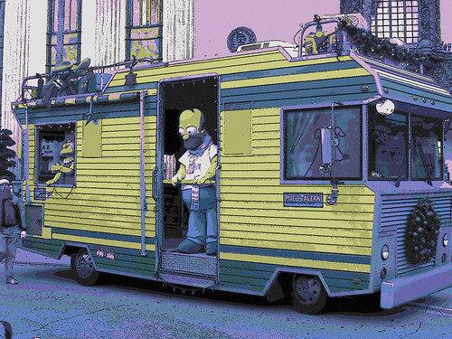
Comic Book Effect – 1 star

I used Photo Booth to grab a silly picture of myself and then headed over to Acorn to throw a half-tone dot effect over it. Once I achieved half-tonality, I opened up ComicLife and set up a half-Dark-Knight-Returns, half-Scott-McCloud, half splash-page layout to show myself sitting the Marvel Way. I look just like my dad looks when he plays video games, but he sometimes sticks out his tongue. Like Jordan. My dad is the man.
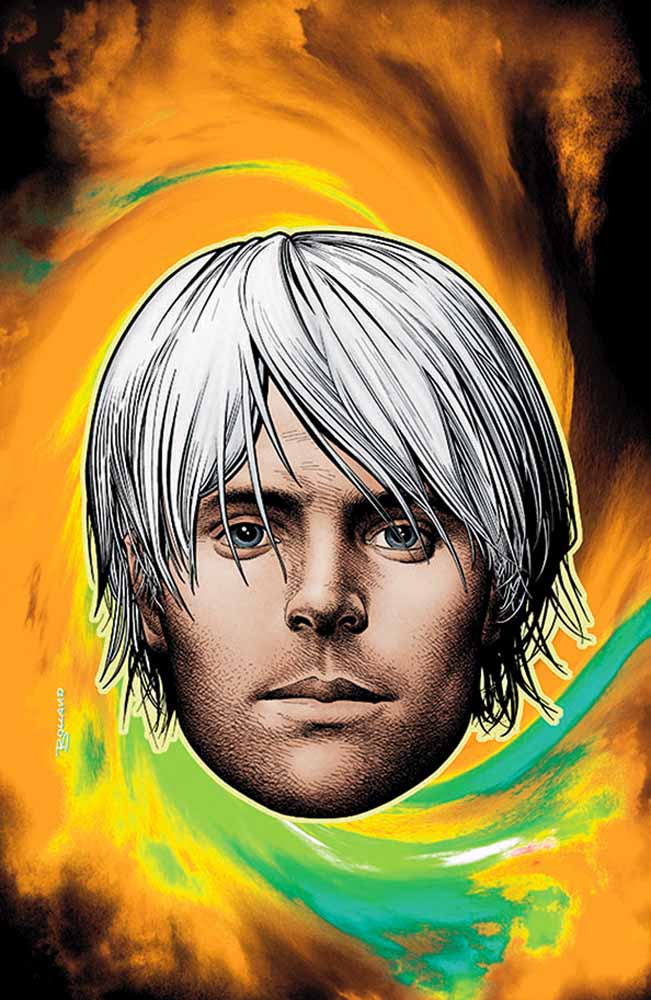
"Sitting Down the Marvel Way!*"

Draw it. – 2 stars

I remain drawn to the portrait I used for my Daily Create trace drawing. The amount of detail in the photograph captivates me – it speaks to the part of my brain that has been filling up bookscovers and meeting agendas with cartoon eyes, cross-hatching, flames, flowers, spirals, and stick-figure legs since 1990. I went back to the same portrait for this exercise and the next.

I wanted to find a combination of filters that made the portrait look like a pencil drawing while preserving the volume of the subject’s beard. I clicked through a number of combinations in Photoshop Elements 9, and eventually settled on the pencil cross-hatch effect combined with fully desaturated colors and dust and scratched noise to soften the cross hatching and add volume back to the beard.

"Beard with Volume"

Warhol Something – 3 stars

This was the first visual activity I tackled. I found myself using several different programs to get it done. Each program had bits that seemed intuitive to me, and each had bits that seemed obtuse, so I bounced back and forth between them at my whim.

I went back to my portrait and pasted it into SketchBook Pro. I added a layer and colored in different areas with colors that appealed to me in vaguely Warholian ways.

Then I went to Acorn and used the magic wand to prune a copy of the original image so that I would up with a layer of details I could paste over the colored image in SketchBook Pro in hope of creating a silk-screen effect.

I dig it.

"Beard with Warhol"

An Album Cover – 2 stars

My random Wikipedia search turned up Konrad I, Duke of Glogow. I rolled through his dad’s page and found the Piast Dynasty and its arms.

From there I did a cc-license search for Piast on Flickr and found a sculpture of the arms.

At that point I decided to try something inspired by the work of Rose Chase, a high school drama club pal, who designs for the Lower Dens, a Baltimore-based band.

I am no Rose Chase, but I went into Photoshop Elements 9 and equalized the images of the Piast arms. Next I put a blue photo filter on the image, blurred it five times, and desaturated the colors. To create the band of arms, I threw a 4-panel kaleidoscope effect on the arms, separated out the lower elements, and stitched them back on to the side of the upper elements. I drew, shadowed, and copied a few gold chevrons to represent one of the Piast colors and Konrad’s military victories. Finally, I dropped in the band and album names, adjusting the kerning on “Konrad1″ and the line spacing on “The Duke of Glogow.” I picked Trebuchet MS – a favorite sans-serif font of mine – and pink so that the lettering would conserve some interior weight and pop a bit.

Get ready for the drop:

"Konrad1 - Duke of Glogow"

Picturing Prufrock – 3 stars

I love comic books covers by Brian Bolland and Jim Steranko, and I staggered after them here.

First, I printed and read the poem, marking up lines that spoke to me. Then I started sketching street signs in my Moleskine. Pretty quickly, I decided on iterating a picture of a faceless man whittling a mask while seated on a pile of discarded faces. I gave him some shirt-sleeves because why not?

I went into SketchBook Pro and did a blue-line drawing, which is something I picked up from traditional comic book pencilling – artists sometimes layout a page in blue pencil (which doesn’t photocopy) before drawing “finished” pencils on the page for photographing and inking.

"Blue-line Prufrock"

On top of the blue-line sketch I drew a black-line picture of the man and his faces.

"Black-line Prufrock"

After that, I opened Acorn to get rid of the background and keep the figure and faces.

I added a nerve filtered to translucency in a layer behind the figure, and behind that I added a circular patten, coloring every other ring yellow as the fog curling around the house (sorry – couldn’t help it). I also inserted a text layer in a modern font with the lines that inspired the work.

I saved the image and exported it as a .jpg. I brought the .jpg into comic life and added the marquee lettering, which I wanted to be a bit jarring – this would be a Vertigo title, no? I used our bunkhouse logo for the publisher’s imprint and priced the comic according to my ever-loving whim. Finally, I added a lovely portrait called “The Love Song of J. Alfred Prufrock” and pushed it to the back of the image to take care of some of the negative space underneath the circles. I liked using a huge face that someone shot to represent the poem because it fit with what interested me about the poem this time around – the creative donning and murderous abandonment of different faces and identities.

Here is the cover as it stands around, maudlin and modern:

"Prufrock - the Comic"

I’m still processing all the work, but I felt delighted and surprised throughout by how some pieces defied my expectations of myself and came out much better – or even much worse – than I imagined. I would like to practice enough visual arts this summer to get a better feel for the kinds of tools and design approaches that can consistently get me into a flow state in pursuit of work that delights me. And I want to connect it all to what I’m learning about coding while noodling about in the shallowest kiddie pools of HTML, CSS, Javascript, and game design.

Captain America at Work

Of course, Captain America would choose the BGY-11 as his background. They're both as American as apple pie.

What does Captain America do when not saving the world from crazed Nazi scientists? We know he served his country as a part of the U.S. armed forces, and is an integral member of The Avengers, pontificating on what is or isn’t righteous in a rather old-fashioned Americana way. Most recently he spent a few years thought to be dead, only to be reborn in mid-2009 when it was deemed that a character of his moral fiber was needed once again (translation, he had been dead long enough to capitalize commercially off of it). But what does Captain America do when he’s not busy stomping enemies of the USA and being six feet under?

While I might have a Herculean task comparing what most public school teachers do for a living to Captain America’s exploits, the question I found myself pondering today was what do teachers, much like super heroes, do “behind the scenes” that the public doesn’t get to see? How do we unwind ourselves in such a difficult time (at least here in Michigan), where it seems as though all of our traditional foundational structures are shifting out from beneath us? Captain America and the rest of the Avengers can hang out in cool secret flying military bases for only so long before they must have to seek out something to stave off the boredom in between world-ending evil plots. As the summer looms large for many educators, some already on break, I wonder what my colleagues do in their “off time”.

I know that some tend to small family farms, others do driver’s education (more teaching), and tutoring (ditto), but I’m always curious about the teachers that have jobs beyond what you might expect. I used to work at a small independent children’s bookstore in the summers, which actually complimented my growth as an elementary educators, but I do know a few that have tended-bar, played “dj” for the summer, and one recent discovery was a teacher who has taken a 2 year leave of absence to join the Peace Corps. Those are certainly “un-teacher” like in much the same way that Captain America typing away on a computer doing data analysis or input would seem rather “un-hero” like (even if it is just a tiny LEGO model of him).

I don’t have the luxury of unwinding anymore; I work almost all year long (save for July) in my position as an instructional technologist. The summer is different, where I get to develop and work on curriculum and plan for the coming year, but it’s still in the same environment as the rest of the school year, and I miss that “down time” of being able to turn off teacher-me and do something completely else. Which is probably why I’ve been so enamored with ds106 this past year, and plan to spend a great deal of time this summer learning a lot of new tech tricks and tools thanks to creative assignments such as the “comic book effect” image above. I hope it can get me through the rather lonely weeks of late June and early August when the buildings are close to deserted and I have to force myself to stay on task, with only the clock as my closest reminder of any deadlines.

For those curious about creating the  comic effect above with Photoshop, I found a rather ridiculously easy tutorial on YouTube that you can watch below.

My MeMe two point assignment

Taking a leap
Taking a leap

This is a picture of a lady taking a leap of faith. I actually find it inspiration sometimes you just gotta take a chance and whatever outcome you must always try to succeed
Comicbook effect 1 star assignment

This is a picture i took earlier today at the jamaican queens, train station.I thought it look pretty cool, and actually resembles a seen out of a comic book.First i took this picture with comicscreen.It is an application on my android phone that changes the setting of my phone into a comic mood.So whatever picture i capture will come out already animated.

My MeMe
This is my own version of a MeMe. The president is always being judged, so in this picture. I wanted the president to seem as if he not gonna take any negativity from no one

The first step i took was to find a picture of the president with a bold expression on his face, and i came across this picture on google image. Second, I copy and saved it in my album on my andriod phone. I then doadloaded it into this application called “PICSAY.” Lasty, I edit the picture by incorporating this saying (problem?). Which gives the impression that the president is fed up with the judgments.