Did you know I was in a Band?

Yeh, me neither!

I’m really not in a band (I have ZERO music abilities) but for this 2-star ds106 assignment I got to pretend I was in one! This was a really fun assignment and I laughed so much while making it!

First, you click on this wikipedia site http://en.wikipedia.org/wiki/Special:Random  and the title of the page became your band’s name (it randomly generates new pages each time you open the link).

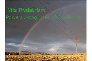
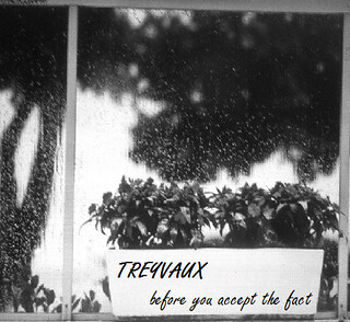
Then you click on this link: http://www.quotationspage.com/random.php3. Scroll to the bottom and the last quote is the name of your band’s Album. Next click on this link: http://www.flickr.com/explore/interesting/7days and select the 3rd picture- this is your album picture.

From there you can manipulate the picture, add the text, etc to create an Album cover.

So what’s my bands name?

My "band's name"

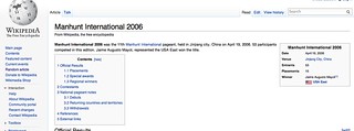
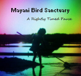
I just laughed when I saw this! For some reason I just picture a serial killer with the word “Manhunt.” I guess that’s what I get for having a dad who is a police officer and watching to many crime shows.

The album name?

my "band's album name"

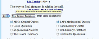
We are getting deep here…

And I forgot to screenshot the album picture before editing it. But here is the final copy.

Album Title- Ds106 Assignment

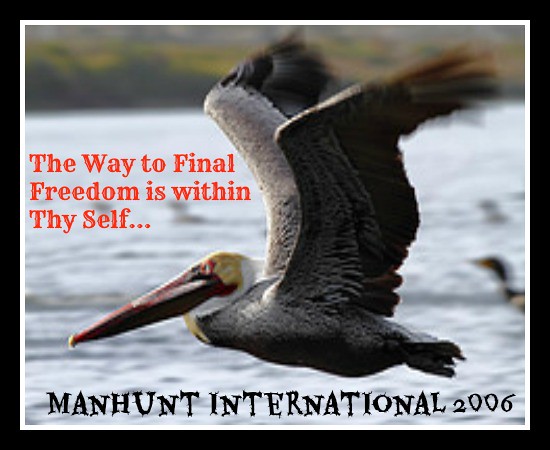
I used Picmonkey.com (you can read a tutorial on using picmonkey- here) to add the text and add the border. For the title I chose a font that had an “Old English” feel to it, I guess since it had the word “thy” in it, I felt it needed to look old. For the Name I went with a font that was edgy and had a creepy feel. Since “manhunt” and “serial killer” are synonymous in my mind, I thought it was an appropriate font. At the same time though I was trying to keep it clean looking, because the pelican takes up SO much of the picture I didn’t want it too look messy or be overwhelming to the eye.

I really like how it turned out, even though it such a bizarre combo of name, title and picture. But I guess that’s the whole point of the assignment- to see how ridiculous it can be! haha

What do you all think?

PS: This is my third 2 star assignment, taking me up to 6/10 stars!

DS106 Visual Assignment- Album Cover


This was a pretty cool assignment I did in my CT class. You generate random titles , names and pictures then use them to create and album cover. I decided to use a picture I took myself however. I couldn’t resist.  Check out the assignment at the link below.

http://assignments.ds106.us/assignments/an-album-cover/

“So here’s something fun for everyone to do, should be quick and easy, but try to make it pretty. First, go here: http://en.wikipedia.org/wiki/Special:Random The title of the article is now the name of your band. Next, go here: http://www.quotationspage.com/random.php3 Go to the bottom of the page. The last four to five words of the last quote are the title of your first album Lastly, go here: http://www.flickr.com/explore/interesting/7days Select the 3rd image. It is the picture for your album cover. Manipulate the picture, resize it, add some other color, whatever. Do the same with the band name and album title, put them over top. However you wanna do it. Make it look cool.”-Submitted by: Crazylegs


Crazy random happenstance (or, “I was motivated by guilt”)

When the cat is away, the mouse will either clean the house, watch a movie, or read Photoshop tutorials and do DS106 assignments.  The husband is at the Chesapeake Central Library 2012 Monsterfest.

photo from the Chesapeake Central Library

I am bored to tears.

Last week at school I encountered a project that required the use of Photoshop.  I really have no excuse for not being completely comfortable with Photoshop and Gimp.  But since I hate to read instructions, I find myself fumbling through both programs when I’m called to use them.  Enough of that.  It’s time to get serious.  I settled in with Photoshop Essentials, and decided to rework the album cover assignment from Camp Magic Macguffin.

I’ve been thinking about Galeophobia’s album cover over the past week or so.  I used Befunky to create the photo effects.  I’ve been feeling totally guilty about that after reading a blog post by Alan Levine.

No one dishes out the guilt quite like Alan Levine (evidence below):

I read through a few of the basic tutorials about layers.  Photoshop layers make a lot more sense once you know how they work and what can be done with them.  Here’s the album cover for “More Than the Intelligence Quotient” by the band Robert Finch:

album cover for More than the intelligence quotient by the band Robert Finch

photo courtesy of Ingrid Eulenfan (Flickr)

I added a subtle diffused glow to the photo.  It was enough.  I think Ingrid Eulenfan‘s photo combined with the quote from Eugene S. Wilson.

It was crazy, random happenstance that the image and text fit together so well.

Stuff to work on: design (that font is awful and not placed well) and storytelling.


Album

An Album Cover

album

The name of the band that I got from a random wikipedia article is Valea Vidri?ca River.
Then I got the random quote, (from Twilight “etched in my mind” as the album name
Then I got the random image from the link provided.
I put them together and messed with the fonts and colors some, and voila!

I Make Music, Not Album Covers

This one baffled me a bit.  I feel like maybe I’ll have to take this down before long.  Is there something wrong with this assignment page itself?

The assignment here was to make an album cover, finding your band name, album name, and base cover photo by way of random url generators on wikipedia, flickr, and a quotations page – total assignment worth 2 stars.

This was all fine and dandy, till I got to flickr, and every time I loaded the generator, the photos provided were ‘All Rights Reserved.’  Now what?

So I created this by cropping the flickr image and opening it in GIMP, and adding the band name and album name using that.  Easy-peasy.  But I don’t feel good about it.  Does the assignment itself need review?  Or is there something I missed?  My apologies if I have offended – I’ll change it if necessary.  I have no intentions of stealing anyone’s work here, in particular not this guy’s.  But for now, here is the assignment, completed as instructed.

My Album Cover?

This Visual Assignment was incredibly fun and random. I was not going to complete this because I already had completed enough assignments to get credit for the week but I just loved what happened.

Here are the directions for the assignment:

http://assignments.ds106.us/assignments/an-album-cover/

Basically I had to do a mash-up of all these random things to create an album cover. My name turned out to be Nils Rydström, who was actually a Swedish fencer who competed in the Olympics way back. I love the name because it looks pretty rock and roll with the umlaut above the ‘o’.

Here is some information on how heavy-metal groups use umlauts:

http://en.wikipedia.org/wiki/Metal_umlaut

 
Next there was a random quote by JFK that ended with “Powers Along Lines of Excellence.” Again, pretty sweet.

Next I had to get the photo for the cover that just happened to have power lines in it. I thought it fit perfectly with “Powers Along Lines.”

This seemed too good to be true. Here is the final product:


albumfinal1

Fontanella Live

Fontanella-LifEhAsOpeNedBeForeyoU

I remember doing those Album Cover you make from randomly generated things, a ton of different methods of doing this and getting the album/artist name and the artwork. I feel really lucking with the picture and album name I got I feel like the homeless man packed up with his garbage bag suit case moving away I feel like for him Life really may have opened before him and he is moving towards it. The band name Fontanella wasn’t that interesting which is part of the reason I put it up in the sky portion of the photo and got it to kinda look as if it were the clouds. The color and font of the album name “Life has opened before you” i tried using the redish orange lights reflecting in the trash bag and put that look into the text. the font I choose becasue it seemed like something you could find on one of those cardboard signs the homeless often use. i toyed with the coloring, shadows and lights. I made the portion he was walking towards brighter and the part behind him more shadowy to illustrate the moving forward to better options and opening up. I had a lot of fun with this assignment and was very pleased with how it turned out, even though it didn’t even take me that long to actually do. the Entire thing was done in Picasa by Google.

Treyvaux…

This assignment was an interesting one! We had to follow 3 links to these random websites to get 3 random things: a band name (from an article title), an album name (from the last 4-5 words of the last random quote on the page), and a random photo as the background picture.

Everything I had was really random. For instance, the band name, Treyvaux, is a “municipality in the district of Sarine in the canton of Fribourg in Switzerland,” according to Wikipedia. But it’s definitely somewhere I’ve never heard of before. However, I really liked the quote and picture that I was randomly given!

So I took a picture of the picture with my phone and used the Photoshop Express app on my phone to turn it black and white and then sent it to my email. Next, I copied and pasted the picture onto Paint, an image editing program installed on PCs, and cropped it so that only the window was in frame so it would fit onto a potential album cover. Next, I added the band name and album title. I used a cursive-ish font and placed these words over the flower box because it was the only white space in the picture.

I think this turned out pretty well. From the whole image together, I get that the band is a very laid back, chill band that maybe has some folk melodies, acoustic guitar, and quirky but classic voices. Maybe you see something else, and that’s great too!

Album Cover

An Album Cover: With Greater Contemptment

AlbumCover

I really loved this assignment. It was fun and it actually sounds like it would be a real indie band. This one was two stars.

I did as I was told and found my picture, band name, and album title like the first step of the assignment says to. I really wished I had thought ahead and saved the website addresses here so I could “cite” them, but alas. Once I got all my information, I opened my picture in Gimp. From here I made the buildings blurry and added a sepia tone to it using the color balance tool. Then I added the text “Robin Hood’s Stride” (the band name) and “With Greater Contemptment” (album name) with the text tool and fooled around with the text font and color. When I finished, I realized it needed something more and added the solar flare in the upper right corner. (Here is a wonderful tutorial on how to do that because if you asked me to do it, I’d look like a fool.)

Mayani Bird Sanctuary

Mayani Bird Sanctuary Album Cover

First of all, I really enjoyed doing this assignment. I liked the randomness of it, and I liked the room for creativity that it allowed me. So, how did I result in this vundabar album cover? Let me tell you.

After extracting the random picture/album title/band name that I was going to be using, which I did on the actual page for the assignment, I started by editing the picture because that was going to be the background for the whole thing. By the way, my random things fit very well together, I think. I imagine a a hipster, indie band of sorts. Anyways, I saved the image, and then I wanted to achieve a kind of pixely look, so once I saved it, I snapped the photo onto my iPhone directly from the computer screen. I don’t know if you’ve ever done this, but it ends up making any picture you take look pixely. It’s weird that it does it, but sometimes, in cases such as this, it can make things look pretty sweet. From there I used an app on my phone, Photoshop Express (a free app; it’s cool, but it doesn’t have all the cool features like the one you can pay for does; it makes editing photos really easy though). I changed the colors of the original photo. And then emailed the photo to myself to call it a day. From there I used paint to add the captions (the band’s name and the album title). I chose a pixely font for the band’s name to go with the theme of it, but I wanted something different for the album title–because I wanted to break up the pixel look, and because it was hard to see the black font of the pixel font on any other part of the cover. I cropped down the size of the picture so that it looked more album cover sized, and uploaded it to flickr, and is the image that you now see above. LOVE it.