Breakfast in American Redux


Rating: 2 out of 5.

For this assignment I decided to remake an album cover. This is for the assignment “Remix An Album Cover” in the assignment bank, which gives you free choice on however you choose to remake it. This was only a two star assignment and it was fairly simple to do. The hardest part was picking an album to remix. Since I’m old-fashioned when it comes to music, I went through every interesting album I could think of. Originally I wanted to remix Boston’s debut album, but later used it for a remix assignment instead. For this assignment, however, I pulled up and interesting album cover to turn back into a more literal representation of itself: Supertramp’s Breakfast in America.

Supertramp is one of my favorite bands, and Breakfast in America is one of those albums that is referenced by anyone familiar with them. It has an iconic photograph of a waitress holding a platter with a glass and a menu, much like the Statue of Liberty, while the city of New York is shaped in the background by dishes. I looked at this album and thought, “Hey, why not make the waitress literally the Statue of Liberty?” And thus, I got to work.

I’m going to outright admit I’m not good at editing photos, so instead I choose to draw this one by hand using Procreate. The layer feature was a blessing, letting me focus on the waitress before creating the background. Some reference photos to get her general shape in a light shade of blue-green that resembles oxidized copper before creating shadows with a slightly darken color. Since I was drawing it by hand, I opted for a minimalistic approach. Drawing her took the most time and afterwards I made a rough sketch of the New York skyline in the background before coloring it in. I choose a slightly lighter shade of blue to emulate the sky before using the spray-paint tool to create the yellow horizon. I even wrote the name of the band and the album name myself to complete the image. I had to practice writing it a few times before I was happy with the final result.

Breakfast In America Remix

What do you think? Instead of resembling the Statue of Liberty, she is now, quite literally, the State of Liberty. Or a Waitress of Liberty, or something like that. Basically, I broke the metaphor by creating the thing the original album cover was alluding to. I’m quite happy with the result, but have also thought about going back and putting the writing behind her.

Please tell me what you think by commenting down below!

A dreadful album for a dreadful legend.

black sabbath

Tells of Mr, Crawlston have circulated through the West for generations, becoming its own corner of paranormal/pop culture storytelling that people love to use again…and again…and again…ad nauseum thinking they’re being edgy and clever.

It is no different with the British upstart band “Black Sabbath”, a bunch of dour, talentless hacks that think that basing their style off of satanic ‘worshhip’ somehow makes them good as opposed to just another piece of drivel trying to make their break in the U.S. riding the wave of anglophilia left by the their almost equally talentless predecessors. For their first album, they unashamedly slap on a likeness of the famous Crawlston to catch the attention of their audience, which I assure you, must just be teenagers looking to be rebellious in the face of their parents noble protests, for no self respecting adult would buy this drivel. Looking past the cliche that is this album’s cover, the record itself contains no saving grace though. It starts with a trudging, minour key filled track that simply put me to sleep while Mr. Osbourne droned on in what seemed like a poor attempt at poetry and just when I thought the track could not get any worse (and when I was just falling cozily into sleep) it starts rasping on dreadfully with loud electric guitar riffs, by Mr Iommi and Mr. Butler, that were like nails on a chalk board.

I say to you parents, please do not let your children listen to this filth, the only way to get this DRECK off the airways is by squelching its source of popularity and no good Christian parent would let their child listen to this satan aggrandizing racket, regardless of if it is seriously worshiping satan or just looking for the image. Let Mr. Crawlston remain a story you tell to your little kids to make them behave, not a symbol of the “counter culture”.


____________________________________________________________________________________

So this assignment I had a lot of fun with, I got the remix ‘Stuffy Art Critic’ for it and went full at it. Let it be clear, I adore Black Sabbath, so this was all done satirically. For the main part of the assignment, the album cover remix, I made it fairly small scale, finding a picture that fit Richard Crawlston and photoshopping it in place of Ozzy on the album art, implying that Crawlston’s story has ballooned as time past, and by the 70s he’s become a  pop culture icon of the paranormal

The Beatles Go to the Lake

My next mashup assignment involved changing up an iconic album cover. I chose to use the Abbey Road album cover and made the street water and the crosswalk a wooden bridge they have to walk across. I used GIMP again for this assignment. I changed the color of the road to be blue so that it looked like what and changed the white striped from the crosswalk to brown for wooden planks. Again, it isn’t super pretty but I think it turned out pretty good!


I also changed the name to Abbey Lake instead of Abbey Road.

beatles

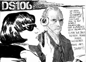
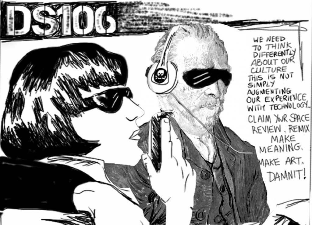
#tdc1547 Van Gogh goes #DS106

make-art-vg

First Daily in a while, so though it was worth a quick post.

#tdc1547 Make a Van Gogh – Make him go for DS106 | The (new) Daily Create

The original DS106 image from DS106: The Open Online Community of Digital Storytellers by Jim Groom — Kickstarter Not sure who to credit as Google didn’t turn up a backstory.

The Van Gogh picture from File:Vincent van Gogh – Self-Portrait – Google Art Project.jpg – Wikimedia Commons where it says:

This is a faithful photographic reproduction of a two-dimensional, public domain work of art. The work of art itself is in the public domain for the following reason:

The author died in 1890, so this work is in the public domain in its country of origin and other countries and areas where the copyright term is the author’s life plus 100 years or less.
This work is in the public domain in the United States because it was published (or registered with the U.S. Copyright Office) before January 1, 1923.
This file has been identified as being free of known restrictions under copyright law, including all related and neighboring rights.

Which is good enough for me.

Process

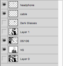
vg-layersDownload both images. Open in Photoshop.

The Quick Selection Tool is my Friend.

  1. Select Van. and make new layer via copy.
  2. Duplicate that layer into DS106 image.
  3. Quick  Selection tool to cut out rear figure to new layer. Then headphones and cables to new layers too. Hide figure.
  4. Move VG layer behind main layer resize to fit.
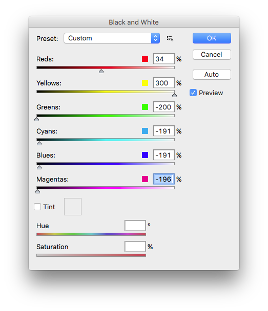
  5. Image-> Adjustments -> Black & White…

vg-b-w

I messed about till I got it as B&W as I could.

Cropped and exported to jpg.

Other possibilities

I did think about the dark glasses:

make-art-vg-2-dg

But think the eyes had it.


I also though about tracing the VG picture to make it more in the style of the DS106/Sonic Youth.

Or sending the ds106 image to the twitter bot that does impressionist images…

Updates

Worth noting I flipped the VG image.

More important we know the DS106 Artist:

And I claim a couple of assignment stars: ds106 Assignments: Remix an Album Cover 😉

The Beatles Hair Promo

The Beatles Hair Promo – Let it Grow!

Beatles Let it Grow

Michael bring flowers to Repsag

melissamichael

This assignment is worth 2 stars and it asked to change a music album cover. For this reason I choose the album cover for Thriller by Michael Jackson and I added a flower bouquet. I did it in paint, nothing too fancy it was simple and easy to add a bouquet of flowers to a very ionic album cover.

The Joker (Remix an Album Cover)

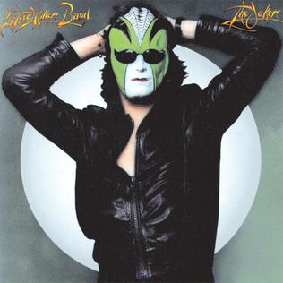
The next assignment that I decided to do was Remix An Album Cover. The goal behind this assignment is to take a classic album cover and remix something within it. Whether it be the title, image, or aesthetics of the cover. To do this, I had to first decide which album cover I wanted to remix. I looked at Rolling Stone’s list of 100 greatest album covers to help me decide. The album I finally decided to remix was The Joker by the Steve Miller BandI chose this album because I wanted to use the title of the album as a play with the Joker from Batman. And very ironically/lucky for me, the cover focuses on a person wearing a mask, making it easy for me to place the Joker’s face on top of this. Here is the original album cover:

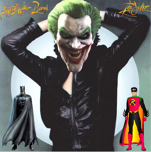
Now, to edit this photo, I decided to use Google Draw, it contains every tool that I really needed to complete this album cover. And here’s my final album cover:

The Joker (Remix)

To create this, I simply downloaded a png of the Joker’s face. I then resized it so that it fit upon the person’s body. From here, to make sure that everyone could comprehend that the face was the Joker’s, from the Batman series. I added to png’s of Batman and Robin in the corners of the photo.

Overall, I think this is a really good remix of this cover. It is a good play on the title of the album and I think the images mesh really well with the cover. This assignment is worth a total of 3 stars out of 5.

Giving me a total of 8 stars for the week. I have a couple more assignments left for the week, so make sure you stay tuned. Til next time everyone. See ya!

Death Note Album Cover (Remix an Album Cover***)

What do you get when you cross a Japanese cartoon with an English band? You get a remixed album cover!
DeathnoteAlbum

This cover was created for the Remix an Album Cover remix assignment. This image is a parody of the Gorillaz Demon Days album cover which features all four of the Gorillaz members on a white background facing the same direction. Instead of Murdoc, 2D, Noodle and Russel, I replaced them with Light, L, Misa, and Ryuk from the anime called Death Note. I changed the title of the album from “Demon Days” to “The New World” because in the show, Light and Misa are trying their hardest to create a perfect world free of crime by bringing the criminals to a deadly justice. (Seriously, I love this show!)

I made this album cover in GIMP by taking the original Gorillaz cover and erasing the text and characters. After that I went through a bunch of Death Note clips to find the 4 main characters with a side view, to make it match the original album as much as possible. This was what took me so long because they were always facing the camera straight on in the shot. I fuzzy erased the backgrounds they were in and pasted them in their respective white squares. Hm, I would love to see these 4 in a band, too bad they couldn’t work together since they’d be fighting all the time.

Remix An Album – Buddy Holly

For this assignment students were to remix an album cover. I decided to take a minimalists approach to Buddy Holly’s, “That’ll Be The Day.” Originally the album Holly standing infront of the sunset, today that would be kinda cliche. So instead I decided to see if simple is really better.

However, I hade two variations and could not decide which one was better, so I uploaded both.