Highlighting the Highlighter (Splash the Color Assignment)

The second visual assignment I chose to complete this week was “Splash The Color.” This is a 3 star assignment. The assignment instructions were

Color splash is a technique to emphasize details- you remove all color from a photo, and then restore original color to a single object, e.g. a green apple on a table. Think of the Girl in the red dress from Schindler’s List.

Here is a link to the assignment page.


First, the final image:

Final


Since this assignment focused on the color on an individual object, I wanted to find something with a vibrant color located in a busy setting . This orange highlighter was exactly what I was looking for. It’s stashed in among many other writing utensils and its bright orange color really stuck out.

I’m happy with the way this image turned out. In the previous visual assignment, I attempted to selectively color something much more complex and it didn’t turn out as well as it could have. Selecting an object with a simpler shape definitely made it easier to get the borders right. As I get better at using these tools, I’ll be able to work on more difficult pictures, but I think selecting the correct image for your skill level is important.

The instructions I used for the rest of this process can be found here.  I took the original picture with my iPhone and emailed it to myself.

Colored

I downloaded the photo onto my computer and opened it up in GIMP. I duplicated the picture and went to Edit->Mode->Grayscale to convert the picture to black and white. I copied the image into a new layer sitting above the original color image.1

I right-clicked on the B&W layer and selected “Add Layer Mask.” 2

I accepted the options seen above and then selected the Paintbrush Tool. I zoomed in a bit and began painting in the middle of the highlighter.3

When I had everything except the edges colored in, I zoomed in further and decreased the size of my brush to get clean edges. I had to zoom in to 800% to get some portions of the border colored correctly. The edge of the highlighter blended fairly smoothly in grayscale in some spots, so I had to zoom in and out several times to see what else needed to be colored.45

After finishing up some spots with a brush as small as 1 pixel, I had completed the coloring. I saved the file in GIMP and then exported it as a png image file so that it could be embedded into this post.

7


A Splash of Magic

Splash of Magic

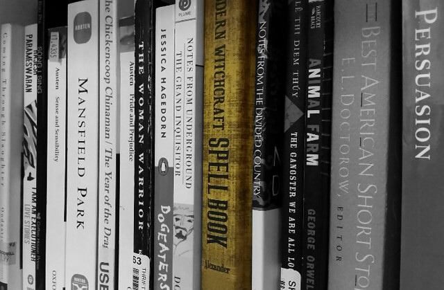
My bookshelf for this semester is just filled with so many books, some aren’t even pictured here! But there’s one book that’s just for me. Something that’s just for fun, that I know I can relax and enjoy and not have to worry about analyzing and papers. Just a little bit of magic to brighten my day.

This was for the Splash the Color assignment (3.5 stars)! In this assignment, we had to take a picture and isolate a single object to retain its color, and the rest of the photo had to be in black and white. I love this type of photography, because depending on what’s highlighted, it could have so many different meanings.

For this picture in particular, I wanted to highlight my spellbook amongst all the books I have to read for this semester. I figured since it’s the only book I’ve gotten to read in my spare time, and its subject is so vastly different than what I’m studying this semester, it would be perfect!

Process:

For this, I used GIMP, because it’s the best and I don’t have anything else downloaded. And I know how to work it mostly. So, for this, you have to open the image in GIMP

stp1

Then, you take this tool and this mode:

stp2

This is the “fuzzy selection” tool, with the “add to current selection” mode. Basically, you click the area you want to select (drag it to select more or less), and then with this mode on, you can just keep clicking away to complete your selection.

Of course, if your object is like mine and doesn’t select easy, you’ll eventually move on to:

stp3

The lasso tool with the add mode! This allows you to freehand an area to select. Draw around the little bits that you just couldn’t get before with the wand. This step is a little tricky if you have an unsteady hand, and that’s okay, because that’s what the next step is for.

stp4

Still on the lasso, select the “subtract from selection” mode. This is the opposite of the add-to mode (of course), and allows you to draw around areas you don’t want to include. You’ll probably jump between this mode and the other mode a lot, until you have exactly what you want.

You can also use the other selection tools (just make sure to set the right mode), or the first tool on the second row of tools, which selects every instance of a color throughout the image. So if I clicked on the red “A” in Animal Farm, it would also pick all the rest of the red in the picture.

Next comes the actual fun part.

stp5

Go to the toolbar and hit select, and then invert. This takes the area you selected, and then selects everything around it instead. Then

stp6

Go to Colors and Desaturate, play around and see which option suits your needs, and you’re done! A bit time-consuming, but with a great result!

Focus Here Please

Visual Assignment called “Splash the Color” 3.5 Stars

“Color splash is a technique to emphasize details- you remove all color from a photo, and then restore original color to a single object, e.g. a green apple on a table. Think of the Girl in the red dress from Schindler’s List.”

The photo I chose to use was taken right when Spring had sprung a few years ago. So many flowers were blooming everywhere and I just had to go and take some pictures of them. These particular flowers were found in the woods in my back yard. There was probably hundreds of them  all over the ground.

I’ve seen this technique used many times and I think it is a great and effective way to draw attention to the subject of the photo or draw attention to something else within the photo that the photographer finds more important than the actual subject. It’s a technique I have always wanted to try so I thought this would be the perfect assignment.

The original photo I used was filled with a good amount of color so I knew the contrast would look great in black and white, which is important when taking out all of the color from a photo. As you can see, there is a lot of distinguishable blue and green, which is perfect for switching to black and white. DSCN1258


After choosing a photo that would have good contrast. I opened it into Photoshop Elements 11 and selected the focal point of the picture and copied into another layer. Then I took the color from the background. Finally all I needed to do was place the layer with the colored flower on top of the black and white background and then I was done!

In this photo you can see that this particular flower is the only one in focus, everything else is blurred in the background. By changing everything else to black and white and making the focused flower the only one in color really brings attention to it.DSCN12582

Assignment #1

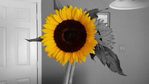
My first visual assignment is called Splash the Color worth three and a half stars. The assignment details were to take a picture , make it black and white, but leave one part of the picture colored to emphasize a part of that picture.
sunflower

Steps to creating the photo:

  1. Went to the Not Digital True Telling page , and clicked Week Five.
  2. I scrolled down to the section called Visual Assignments.
  3. I clicked the first bullet called Splash that Color, which took me to the Assignment page.
  4. I found a picture I wanted to use and opened Photoshop.
  5. I dragged the picture into Photoshop.
  6. I used the loop tool to outline the part I wanted to stay colored.
  7. After I finished outlining the flower , I hit copy and paste, which created another layer.
  8. I went to Image, then Applications, then Black and white, and hit OK.
  9. Posted my picture to Flickr.

I picked this photo because I love flowers and I’ve always felt flowers are good candidates for pictures like this. This photo has a lot of meaning to me because it reminds of a wonderful and happy day. I got these flowers on the day I graduated from high school from someone very special to me.  The bright yellow flowers symbolize the happiness brought about from graduating and getting celebrate with everyone.

Fizzlebottoms, a splash of color;


 Color splash is a technique to emphasize details- you remove all color from a photo, and then restore original color to a single object, e.g. a green apple on a table. Think of the Girl in the red dress from Schindler’s List.

You can do this in a number of ways with photo editing software or using mobile apps. The answer lies in the Google

IMG_6257 [263240]


Fizzlebottoms’s, Downtown F’Burg. (3.5 Stars)

Pennyfarthing Drive

Pennyfarthing Drive

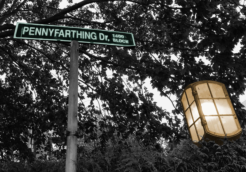
When I was out doing my design blitz in the Village the other day I discovered that there is a street called Pennyfarthing Drive in the Village. Well, of course there is.


Alternate version

I also did a red version. I’m not sure which I like better.

PennyfarthingDr


the process

This is really a “visual assignment” (last week) rather than a “design assignment” (this week), but oh well.

This was a problematic image to work with because it was not very light in the laneway where I took it, and there wasn’t much daylight left in the day. So the street sign didn’t stand out at all. I wanted to find some way to emphasize the sign.

First, I discovered the “burn” tool in GIMP (in the tool pane) and tried it out. I didn’t know what it did. On this b/w image it lightened things up. So I used it on the words on the sign, to brighten them.

Then, I decided to do a colour splash. This was a little tricky because I wanted two different colours, one for the sign and one for the lamp.

1. First, I duplicated the image a couple of times.

2. I added an alpha channel to the layer with the b/w image, and then used the “lasso” tool to select around the sign and then the lamp. I used Edit -> clear to delete the selection, leaving a transparent spot for each.

Screen Shot 2015-07-26 at 10.54.24 PM3. I had two other layers with the same image. On one of them I used Colors -> colorize to colour it green, and I did the same on the other to colour it yellow. Only I discovered something: I had the lamp still selected on the yellow layer, and when I did “colorize” it just coloured the lamp, not the rest of the image. Interesting.

4. On the yellow layer I selected around the sign and did the same thing as in step 2 to make the sign on the yellow layer also transparent. That way it would show through to the green layer below it rather than showing the sign yellow.

Screen Shot 2015-07-26 at 11.00.07 PM

Here’s a screenshot of the layers; the b/w on top, the yellow lamp, then the layer that got colorized entirely green.

Screen Shot 2015-07-26 at 11.00.43 PM


Gearing up for a busy summer of DS106 I decided to turn today’s…


Gearing up for a busy summer of DS106 I decided to turn today’s daily create into my first proper assignment. It is called Splash the colour and I had a little help from the lovely Jack Hylan to get it done. He made a tutorial to make it easy and enjoyable. 

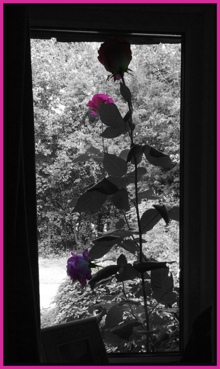
The prompt for the daily create asked us ‘see beyond the buildings’. I looked out of my office window to see the beautiful roses outside. I wondered if I could take a photo from the inside that would show the window (building) and focus on what was beyond it (the flower). I did that. 

Then I wondered if I could make one of those photos where everything is black and white and only a splash of colour. I used to have a cheap camera that did that automatically, I still miss that camera. 

Then I remembered Jack and his towel. All I did was follow his tutorial exactly and then add my tacky pink frame, I could not help it. I wanted the pink to highlight the roses. 

Well, that is me dusting the blog up for this DS106 summer!

I hope I found my pot of gold.

Moving to Denver

My first visual assignment for class was chosen at random.  The instructions were to emphasize a color from a picture.  I have decided that my theme for the next two months is going to be me exploring a new city.  This picture was taken in July last year when I visited Denver (better yet Colorado) for the first time.  My little brother was trying to convince me to move out here, which is why I came to visit.  I told him that I was looking for a sign when I arrived.  Sure enough the first day I visited I saw a rainbow.  I was in a car so this is by far not the most epic picture taken but it was one sign that actually made me consider picking up my whole life and moving.

To create this photo I downloaded the app Photo Splash.  It was a free app that I downloaded on my cell phone.  The app walked you through the entire process.  Essentially your finger is the paint brush applying color to a black and white photo or visa versa.  I found this app to be very fun and not at all time consuming.  I know I will use this app again in the future as it does add that tough of drama to photo’s.

I think since this is my first visual assignment choosing one the first pictures I have ever taken in Colorado seemed appropriate. I am hoping things work out here but so far so good.  I would recommend anyone who takes a lot of pictures to download this free app because it works well.

Today in four year old fashions…

Tori

I felt like the paparazzi snapping this picture of my unsuspecting niece. Minding her own business in her chair, not a care in the world. Anyway, for this assignment (three stars) I decided to zero in on her shirt. It’s this weird pinkish-purple with cheetah print. It always surprises me how out there kid’s clothing can be. This is tame compared to some of the stuff she owns. So many colors and patterns that clash. I don’t think its necessarily a bad thing. Just something I’ve come to notice. Perhaps it’s to encourage creativity in kids or something.

As for how I went about making this, everything was done in photoshop. First I loaded the image into photoshop. Then I took the quick selection tool and made a selection of my niece’s shirt. I made a copy of the selection and pasted it to its own layer. After that I went up to Images-> Adjustments -> Black & White. Black and white layer popped up and I placed it over the initial picture’s layer. Then I took the layer with the color copy of my niece’s shirt and placed it above the black and white layer.

There’s many other ways out there to accomplish the same thing though, don’t feel this is the only way!

Well, Color Me Gold!

Experimenting with image editing software has always been a pleasure of mine. I  enjoy transforming photos from their original form, such as by cropping and applying filters. Given this hobby, the assignment, “Splash The Color” seemed perfect because I had never tried to add color back to only one object in a picture. The assignment states: … Continue reading Well, Color Me Gold!