Storytelling Within the Web Assignment: How Cynics See UMW

Do you know anyone on campus who aaaallways has something negative to say about the school? In some cases what they say is true, but most of the time they just need something to complain about in front of their friends. It gets annoying. Wouldn’t it be simpler to transfer if you dont like the university? Apparently that concept is too complicated.

I created the How Cynics See UMW page by taking the original UMW homepage and editing the text to what is usually negatively said about the campus; “There’s no parties here!” “The food service here sucks!” ect. I do agree with a few of these, such as the small amount of diversity and the fact that our school’s slogan is cheesy, but I don’t complain about these aspects every waking moment! For the most part, I wouldn’t have selected any other college to attend.

Here’s the original UMW homepage

Picture 4

And here’s how cynics see it
Picture 1

I was unable to change the UMW logo and slogan just by typing over the text because the whole space was an image. This was the only place on the site where I had to use GIMP, since everything else was a basic editable text area.

Check out the main page to see the text a bit clearer. And for pete’s sake, don’t turn into one of these people!! People like these make the school more unbearable than what they actually claim.

My Dream College Experience

This may just be my favorite assignment yet! Anyone who knows me knows that I am not someone who picks favorites easily. Ever since I was little and someone asked me what my favorite part of vacation was or my favorite part of school, I simply responded with “everything”. I still do it to this day in fact. So when first brought upon the challenge to tell a story through a website I was a bit tentative. How am I going to do this? What website will I choose? What story will I tell?

I started thinking about different things that I could do. What do I use the Internet for? Well, recently it’s only been for Digital Storytelling and another class that I am in online. So, my top 8 visited websites mainly have to do with those, or Hulu since I watch way too much television. However, after looking at the top 8 visited websites I remembered something. Before this class took over my life (in a good way of course) I always had a number one visited site, umweagles.com. In fact, I visited that site so many times that it used to be my #1 AND my #6 most visited site. How that happened, I still have no idea. At first I started to dream really big, and I go onto ESPN’s website and put on my x-ray goggles and realized that I enjoyed having hair and didn’t want to pull it all out trying to even decode a thing. So I went to something that I thought would be simpler, NCAA. Once again I was wrong. I should have just stuck with my gut instinct and looked at UMW Eagles. Once I put on my goggles, I saw all the potential for manipulation.

At first I was going to make myself an All-American, then I was going to take the volleyball team onto some crazy trip. Then in a state of pure brilliance I decided to change things up a bit and make a new sport, dedicated to princesses. My mind started working at a million words per minute and I was just trying to gather everything together. A Princess sport. I first went right to equestrian, and I don’t mean riding horses, but I mean the competition style. There are different aspects that they get judged on, just like in gymnastics. So my idea is that the competitions would be more like a meet fashion rather than a game fashion. The criteria would be Magic Carpet racing, Archery, Sleeping Competition and finally a Math competition.

I loved being a college athlete. I came into this school lost and not knowing anyone, and it gave me a family right away. I wouldn’t trade my experience as an athlete for the world. I think it is a great way for students to really have a great college experience. So, why not open it up to Princesses? I would totally do all of these things if it was an option!

So I decided to “Pimp My Page” for lack of a better analogy. Using the x-ray goggles, I was able to change the pictures and the beginning of the stories as well as their titles. I even got to change the scores on the top!

Sadly, the main headlines do not rotate like they do on the main page, so it takes away a bit from the story that I wanted to tell. However I changed the stories anyway. So this is the order of the pages that I want you to view (to portray the switching from story to story). So just to make sure what I am saying is clear here is the deal. On the original website, the 5 most recent stories are rotated, starting with the most recent one.

So my here is my first page, second page, third pagefourth page, and fifth page.

Now that you have seen the result, it’s time for the down and dirty part. How the heck did I pull this off? Magic of course.

It actually was not too hard at all!! X-ray goggles really do help a lot. The stories were all very easy to fix, and the big pictures were easy to put in. In order to fix the big pictures, you had to type in the link for a picture that you found. This was easily done using google image search and hitting view original image and typing in that link to replace the one previously there.

Where I had the most trouble was the pictures on the bottom. The coding revealed that there was more than just the link because the picture had to be resized to be smaller.

Here was the basic format of the smaller picture:
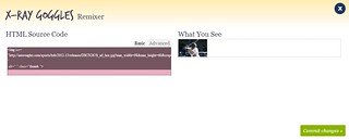
thumbnail

Compare that to the basic format of the large picture:
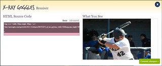
Big_Picture_Basic

There was clearly a difference. It wasn’t until a bit of researching later that I realized something interesting. The part of the code that I could not change in the basic format (the gray part) was what was throwing me off. So I ventured into the advanced section to see what I could find. And I really liked what I got to.

Here is the advanced format for the small picture:
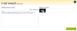
Thumbnail_Advanced

Here is the advanced format for the big picture:
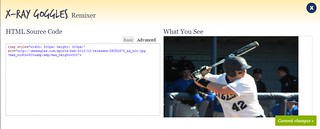
Big_Picture_Advanced


The big picture’s advanced box has a nice clean simple way of putting dimensions in it! Which is why all the photos are the same size. However, the small picture has a weird complex and cryptic way that I did not want to figure out.

So simply all that I did for the small pictures code was change the dimensions to by 98 by 60 (which I figured out from the cryptic code).

As a final touch I decided to change some of the scores in the top. Just to keep things interesting.

I chose not to change all of the stories because that is not realistic on this website. Instead, I decided to show the announcement of the sport, the fundraising for the sport, and then one competition of the sport. I hope you enjoyed looking at it as much as I did!

Thanks for reading!

Princess Karissa


Travel Hippy Style With Ozmomatics

As part of a ds106 final project story I am doing based on the Wizard of Oz, I have a part where Dorothy decides to go back to Oz. Not knowing how to find another tornado to whip her house (no one in Liberal, Kansas could explain how the house that was whipped to Oz was back in Kansas in tact. Continuity issues at the tourist trap).

I decided to to the Storytelling Within the Web assignment hoping to find a travel agency with a hippy theme:

From the Spring 2011 ds106 class came the idea of changing up an existing web page to tell a new story ” you will be intervening in the code and design of a website of your choice to tell a story. You are not to photoshop the design of the site, but rather intervene in the actual html and CSS of the site—though you can photoshop particular images on the site. Essentially you alter the content of a web page (content, images) to make it tell a new story.

But I failed it surface anything useful. I did find that the authoritative hippy.com site is sporting HTML vintage 1997 (tables, baby, it’s all tables and no CSS),

The Tecnomadics site seemed to come close enough to give me something to play with – the “hippies on http? banner drew me in. I set about in Hackasaurus to bend the text and media to my story. The one place I could not edit was the slider widget the have below the main header. Once I had saved the HTML from Hackasaurus, I opened it in a text editor, and deleted the DIV that contained they slider widget (as well as the fraebook iframe). I also got rid of a few lower blocks of content; the page was already long and I have enough for my purpose.

You (and Dorothy) can find my web edited version of this site at http://cogdogblog.com/stuff/gotooz/ozmomatics.html- its pretty heavily edited, all text and menus.

The idea is that it appears as this cool kind of travel site for hippies, but when Dorothy reads it, the content shifts to match her own personality and desires.

In fact, if you go under the “Take a trip” menu there is a link to “oz”, a page that uses the earlier animated gif I made of the ruby slippers, and I set up that page when clicked to go to an embedded version of my backwards video.

The story pieces are getting more connected!

Pinterest Peaks Interest

Storytelling within the Web

the idea of changing up an existing web page to tell a new story ” you will be intervening in the code and design of a website of your choice to tell a story. You are not to photoshop the design of the site, but rather intervene in the actual html and CSS of the site—though you can photoshop particular images on the site. Essentially you alter the content of a web page (content, images) to make it tell a new story.”

You can see my site here

This is part one to my final story:

My story starts with a girl, named Eliza, who is soon to graduate from college. She, like most other college girls, is looking at her Pinterest in hopes the answers to all her finals will magically be “pinned” :) . She is looking at the Travel section and searched Italy. She HAS to go! Part 2

I made this web remix by intervening the the code with the program X-Ray Goggles.

Karma Catchers!

This is web assignment 713, “Storytelling Within The Web.” It is worth 5 stars! The assignment reads:

“From the Spring 2011 ds106 class came the idea of changing up an existing web page to tell a new story ” you will be intervening in the code and design of a website of your choice to tell a story. You are not to photoshop the design of the site, but rather intervene in the actual html and CSS of the site—though you can photoshop particular images on the site. Essentially you alter the content of a web page (content, images) to make it tell a new story.

Originally we recommended doing this using the Firebug extension in the Firefox browser, which does work, but is unfortunately easy to lose your work. We currently recommend Mozilla Hackasaurus — install the X-Ray Googles in any browser and use it to re-cast the content of any web page.

When you blog it, include both a screen capture in your post, but you will also need to upload the web files (HTML and media files) to your own site so it can exist as a stand alone URL. (see our older Firebug Tutorial)

Consider using news sites, social media profiles, product pages, movie review pages etc. The simpler the design of the page, the easer it will be (think Craig’s List).”

(Website)

 I turned Amazons dream catcher earrings into Karma Catchers for bullies sold by “Stop Bullying Inc.”! I  plan to use this in my Final project as revenge against the mean girls! No one likes getting bullied, and this provides some type of peace of mind to those who are victims. Just wear these pretty earrings and karma will catch up to whoever bullies you! It’s time to give bullies a taste of their own medicine! (DISCLAIMER: These do not exist, this is a lie. Sorry not sorry.)

I used “x-ray goggles” to create this new Amazon product. This tool makes it extremely simple to alter a web page, I think it is extremely cool as well. You simply click on the tool then click on whichever element you wish to change. I see some major plotting and trickery in my future ;)

For this assignment, I changed the name of the original product where ever I saw it as well as the name of the real seller. Then I changed the description of the product to fit my new invention :)


Final Project: Storytelling Within the Web Obama Style


Screenshot

I decided to make Barack Obama president by day and super hero by night. For the Storytelling Within the Web assignment, I choose to make the site where Obama bought his super hero cape. Follow this link to view the site I edited with X Ray Goggles.*

First, I changed the original picture to a super hero cape. The original was a t-shirt with Obama’s signature on it, I think. They I changed the title to “Super Hero Cape”. I edited the description to fit what he would need (“perfect for a night out saving the country”). I alos made it out of silk. I changed the thumbnail swatches to two swatches of red, a dark one and a bright red. I also changed the thumbails of suggested items to pictures of Obama as a super hero, one, two and three. As an added detail, I changed the other thumbnail under the cape picture to another super hero picture.

The storytelling bit:

One day after a long hard day of being president of the United States, President Obama decided to become the super hero that he is to many Americans. He logs onto CafePress and searches for the perfect cape to wear around his house/the White House. He finds this one and describes what he needs to a t.


[5/~20]

* In case for some reason it doesn’t work: http://p.webremixes.org/egyyvpvj

Web Storytelling Assignment

The link for this assignment is here: http://assignments.ds106.us/assignments/storytelling-within-the-web/

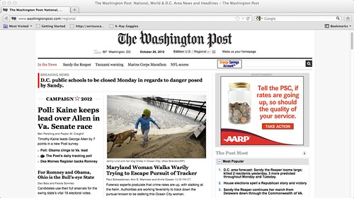
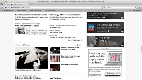
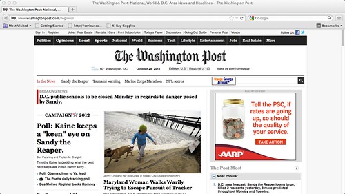
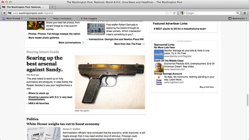
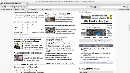
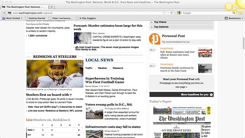
Here are my screenshot images for the Washington Post page that I remixed :p

Web-Based Story

Web-based story 4

web-based story 5

web-based story 6

Web-Based story 3

Web-Based Story 2

The standalone URL for my remixed Web Page can be found here: Washington Post front page re-done

What I did, and I thought it was pretty clever and lead to an overall theme, was I converted all Hurricane Sandy posts to Sandy the Reaper, and gave this overall theme of a serial killer on the loose. My idea with this was to create several different angles. A Maryland woman on the beach anxiously looking behind her. I made it sound like there was a killer tracking her and she could feel the killer behind her. There was another post that gave tips on how to stock up on weapons and prepare for Sandy coming into your neighborhood. D.C. schools would be closed on Monday due to the madness that was ensuing by Sandy’s terror. All of these changes led to a terrified and a very on-edge feeling of this newspaper front page. Especially being constructed out of Washington, D.C., politicians would have much to say about this topic as well.
To complete this assignment, I used the Hackasaurus tool, which can be used in any browser I am pretty sure, but I used it in Firefox just to be safe. Within this tool, there exists what is called the X-Ray Goggles, and these allow you to scroll over elements of the web page you are looking at, and allow you to make edits to the page right then and there. You can view the actual HTML and CSS code while at the same time, seeing what it will look like when completed, which is very helpful. While editing the Washington Post web page, I used the goggles to see the underlying code to whichI would be making changes, and made edits to the text, some of the pictures and so on. I know I could not have edited the raw HTML so I was super thankful to have this tool available. Anyways, enjoy this, and I hope it came out as a pretty cohesive story!

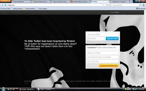
Twitter Has Been Hacked By Pirates!

Using Google X-Ray Goggles from Hackersaurus, I “hacked” Twitter to show what it would look like if pirates were to take over Twitter. Here is a screen shot of the finished project.
Twitter Hacked
I used the Twitter main page for my project and this is the link to the assignment.

THAT RABBIT’S DYNAMITE!!

I’m going to publish my weird borked edited web page for the evil awful horrid honestly quite educational Storytelling Within the Web assignment right now so that the code is at the very least out there and accessible before the storm robs me of my interwebs. Here’s what it ought to look like (flaws and all):

CUTEBREEDSSCREENCAP

Read on for the full writeup…

This assignment basically decimated my brain. And the sad thing is, I was super excited for this week when it all began:

But I got freaked out by the amount of stuff I wanted to do and how unfamiliar the coding language was and Firebug not working and me being more or less unable to make heads or tails of it anyway, and before I knew it I had zero time and less plan.

My first thought was to turn Prof. Levine’s blog into a bunny sanctuary (the new title was going to be BunnyButtsBlog. GENIUS), but I couldn’t figure out how to edit the header image behind the very first navigational menu. After failed attempts with Hackasaurus, the Firebug extension failing to show up in my browser even after extensive troubleshooting and some unsuccessful prodding with a 30-day free trial of Dreamweaver, I gave  up and moved on to sillier, lamer things.

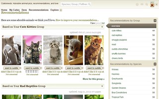
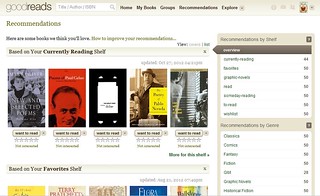
Expanding on my original idea of invading Prof. Levine’s blog with pictures of adorable fluffy bunny rabbits, I decided to edit my Goodreads.com recommendations page to do something similar. Instead of a site that suggests awesome books, my thought process went, how about a site that recommends cute little animals to hug and squeeze and love (but nobody is calling them George). Here’s what my rec’s page looked like originally:

goodreadsORIGINAL

Because you can never have enough poetry in your life. Never ever.

I discovered that to make the images look reasonable and not squished and malformed, I was going to have to edit them myself. Desperate as I was by that point, I did a few quick image searches and grabbed whatever images I could find of “cute puppies,” “chinchillas,” “bunny rabbits” and “cute reptiles” (yes, snakes are adorable. Yes, I will fight you on that point). After snagging five from each category I’d made up, I opened them all in GIMP and cropped them to more or less the right dimensions, then got the aspect ratio perfect with the “Scale Image” tool. Finally I uploaded all of the images (including a modified Goodreads logo) into a private, unsearchable folder in my Flickr account to prevent the images from being recirculated too widely and then went image-crazy with Hackasaurus.

Several hours later when I thought I was finished it barfed up some completely unusable code that I had to look up tutorials in order to save properly, because Notepad is pure evil. I have no idea why the HTML I got from that program was borked, if it had something to do with me saving the file improperly or if the Coding Gods are just particularly cruel and capricious to newbies, but whatever the case, I couldn’t use the web page I’d worked so hard to edit.

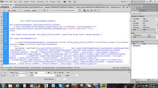
The one good thing Hackasaurus did was familiarize me with code in a way that wasn’t entirely overwhelming. I decided to just save the source code of the Goodreads page I wanted to alter, open it up in Dreamweaver and see what there was to see. With the split-screen view I was able to click on elements visually and see which lines of code corresponded to them, and pretty soon I was editing the code alone (also necessary, as the split-screen view makes the program freeze up on my craptop every other minute).

workingwithDW

After several more hours of painstakingly editing the same lines of code over and over again, copy+pasting image locations from Flickr and uploading the file every now and again to see if it looked presentable, I once again had a more or less working web page. Despite all my issues with this assignment, I am kind of impressed that I mostly just muddled through it myself without looking at tutorials or coding guides. I just sorta looked at stuff and figured out what needed to go where, which suggests that coding websites is actually not that difficult at all.

Regarding the story behind my altered web page, I feel like Cutebreeds (See? SEE WHAT I DID THERE?!?!) is a site that someone would visit if they really needed to calm down after a long, stressful day at work. Maybe it would crop up as an extension of Tumblr or Pinterest, where you can share content extremely easily across user spaces. The cutest animal images and videos would be determined by user ratings and the reach of any individual piece of media would be dependent on how far users were willing to share it, thereby determining its popularity.

Or maybe it’d just be a hangout for wannabe crazy cat ladies. I’d be into a website like that.

Hey You! Here is how you tell a Story Within the Web

For this Web Assignment we were asked to take any web page of our choice and alter the content of that web page (content, images) to make it tell a new story. Here is the screen shot of the page web page I chose to alter. (Just click on the image to see the details)

Bianca's Secret

Do you ever wish that your eye color was different? Hate having to spend money every year on color contacts? Wish that you could change your eye color anytime you wanted to??? Well here is your perfect solution! There is now a new product being sold on Amazon known as Bianca’s Secret/Inoxxa Eye Color Changing Droplets. These magic droplets will change your eye color to any of our selections (brown, blue, hazel, green, or grey) in 24 hours after being applied! Just use 2-3 drops within 24 hours of opening (refrigerate the bottle afterwards to use multiple times) and your on your way to the eye color you have always wanted! No hassle! No limits! And you can change your eye color anytime you want!

I got the inspiration for this story basically from myself. I sometimes wear colored contacts and I am constantly changing up the colors I buy every year. It would be so convenient if there was a easier way to go about changing my eye color. Viola! The inspiration for my magic eye droplets!

For this assignment I used the X-ray Goggles Tool. I added the tool to my bookmarks tab and once I activated it everything after was a go! I originally thought this assignment was going to be super hard. But after doing the tutorial on the website making changes to the web page was a breeze! The only sad thing about this is that I wish my product was actually real! = (