Pods Embed Error: Pod not found.

Coprecipitation-DS106 album cover

The Assignment-

This assignment is a mashup of three random things together to make an album cover. First, take a random wikipedia entry, this is the name of the band. Then, take a random quote (the last 4-5 words of the last quote), this is the title of the album. Finally, take a random flikr image (the 3rd picture) and use it for the album background. I think its important to either add a background story for the band or a song list as well.

The Process-

Wikipedia entry (band name)- http://en.wikipedia.org/wiki/Coprecipitation

Quote (album title)- “The moment of victory is much too short to live for that and nothing else. “- Martina Navratilova

Flikr image (album cover)- Snowy Owl by Touchlight Photography

I used photoshop to manupilate this stunning image of a snow owl. First I used the grain filter to get the texturized feel. Then I added the texts of the band name and album cover. This assignment did not take too long, so the rest of the time was spent creating the story of the band.

The Story-

Croprecipitation is back with their latest album For that and nothing else featuring their hit single: “Like an Owl in the Dawn”! Inspired by their walkabout through the forests of Washington state, this album will immerse you in the beauty of nature. Soothing pan flutes, relaxing harps, and gentle navajoe drums will take you through a journey of mind, body, and spirit. You won’t want to stop listening once you start! This album can be enjoyed anywhere; in the bedroom to guide you through fantastical dreams, during daily activities, or even on the daily commute to prepare yourself for a busy day.

This album brings the 20 years of relaxation music experience of Coprecipitation that you know and love and adds the lyrical harmonics of gregorian chanters from the Vatican City. The combination of saintly harmonics and earthly instrumentals soothes your soul to levels never before imagined.

Pick up your copy of For than and nothing else today and receive a free set of incense handmade by coprecipitation! This incense made from herbs and oils from the deep forests of Washington State and when combined with Coprecipitation’s music will make your relaxation complete. Relax, enjoy life, and listen to the sound of the Earth with Coprecipitation.

Mad for ET

Some might say that MAD magazine is not a comic, but I went for an animated version anyhow for the Animated Comic Cover ds106 assignment:

I saw this cover of Alfred E Neumann and ET and felt like they might me a love match for each other, so they gaze at each other with affection and experience the tickle of that magic extra terrestrial finger.

Don’t they make a sweet couple?

I read a ton of MAD as a kid, and I can recall backing out the plots of movies from the parodies there- so I knew about the Godfather from he satire first, seeing it in MAD before ever seeing it on video.

I think there is a future assignment related to the troubles faced by Roger Kaputnix or maybe a bit of mashup of Spy vs Spy.

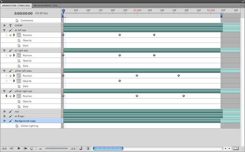
In this animated GIF, I used a bit of magic I uncovered in the Photoshop animation palette. I copied and pasted out the eyes and ET’s finder to new layers, and filled in the background with some clone brush fill. In the animation palette, the layers have additional things you can animate via the toggle menu on the left side- you can set key frames for position or opacity, and by moving the slider on the timeline, you can nudge the position and make a key frame.

This method of animation is a bit closer to doing stuff in Flash or Director on the timeline- in Photoshop the only thing I cant seem to do is to resize objects, but doing movement and opacity offers a lot.

So I made the eyes of ET and Alfred move towards each other and away, and also made the finger move to the right. The glow and the star appear by keyframing the animation.

I thus only needed 10 layers (2 eyes each), and the animation weighs in at a puny 176k.

Don;t just get mad, get MAD! get Animated! Cause it is ds106 fir life and hell yes, I am over-branding this sucka.

Re-M*A*S*H-ed Game Cover

I’d noticed Jim Groom tweeting various bits of trivia about Atari game systems over the past week or so and thought something must be up. Sure enough, he just created a new assignment called Remixed Game Covers. I got a kick of seeing what he did with the old Atari Bowling game box and the Big Lebowski for his first entry. As someone of an age to have vivid memories of wanting and eventually getting an Atari 2600, this assignment was an invitation to revisit ancient memories. Additionally, it seemed like it would be a pretty simple assignment to do as all it calls for is:

Take a video game cover and remix it to change up the meaning or play with the general idea of the game.

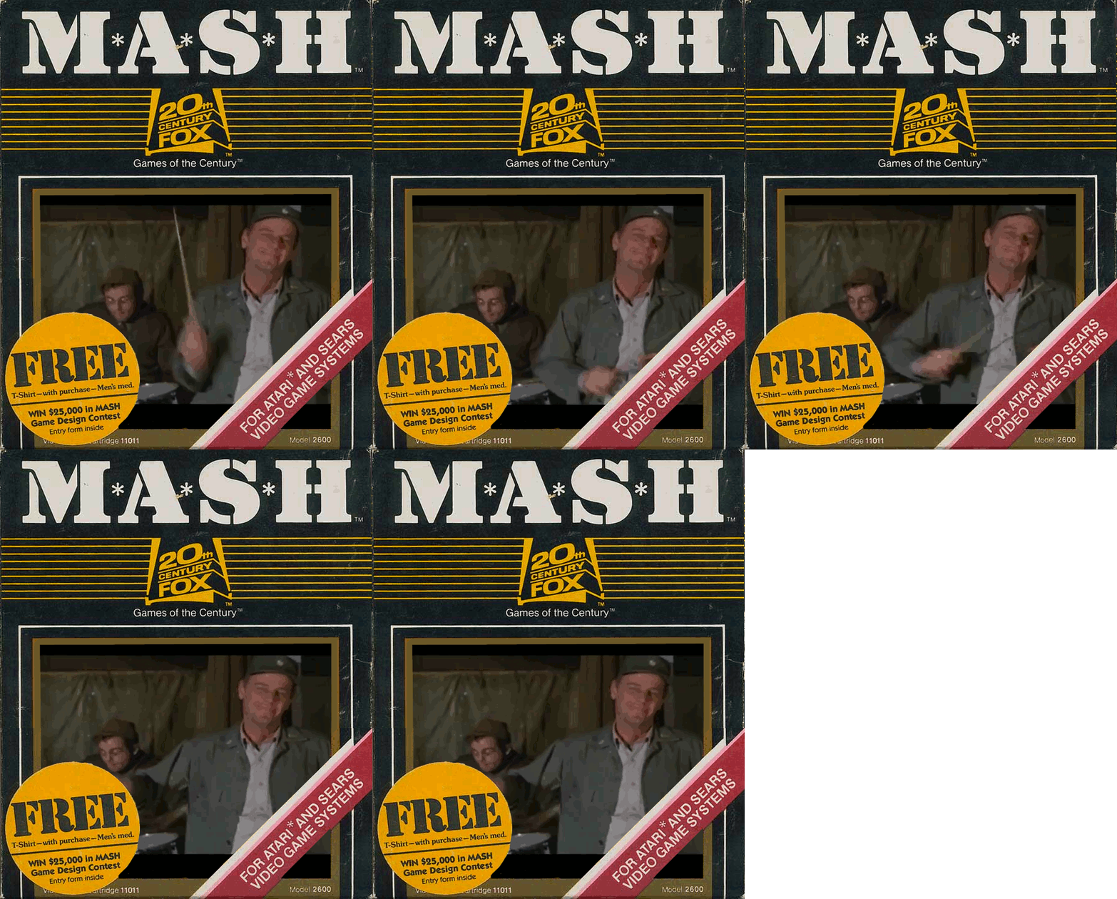
Jim mentioned he’d try to use an animate GIF in his next attempt so I immediately decided to try to beat him to the punch. I scrolled the hundreds of scanned boxes at the Atari Age site until  I found M*A*S*H. As this was a program that I watched for many years (at one point it was possible to see five episodes a day in rerun on the various cable channels – and I did) in junior and senior high. Then I jumped over to YouTube and found a clip of “Funny MASH Moments” set to Yakkety Sax.

Once the parts were collected, I used MPEG Stream Clip to grab the five frame sequence of Lt. Col. Blake with baton and Cpl. O’Reilly on drums. I opened the Atari Box image in GIMP and brought in the five frames as layers and begin trying to make the GIF. All I can recall now is that it took more than three hours and I nearly quit more than once.

My intention was to have the animated GIF replace the game graphic on the box while keeping the orange/yellow sticker in the bottom and the read and white diagonal bar in the bottom right. There was a problem because the space was too tall for the GIF. So after I erased all of the graphic, I duplicated the box layer and chopped the top and bottom of either layer and moved them closer together (basically cutting out the middle). Then I had to duplicate the box layer 5 times and merge it down on to each of the five MASH frames. The delay on each frame is 250 milliseconds. I’m not sure if this ideal but it seems to work.

In terms of a story, for me it in trying to imagine how such a game would play. Today was the first time I’d ever even heard of this game. It’s not something I’d have been interested back then even though I was huge MASH fan. I didn’t see the movie until many years later but something about the show worked for me. I suppose it was the general attitude of contempt for authority. My favorite character was Henry Blake which might explain why I selected the clip I did. Thinking about his final episode still chokes me up. Such a tragic and senseless turn of the story line which ultimately, to me, was a powerful anti-war statement. I seem to be drifting into middle-age nostalgia which nobody really wants or needs so I’ll wrap this one up. Just to close by saying that once again I find myself stunned with what I encountered during the several hours of working through this assignment.

An iThingr: ReCaptcha Illustrated and the Benefits of Playing with Apps


Product

Here’s my ReCaptcha Illustrated assignment for ds106.

The project gave me another chance to play around with Gimp and, as students and I discussed in class today, I discovered for myself that one of the tangible benefits of struggling with some of these programs is that, once you do, you know them all the better the next time.  Which is to say that though I didn’t exactly whiz through this creation, my time on task was much reduced having already played with Gimp for a previous assignment.  And though it’s still not perfect, I am relatively happy with the outcome.  I’m especially cognizant of the little boost to my confidence my success here has provided me with.  More visual mashups:   bring ‘em on!

Process

I went to Alan Levine’s assignment page and pulled the virtual slot machine lever a couple of times till I came up with a ReCaptcha that captivated my imagination.  Here were the others that were vying for first place:

But when I landed on “an ithingr,” images of my dongle (whose name affords my students no end of amusement) and “finger” sprang to mind, and I knew that I’d hit the jackpot.

I did a quick Google Images search on iFinger (I am a firm believer that not only are there no longer original ideas, but also that, however whacky you might find a concept to be, there’s usually a pretty good chance that if you Google it, you’ll find something out there that at least comes close.  My hunches were right.  Up popped this image from a 2007 Wired magazine post about the “X-finger” for amputees:

Another quick search of the Apple Store unearthed a workable background from the iPad 2 site, whose tagline,”now with iOS 5 and iCloud, it just got harder to put down” couldn’t have been more fiendishly apt.


Reflections

As I write this, I’m reminded again of our conversation in ENG 307 earlier today: about how, through the all of the low stakes play with apps that ds106 assignments require of us, we are actually learning the apps and, as I have written before, learning about learning, too.

We’re learning lessons such as how, when students are asked to create something meaningful that they will share with a supportive and like-minded community that truly values their contributions, motivation is high to acquire skills in order to produce high quality products.  Students have reported spending “24 hours” on assignments; warned me that they will “blame [me] when they fail all of their other classes :) ”; that they are “obsessed with [their] blog[s]“; and that they went outside for the first time all year and spent the “entire day” taking photos for our visual assignments.  Sure, they’re devoting tons of time to creating what Jim Groom and Alan Levine celebrate as “ds106 awesome,” but I never asked them to.  That my students — preservice teachers, mind you — are this motivated to spend time on schoolwork because they are enjoying it, are really seeing what “authentic” assignments, audience, and learning are all about, and are learning technology tools in the meanwhile (tools that they will eventually be able to apply to their own discipline-specific curriculum planning) are all invaluable lessons for these teachers-to-be.  I couldn’t be happier with the way our collaboration with ds106 is working out.

Today we spent time in class on independent work, partially because I wanted the opportunity to float around and help students who might still be struggling.  Much to my surprise (and delight), students displayed an amazing level independence that had been completely missing just a couple of weeks ago.  We joked that they didn’t need me any more, that I should just “leave them alone to play with their computers.”  Instead of panicked cries from all corners of the room about problems as tiny as where to find the directions (the classroom tenor at the beginning of the semester), students were brandishing a new savvy about finding solutions to their own problems:  asking their classmates for help, Googling their questions to see if there was help already out there, and knowing that they could ask the community, as well as me, their teacher, if they couldn’t help themselves.  They have become that much more competent and self-directed in only four weeks!

We reflected upon students’ amazing dispositional turnaround (an explicit objective of my course, btw) and agreed that the ds106 trial-by-fire in setting up our own blogs and then the relentless requirement to constantly engage in lots of low-stakes, “make art, dammit” assignments were to blame :) .  Without our actually recognizing what was happening, the weekly work of ds106 — the daily creates, the quantity and variety of new media assignments students are regularly engaged in, and students’ regular reflection upon their processes — all of these components of ds106 have helped us build competence in and confidence about our abilities as learners (of new media).

I reminded students of the old “hide the peas in the macaroni” trick that teachers often take from parents.  Digital storytelling and its component tasks can be a delicious distraction from the “what’s good for you” part of school.  I’ve been saying this for years (and most of these students heard it all last semester as we discussed thematic unit planning in ELA).  But now we’re not even one-third of the way through the semester and students are really “getting it” in ways I could only dream about last year.  I can hardly wait to see what the rest of the semester brings.

Hurray for ds106!

Fat Cats on a Plank

Pleasure Wheel Fat Cat

AssignmentAnnie Belle has come up with one of the more bizarre, wacky and exciting ds106 assignments in recent memory with: Fat Cats Make Art Better. It’s hard to imagine anyone not being drawn into an assignment described in such a way:

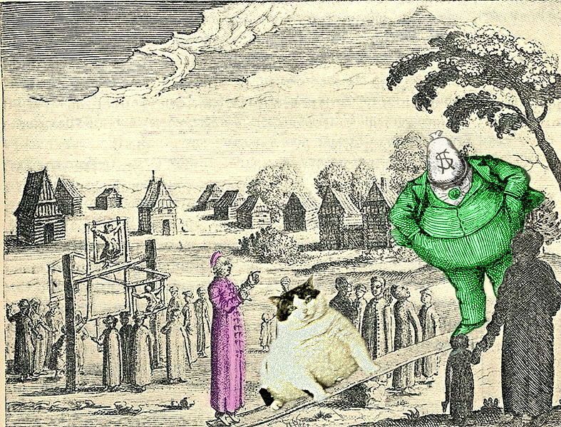
Using this site: http://fatcatart.ru/category/klassy-ka/ as a platform for ideas, and using Photoshop (or something like it) as your tool, place a fat cat into a photo of a classic art piece. The goal is to make it convincing: make the art become on with the cat.

I first saw this assignment early last week. Last time I checked, I noticed sixteen submissions already. If I’m quick in writing this post, this hybrid – mash-up version will be number seventeen. For inspiration, you might want check some of these recent contributions:

What was done, what was learned: It’s exciting to see the various angles and approaches people put in to completing such an assignment. We’re all coming to it with the same basic assignment description and look at the rich and surprising variety that results. And what do we learn from doing such an assignment?

For me, I learned a bit more about how to use Pixlr. It is now my preferred web-based image editor. In fact, I’d probably choose it over GIMP for most projects so long as I’m connected to the net.

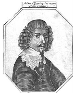
I also learned about an interesting historical character. The engraving upon which the two different types of fat cats were placed was done by a seventeenth century German librarian named Adam Olearius. The name of the original work is called Pleasure Wheel, which according to Cerebral Boinkfest is one of the earliest depictions of what we now call a Ferris Wheel. I found the image through some Google image search using the word engraving and some other term which I can’t recall.

Recently, as mentioned in an earlier post, I’ve become interested in colorizing old time drawings and engravings. I hope to eventually devise a new ds106 assignment in which we find such an image, colorize it and come up with some interesting story based on the the associative trails formed through interrogating the artifact.

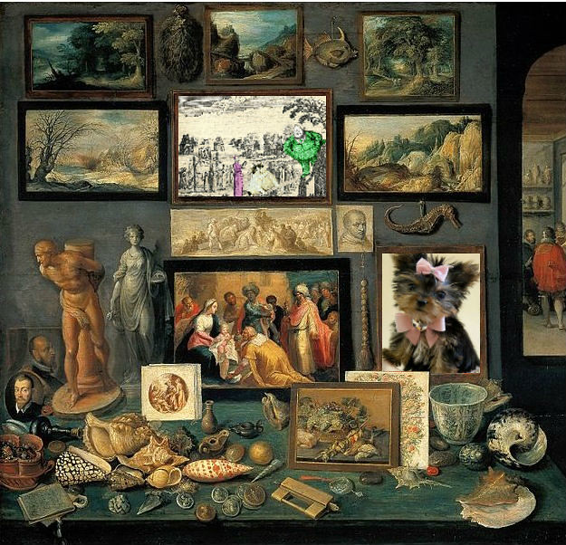
For me, reading about Olearius, his journey to Russia and Persia as the secretary to an embassy sent by the Duke of Holstein-Gottorp (Frederick III) in 1634-35, and his duties as the keeper of the Cabinet of Curiosities was a fanciful escape into history and imagination. So let me try to briefly summarize what I think this means and why it matters.

Had I not taken the challenge to try this Fat Cats assignment, I’d not find myself where I now do. That is, totally excited by how tightly this idea of some old rich geezer from a few hundred years ago hiring some smart guy to be his librarian to build a collection of everything known in the world. Even back then, there was the desire to assemble, index and present collected knowledge. I’d never known of a Cabinet of Curiosities until a few hours ago. Now I have new metaphor to help me try to make sense of this connection between me, cyberspace and society. I’m sure I’m not the first to put this idea forward, but I would like to consider that the Net is our civilization’s Cabinet of Curiosities. To me that is very deep and powerful and gives this particular assignment great personal value.

curiosity cabinet

Franz Francken's "Kunst- und Raritätenkammer" (remixed)

‘ReCaptcha Illustrated’: A Unique Assignment

Although this assignment and tutorial has been created as part of my contribution to the Ds106 learning community, it also has great potential as an activity/project for our Senior Years’ students. “ReCaptcha Illustrated” is a unique Visual Assignment that was proposed by Alan Levine (aka cogdog), who challenged DS106 students to:

Include a screenshot of a word pair from a reCapctha in an illustration or visual mashup that shows what the words might mean. Use your imagination to create something meaningful out of the random words.

When you write it up, provide some narrative that puts the image in context.

As someone who can trace his heritage back to the “Emerald Isle”, it would have been ideal if my visual mashup creation, and its equally important narrative, could have been posted on March 17th.

I will provide a step-by-step tutorial to help engage others in this unique learning experience.

1.   After reading the description of the “ReCaptcha Illustrated” assignment, I searched for a web site that would allow me to activate a ReCaptcha display.

2.  My Google search led me to the “What is a reCAPTCHA?” site with an active reCAPTCHA “generator”.

3.   I examined the initial “two string” display, which made no sense, so I kept pressing the “recycle” button located above the “speaker” icon to generate a new text combination for consideration.

4.  I admit that I rejected perhaps 80% of the reCaptcha images generated because I was unable to visualize a context under which the displayed text might apply.

5.   However, when I found a reCaptcha display which looked promising, I took a screen capture and saved the image. Some of my “possibles” are shown below:

This one had possibilities if I could find an image of a “farming family”. I could then manipulate the photo and add a speech bubble having the children complain that “Ma …kills o(ur) farming”.


This one looked much more promising. I envisaged a teenaged boy, texting his buddy and (with an unfortunate slip on one letter) proudly announcing “I’ve dat3d Lisa”. Perhaps this display might also be a person typing in a 15 character password using the popular technique of replacing the letter “E” with the image reversed number “3″.

6.   When the reCaptcha displayed this one, based on my Irish heritage, I immediately imagined “a bubble in green beer”.


7.   The next step was to find an image of a “green bubble” using Flickr’s “Advanced Search Tool”.

8.   In the “search field” at the top of the page, I entered the two words “green bubble” (without quotes). Since I only wanted Creative Commons-licensed images that I could modify or mashup, I clicked on the check-boxes in front of the following two statements near the bottom of the search screen:

  • Only search within Creative Commons-licensed content; and
  • Find content to modify, adapt, or build upon

9.   I began searching for images that I felt had potential. Whenever I found an image that I thought I might use, I clicked on Flickr’s “Actions => View all sizes” menus to check the “license type”, and verified that the image was available for downloading.

10.   Whenever I found a possible image, I always recorded the image’s URL address in my Research URL File, together, with a brief description and a 1-10 rating. Experience has taught be that it takes little time to record the URL at the time of download as opposed to deciding to use an image and then having to go back later to find the image address. If you finally decide on an image and then have to go back later to find its URL for citing purposes, you often can no longer remember the exact search parameter terms which can be very frustrating and a real time waster!

11.   I decided on this “Green Bubble” Flickr image with its Creative Common’s Attribution-NonCommercial-ShareAlike attributes. Under this photo’s license, I could “Share” and, most importantly “Remix” or modify/manipulate it by adding a speech or thought bubble. I proceeded to download the largest format size available that didn’t exceed 1024 x 768 pixels.

12.   I think that one should always follow the DS106 “ABC” mantra of “Always Be Commenting”. In particular, I believe that it is proper etiquette to leave a “Thank You” comment below the original Creative Commons image that you are going to use. Furthermore, I try to provide a URL link to the the remixed image in your own Flickr photostream. This provides an opportunity so that the individual who uploaded the original file can visit your remixed or modified creation so s/he can see how you utilized the original.

13.   Next I decided that I would need to add a speech bubble to the image. The only mechanism that I knew for accomplishing this task (at that time) was to use PowerPoint 2007. I started this application and used the Insert => Picture menu items to transfer this image on to a PowerPoint slide.

14.   After dragging the image’s corner handles out to fill the entire slide, I clicked on PowerPoint’s Insert => Shapes => Callouts menu items and selected the “thought bubble” icon. I clicked on the slide and dragged the “thought bubble” into position.

15.   Since the reCaptcha’s “A green bubble.”  text was displayed on a white background, it is very important that one right-clicks on the active “thought bubble”, selects the Format Shape => Fill => Solid Fill => Color, and selects the white “Theme Color” to match the white background of the reCaptcha disply.

16.   Next one must choose the Insert => Text Box menu items and enter an appropriate “thought” as a layer above the bubble image.

17.   One must now use a graphic viewer, such as the Irfanview freeware for Windows, or image editing software to capture only the reCaptcha’s “A green bubble.” text with its white background. Once this portion has been saved as a new image, it can be inserted onto the PowerPoint slide.

18.   All that remains is to add appropriate text into the thought bubble, add the ”A green bubble.” image, and experiment with resizing and positioning these components.

19.   Once you are satisfied with the thought bubble text and it’s position on the slide, it is important to save this file. Certainly one can save this PowerPoint file (of one slide) as “Greeen Bubble.ppt” or (.pptx using the newer 2007 file format) or any suitable file name. However, it is also important to save this single slide as an image. To do so one must click on PowerPoint’s Office Button” in the top left corner of the screen and select Save As => Other Formats menu items. Under the “Save in:” location options, navigate to an appropriate folder or location on your hard drive. Next, click the “Down arrow” at the right end of the “Save as type:” field, scroll down, choose the “JPEG File Interchange Format (*.jpg), enter an appropriate “File name:” and click the “Save” button. When prompted “Do you want to export every slide in the presentation or only the current slide?”, click the “Current Slide Only” button to save the following creative image for display and/or later use.


Teachable Moment

“Enquiring Minds Want to Know”
Providing a narrative to put the image in context


Background

This assignment has great potential for being used to engage students in Manitoba’s Senior Years Information and Communication Technology (ICT) courses. Undoubtedly, it could be introduced in both the “Applying ICT” and the “Digital Pictures” courses.

One might consider having students investigate the work of Luis von Ahn at Carnegie Mellon University as he developed different CAPTCHA processes. Some excellent resources were provided in my earlier blog post entitled “CAPTCHAs Reduce Blog Comment Spam“. Once students are more familiar with CAPTCHAs, this “hands-on”, multidisciplinary assignment will complement the theory and provide an excellent opportunity for students to demonstrate their creativity.

Although the somewhat technical portion of this Visual Assignment is completed, there are still ample ways to demonstrate creativity. This “reCaptcha Illustrated” activity has many learning opportunities for Senior Years students. Why not request that pairs of students work on this activity together? One person may take the lead in the more technical areas while his/her partner may wish to focus more on this narrative component. Regardless of how the work load is divided, students will learn more through communication in a collaborative environment.

ReCaptcha Illustrated – The story behind the image
The scene opens on St. Patrick’s Day in Ireland. The story centers around a wee, Irish leprechaun by the name of Tommy O’Toole. Since early morning,Tommy has been celebrating all by himself in the local public house (or bar) called “Clancy’s Cellar”.

Tommy has not been keeping track of the number of beers that he has consumed. but it is safe to assume that even the locals would agree that “wee Tommy” is, indeed, intoxicated.

Tommy shouts to the barman … “Clancy  … draw me another pint of your best green beer, my good man.” Within moments a large glass tankard automatically appears in front of Tommy.

Just as Tommy toasts St. Patrick, hoists the tankard to his lips, and is about to pour the green nectar down his throat, he stops abruptly. He spies a large green bubble staring back at him from the frothy surface of his beer. Grasping the mug in both of his alcohol-induced shaky hands, Tommy slowly lowers his tankard and gingerly sits it carefully on the bar so as not to upset the delicate equilibrium.

Although his mind is somewhat clouded, after spending more than seven hours sampling all varieties of green beer, Tommy says to himself … “Faith and begorrah … have ye ever seen such an amazing green bubble? I wonder if St. Patrick is, indeed, sending me a sign of future good luck? I must share this good fortune with my closest friends.”

Through squinting eyes Tommy surveys the patrons of “Clancy’s Cellar” and, regretfully, does not recognize any of his friends. “How can I share this moment with my personal learning network?”, Tommy thinks.

“I could take out my cell phone and take a picture of the bubble”, thinks Tommy, but he quickly dismissed that poor idea. He says to himself. Although my brain is a bit fuzzy, the picture would be worse, as my hands would shake so much while taking the picture.

He continues problem solving as he thinks of a strategy. “I could brace my shaking hands on the bar and take a much steadier photo to send to my friends. No … even if I they were to receive a good quality picture of this green bubble, they would all accuse me of “Photoshopping” it. There has to be a better solution”, he thought.

Then Tommy shouted out loud … “OMG!”

He quickly realized that he had to invite all his Irish friends over to this bar ASAP, so they could witness for themselves, this wonderful green bubble.

He reached into his pocket with one shaky hand and slowly withdrew his cell phone. He grasped the device in both shaky hands as he navigated his thumbs over the keypad. Even in his drunken stupor, “wee Tommy” remembered he had to be extra careful with that one key that kept sticking.

“Was it the letter ‘e’ or the number ’3′?”, he muttered under his breath.

“I’m sure that every sober person knows that the uppercase ‘E’ looks like a backwards ’3′”, however Tommy was far from sober. “It’s understandable that everyone becomes confused over their similarities. They look so much a like”, thought Tommy in his drunken state.

Tommy realized that there was some urgency in sending a quick message to members of his PLN, so they could quickly travel to “Clancy’s Cellar” and view this amazing green bubble.

In his mind he began formulating a message he could send out through Twitter. Wee Tommy struggled to compose a coherent message. Furthermore, he knew he had less than the standard message length of 140 characters, because he needed to alert his friends using the important “#Irish” hashtag.

Tommy’s brain tried its best to send signals to activate both thumbs appropriately as Tommy stabbed at each key in turn.

As displayed below, there was a close correlation between the thought image in “wee Tommy’s” brain and the message that each of his friends actually received through Twitter …


Take care & keep your “Irish eyes” smiling :-)

Credits:
-   Flickr – Creative Commons image “Green Bubble
by jacsonquerubin – http://www.flickr.com/photos/spacial/4861327151/

-  Brian Metcalfe’s DS106 “photostream”
http://www.flickr.com/photos/life-long-learners

ds106 come out and play!

It was only a matter of time before I did an animated GIF assignment from the 1979 classic The Warriors, a film that seems to be an integral part of the ds106 fabric. This one was actually pretty easy to do—I’ve done many an animated GIF—and while this isn’t the best GIF I’ve ever done, I love that Rogue gang leader Luther is featured here doing his infamous “Warriors come out and plaaaaaaaaay.” You can see the scene below, and if you haven’t had the opportunity to see the film you really, really should, I mean what could be better than a gang film set in NYC during the late 70s, early 80s.

In terms of my process. I used the beta version of MPEG Streamclip to download the clip from YouTube, which is a great tool for ripping and converting YouTube videos for animated GIFs, mashups, etc. What’s nice is you can trim down the scene you want from the YouTube clip an then export to your desktop, from there you need to play with GIMP to create the animate GIF. I’ve created a tutorial just for this occasion, and you can find a tutorial for ripping YouTube clips from MPEG Streamclip and create a GIF using GIMP here. Hope it helps.

Splash The Color – Apple

If you’ve ever used apple products, you know how reliable they are and rarely ever break on you (unless of course you smash it against a brick wall or drop it on concrete). That’s what inspired me to make this, these are all products I own, and all of them, except the iPod are broken in some way. The iPod hasn’t given me any complications and I’ve owned it for years now. Zunes always break!! As you can see I had to learn that the hard way. The two on the ends are portable game systems, the Sony PSP on the left and the Nintendo DS on the right.

I also choose these specific items because the iPod itself can do almost everything the devices surrounding it do, including music, pictures, gaming, etc. So apple products are truly amazing (but still very pricey :/) and it made sense to have the splash of color on the iPod while the rest were in black and white.

I made this in photoshop, first by creating a blank ‘color’ layer on top of the image and painting white everywhere except for on the ipod. I then added the Apple logo on top.

We Need More Reality Shows

Actually we don’t. We need more fake reality shows.

San Francisco: Flip This Mayor
There must be something in the water at Oakland’s City Hall which makes people stupid.

San Francisco’s unemployment rate stands at 7.6 percent, below the national average and the third-lowest unemployment rate in California, as city officials say the number of tech jobs in the city nears levels not seen since the first dot-com boom.

——————————————————-

Tune in for the drama in city hall, as city officials labor hard to prove their are “creating jobs”. Mayor Stan Usual was elected on a split opposition vote, and has no mandate. He is dealing with a water issue, but it is not stupidity, but lead. As the tech industry dries up, before the tumbleweeds are spotted blowing through SoMa, city council people have developed a new job sceme involving portable structures made from aluminum cans. Who will win this epic community battle for the hearts and minds of the city? Stay tuned….
——————————————————-

photo credits

cc licensed ( BY NC SD ) flickr photo by echoman: http://www.flickr.com/photos/80154053@N00/151680058/

cc licensed ( BY NC SD ) flickr photo by slworking2: http://flickr.com/photos/slworking/3875709508/

cc licensed ( BY NC ) flickr photo by Thomas Hawk: http://flickr.com/photos/thomashawk/2934728223/

Hence a new ds106 assignment, partly inspired by the formula of the Album cover assignment, Really Reality TV The tags for this assignment are DesignAssignments, DesignAssignments342

  1. Use the Reality TV Show name generator to get a title for the show.
  2. Do a Google search on the show title name.
  3. Use the first paragraph found on the 5th result of the search as the first part of the show description.
  4. Use the last paragraph found on the 10th result of the search as the second part of the show description.
  5. Find three creative commons licensed images to represent a protagonist on the show, the setting, and one example of action. Combine them into a three panel show banner. Be sure to credit the sources in your blog post
  6. On your blogpost, write in the elevator pitch for the show, and a tag line for it appearing on ds106 TV.
  7. Sit back and wait for Spielberg to contact you. He is into TV these days.

So for my show, I generated this name, “San Francisco: Flip This Mayor”:

My google search results (which who knows if ever are unique?)

Result five was a link to 1st sentence from 5th result “the tattler: Occupy Oakland…Mayor Quan flip-flops! Cops cry foul!” where the first paragraph was There must be something in the water at Oakland’s City Hall which makes people stupid. (that is definitely show material).

The 10th search result was Tech company move boosts SF mayor’s branding push, where the last paragraph was:

San Francisco’s unemployment rate stands at 7.6 percent, below the national average and the third-lowest unemployment rate in California, as city officials say the number of tech jobs in the city nears levels not seen since the first dot-com boom.

That leads me to search terms in compfight for “Oakland City Hall”, “Mayor”, and “Tech jobs”, giving me these three photos:

Ogawa

San Francisco Mayor Gavin Newsom

Rockin' my Tevas at work.

I set up a blank photoshop document with a black background, and dragged and dropped the downloaded photos (500px size) right in there- you can move and resize them as smart objects, then added some text, and boom! Done.

The last bit was to write the pitch for the show.

Shiznit! Reality TV is done.

fat cats

Fat cats make art better. I’d never thought of that, but I wish I had. My in-laws have a cat they call Fatty. She looks like swallowed a football helmet. The photos they sent don’t do her justice. Since her proportions are surreal, I thought of Magritte:
But on the other hand, Jasper Johns is one of my favorite artists:

She seems to fit there better.

How I Did It: basic photoshoppery. The original photo of Fatty had her sitting on the lawn, which is why she has that greenish aura in the Magritte mashup. I used some feathering on the selection and picked up some background. I duplicated the background layer and used the magic wand to get the wood in the background and deleted it. Then I traced around some of the left shoe-foot and cut out that background. I put the cat behind the duplicate layer so it looks like she behind the shoes. There’s a lighting problem though.

For the second picture, I made the cat cut-out black and white to get rid of the green aura. Then I stuck her in the corner and trimmed a little off the side and bottom so it looks like she’s inside the frame. It almost seems like she belongs.