Design Summary

Design Week Assignments:

  1. Reflection on the Vignelli Canon
  2. DesignBlitz Photo Safari
  3. Face The Odds: Adds Text to a Photo
  4. Create A T-Shirt: Add Yourself From One Photo to Another Photo
  5. Create A Movie Poster: Modifies A Photo

Design Summary

What did you learn?

This week, I learned that design is complicated. There are so many elements that go into creating a good design that I wasn’t aware of until this week. During this whole week, I probably spent about 10 hours just reviewing information focused on design. And that would have been more if all of the provided links had worked! Really, it was a little overwhelming. My main takeaways from this week are about keeping things simple. From typography, to colors, to other visual elements, it is important to streamline my choices. This doesn’t mean shirking on quality or cost. This is a minimalistic approach. Less is often more.

What was harder than you thought it would be?

By far, the hardest thing for me is finding free programs which allow me to make the necessary edits to complete these assignments. Most of the free programs have limited uses of various elements before asking you to pay money. In the past, I used Photoshop CS5 professionally. Since then, Photoshop has changed a lot and it’s even more expensive. I can’t spend so much money on a program that my computer barely has the capability to run. I’m trying to avoid programs like Gimp. In sticking with a minimalistic approach, I also want to keep my apps simplified. I want maximum impact for minimum cost and processing power. I really thought there would be more free programs out there. I’m slowly upgrading my design arsenal, but it is taking a lot or research and time.

What was easier?

It is becoming much easier to manage my time. I was able to get some blog posts out earlier this week, which makes more sense than having five posts on the assignment due date. While no one is publicly viewing this blog, if they were, they would be overwhelmed with the number of posts that I put out on Sundays. I feel better about my progress this week. Perhaps in the next week, I’ll be able to space my assignments out over each day of the week. That is probably the idea situation.

What drove you crazy? Why?

Broken links drove me a little crazy this week. Last week, there were one or two. This week, there were quite a few. Other links could not be accessed by clicking on them. Instead, I had to copy the link address, open up a browser tab, and then past the address in that new tab. It isn’t a ton of work, but it definitely makes things move slower when you have to do it for twenty or more links. I’m often working from car, listening to videos and audio while driving or at work, so it’s better for me to have a streamlined approach to accessing materials. At this rate though, the class will be over very soon. I suppose I can deal with it for a couple more weeks.

What did you enjoy? Why?

This week, I began to take a cumulative look at my progress digitally. While a lot of the assignments annoy me, such as the Daily Creates, I am still learning. The learning is minute, yes, but at least it is happening. I like feeling like I’m making progress. As a digital hoarder, I also enjoy gathering lists of free programs. I especially love being able to direct others to these free resources online. I’m all for freedom and access of information.

Big picture: I’m starting to prioritize digital content creation. These smaller projects help me realize that it’s not so difficult or time-consuming to create quick content. Additionally, I’m becoming more proficient with completing some of the larger projects in a timely fashion. I’m not sure yet how this will translate into my own life outside of school. I guess I’ll know more once this course ends.

Design Summary

Design Week Assignments:

  1. Reflection on the Vignelli Canon
  2. DesignBlitz Photo Safari
  3. Face The Odds: Adds Text to a Photo
  4. Create A T-Shirt: Add Yourself From One Photo to Another Photo
  5. Create A Movie Poster: Modifies A Photo

Design Summary

What did you learn?

This week, I learned that design is complicated. There are so many elements that go into creating a good design that I wasn’t aware of until this week. During this whole week, I probably spent about 10 hours just reviewing information focused on design. And that would have been more if all of the provided links had worked! Really, it was a little overwhelming. My main takeaways from this week are about keeping things simple. From typography, to colors, to other visual elements, it is important to streamline my choices. This doesn’t mean shirking on quality or cost. This is a minimalistic approach. Less is often more.

What was harder than you thought it would be?

By far, the hardest thing for me is finding free programs which allow me to make the necessary edits to complete these assignments. Most of the free programs have limited uses of various elements before asking you to pay money. In the past, I used Photoshop CS5 professionally. Since then, Photoshop has changed a lot and it’s even more expensive. I can’t spend so much money on a program that my computer barely has the capability to run. I’m trying to avoid programs like Gimp. In sticking with a minimalistic approach, I also want to keep my apps simplified. I want maximum impact for minimum cost and processing power. I really thought there would be more free programs out there. I’m slowly upgrading my design arsenal, but it is taking a lot or research and time.

What was easier?

It is becoming much easier to manage my time. I was able to get some blog posts out earlier this week, which makes more sense than having five posts on the assignment due date. While no one is publicly viewing this blog, if they were, they would be overwhelmed with the number of posts that I put out on Sundays. I feel better about my progress this week. Perhaps in the next week, I’ll be able to space my assignments out over each day of the week. That is probably the idea situation.

What drove you crazy? Why?

Broken links drove me a little crazy this week. Last week, there were one or two. This week, there were quite a few. Other links could not be accessed by clicking on them. Instead, I had to copy the link address, open up a browser tab, and then past the address in that new tab. It isn’t a ton of work, but it definitely makes things move slower when you have to do it for twenty or more links. I’m often working from car, listening to videos and audio while driving or at work, so it’s better for me to have a streamlined approach to accessing materials. At this rate though, the class will be over very soon. I suppose I can deal with it for a couple more weeks.

What did you enjoy? Why?

This week, I began to take a cumulative look at my progress digitally. While a lot of the assignments annoy me, such as the Daily Creates, I am still learning. The learning is minute, yes, but at least it is happening. I like feeling like I’m making progress. As a digital hoarder, I also enjoy gathering lists of free programs. I especially love being able to direct others to these free resources online. I’m all for freedom and access of information.

Big picture: I’m starting to prioritize digital content creation. These smaller projects help me realize that it’s not so difficult or time-consuming to create quick content. Additionally, I’m becoming more proficient with completing some of the larger projects in a timely fashion. I’m not sure yet how this will translate into my own life outside of school. I guess I’ll know more once this course ends.
Tee Shirt

Looking for a DnD shirt that fully expresses that is all your personality is. Then here you have it. This shirt perfectly expresses that DnD is always on your mind but shows you can never find a group or have a normal schedule.

Create A T-Shirt

Prompt: For this assignment, you get to design your very own t-shirt! Find a blank t-shirt template, then add a picture or some text. It could be a joke, a pop culture reference, a movie quote, or anything else you want. #ds106, #DesignAssignments, #DesignAssignments1767

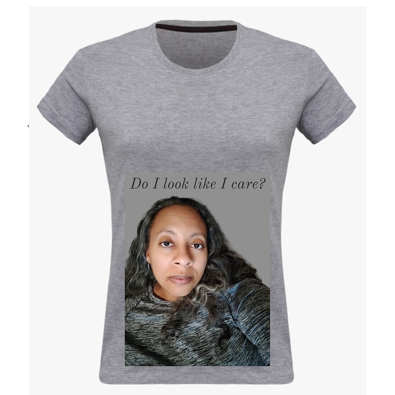
Adobe_Express_20230528_2042260_1

I am a person who often avoids and sometimes despises being in pictures. With the advent of social media and the increased use of the selfie, I have started doing my own random photo sessions. Basically, I just grab my camera, choose a location, and then take twenty photos with different expressions and such. Then, I delete the bad photos and keep the good ones. Over time, I have learned how to pose so that I look a bit thinner, so people can’t see how my glasses disfigure my face when looking through the lenses, or so that I learn how my face looks to others when I make certain expressions. The biggest lesson I learned is that I still hate to take photos. Occasionally, I have a resting bitch face photo that comes across and I decide to save it.

People usually take the most inopportune moments to take a photo. Last month, my father died. I remember at the funeral, one of my in-laws came up to me and asked me and my daughter to pose for a picture. I told her that it wasn’t the best time to pose. Her response was, “Oh, this photo isn’t for social media. It’s just for me.” As if that made it better. People have become so insensitive. On the heels of that, my own mom decided to ask for pictures of everyone at the repast. I get it that this “event” is one of the few times our family will be united. That doesn’t mean that any of us feel much like smiling. And who wants a photo of all of us in our deepest sorrow?

Other’s ‘F you attitudes’ have led me to have my own. I express these feelings of dissatisfaction and hurt in my own selfies sometimes. I don’t have any regrets for posting these selfies publicly. It feels good to be like, “Do I look like I care?” I do care, but it’s nice to pretend like I don’t. I wish people would step outside of social media for just a minute to sympathize with others and to act like humans again.

Create A T-Shirt

“For this assignment, you get to design your very own t-shirt! Find a blank t-shirt template, then add a picture or some text. It could be a joke, a pop culture reference, a movie quote, or anything else you want.”

I found a photo of a blank T-shirt, and decided to make a design about something I’m super passionate about: Hamsters! I really do love hamsters (in theory ONLY, I can’t imagine myself owning one just yet). I figured that I would use certain design skills to cut out a photo of both myself and a hamster I found online on Photoshop, and combine them together to make an appealing article of clothing. Working on this assignment made me think about the different ways that design can be used for different purposes, in this case it would be design for articles of clothing. I think the theme of design is really important in cases like these, honestly.

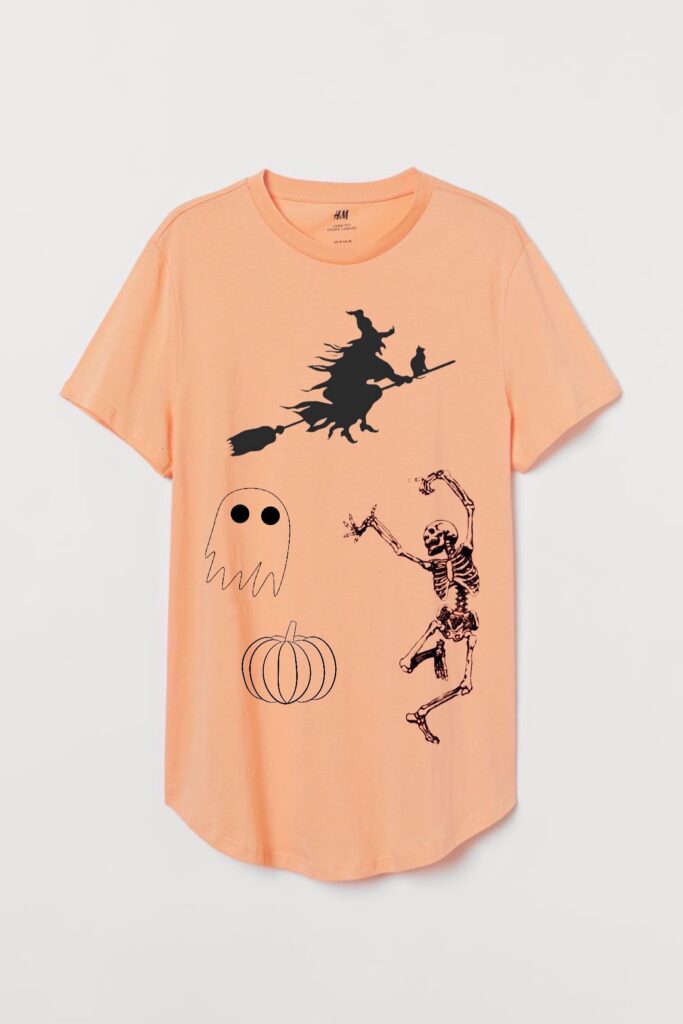
Spooky T-shirt

In this assignment, I designed a t-shirt! Since it is now October, I thought it would be fitting to make a spooky halloween themed shirt. Obviously, this is why I chose orange and black as my colors. I used Superimpose to put everything together. I started with the plain orange shirt, and then layered the different elements onto it. I tried to place them so that they all had around the same amount of space around them. I would wear this shirt.

Merch

The second creative assignment I chose for this week was to create a tshirt so I took this opportunity to make an 80’s themed shirt. I knew I wanted to make a collage of a bunch of 80’s logos because if I just chose one logo I know that this would have already have been created into a tshirt before and I knew if i made my own collage it would be original. To make this tshirt the assignment said I needed to use a plain shirt so I thought it would be easy to go onto a tshirt design website as if I was going to order something and create the shirt there. I used uberprints.com for the tshirt and it was really easy to make, upload, and resize the pictures. The hard part about this assignment was thinking of what logos to use. I wasnt super sure with what was popular in the 80’s logo wise or which ones to use, finding them wasnt hard because i just googled them and the website allows you to just upload saved pictures easily.

80’s T-shirt Vibing

Create A T-Shirt:
For this assignment, you get to design your very own t-shirt! Find a blank t-shirt template, then add a picture or some text. It could be a joke, a pop culture reference, a movie quote, or anything else you want.
2.5 Stars
http://assignments.ds106.us/assignments/create-a-t-shirt/

I decided to choose this assignment because I thought it would be fun and it was! I wanted to give this an 80’s vibe. The assignment was pretty easy, the only time consuming part is doing the outline and coloring, though it was also my favorite part.

How It Works:
1.) I first found a shirt template which I google’d and quickly found a black shirt template.
2.) I then decided to look for a woman with 80’s attire.
3.) I then outlined her body and colored her and the background on GIMP.
4.) I added the blue and pink stripes using the brushes and was finished!

Create A T-Shirt

SPARKY SPARKY BOOM MAN!!!

If you’re a fan of Avatar: The Last Airbender, then I think you will love this t-shirt I designed!

My favorite childhood show growing up was Avatar: The Last Airbender! About a month ago I was in Target, and I saw the complete series of Avatar was on DVD! So I did what any other college student would do… I PURCHASED THE ENTIRE SERIES OF AVATAR: THE LAST AIR BENDER!!!! BEST PURCHASE OF MY ENTIRE LIFEEEE!!! ?

My favorite character would have to be Aang, because his personality is extremely identical to my personality! Not to mention we both sneeze and fly high up in the air! My favorite villain from the show is an assassin originally named SPARKY SPARKY BOOM MAN (his name was changed later on in the series to Combustion Man). Sparky sparky boom man had special powers to blow things up with his mind (or his third eye), and he was hired by Prince Zuko to eliminate the Avatar.

I just had to create this shirt of sparky sparky boom man! He looks so funny yet so angry and serious! I can never take him seriously! He lowkey reminds me of my Dad who I used to watch the show with as a kid! I would love to walk down the street and see a random person wearing this shirt! And we could have a great conversation about how amazing Avatar: The Last Airbender is!