In this assignment, you’re supposed to pick a movie poster and animate it in some way. I picked this up initially thinking it wouldn’t be too difficult, especially for a 4.5 star assignment, but boy was I wrong. I chose 2001 because it was the last movie I watched, and the movie poster was simple enough to plop some moving footage in. While going through the movie, I realized the movement is so subdued in general, and most of the scenes wouldn’t make a great cover. I ended up going with a short shot that includes HAL and Dave. The gif itself is rather large, so I’m making it required to click it to see it in motion.
The process was a lot harder than I expected. My first problem was cutting the clip out of the 2 hour+ movie file I had. I soon realized there isn’t a good free movie editing software akin to audacity, and I immediately regretted not getting the entire Adobe app collection. What I ended up doing was playing the scene on my computer while recording with OBS, which is one of the best screen capture programs, and also free. I then imported that 5 seconds into photoshop as layers, cropped out the rest of my screen that was included in the recording, and overlaid the cropped portion of the poster onto those layers. With that done, it’s easy enough exporting the layers as a gif, although it was rather large, and I wish I could have exported it as a webm, but you can’t do that through Photoshop, at least not to my knowledge. Anyway, I think it came out fairly decent, though I’d like to try this again once I have better software.
Created for the Animated Movie Poster Assignment (4 and a half stars) It’s an animated version of the teaser poster for the upcoming James Bond film Spectre
I really love James Bond. Or maybe just Daniel Craig. Probably a mix of both.
This is actually my second James Bond post this week. (If you hadn’t already guessed, the movie from this post was Skyfall)
I feel slightly obsessed.
When I came across this assignment I knew I wanted to do it, especially after the Animated Comic Book Cover I did. However, I didn’t know what movie poster I wanted to use. So I sat and thought about it for a bit.
Then James Bond popped up. I actually knew which poster I was going to do as soon as Bond came to mind. I remember when they released the poster design (late last year or earlier this year) I was so excited. I loved the design. I still do. I’m not all for guns or anything but there’s something about the single bullet hole and the cracking glass that makes me really pumped for the film. It’s so simple yet it has such an impact on me.
Real minimalistic techniques at work here!
Creating this took some planning. I first had to think about what it was that originally drew me to the image. The bullet hole. So I decided to have that slowly fade in. Using photoshop, I duplicated the original image 15+ times and faded the bullet hole a little bit on each one until it was no longer visible. After I was done with that I was pretty happy with my project.
Then I thought about the text. And how cool it would be if I had it fade in too.
So I went back through each layer and took the text off. Then I duplicated the final layer a few times and placed a lower transparency version of the text on each one until it became completely visible.
From feedback and suggestions I reversed the build. I still want to go in next and change some of the text will be more group specific.
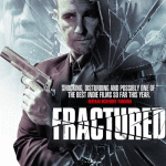
Also found the feature to create a gallery. Here is the Fractured Gallery starting with the first attempt to the most recent. Still working on how to title and make this smoother. Right now this feature is rather clunky – you have to click an image>go to a page> click on image to get it to run. Too much effort for a visitor. Working on it.
For some reason it is not loading as an animated gif but if you click on it, it opens in a new window and runs….If someone has some hints on what to check please tweet or post a comment.
I chose this assignment for the following reasons:
4 stars to challenge and stretch
Theme of movies seemed in alignment with #noir106
Having to use PhotoShop for more than a quick image manipulation.
I first searched for NOIR movie posters. Several options came up including several “100 Best Noir Movie Posters”. I ended up on a site with posters from the 40’s-today. (I will put the link here when I find it in my history).
There were several posters that text, color, placement- the design elements this unit is focusing on, were prominent.
My next step was to narrow a choice down to interest and forms and shapes that would challenge me, yet be appropriate for using in photoshop animation. For this first attempt I wanted the pieces of the poster to build the whole rather than try to create movement within an image like a leg kicking or gun firing. That attempt will be the next creation. I decided to do “Fractured”. It is actually a newer movie, but does come up as Noir. I will gladly wait for comments to tell me how it is not Noir. Not taking a full noir slant to ds106 I do have license to be as Bond has stated – a heretic.
Using the resource links from the UMW instructors for #noir106 I came across a screencast created by Alan Levine from a poster for the movie Bridge over the River Kwai. It was helpful in pointing out Photoshop had an animation feature and that it was built upon the concepts of layers. Seems that Shrek’s reference to life is better as an onion – it has lots of layers is a key in this creation process for digital media.
I began with making the segments. Lots of do agains, and using blurs, cuts, smudges. Once the pieces were set it was time to find the animation. The screencast was an earlier version of Photoshop so a few queries on Google and I found where it was located in my version. Some time spent in things being grayed out, etc. Finally got the slides and timing to an acceptable point. It was then time to Google how to save as a gif.
Settings complete. Saved and it works when I open it in a browser.
Wow. This one was way more difficult than it needed to be. I found out that making GIFs is actually a LOT easier in Adobe Flash. But I’m broke and stuck with GIMP, so…
Anyways, based off this design assignment, I decided to make my own, but inspired off a tv show, The Legend of Korra. Since the final season premieres tomorrow, I thought it would be perfect to make my own tribute to it. I used the following promotional image for the season:
I used the free selection tool to cut her out; this got really different around the thin parts of her hair. Then, I found this GIF online, which is from the intro to the show: (you may have to click on them if they don’t load)
Since GIFs have their own index color palette, I had to convert it to RGB so I could properly overlay my cut-out. I resized my cut-out to the dimensions of the GIF and pasted it as a layer. Once I did that, I had to go through the horrible tedium of manually merging the my cut-out with each individual frame of the GIF. All 47 of them. Unfortunately that’s the only way to do it in GIMP. For future similar projects, it’s better to stick with Flash. After this was finally done, I simply exported it as an animation, and reindexed the color. The resulting product is this:
All in all I am quite proud of it. Although I would love to move the foreground image more to the right to make the animation more visible, I am not going to remanually merge all those layers again. So while the image is not the most balanced or unified, at least I can safely say that the foreground exhibits dominance over the whole design. I am actually quite happy with how well I was able to extract Korra from the original image. Small traces are really only noticeable upon close inspection.
Difficulty: 4.5 Stars (Should be 5 in my opinion).
This assignment was probably my favorite out of all the ones we have done so far. This design assignment was to create an animated movie poster. After looking through some of the previous ones that others had made in the past I thought this assignment would present a good challenge. I would recommend checking out some of the others work because some of them are really good and probably took some time to make.
Seeing how it is Independence Day weekend I thought it would be a good idea to go with something a little patriotism in it, but also keep it comical. I noticed that the Pain & Gain poster had a giant American Flag on it and decided it would make an excellent animated poster. Here is the original:
And here is the animated version:
This assignment took me just about an hour to complete mainly because my computer was being slow. The process is not as difficult as one might think, but it will probably take a while to complete. You can do this assignment with either GIMP or Photoshop, but I would again recommend Photoshop for better quality work. I’m not going to do a tutorial for this one because it would take too long so I apologize, but if you have any questions I would be happy to help you.
First I searched for a large American flag waving video on youtube and used the one I found to make an animated GIF. If you would like to know how to make a GIF I made this tutorial just for you. However, I made this poster using Photoshop, but the tutorial shows how to make one in GIMP. Both will work just the same and GIMP is for free.
After making the GIF I uploaded the Pain & Gain poster to photoshop and used the selection process from my previous post (Tutorial) to cut out the characters without the flag in the background and pasted them to the GIF. I made sure to bring the pasted layer to the front and made some size adjustments to the gif to fit the poster and then I saved it for the web and there you go one animated movie poster.
For this assignment, I made an animated poster for the Twilight Zone episode “Time Enough At Last“. This was my favorite episode so far, but it was also the most depressing so I ended up in bed afterwards and drowned out some of the pain with the ever timely humor of Lieutenant Data. Then I had to work.
This took a little longer than I would have liked it to, but as a wise boyfriend once told me yesterday “Just figure out how to do the layers and Google it before you ask me”. So, I eventually figured out that I could link all the frames of my gif in GIMP and thus scale them all at once, rather than painstakingly one by one.
I tried to use a climatic scene because I feel like that’s how movie posters do, ya know? This one was fun, but definitely challenging.
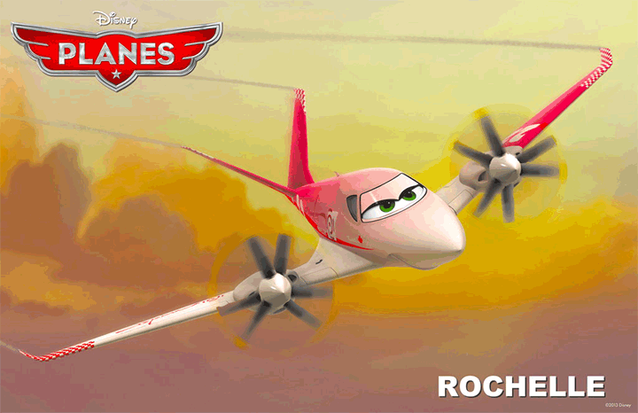
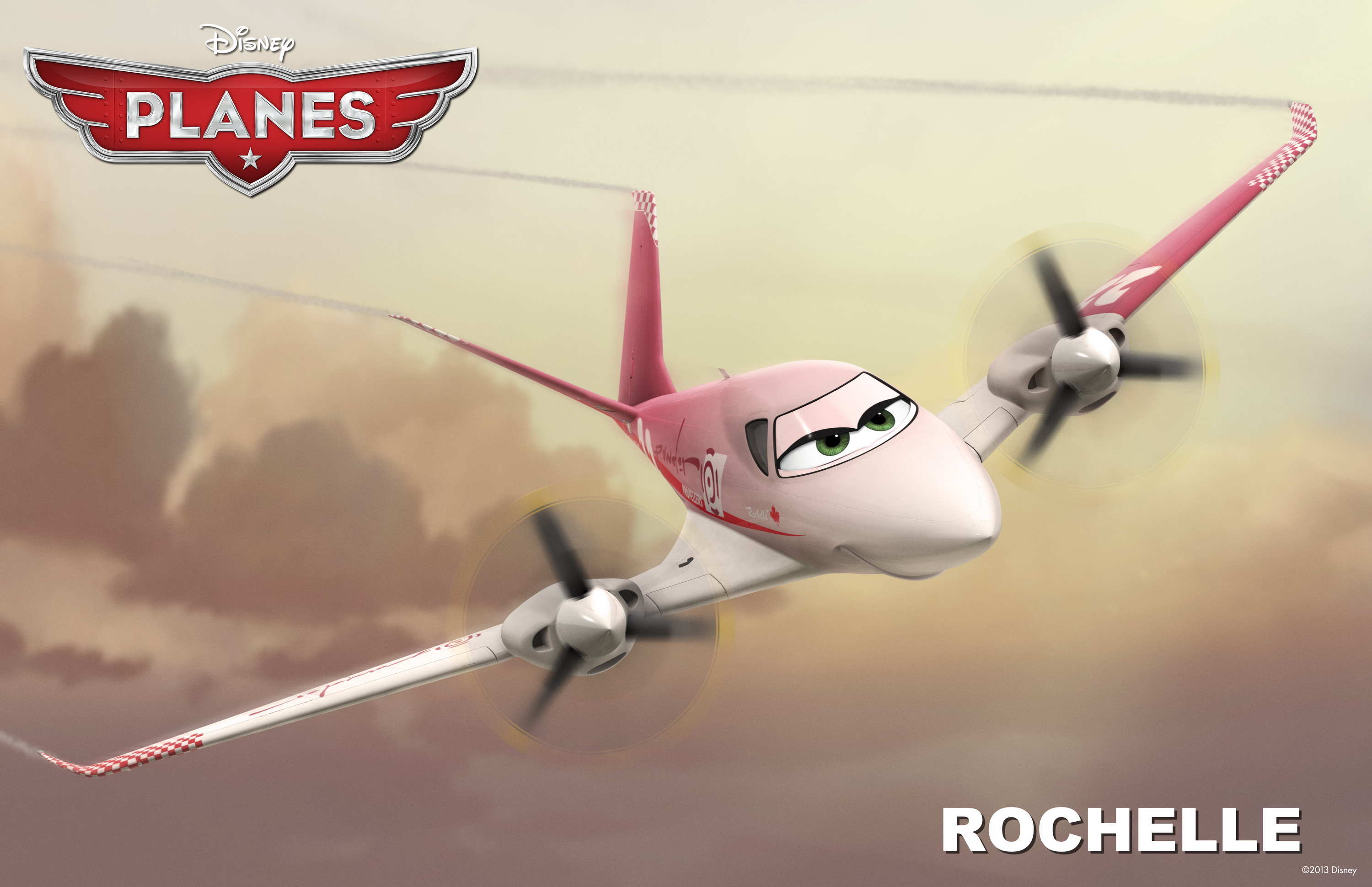
Still enamored with creating GIFs, I stayed up way too late last night creating this animated movie poster from the movie Planes by Pixar to be released in theaters August, 2013. (DesignAssignments313)
Let me give you a little background on why I chose this particular movie poster. My name is Rochelle, and it’s not a very common name in the United States. I met only one other Rochelle growing up, and that was in High School. I’ve met maybe 5 others my whole life. So when a Facebook friend posted on my timeline that Pixar would be introducing a new character in their upcoming movie about planes, I was beaming,
“I have a cartoon character named after me?”
Now this assignment would give me the opportunity to create something out of a real movie poster that had my name on it. How cool is that? If I liked it, I could see using it in other circumstances around the web. I do like my final product, so you might see it popping up again.
Keeping with this week’s design theme, I studied the poster to understand what is being conveyed in the image. Since the movie isn’t even out yet, I read the Pixar synopsis of the movie and more specifically the plane character, Rochelle. (voice of by Julia Louis-Dreyfus)
Rochelle is a tough racer and the pride of the Great White North. Always confident and capable, she got her start running mail to small towns in Quebec, picking up home remedies for mechanical maladies along the way. She also developed a knack for fast travel that ultimately inspired her to give air racing a try. Rochelle never looked back (this competitive contender doesn’t need to). She is relentlessly pursued by charmer El Chupacabra, but steadfast Rochelle is much too focused on winning the race to return his affections.[20]
I would also need to keep in mind the file size limitations of a GIF, how many frames I’d be allowed in my photo editing software, and since I didn’t want this project to consume my life for days, the number of frames I’d actually have to create. I decided that the important elements of the poster to focus on would be that this is a plane, and then illustrate something about Rochelle’s personality. My first overly ambitious thoughts were to have her fly on the poster. Moderating my initial exuberance with a dose of reality, I admitted to myself the work required to make the plane actually fly in or out of the poster was way too complicated to pull off. My rational, although still very creative self, went with animating the propeller props, and giving her a wink. I’m not totally at peace with the symbolism of her winking, since the character synopsis says she is steadfast and much to focused on winning the race to return another plane’s affection, but I’ve seen that effect used in a lot of other GIF projects, so why not give it a try.
[An illustrated detailed process of creating this animation will be documented and posted as a tutorial shortly.]
A summary of the process using PhotoShop Elements 11 for the Mac:
1. I used the lasso tool to grab an image of each of the propellers and the eyes/windshield of the plane. This was pretty painstaking while I experimented with which parts of the propeller would work best to create the rotating effect. I then duplicated the propeller images and rotated them 30deg and 60 deg. I ended up with 3 different propeller images for each side of the plane.
2. For the winking eye I used the lasso tool again to capture just the left half the windshield image. Then started stretching, erasing, copying, pasting, aligning… until I had something that looked right.
3. Once all of the individual image layers were created, it was time to merge the appropriate layers to create new combined images that would animate correctly. Oh my was this a chore as it became closer and closer to midnight. I was creating a total of 3 animation zones?! My brain just wasn’t working as well anymore and I was having a hard time following tracking of what went where. And remember that ambitious enthusiasm I spoke about? Well I added in an additional challenge to have each of the propellers appear to be spinning a little differently. And believe you me, it was no walk in the park to properly align everything so that those parts that were supposed to be still remained still. I didn’t want any distracting jumping around of the animation.
4. The timing of the animation sequence was also important. I didn’t want her constantly winking, yet I wanted the propellers to be moving at a quick rate to provide a better spinning illusion. I was able to create the effect I wanted by duplicating more of the image layers for the propellers and sandwich the winking effect in the middle. All-in-all I ended up with a total of 14 frames: 8 propeller frames + 2 winking frames + 4 propeller frames, all running at 0.2 seconds per frame.
As I mentioned above, this post only gives a high level synopsis of creating this GIF. The tutorial will have much more detail with screen shot images and examples at each stage as I move through the creation process.
I made a moving poster for the festival mario and luigi are going to. Not really the original assignment, but it works the same. For this, I took a bunch of things to get it all together. First, I downloaded this jumping video off of youtube.
Then, I took this image into gimp and made the tomorrowland thing so I could put that over all the jumping stuff.
Then, I cut up the clip of the jumping and loaded that into Gimp to get each frame. Then I deleted a bunch of them to make the clip easier. Then I took each clip and pasted the tomorrowland logo into them, saving each one. After that, I loaded all the images into my gif program and it was complete.


