Assignment Bank 3 (Week Six):

If Movie Posters Told The Truth

For this assignment, the instructions were to improve movie posters to make them more accurately reflect the content of the film. So to begin my thought process, I thought to myself, “What is one of the most popular films of all time?” Instantaneously, the movie Titanic popped into my mind. I then thought about what central theme of the movie I can focus on while creating my movie poster. I came to the scene about the dresser at the end of the movie. It is a huge controversy all around the world! Everyone I’ve ever talked to always mentions the fact that Rose could have saved Jack’s life if she would have just moved over. I mean, I have seen people draw actual diagrams of different positions the two could have utilized to both survive. Below is how I created my poster for this assignment:

  1. I googled a movie poster of the Titanic and saved it
  2. I opened up the online photo editor befunky.com
  3. I uploaded the picture, cropped out the title ‘Titanic’, inserted my text: “Rose could have made room for Jack on the dresser,” and hit save!

I Will Find You

If Movie Posters Told the Truth

Improve movie posters to make them more accurately reflect the content of the film. Inspired entirely by theshiznit.co.uk. (3 Stars)

I think everyone knows that Liam Neeson knows how to play one character and one character only.  That character just so happens to be Liam Neeson.  Neeson is the ongoing butt of my friends jokes about actors and actresses who only play one type of part.  I could not think of anything more true than Liam Neeson playing Liam Neeson.

First I downloaded a Liam Neeson movie poster (Taken obviously) from IMDb.

liam neeson 2

I then uploaded the movie poster into Canva.

Screen Shot 2016-05-27 at 6.20.34 PM

Once in Canva I cropped the poster to only include Liam Neeson.

Screen Shot 2016-05-27 at 6.41.00 PM

Once I cropped the poster I inserted text from the text menu.

Screen Shot 2016-05-27 at 6.22.42 PM

I enlarged and changed the Color of Liam Neeson to red before turn it sideways.

Screen Shot 2016-05-27 at 6.24.44 PM

I added more text from the text menu and copied Liam Neeson again and resized it to fit at the bottom of the page.

Screen Shot 2016-05-27 at 6.27.13 PM

I then downloaded the file from Canva and uploaded it to Flickr. and embedded it into this post.

LIAM NEESON

At this point do we truly expect anything else from Liam Neeson?  I think not, but what about you?

To Ruin TRON

To Ruin
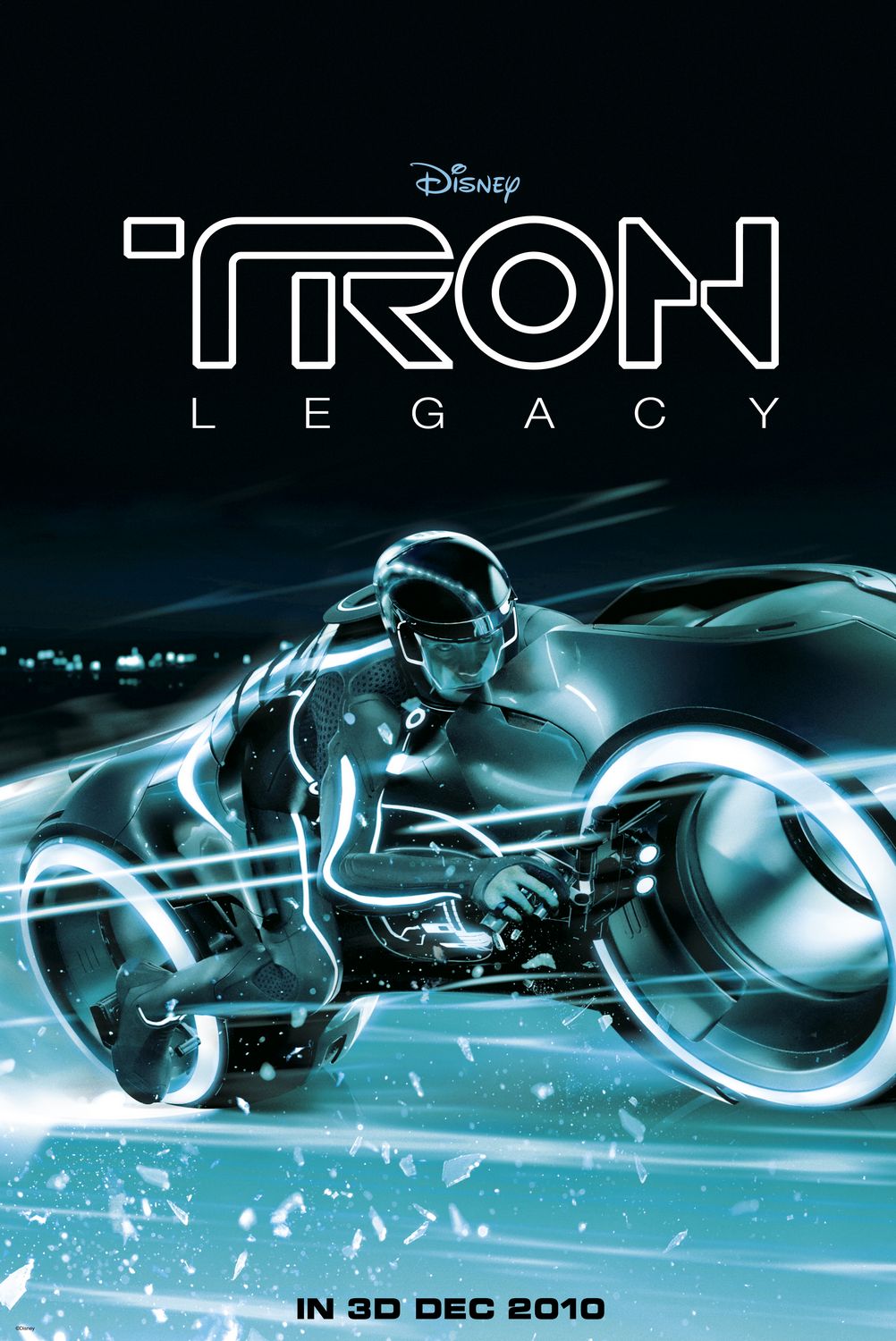
Going on with the Jeff Bridges theme for the week, I decided to revisit TRON Legacy. That was a mistake. I thought maybe I’d been too hasty to judge the film my first showing, but no. It was bad.

TRON. It brings back memories of Jeff Bridges in his early years and Dan Shor before he became a time-traveling guru. It was one of the many 1980s films that included ridiculous computer hacking and video games. Those hockey helmets, laser discs, and neon polygons were so iconic.  So iconic that Disney had to revisit the world.

I was thrilled! A TRON movie with the potential to have some decent special effects! Well, the effects reigned while the plot, albeit more rebellious and action-packed, was a severe let-down.  Disney had to go and ruin TRON for this generation.

As a result, I chose the If Movie Posters Told the Truth assignment to finish off my non-Donnie design points for the week.

I started with a simple image search, as per usual, and found a few TRON: Legacy images I actually liked, but stuck with this one because the header didn’t look like it would be very hard to erase.  Then I went to the trusty fontspace.com to find some nice TRON and Disney fonts. Since I’d already completed my Motivational Poster for Donnie, I knew my way around text manipulation pretty well, so it ended up being rather easy to assemble.  The font sizes were tricky, though. I tried to make them as near to the original sizes, but the text boxes in GIMP have a bit of an overhead clearance issue, so I had to make due with font sizes a little smaller than the original’s.

I left the date intact, as a memorial to the date TRON lost its magic.  I actually made a version using some of the shattered glass pictured and layered over the date, but didn’t really like that, so I reverted to this one.  I’d said all I wanted to say with the header, so I thought it would just be too forced if I tried to edit the footer with something dumb.

Honest Wire Poster

Honest Wire Poster

This is my If Movie Posters Told the Truth assignment (worth 3 stars). I decided to do it on The Wire, but not on a specific episode, more on a general theme of the series. I wanted to put something about the actual point of the show, but McNulty was front and center in the poster, so all I could think about was his women problems, and then I realized that this was a common theme on the show.
I got a copy of one of the HBO posters online and then edited the text in photoshop.

Spin on Avatar Movie Poster

Spin on Avatar Movie Poster

The Truth about Tangled

For my last design assignment I decide to do If Movie Posters Told the Truth which was worth three stars.  I decided to to Tangled as my movie poster.  I started out with this movie poster for Tangled.

tangled-movie-poster-1020560376

I decided the truthful bit of information that should be included into this poster is how wonderful her hair is.  Throughout the whole movie all I ever think about is how much I’d love to have longer hair (however I do realize that hair as long as hers may be a bit difficult to deal with).  And on top of her hair being super long and beautiful, it also has magic power.  How is that even fair?

To remake this poster I first downloaded this Tangled Font so that my words would look similar to that of the words already on the poster. I then added words describing how this movie will just wish you had long, magical hair like hers.  I played around with the size placement of the font to make it as natural as I could.  Here’s what I came up with!

editedposter

That’s all my stars for the week!

The Perfect Truth

For my next design assignment, I clicked on the “random” button. I tried reading through all of the assignments and picking which one I wanted to do, but I couldn’t pick!!

The assignment I was given was If Movie Posters Told the Truth (***) Boy, do I wish this was true! I watched a movie the other day and I thought of it right away when I was reading the assignment details. Here is the original movie poster.

true movie poster

Yes. Pitch Perfect is a funny movie. I laughed and cried…yadda yadda. However, this movie is “perfect” for this assignment! Here is my truthful poster for this movie:

true movie poster FINAL

I did this assignment in GIMP. I started off by covering the original movie title. You can kind of see where I covered it because it gets kind of ‘choppy’ at the bottom. I tried using the spray paint feature to cover that up. I also matched the font as best as I could to the original font because I wanted to make it look as real as possible.

I really enjoyed this assignment because it is something everyone can relate to! Like many other assignments I do for this class, this one can be used in my future classroom. Kind of like a book report? Or a final project?

Final Design


When I read over the description for “If Movie Posters Told the Truth,” I knew I wanted to do a scary movie because they are all so predictable. One of my favorite suspenseful movies is Final Destination 2. This may be due to the fact that a friend of mine took me to see this movie with her without having seen the first one. I thought it was amazing because I was enwrapped in the guessing of who was going to get away from death, because someone had to escape. Afterwards, I went back and viewed the first film and then watched the additional sequels that came out, and regardless of their repetitiveness, I still like these movies. However, I did tire of the third film and any that came out after that. I wanted to let the viewers know that this movie is exactly like the first.

First, I had to find an image of the movie poster that would show up large enough without being pixelated. Next, I pasted it into a PowerPoint slide. Since the background was already black, it made the next few steps much easier. I also set the background of the slide to solid black fill so that the original image would blend in with the rest of the slide. Next, I had to insert a text box and write my new title and caption, both of which were separate text boxes. After I had my text inserted, I had to make the text box show up over the top of the image. To do that, I had to right click within the text box and choose, “Bring to Front.” I played around with the fonts in PowerPoint in order to try to match the fonts on the original movie poster. I found the title to be most similar to the font DFKai-SB. I wanted the “Again” portion of my title to mirror the “2” in the original title by making it larger than the rest of it. I also capitalized the entire title to match the original. Next, I noticed that the original title had a blue glow behind it. I highlighted the text, right clicked, and clicked on “Format Text Effects.” The “Glow and Soft Edges” tab allowed me to pick a thickness and color to glow behind the text. I intentionally left the original text and my inserted text both visible up until this point so that I could use the original as a guide. After my text was how I wanted it to look, I right clicked inside the text box and chose to fill the box with solid black. This was much easier than it could have been because the background was already black. I repeated these steps for the caption at the top as well, except I made the thickness of the glow thinner and chose “Chiller” as the most appropriate font. I then saved the PowerPoint slide as a .jpeg file.
Overall, I was pretty pleased with the turnout of the image. It ended up being easier than I thought. It just took some time playing around in PowerPoint. I originally played around with the image in Paint. I even painted over the original text with black but then decided that it would be easier to match the text if it was still there. I also decided it would be better to have access to more fonts in PowerPoint, so I got rid of the Paint version of the poster and started over. My original intentions were to try to match my remix poster with the original poster as much as possible. I struggled when it came to getting the font to match the original poster. I wanted to have the glow behind it and had a hard time figuring out how to do that. I played around with the text a good bit. I even tried looking up glow letters on Google to insert over the image, but I knew there was an easier way to do it than that. I finally saw the “Format Text Effects” option when I right clicked and found the glow option. After that, I just played around with the glow color and thickness until it looked close to the same as the original.
I think an assignment like this would work great with any novel or play that was being read in the classroom. It could be used as a summarization activity at the end of the unit or lesson. It is first acting as a short, but sweet summary. Then they could go deeper into the text, providing textual evidence even, to support the reasons for the new truthful poster. They could demonstrate their learning by reflecting on the choices they made with the poster and for what reason. What were they trying to show about the novel or play through this poster image? It also lets the teacher know whether or not they enjoyed the reading/acting.
Another assignment that could incorporate this idea is a unit on persuasion. They could take a normal persuasive advertisement and write the truth over the persuasive verbiage. This would require the student to analyze the persuasive digital text and then alter it by writing their truth about the topic, which could incorporate research before they complete the image remix.

Truth about Movies

The Young One

The Young One

I took the poster for the movie The Lucky One and retitled the movie The Young One. I also added a description to it saying I stalked you down, but lets be real I’m too young for you. I saved an image of The Lucky one onto my computer. I then opened it onto the program Artweaver and used the stamp tool (clone tool) to edit out the Lucky one which was written on Zac Efron’s shirt. I then added my own text in Red and White onto the poster to create the new movie The Young One. This is one of my favorite movies, but honestly I wish the main actress was younger, kinda ruined the movie for me haha.

The Truth About Bridesmaids

Truth about Bridesmaids

Alright, so maybe you won’t shit your pants, but you might pee a little–I did. (Plus, the poop reference is just too relevant to pass up.) The first time I saw Bridesmaids, I didn’t know what was happening to me. Seriously. I lost it. One of the funniest movies I have seen in a hot minute. And I love that it is women being this funny–especially the poop scene, and also the airplane scene. Kills me. Every time.

I was inspired to do this particular movie (for this assignment) because I caught it on TV last weekend when I went home (since I don’t have cable at my house here) and I was reminded about how much I love it. To get my picture to look like this, I, first, found a picture online in the handy, dandy Google images, and edited it with Picasa (yes, Google rules my world). I used the “retouch” tool to edit out the title in the original image, and then used the “text” tool to edit in the “truth.” This was the outcome. I like.

As always, feel free to leave me some constructive criticism. It’s always welcome!