If Movie Posters Told The Truth

This is for the assignment If Movie Posters Told The Truth


http://www.flickr.com/photos/75437437@N06/6906429863/in/photostream


for this assignment i chose 28 days later because in every other zombie look alike film the zombies always walk or at least jog but in 28 days later they are doing full sprints to get to you so i feel like its much more scarier then dawn of the dead or any other classic zombie movie. the quote better start running is prob the best advice to give based off this movie.


You can’t handle the truth!

As soon as I read the assignment description I knew I wanted to do Firefly. Yes, I know, technically this poster is from Serenity. But I like to think of it was the last episode of Firefly, because it deserved more than 13 episodes. I’ve always told people that were on the fence about watching it, “you’ll love it, It’s cowboys in space!” Even though the Firefly series is so much more than just cowboys in space, that’s what it would appear to be to a new viewer.

Making this poster was actually fairly simple. I googled the movie poster, imported it into Picasa and used the blemish remover tool to wipe the original title. Then I just found the font I wanted and used the text tool to add my title.


I hope you like my poster. Also, if you haven’t seen the Firefly, you should absolutely go watch it right now. Seriously. it’s on Netflix. Just do it.

If Movie Posters Told The Truth

Rachel McAdams has now been in romantic movies with Ryan Gosling and Channing Tatum. In both movies she has contemplated leaving an extremely hott guy. I don’t know why these are such difficult decisions for her so I created this movie poster to help her out with her decision making.

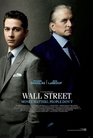
The one percent


Sorry to get all pessimistic and political, but I think it’s a problem with our society. Kind of a truth about the movie as well, sort of.
The first challenge was getting rid of the real subheading. I used the rectangle selection tool and copied and pasted bits of background from above and below the heading to cover it up. That worked pretty well. I used the eyedropper tool to match the color of the font. Matching the font was more of a problem. It looks like it should be something like Bodoni, but my Bodonis don’t match – the Rs are different. Not too noticeable to the untrained glance though.

I sure do love me some movies

I’ve done a couple of design assignments this weekend.  There will be a few more to come, but I was pretty excited about these and wanted to post them now.

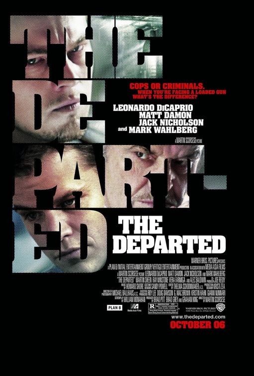
This assignment looked like a lot of fun.  It also seemed somehow familiar.  Long ago, my friends and I renamed “The Departed” with a much more apt title: “Head-Shot: The Movie”.  So I started with this

And ended up with this

Head-shot: The Movie

Not great, but I think it does the job.  By the time I finished, I really wished I had used a different font.  I was unwilling to start over though, because just doing this version took me quite a long time.


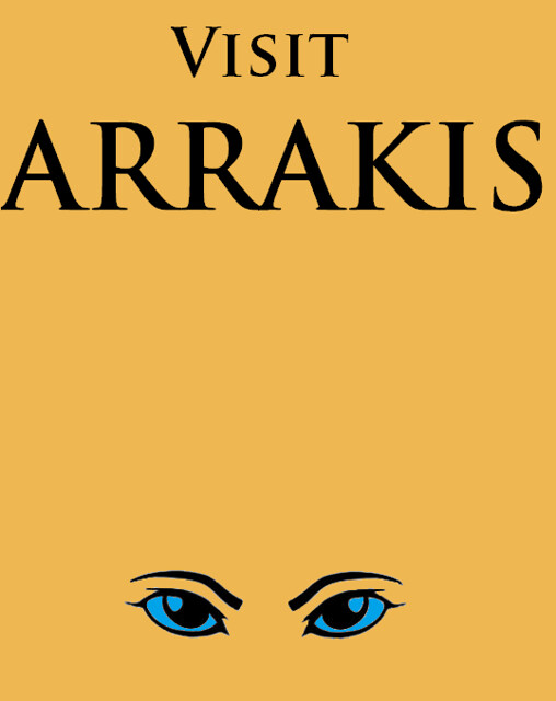
Then there was this one that I honestly chose because it seemed easy enough that I could actually do it. And since I’ve been rereading Dune this week:

Dune travel poster

These were both pretty simple.  I had someone show me some basic photoshop layering for Head-Shot and then had some annoying trial and error adventures.  For the Arrakis travel poster, I just used mspaint.  That one was easy.  Really, simplicity is key.

More design assignments on the way, probably mostly movie related as well.  There will also be more daily creates too.  I know you’re thrilled.

DesignAssignment329: Eat Pray Love?

If Movie Posters Told the Truth. This Assignment is worth 2 stars. I will write more about it soon.

If Movie Posters Told The Truth

Improve movie posters to make them more accurately reflect the content of the film. Inspired entirely by theshiznit.co.uk