The Truth is Out

Movie posters never tell the truth. They are meant to compel you to come see the movie. When I cam across the assignment to reveal the truth, I knew I had to do it. I’m not sure why, but when I saw this assignment the first movie that came to my mind was Friends with Benefits. In the end, the two “friends” do end up falling in love. But, in the movie poster you aren’t supposed to know that until you watch it. I decided to go ahead and reveal the truth about this movie.

First, I googled the movie and got the original movie poster. I then uploaded it to pixlr and edited out the title. It turned out to be very convenient since the title was on a black background. I then saved the image and uploaded it into powerpoint. I played around with fonts for a bit, but couldn’t get the exact one. I got one that I think is pretty close. I changed the colors to match the original title and then saved it. It was quite a simple process and the results are great!


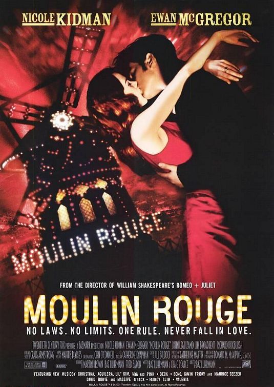
Moulin Rouge and Forcing You to Cry.

Mine:

IfMoviePosterTold

The Original:


For the record, I love Moulin Rouge. Seriously. The flashy dances, the taboo life of a prostitute, and the music mash ups. Except the sad ending. I won’t ruin it for you, but you’ll cry if you have a heart. Anywho, I correctly changed the tag line from “No Laws. No Limits. One Rule. Never Fall In Love.” to “No Laws. No Limits. One Rule. Cry.” by using the paintbrush tool in Gimp and painting over the original in black to blend in and then using the text tool to “fix it”. I found the original poster here, and naturally, the assignment here.


Marley & Me-the Real Truth to the Movie

If Movie Posters Told the Truth

Improve movie posters to make them more accurately reflect the content of the film. Inspired entirely by theshiznit.co.uk

This is a 3 star assignment

For this assignment I used the movie Marley & Me.  This movie came out during Christmas 2008 and is based on the book by John Grogan.  I found a google image of the movie poster, and then I opened the picture up in paint to add the words to it.  I went to see this movie  in theaters around new years, not having read the book and I swear by the end of the movie everyone in the theater was in tears.  I know I was and I don’t usually cry during movies I see in the theaters.  So for this I changed the top part of the movie to: “This Christmas, be ready to cry”  instead of “This Christmas,  heel the love”And changed the title from Marley and Me to “The Saddest Movie You Will Ever See”  Below the movie title it said: “Life and Love with the worlds worst dog” And I changed it to “this is particularly sad for all dog owners”  The one time I saw the movie in theaters was the only time I have seen the movie.  It was just too sad to be seen more than once.

If movie posters told the truth


ds106 Design Assignments

My goal with participating in ds106 (in whatever way that played out) was to learn something. I’ve only scratched the surface but I’ve learned quite a bit about GIMP and Photoshop today. In addition, without putting in much effort (as I probably should have done) I am looking at design differently, more aware of choices made and how those decisions impact the overall view of an item. Again, lots more to learn but I’ve gotten started.

I had to make some lame workarounds to create my CC poster because I’m not yet proficient enough in GIMP or Photoshop. That said, I’m fairly pleased with how it turned out. Here’s the original picture from Mean and Pinchy on flickr:

Here’s my take on Creative Commons:

The next assignment I attempted was If Movie Posters Told the Truth. I’m less pleased with this work because I know if I had more patience I could fix the ‘bad script’ part to look more a part of the poster. Unfortunately it’s late (for me) and I’m not a patient person in general. 
I picked a movie I can’t stand because that seemed more fun. It required inventing a new word but it captures my sentiment pretty accurately.
Finally, I tackled Iconic You. As simple as this looks, it took me a while because I kept trying to make it do too much. I could not come up with one thing to illustrate me and I wanted to create something that included a lot of the ways I define myself. This design came pretty quickly but I spent a lot of time trying to add more to it. I thought about using the top of the music note to be waves and add something to symbolize biking and running in order to show my participation in triathlons. I thought about adding some little faces to the apple to symbolize my children and husband. After trying some of these out and not liking anything, I got back to the simple. It may not show everything that matters to me, but I like it.

G R O O M

So this sort of begged a response…  #ds106

The Social Downes

I started remaking this poster as bava art, but then I realized that nobody fits this poster better than the great Stephen Downes. Nobody more prolific, nobody more willing to speak his mind, and nobody less afraid to piss other people off! NOBODY!

All that said, nobody could be further away from the Facebook idea of corporate control and lock-in, which I guess is the joke.  I’m gonna file this under the “If movie posters told the truth” design assignment, but that isn’t exactly what this is. Anyway, this was too much fun to make.

If Movie Posters Told The Truth

should be poster

I chose the Harry Potter Part 2 poster for the assignment If Movie Posters Told The Truth.

First, I opened the movie Poster with Photoshop. I then selected the text tool and typed in my “phrase”. The font I used was Charlemagne St and I made the font size to 50. I then dragged the text layer to the top of the poster with the move tool.

Next, I went to the layers box on the side. I double clicked on the text layer but made sure I was NOT clicking on the name of the layer. This opened up a Layer Style box. I checked the boxes for the Drop Shadow effect and the Bevel and Emboss effect under Blending Options. Under the Bevel and Emboss box, I also checked the Contour box. I saved the Project and It was complete.

You can’t handle the truth


My first design is telling the truth about a movie on the movie poster. Burlesque is one of my favorite movies because I love Cher! The original movie poster had the two artists names listed, along with other cast members who were included in the movie. I decided to alter the poster, simply by using paint artist and describing each singer with a few words. Great movie, totally recommend it!

If Movie Poster Told The Truth

Three Star Assignment
Gender as a social construct

Process

I spent about 15 minutes looking for a suitable pictures. Mulan has a ton of posters and I wanted to find the right one. After downloading the picture I then basically went through a ton of texts to find the appropriate one. I did try to use whatthefont again but I am still having issues with that. However, I believe the text I used fit the message that I was going for.

Motivation

Mulan is a movie by Disney with a simple message: women can be strong and tough too. I thought it would be funny to make this simple message a more complex a message. I considered making another title as well; A treatise on gender social construct theory. However, considering the simpleness of the movie I decided to make a simpler one to mimic the simpleness of Mulan.

Spoiler Alert!

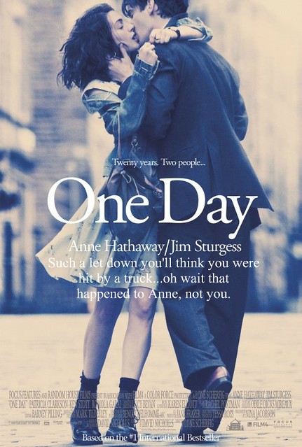
Was anyone else excited to see “One Day”?  I love Anne Hathaway, as in, I am in love with Anne Hathaway.  Ok, not really but I do think she’s pretty swell.  Also, Jim Sturgess isn’t too hard to look at.  Add in the fact that this looked like an almost rom-com tear-jerker and I was set for a new “Notebook” to watch on girls’ night.  Wrong.  So wrong.  So very very wrong.  My friends and I watched this movie occasionally pausing it to discuss with one another the fact that no, this could not be it.  We were sure there was some huge element right about to happen that would make this film the chick-flick we’d anticipated it to be.  No such luck.  All in all, a complete letdown.  I apologize if this is your favorite film.

Spoiler Alert!

Here’s the truth about why I did the If Movie Posters Told the Truth design assignment.  I needed to complete three more stars and I told myself to go to page 3 of the assignments and do whatever one came first that was worth three stars.  It was this one.

I got my inspiration from Candice – hers made me laugh out loud.  Once again, I did this in Picnik and I’d like to thank the individual or group responsible for the original poster.  Your use of Times New Roman font really saved me some time!

Assignment Details